Snowbound by Bram Stoker

snowbound00.jpg

The artwork is mine; the cover design is by Lookatcia.

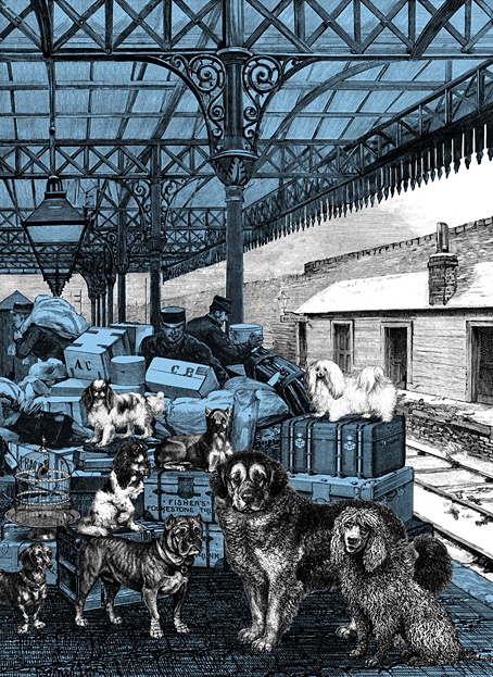
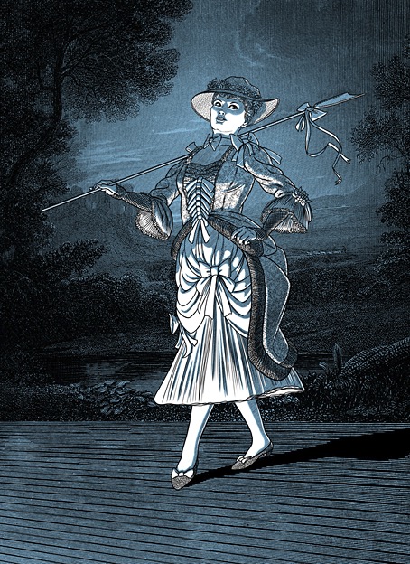
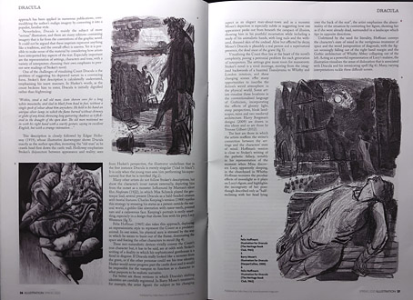
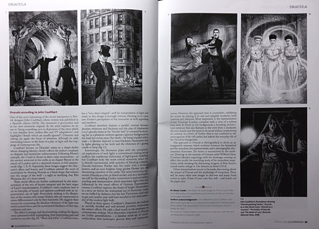
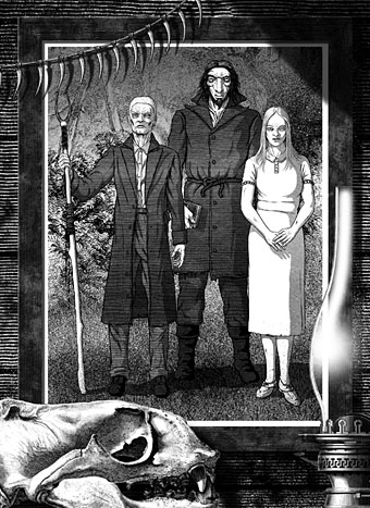
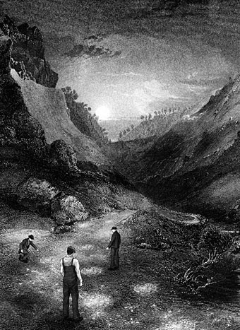
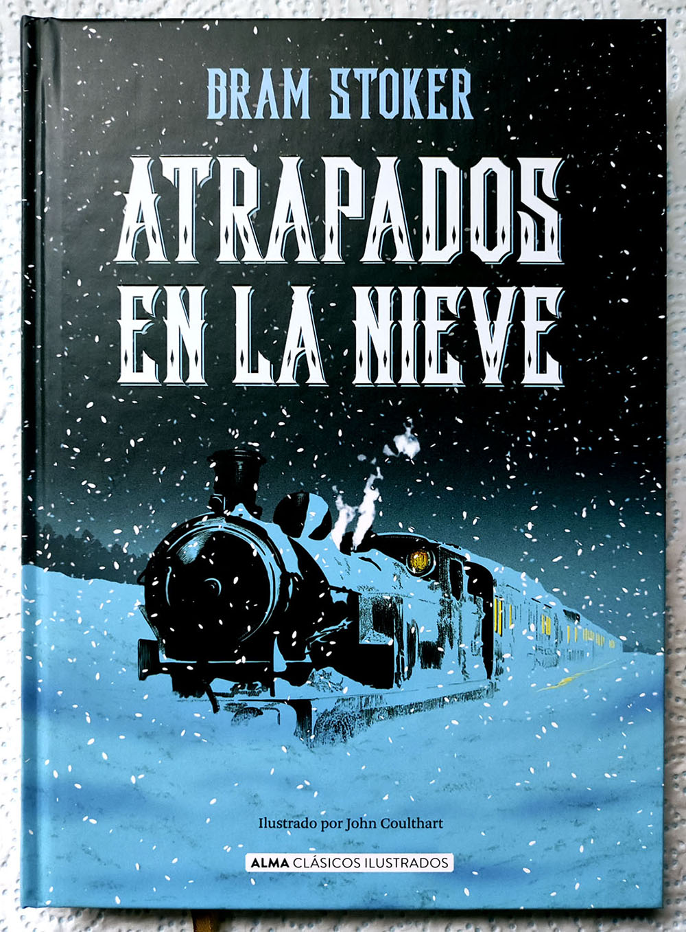
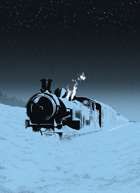
Presenting my latest book for Alma, the Spanish publisher for whom I’ve illustrated several classic novels and story collections. The new volume is my second Bram Stoker title after Dracula in 2018 which, for the sake of convenience, I’ll refer to it by its English title. Snowbound: The Record of a Theatrical Touring Party was a collection of connected stories first published in 1908, 11 years after Dracula had established Stoker’s reputation. I wouldn’t call Snowbound a bad book but if you’ve read Dracula or Stoker’s more popular short stories it’s a disappointment, with no supernatural content and little to recommend it elsewhere. The first episode introduces the framing device: a group of travelling players are marooned by heavy snow while travelling on a train through the wilds of Scotland. To pass a dark and freezing night the troupe entertain themselves by relating memorable anecdotes from their careers, anecdotes which I imagine Stoker either heard from others or experienced himself during his years working for actor-manager Henry Irving. In place of the spooky tales one might expect from such a premise we’re offered a succession of vaguely comic episodes mixed with more serious drama, with a couple of the pieces being related in very broad “Oirish” and Cockney accents. The Irish episode is especially bizarre considering that Stoker was Irish himself; it reads like the kind of thing you’d get from an English writer trotting out lazy stereotypes.

endpapers.jpg

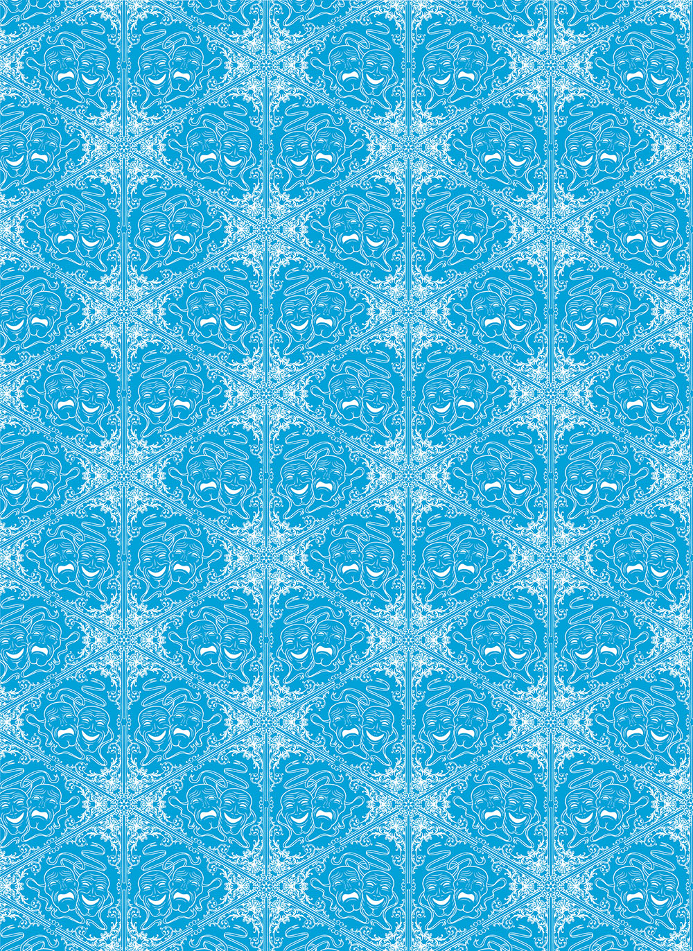
My endpapers design.

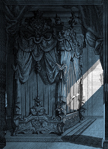
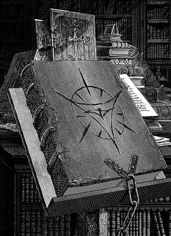
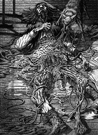
There are other flaws I could mention but I’ve undersold the book enough as it is. Snowbound has never received much attention in the past, it wasn’t even reprinted in English until 2000. In my previous books for Alma I utilised a style which combined collaged backgrounds with hand-drawn elements in order to create illustrations whose engraved appearance made them seem like products of the period in which the stories were written. More recently I’ve been moving away from this style but the success of the previous Alma editions, Frankenstein in particular, obliged me to maintain some continuity with the look I’d created for Dracula. As it turned out, several of the Snowbound illustrations are entirely hand-drawn, with engraving-like textures used in the shading. The biggest departure from the previous books is the addition of an extra ink colour to the artwork, an effect that was fun to play with when creating different lighting effects. As to the pictorial details, several of the anedotes take place in the United States, hence the presence of an American steam train with an elevated smokestack, the spelling of the word “theater” on a poster, and so on.

snowbound01.jpg

Having mentioned Frankenstein I ought to also mention the recent Polish edition of the novel which reprints my Alma illustrations. This is a large-format hardback from Materia, a pubisher who don’t seem to have a proper web presence outside those Meta plague sites that I never link to. The book is on sale anyway. Meanwhile, I’m currently working on another new book for Alma which will feature ten full-colour double-page illustrations. More about this later.

snowbound02.jpg

snowbound03.jpg

snowbound04.jpg

Continue reading “Snowbound by Bram Stoker”

Jodorowsky times three, or The box that never was

jodorowsky1.jpg

The first three feature films by Alejandro Jodorowsky—Fando y Lis, El Topo and The Holy Mountain—are released this week on Region B blu-ray by Arrow Video, but the box they’re packaged in won’t look like any of the designs shown here. It was almost three years ago that Arrow asked me to create something for this box set, but backstage wrangles meant the project moved out of my hands in the early stages. This was a great disappointment since Jodorowsky’s interests and aesthetics align with my own much more than many other directors whose work has been released by Arrow. And having written the notes for the Arrow release of Henri-Georges Clouzot’s The Mystery of Picasso, I was looking forward to working with the company again.

In preparation for the work I rewatched almost all of Jodorowsky’s films (I still haven’t seen Tusk or The Rainbow Thief), then drew up a detailed proposal with sketches, something I seldom do for commissions. Arrow releases all have double-sided inserts in the boxes that hold the discs, one side of which shows a poster design from the film’s original release, the other a new design. My idea for the new art was to connect the three films using Tarot-like iconography (the director is a Tarot scholar, among other things), with each film also being assigned a symbol of some kind. The Surrealist fable of Fando y Lis lacks any suitable graphics so for this I chose a yin and yang symbol to represent the film’s opposed-yet-connected brother and sister characters; El Topo was to be represented by a cross-section through a revolver chamber, while the seven characters from The Holy Mountain are represented by the enneagram that Jodorowsky himself wears in the film. All three symbols are connected by the eye-in-a-triangle from El Topo, a symbol that worked while a three-film box was being planned but which wouldn’t have worked for the final release which adds Jodorowsky’s most recent film, Psychomagic, A Healing Art. For the box design I suggested metallic inks (or foils) either as highlights or in other combinations. The font was a further suggestion, Roberta being one of the typefaces of the occult revival of the 1970s. The art for each film didn’t go further than the sketch stage although I was asked to work up the El Topo design into a final piece; I wasn’t very satisfied with the end result so it isn’t posted here. One problem with the extended negotiations was they were taking place at a time when I was extremely busy with other projects, including contracted illustration work for Editorial Alma. There was no contract for the Arrow commission so it had to take second place even though it was the work I most wanted to be concentrating on at the time. Collisions such as these are an occupational hazard when you’re working freelance.

jodorowsky2.jpg

As things turned out the stumbling block wasn’t my art and design suggestions (which Arrow liked) but the parties described in communications as “the rights-holders”. These individuals apparently disliked the Arrow Video aesthetic and wanted something more directly connected with the films, preferably photographic material which is what you now see on the discs and the box art. It should be emphasised that the rights-holders are not the director, whose wishes for the presentation of his work were never part of the discussion. Given the previous activities of the rights-holders we should probably be grateful that the first three films have been reissued at all. For details of Jodorowsky’s difficulties with one rights-holder in particular, see this interview by Jay Babcock.

On the upside (there is one!), the box set is a typically high-quality Arrow release, with new transfers of the films approved by the director. The bonuses include Jodorowsky’s short films (including his explanation of Tarot symbolism), Louis Mouchet’s feature-length documentary, La Constellation Jodorowsky (1994), soundtrack CDs of El Topo and The Holy Mountain, a small poster and set of postcards, and a substantial booklet. In the end the most important thing is that the films are available for home viewing once again, not their exterior decoration.

Previously on { feuilleton }
Fabulas Panicas by Jodorowsky
• Alejandro Jodorowsky’s Dune
• Jodorowsky on DVD

Interview with the vampire illustrator

illustration1.jpg

Some of the many illustrators of Bram Stoker’s Dracula are the subject of a six-page feature in the latest issue of Illustration magazine. The writer of the piece, Simon Cooke, asked me a few questions about the edition I worked on for Editorial Alma in 2018 (previously), and he devotes two pages to analysing my illustrations. I was a little unnerved by this since Alma asked me to produce 27 full-page pictures—one for each chapter—in five weeks, which isn’t the kind of deadline I prefer for work that requires so much historical research. Consequently, I still feel the book is compromised but people evidently like the end results so I should stop complaining. Illustration magazine is available from Cello Press.

illustration2.jpg

As for my work of the moment, the Joe Banks Hawkwind book will be published by Strange Attractor in the next few weeks, so everyone will finally get to see my Frank R. Paul-derived wraparound cover. And there’s more science fiction on the way with a new cover design featuring a robot as its centrepiece. Watch this space.

illustration3.jpg

illustration4.jpg

illustration5.jpg

Previously on { feuilleton }
Hawkwind: Days of the Underground
Illustrating Dracula

The Resurrectionist of Caligo by Wendy Trimboli & Alicia Zaloga

resurrectionist.jpg

My latest cover for Angry Robot Books was unveiled this week on the Barnes & Noble blog. The Resurrectionist of Caligo is an atmospheric Gothic fantasy for which the cover art veers close to the illustration work I was doing recently for Editorial Alma, Frankenstein in particular:

With a murderer on the loose, it’s up to an enlightened bodysnatcher and a rebellious princess to save the city, in this wonderfully inventive Victorian-tinged fantasy noir.

“Man of Science” Roger Weathersby scrapes out a risky living digging up corpses for medical schools. When he’s framed for the murder of one of his cadavers, he’s forced to trust in the superstitions he’s always rejected: his former friend, princess Sibylla, offers to commute Roger’s execution in a blood magic ritual which will bind him to her forever. With little choice, he finds himself indentured to Sibylla and propelled into an investigation. There’s a murderer loose in the city of Caligo, and the duo must navigate science and sorcery, palace intrigue and dank boneyards to catch the butcher before the killings tear their whole country apart.

Some covers present more difficulties than others, this one being an awkward layout in its early stages due to the multiple demands of the brief. Not only was the book title a lengthy one, there were also two author names to accommodate plus a variety of pictorial detail that required placing in a harmonious arrangement. I don’t always begin a design with the title layout but in this case this was the first priority, so the cover is designed around the title rather than the title being applied to the cover at a later stage. All of this caused me some headaches for a few days while I tried to find a type layout that would look pleasing, be readable from a distance and also not interfere too much with the background. None of the struggle is evident in the final work, of course, which is as things should be.

The Resurrectionist of Caligo will be published in September.

Illustrating Lovecraft again

dunwich.jpg

The Dunwich Horror (1972). Art by Victor Valla.

El horror de Dunwich y otros relatos is the last of the books I was working on earlier this year for Spanish publisher Editorial Alma. This was a more stimulating Lovecraft collection to work on than the previous two-story volume since three of the stories were ones I hadn’t dealt with before. The fourth story, The Dunwich Horror, I partly illustrated back in 1988/89, and I took the liberty of reusing the best of that set of pages showing Wilbur Whateley’s messy demise. This picture has been reprinted a few times elsewhere so I was reluctant to recycle it again, but the collision of deadlines earlier this year meant that once again I was pressed for time on this book, and having an illustration already done was a great help. It’s taken me 30 years to finally get round to depicting Wilbur’s monstrous brother.

hpl11.jpg

The Dunwich Horror 1.

hpl12.jpg

The Dunwich Horror 2.

hpl13.jpg

The Dunwich Horror 3.

hpl14.jpg

The Dunwich Horror 4.

Continue reading “Illustrating Lovecraft again”