
Frontispiece by Theodore Von Holst of the 1831 edition of Frankenstein. The monster in this illustration, which Mary Shelley would no doubt have seen, is closer to the description in the text than the myriad shambling figures that came later.
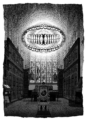
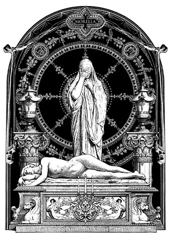
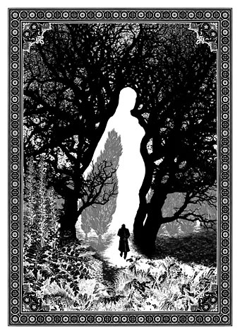
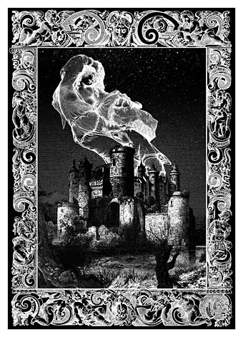
It’s a recurrent feature of commissioned work that you sometimes find yourself illustrating novels or stories you might otherwise have never attempted. Spanish publisher Editorial Alma have just added a new edition of Mary Shelley’s Frankenstein to their series of illustrated classics, convenient timing with this year being the bicentenary of the book’s first publication. Last year I produced 33 illustrations for Alma’s collection of Poe stories, as well as 3 new illustrations for a small Lovecraft collection. For their edition of Frankenstein I’ve created 24 full-page pictures, one for each chapter. (I produced 25 in total, 24 for the chapters and one for the letters at the front, but the Spanish translation is arranged slightly differently so one of the drawings has been omitted.) In the past I’ve given little consideration to illustrating classic books, preferring to look for subjects which were less familiar. Frankenstein is a book that isn’t illustrated as much as some but Lynd Ward in 1934, and Berni Wrightson in 1977/78 both produced sufficiently exceptional sets of drawings for me to regard the novel as almost unassailable. Until last year, that is.
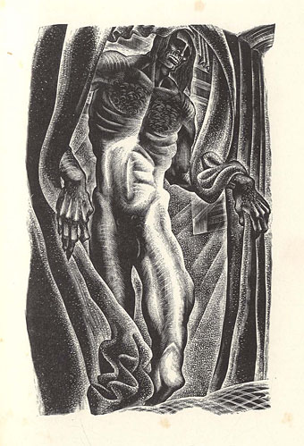
Frankenstein by Lynd Ward (1934).
Despite such formidable predecessors, I felt that with this book at least I might be able to offer something new using the blend of collage and drawing that I’ve been evolving recently. There was additional promise in that the story as it’s written is less familiar than the Poe stories, and much less familiar than its fellow horror classic, Dracula. People think they know Frankenstein but what they often know is the manglings the novel has received in various film and TV adaptations. The Ward and Wrightson illustrations stay close to the text, the latter being replete with period detail, and rendered in a style reminiscent of 19th-century wood engravings. Wrightson even copied two of Gustave Dore’s pictures from The Rime of the Ancient Mariner for the opening scenes on the ship, one of which went unused. But Wrightson’s drawings are closer still to Franklin Booth‘s pen-and-ink style which was also derived from wood engraving yet which achieves its effects in a different manner to the engraving process.
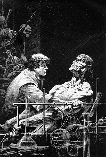
Frankenstein by Berni Wrightson (1977/78).
Even when artists follow the text of Frankenstein more closely than the screenplay adapters, personal tastes can’t help manifest themselves. So Ward’s drawings reflect the angular and stylised compositions of his “novels in woodcuts”, while Wrightson’s work still shows evidence of his earlier career as a comic artist. With my illustrations I wanted to reflect the artistic spirit that gave birth to the novel, namely Romanticism. Frankenstein is very much a Romantic tragedy with violent passions set against the overwhelming landscapes of the Swiss Alps, the Rhine valley and the Arctic seas. Three of the illustrations below allude to Caspar David Friedrich’s paintings, while many of the others have had their mundane cloudscapes exchanged for gloom and tumult.
I’ve said before that one of the things I enjoy about the collage technique is being able to use engravings and other graphics from the same period (give or take a few decades) as the story itself. The disadvantage of relying on pre-existing sources is that you’re always limited by the available material, so recently I’ve been pushing the technique further to achieve a hybrid style, something midway between the Ernst/Sätty engraving-collage technique and the very laborious, heavily-shaded pen-and-ink style I used when I was drawing comics. The approach isn’t so different to the one I used in my Lovecraft comics many of whose backgrounds and other details were copied from photographs. The difference is that where I used to spend several days working on a single panel (and two weeks working on a page) I can now create an entire picture in half the time. In these new illustrations I feel the hybrid style is working as I intended, allowing me greater freedom to create the picture I have in mind rather than a picture dictated by the source material. Without incorporating original figures and other drawn elements into the compositions it would have been difficult to illustrate a story with the same characters in so many scenes, a problem I encountered when I was illustrating Lewis Carroll’s Alice books and ran out of pictures of Victorian girls.
The full run of pictures follows below, including the one which was omitted from the print edition. All may be seen at a larger size here. Since the scenes aren’t always self-explanatory I’ve included fragments of text from each chapter.
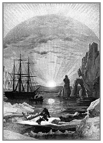
“In the morning, however, as soon as it was light, I went upon deck and found all the sailors busy on one side of the vessel, apparently talking to someone in the sea. It was, in fact, a sledge, like that we had seen before, which had drifted towards us in the night on a large fragment of ice.”
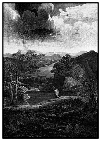
“During one of their walks a poor cot in the foldings of a vale attracted their notice as being singularly disconsolate, while the number of half-clothed children gathered about it spoke of penury in its worst shape.”
This one was omitted from the Alma edition. No loss, really, since the scene doesn’t add much to the story.
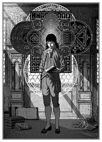
“When I returned home my first care was to procure the whole works of this author, and afterwards of Paracelsus and Albertus Magnus. I read and studied the wild fancies of these writers with delight; they appeared to me treasures known to few besides myself.”
The diagrams here are taken from some of the books the young Victor Frankenstein is reading. There’s an allusion to this in the magic square on the wall in the back of Theodore Von Holst’s frontispiece, the square being the kind of thing seen in books like this one by Cornelius Agrippa, one of the occult philosophers mentioned in the novel.