Whistler’s Peacock Room revisited

whistler1.jpg

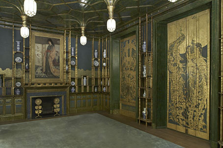
The Peacock Room (1876–1877).

More Japonism courtesy of the Google Art Project where it’s possible to pan around this view of Whistler’s Peacock Room at the Freer Gallery of Art. There’s only one view, unfortunately, it would have been good to see the reverse angle or, better still, a full panorama.

whistler2.jpg

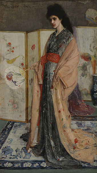
The Princess from the Land of Porcelain (1864).

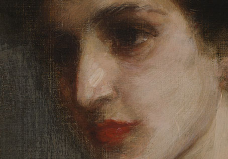
Google has a number of the Freer’s collection of Whistler drawings and paintings, including The Princess from the Land of Porcelain, the painting which the Peacock Room was designed to show to best effect along with patron Frederick Leyland’s blue-and-white china. Once again the Google views allow us to scrutinise the details of a painting in a way which would otherwise be impossible. It’s fascinating for me to see how loose Whistler’s technique was even at this early date, the brushstrokes of the face seem to have been scumbled over raw canvas.

whistler3.jpg

whistler4.jpg

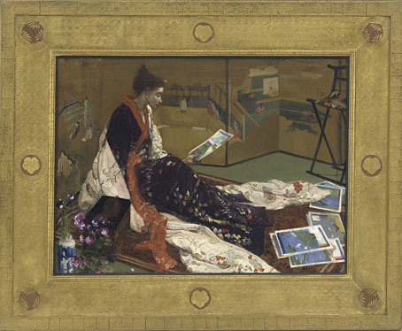
Caprice in Purple and Gold: The Golden Screen (1864).

Also at the Freer is another piece of exotica from the same period with a suitably Japanese frame. Whistler’s Japonism, and the Peacock Room in particular, leads directly to Aubrey Beardsley’s art thirty years later.

Previously on { feuilleton }
The Peacock Clock
Whistler’s Peacock Room

Hapshash Takes a Trip

ufocoming.jpg

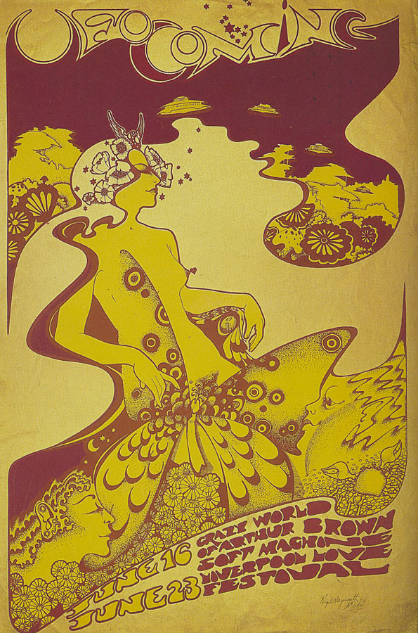
UFO Coming (1967) by Hapshash and the Coloured Coat.

It’s always difficult to choose a favourite from the posters that Nigel Waymouth and the late Michael English produced under the name Hapshash and the Coloured Coat, their standards remained high (so to speak) throughout their partnership. But I always liked the ejaculating penis butterfly on this early design for Joe Boyd’s UFO club, a detail which would have given Aubrey Beardsley a chuckle and which is probably unique in art. The gorgeous Hapshash posters receive another airing next month in an exhibition at the Idea Generation Gallery, London, entitled Hapshash Takes a Trip: The Sixties Work of Nigel Waymouth:

Waymouth’s own archive plays a major part in the retrospective. Kept privately for decades and rarely seen since their first creation in the late ’60s, the artist’s personal collection features works made as part of Hapshash and his designs for Granny Takes a Trip. Furthermore it contains his own album covers, photographs, press clippings and magazines. This extraordinary collection unites rare works with rare moments, through photographs never before seen in public.

The exhibition opens on September 9th. There’s more detail on the press release (PDF) including a promise that “Huge silk-screened reproductions of their iconic posters will fill the entirety of one of the Gallery’s soaring 20 foot walls.”

The exhibition title alludes to the celebrated King’s Road boutique Granny Takes A Trip whose series of striking shopfronts were decorated by Waymouth before and during his partnership with Michael English. The Look posted some pictures of Waymouth’s 1947 Dodge decor earlier this week.

Previously on { feuilleton }
The Dukes declare it’s 25 O’Clock!
Psychedelic Wonderland: the 2010 calendar
Michael English, 1941–2009
Max (The Birdman) Ernst
The Look presents Nigel Waymouth
The New Love Poetry

Tony Grubhofer’s Exposition Universelle sketches

grubhofer01.jpg

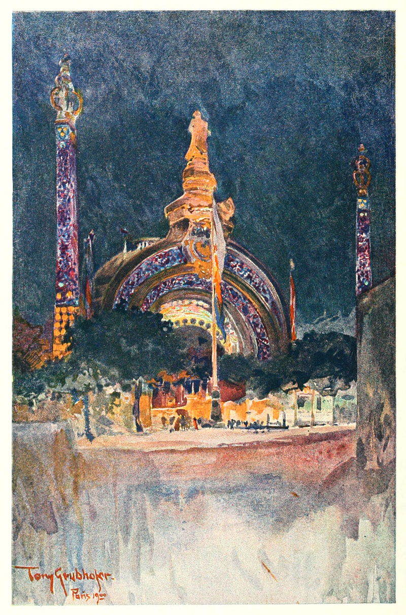
The Exposition gateway.

In a blizzard of work this month I finished another project with a Victorian theme (not more Steampunk!) which I won’t reveal just yet as I dislike spoiling the surprise for publishers. Part of the preparation involved yet more trawling through scanned volumes at the Internet Archive, looking this time at British art magazines from the 1890s. As with the German magazines of the period, some of these are more interesting than others: The Magazine of Art, for example, has its moments but for the most part it’s a champion of the stodgily dull, conservative fare which no one would ever want to revive today. Their columnists also hated the Decadents; I found a wonderful rant against Aubrey Beardsley’s art from 1897 which suggested that the artist and others like him ought to stop poisoning the soul of the nation and emigrate to France. Poor Aubrey only had a year to live, and, as things turned out, ending up dying in that iniquitous nation. I think it’s fair to say he’s had the last laugh.
grubhofer02.jpg

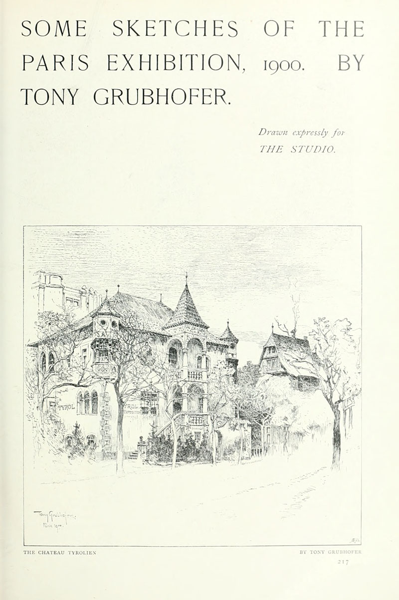
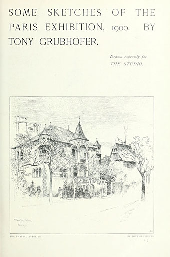
The Chateau Tyrolien.

The Studio magazine, on the other hand, was very sympathetic to the Decadents and Symbolists in general, and to Beardsley in particular, who had his work featured in the first number of the magazine in 1893. The drawings in this post are a surprise find in one of the numbers for 1900, and concern that locus of everything The Magazine of Art loathed: Paris! We’re back again at the Exposition Universelle, a subject which has been explored here on so many occasions I’m surprised I keep finding anything new that’s worthy of mention.

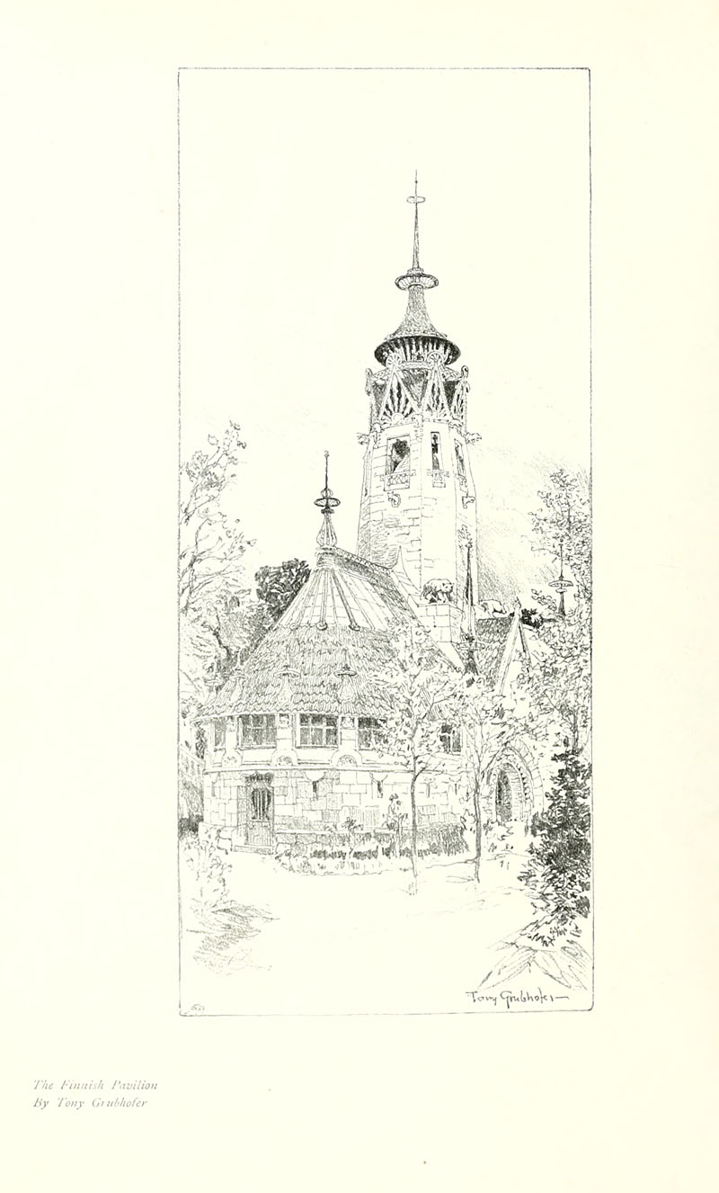
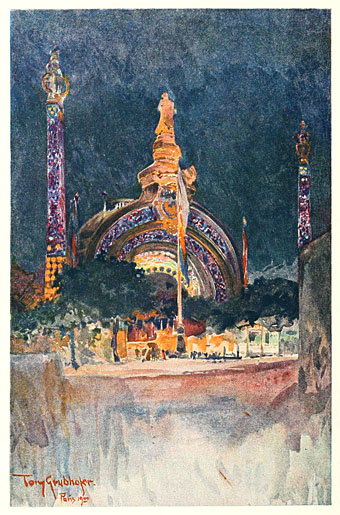
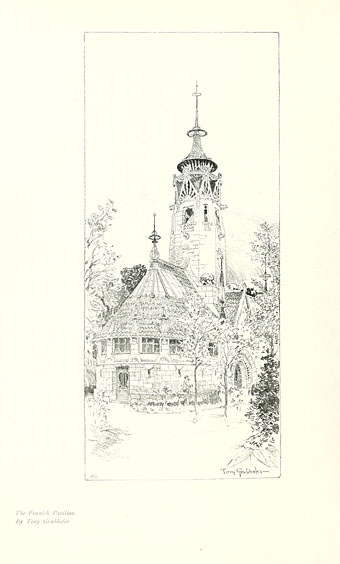
Tony Grubhofer (1854–1935) was apparently an Austrian artist who in these drawings manages to crop his views so selectively that many of them don’t look like they’re part of an exposition in one of the world’s capital cities. Of interest for me are his watercolour of René Binet’s monumental gate, which gives an idea of how the structure would have looked at night illuminated by the novelty of electric light, and his view of Eliel Saarinen’s Finnish pavilion which he renders as though it was a provincial church. This was Saarinen’s first major commission (he was 27 at the time), and Philippe Jullian in his book about the exposition declares this design to have been the most interesting and successful of all the national pavilions that year. It’s certainly better than Edwin Lutyens’ pastiche of an Elizabethan manor for the British pavilion. Eliel Saarinen had a very successful career, as did his more well-known son, Eero Saarinen, one of the major architects of the 20th century.

Volumes 20 to 22 of The Studio can be downloaded here.
grubhofer03.jpg

The Finnish Pavilion.

Continue reading “Tony Grubhofer’s Exposition Universelle sketches”

The Happy Hypocrite by Max Beerbohm

beerbohm01.jpg

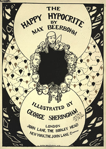
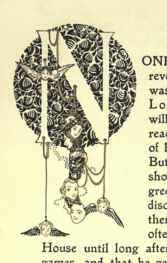
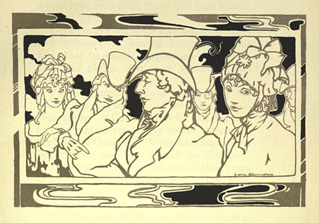
The spirit of the 1890s persists in this 1915 edition of a story the splendid Max wrote originally for The Yellow Book in 1896. Originally subtitled “A Fairy Tale for Tired Men”, The Happy Hypocrite is a typically light-hearted affair concerning the misadventures of one Lord George Hell. The setting is the Regency era so beloved of many of the London Decadents, Aubrey Beardsley included, and the rather fine illustrations are by George Sheringham whose style was distinctive enough to avoid any Beardsley pastiche. The copy preserved at the Internet Archive includes a number of full-colour plates but time and the vicissitudes of reproduction haven’t done them any favours, hence the concentration here on the monochrome drawings.

beerbohm02.jpg

beerbohm03.jpg

Continue reading “The Happy Hypocrite by Max Beerbohm”

Bookplates from The Studio

studio01.jpg

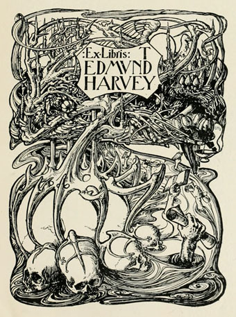
Cyril Goldie.

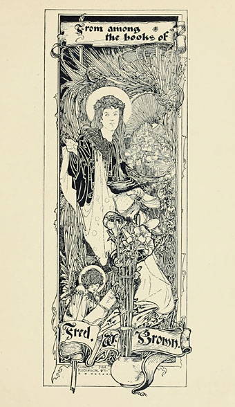
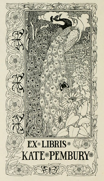
Selections from Modern Book-plates and their Designers, an overview of British, American and European designs published by The Studio magazine in 1898. These small Studio books are always good to see, not least for the period ads in the opening and closing pages. A couple of the designs are familiar from later reprints, notably Cyril Goldie’s remarkable accumulation of thorns and skulls. Many others are in the swirling and tendrilled style of Art Nouveau which The Studio did much to promote in Britain. Also of interest are a few entries from well-known fine artists who are seldom associated with this kind of design. Among these is Belgian Symbolist Fernand Khnopff who contributes a design of his own and an article about Flemish bookplate design.

studio02.jpg

Charles Robinson.

studio03.jpg

PJ Billinghurst.

Continue reading “Bookplates from The Studio”