Chinnamasta

chinnamasta1.jpg

The saintly cephalophores may be reconciled to their martyrdoms but none of them decapitated themselves, unlike Chinnamasta, the self-decapitating Tantric goddess. The most common representations show her sitting or standing on a copulating couple while blood from her neck spouts into the mouth of her severed head and the mouths of her attendants, Dakini and Varnini. In other depictions she should probably be classed among the cephalophores when she goes for a walk or a ride on a lion. The fourth picture here is of Chinnamunda, a related, wrathful form of Vajrayogini from Tibetan Buddhism.

chinnamasta2.jpg

chinnamasta3.jpg

chinnamasta4.jpg

Previously on { feuilleton }
Cephalophores
Decapitations

Cephalophores

denis1.jpg

Martyrdom of Saint Denis, Saint Eleutherius and Saint Rusticus by Pierre II Mignard.

Consider this an addendum to an earlier post about decapitations in art history. What I didn’t know then was that decapitated saints have their own “cephalophore” category if they’ve been recorded as going for a post-decapitation stroll; a case of “take up thy head and walk”. Saint Denis of Paris receives more attention than most on account of his being a patron saint of France. This also explains why his martyrdom is depicted in gory detail on the wall of the Pantheon in Paris.

denis2.jpg

St. Denis bearing his head and halo (1896).

Nine-year-old Saint Justus of Beauvais differs from the strolling cephalophores—who manage to walk some distance before finally expiring—in having picked up his head severed head and carried on speaking. Rubens is one of the few artists to depict this event, although his habitual all-shall-have-muscles technique makes the boy look a lot older. Wikimedia Commons has a few more examples of Saint Denis, with and without head.

justus.jpg

The Miracle of Saint Justus (c. 1635) by Peter Paul Rubens.

Previously on { feuilleton }
Decapitations

El Lissitzky record covers

genx.jpg

Your Generation (1977) by Generation X. Design by Barney Bubbles.

Continuing an occasional series about the work of particular artists or designers being used on record sleeves. El Lissitzky (1890–1941) is an interesting candidate in this area since his pioneering abstractions have greatly influenced subsequent generations of graphic designers. As a result of this you’re just as likely to find his Suprematist style being pastiched on an album cover as find one of his paintings decorating the sleeve. Pastiches are difficult to locate unless you already know they exist—or unless the album credits acknowledge the style they’re imitating—so this list will no doubt be incomplete.

Barney Bubbles’ design for the debut single by Generation X is the earliest example I’m aware of that makes use of the El Lissitzky style. It was also one of Bubbles’ first sleeves for a punk band, and a significant break with his often florid hippy designs.

kraftwerk1.jpg

Die Mensch Maschine (1978) by Kraftwerk. Design by Karl Klefisch, “inspired by El Lissitzky”.

Kraftwerk’s seventh album uses Lissitzkian typography and graphics on its front and back covers. A very popular album with the post-punk crowd that would have been the first introduction for many people to El Lissitzky’s name. Kraftwerk still use that vibrant arrangement of black, red and white in their stage shows.

kraftwerk2.jpg

sakamoto1.jpg

B-2 Unit (1980) by Riuichi Sakamoto. Design by Tsuguya Inoue.

More pastiche, this time borrowing from El Lissitzky’s Suprematist book for children: About Two Squares: In 6 Constructions: A Suprematist Tale (1922). The book’s two characters of a red square and a black square appear on the vinyl labels. This is a great album, incidentally, still my favourite by Sakamoto.

sakamoto2.jpg

Continue reading “El Lissitzky record covers”

Weekend links 221

cornell.jpg

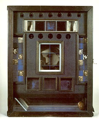
Untitled (Penny Arcade Portrait of Lauren Bacall) (1946) by Joseph Cornell.

• Having been a Bernard Szajner enthusiast for many years it’s good to see his music receiving some belated reappraisal. David McKenna talked to Szajner about his Visions Of Dune album (which is being reissued by InFiné next month), laser harps, The (Hypothetical) Prophets, and working with Howard Devoto.

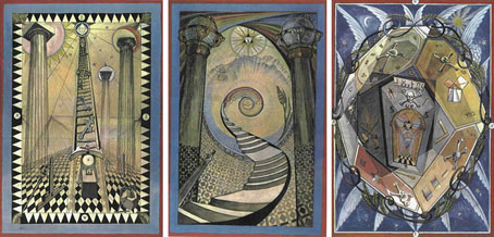
• Priscilla Frank posts some big views of Marjorie Cameron’s occult paintings as a preview of the forthcoming exhibition at MOCA Pacific Design Center, Los Angeles.

• Fascinating reading in light of the recent kerfuffle over True Detective, Christopher Loring Knowles on the possible sources of HP Lovecraft’s Cthulhu Mythos.

Those who set up oppositions between the electronic technology and that of the printing press perpetuate Frollo’s fallacy. They want us to believe that the book—an instrument as perfect as the wheel or the knife, capable of holding memory and experience, an instrument that is truly interactive, allowing us to begin and end a text wherever we choose, to annotate in the margins, to give its reading a rhythm at will—should be discarded in favor of a newer tool. Such intransigent choices result in technocratic extremism. In an intelligent world, electronic devices and printed books share the space of our work desks and offer each of us different qualities and reading possibilities. Context, whether intellectual or material, matters, as most readers know.

Alberto Manguel, lucid as always, on the act and import of reading.

• “It’s time to give prog rock’s artist-in-residence Roger Dean his due,” says Amber Frost. No argument there, I did my bit in 2010.

• “Why do the covers of so many self-published books look like shit?” asks B. David Zarley.

• Mixes of the week: FACT mix 455 by Airhead, and Secret Thirteen mix 225 by Clock DVA.

• At Core77: Rain Noe chooses favourite skyscraper photos by Russian urban explorers.

• “O, Excellent Air Bag”: Mike Jay on the nitrous oxide fad of the early 19th century.

Nick Carr goes in search of Manhattan’s last remaining skybridges.

Lauren Bacall at Pinterest.

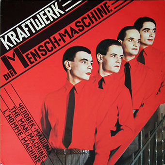
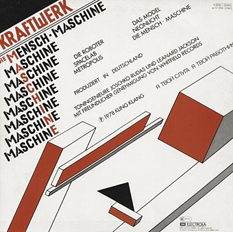
• Shaï Hulud (1979) by Zed (Bernard Szajner) | Welcome (To Death Row) (1980) by Bernard Szajner | Person To Person (1982) by The (Hypothetical) Prophets

The art of Frieda Harris, 1877–1962

harris01.jpg

Searching around for artwork by Frieda Harris turned up a few examples I hadn’t seen before including the marvellous painting above which is unfortunately untitled and undated. Harris is very familiar to Aleister Crowley aficionados and those with an interest in the Tarot via her paintings for the Thoth Tarot deck, a project that she and Crowley worked on during the 1930s. The deck is justly celebrated for its modernising of the Tarot symbolism, and for its radical art style which wasn’t afraid to combine some of the developments in 20th-century art with Harris’s studies of Projective Synthetic Geometry.

harris05.jpg

Masonic Tracing Boards.

Less familiar is her work away from the Tarot deck, some of which can be seen here. Prior to meeting Crowley, Harris was involved with Freemasonry for which she produced three designs for the Masonic teaching aids known as Tracing Boards. (See larger copies here.) I used to think these looked like outtakes from the Tarot deck but seeing them in the light of the mysterious painting above it’s evident that the Tarot style wasn’t unique to that set of cards.

harris04.jpg

Liber Aleph vel CXI: The Book of Wisdom or Folly (1918) by Aleister Crowley.

A book cover which pre-dates the Tarot designs. The heads are the traditional embodiments of the four elements but with one change: the human figure has a feminine face rather than the usual masculine features. The same figures appear on her painting for the final Tarot Trump, The Universe (below), but in a more traditional guise.

Continue reading “The art of Frieda Harris, 1877–1962”