Mysterieux retour du Capitaine Nemo.
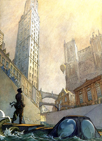
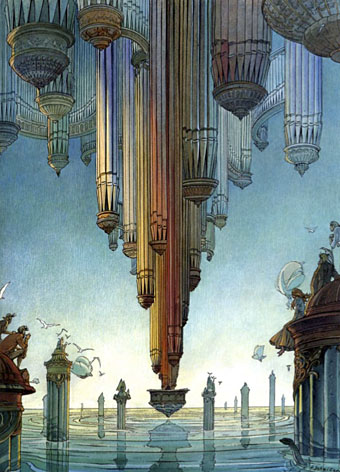
This week has been incredibly hectic work-wise but I’ve managed to keep these posts going, so here’s the last one devoted to an appreciation of the Cités Obscures of François Schuiten and Benoît Peeters. A week of posts barely scratches the surface of their vast and involved creation of alternate worlds, fantasy design and architecture, and Borges-like metaphysical speculation. When I try to explain my disaffection with the popular end of American comics, it’s works such as these which I offer as an alternative. The problem, of course, is that only a handful of the books have been translated into English, a detail which tells you all you need to know about English-speaking comics publishers and—since demand fuels the market—their readers.
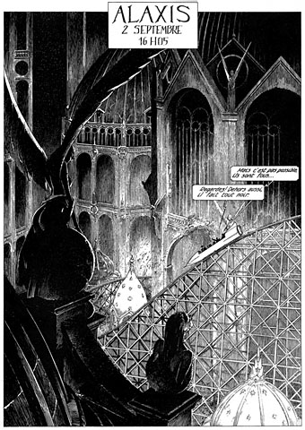
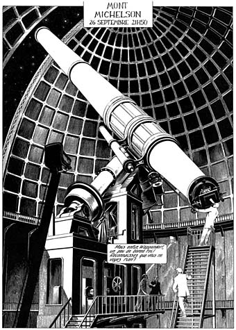
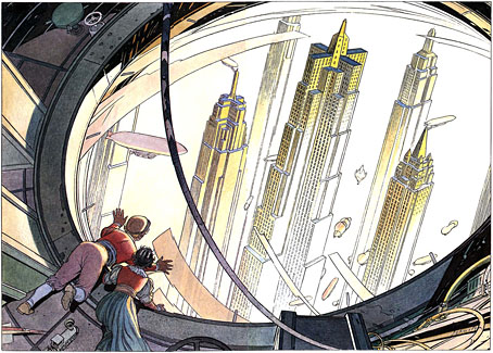
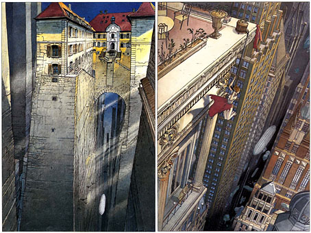
This final set of pictures is a selection from Schuiten and Peeters’ L’Echo des Cités (1993), a facsimile edition of the main newspaper which serves the cities of the Obscure World. Unfortunately, this remains untranslated but the bulk of the book is full-page illustrations, many of which are among Schuiten’s best. A number of these were later reprinted as limited lithograph prints.
Les rêves engloutis d’Oscar Frobelius.