More book design

hotel.jpg

Yes, it’s been a busy year. These are books three and four respectively of the titles I’ve been designing for Tachyon Publications, and there are more on the way.

Kage Baker’s The Hotel Under the Sand is a charming fantasy for children concerning the hotel of the title and its curious inhabitants, which include a ghost bellboy and a pirate captain. The illustrations were by Stephanie Pui-Mun Law and I tried to complement these with the lettering design and graphic elements. I always enjoy working on illustrated books.

fandsf.jpg

The Very Best of Fantasy & Science Fiction is a very different beast, a big (480 pages) selection by Gordon Van Gelder of some of the many first-class stories from the sixty-year history of the fiction magazine. F&SF has published so many classic stories over the years the book could easily have been twice as big. As it is there are pieces by Alfred Bester, Ray Bradbury, Shirley Jackson, Philip K Dick, Harlan Ellison, Stephen King and Neil Gaiman, among others. The design in this case came from studying a copy of the magazine from 1967; I was already thinking of using Bodoni for the story titles and that choice was confirmed when I saw it used for the same purpose in the magazine. The calligraphic titles were also scanned from there, their design going back to the very first issue.

Both these books are on sale now, and Keith Brooke gave a glowing appraisal to the latter in The Guardian at the weekend.

Previously on { feuilleton }
Medicine Road by Charles De Lint
The Best of Michael Moorcock

Forbidden Colours

mishima1.jpg

Wilhelm von Gloeden‘s version of the Flandrin pose as it appears on the cover of a 1989 Gallimard edition of Forbidden Colours by Yukio Mishima. I included this photograph in the very first posting which examines the recurrence of Flandrin’s Jeune Homme Assis au Bord de la Mer but this is the first time I’ve seen it used on a book cover. The French twist the title into “forbidden loves” and in so doing lose Mishima’s punning subtlety.

mishima2.jpg

The Ballad To a Severed Little Finger (1966).

Searching around earlier turned up a nice collection of poster works by the great Japanese collage artist, Tadanori Yokoo. One of these from 1966 is dedicated to Mishima, while the one above shows actor Ken Takakura in one of his many yakuza roles. Yokoo regarded Mishima as a major influence and further cemented the relationship by making an appearance in Paul Schrader’s 1985 film, Mishima: A Life in Four Chapters. By convoluted coincidence, Schrader received his start in Hollywood ten years earlier with a co-written screenplay, The Yakuza, which Sidney Pollack directed. Ken Takakura reprised his gangster persona in that film, along with Robert Mitchum. It’s a good piece of neo-noir, worth seeking out.

For more Tadanori Yokoo, see some of the recent posts by Will at A Journey Round My Skull.

Elsewhere on { feuilleton }
The recurrent pose archive

Previously on { feuilleton }
The art of Goh Mishima, 1924–1989
The art of Hideki Koh
Mishima’s Rite of Love and Death
Secret Lives of the Samurai
Guido Reni’s Saint Sebastian
The art of Sadao Hasegawa, 1945–1999
The art of Takato Yamamoto

Matt Prior’s Golden Bail

prior.jpg

Another work update and the second beer label I’ve done for the Adur Brewery who like to match their bespoke ales with bespoke artwork. This one is cricket-themed, as you may have noticed, Matt Prior being a cricket player, apparently, and the Ashes tournament currently in progress. I know next to nothing about the sport (this is about as interesting as it usually gets for me) so I had to do some research beforehand. Those padded gloves cricketers wear are awkward things to draw in perspective.

As with the other label design I produced for Adur, this works better at a smaller size but I’ve added a larger version to the artwork pages. Those stumps look rather flat but I reduced the shadow so they could be read as stumps and bails from a distance. Once again, if anyone sees a bottle of this in the wild, take a photo and I’ll post it here.

Previously on { feuilleton }
Ropetackle Golden Ale

Uncopyable

moldover.jpg

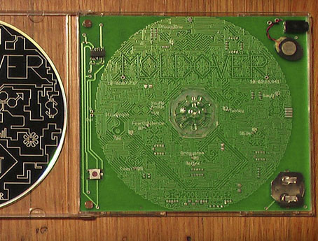
Moldover’s CD case: a working theremin.

In May this year, Brian Eno was writing in Prospect magazine about the current state of the music business as it continues to be assailed by digital technology. Among the things Eno discussed was the packaging of music:

The duplicability of recordings has had another unexpected effect. The pressure is on to develop content that isn’t easily copyable—so now everything other than the recorded music is becoming the valuable part of what artists sell. … That suggests to me the possibility of a refreshingly democratic art market: a new way for visual artists, designers, animators and film-makers to make a living. So, as one business folds, several others open up. (More.)

Having started out as an album cover artist (I wasn’t a designer back then), and working still as a CD designer, this is naturally an attractive thesis. Earlier this week John Walsh in The Independent wrote a potted history of the album cover and noted that the big record companies are also realising again that contemporary music as an artform is more than merely a collection of audio tracks:

Apple, creator of the iPod and the iTunes store—the sworn enemies of commercially-packaged music—is getting into bed with the four largest record labels, to help them stimulate album sales. They’re working with EMI, Sony Music, Warner Music and Universal Music Group on something called “Project Cocktail” that will produce all manner of extras to go with albums: interactive booklets, sleeve notes, photographs, lyric sheets, even video clips. Buyers will be able to call up album tracks through the interactive booklet, while leafing through pictures of the band and trying to make sense of the lyrics.

This, however, seems to be missing the point. Absolutely anything digital can be copied and passed on, and that applies equally to album extras as to the tracks themselves. What can’t be copied, of course, is a desirable object which contains the music. The lavish album sleeves of the 1970s were very much desirable objects which contained music, and no end of facsimile CDs of Physical Graffiti will match the impact of Peter Corriston and Mike Doud’s design for the vinyl release.

Which brings us to Moldover‘s extraordinary light-operated theremin-in-a-CD-case, a beautiful design and a really clever use of the wretched jewel case box. The music on Moldover’s accompanying CD may be swapped around illicitly but no one is going to copy the hardware. The “Awesome Edition” of this work costs $50 and can be ordered here.

perich.jpg

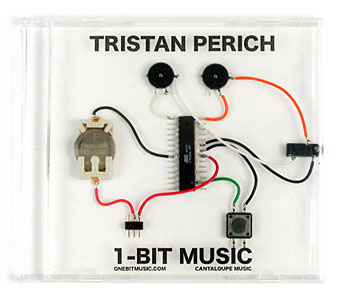
Moldover’s theremin is only an adjunct to his music, albeit a delightful one. Tristan Perich, on the other hand, like Fm3’s Buddha Machine, makes the case and the instrument one, and in Perich’s case (so to speak) possibly takes the 8-bit/chiptune thing to a definitive extreme. This is the kind of invention we could use more of, not some lazy Flash applications appended to a pop release then dumped onto the iTunes Store as an “exclusive”. It’s notable that the one thing all these works have in common is that they’re the inventions of no-budget independent artists, not big record labels.

While we’re on the subject of the Buddha Machine, the guys at Mountain*7 noted this YouTube loop work which extends the drone-loop idea into the audio/visual realm.

Elsewhere on { feuilleton }
The album covers archive

Previously on { feuilleton }
Buddha Machine Wall
God in the machines
Layering Buddha by Robert Henke
Generative culture