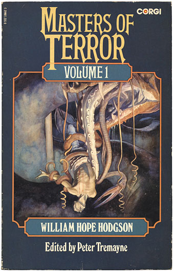
Masters of Terror, Vol 1, Corgi Books, 1977. No illustrator credited.
It was all happening this week so there’s a lot to get through. Are you ready? Deep breath…
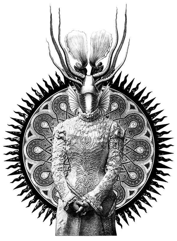
For ye Hogge doth be of ye outer Monstrous Ones, nor shall any human come nigh him nor continue meddling when ye hear his voice, for in ye earlier life upon the world did the Hogge have power, and shall again in ye end.
The Hog (c. 1910) by William Hope Hodgson.
• “The Hog is Hodgson’s most nakedly Jungian setpiece; fetid waves of archetypes sweep repeatedly against the thin walls of quotidian reality.” Thus Iain Sinclair, writing in a 1991 afterword to Carnaki the Ghost-Finder which I highly recommend to both Hodgson and Sinclair enthusiasts. China Miéville dissected Hodgson’s Hog on Wednesday and a few hours later a student protest in London turned into an assault on the Tory HQ. Coincidence? Here at {feuilleton} we only offer the facts, it’s up to you to join the dots. M John Harrison approved. Of the protest, that is, not the raising of Porcine Malevolence from the Gulfs Beyond, although he might approve of that as well.
• Further Hodgsonia: Science of The Night Land: Dying Suns and Earth Energy while for real devotees there’s Andy Robertson’s Night Land site.
• “Amplifying the vibrations of the ether” for a view “beyond the limits of ordinary life”: The Fugitive Futurist (1924), a remarkable short film at the BFI’s YouTube channel in which Trafalgar Square is flooded, a monorail crosses Tower Bridge and a dirigible takes to the air over the Houses of Parliament. Also Trafalgar Square Riot (1913), a newsreel with suffragettes at the centre of a civil disturbance. Some of the critics of Wednesday’s events seem to have forgotten that women gained the vote in this country only after repeatedly smashing windows and causing trouble.
• Related to the above: How to Hex a Corporation at Arthur magazine. And let’s not forget Hakim Bey’s Occult Assault on Institutions.
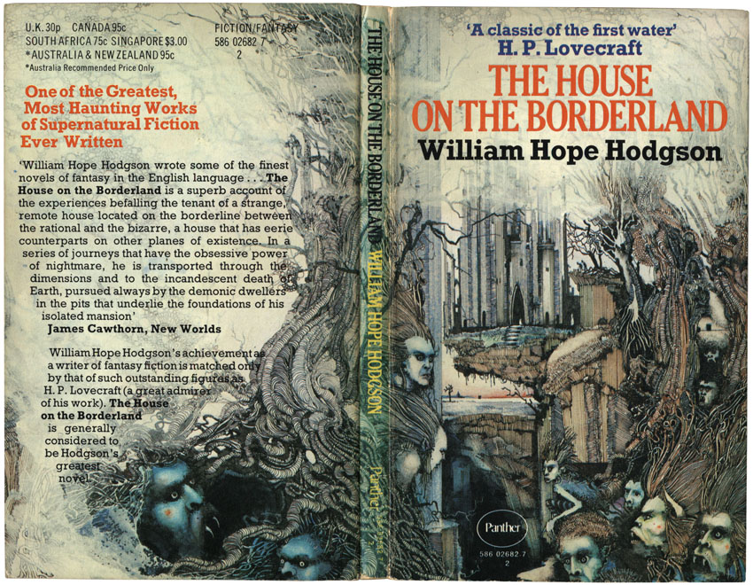
Cover illustration by Ian Miller (1972). The other great cover for THOTB was by Ed Emshwiller in 1962.
The wanderings of the Narrator’s spirit through limitless light-years of cosmic space and Kalpas of eternity, and its witnessing of the solar system’s final destruction, constitute something almost unique in standard literature.
HP Lovecraft reviewing Hodgson’s The House on the Borderland in Supernatural Horror in Literature.
• Lovecraft has long cast a shadow over Hodgson’s fevered visions even though words of praise like those above have done much to keep the earlier writer’s work in print. I’ve been talking for years about doing a series of illustrations for The House on the Borderland and may yet make good on that threat; never say never. Meanwhile, Rick Poyner returned to Design Observer this week pondering the challenge of non-Euclidean architecture in What does HP Lovecraft look like?
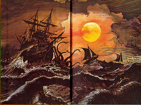
Druillet illustrates Hodgson (1971).
• In his latest piece of Barney Bubbles detective work, Paul Gorman discovered the identity of BB’s first design employer, the alluded to but never named Michael Tucker. More surprising for me than the Robert Brownjohn connection is that there’s now a tenuous link between Barney Bubbles and William Gerhardi.
• 777 classical music album covers from the collection of Dr Horst Scherg. Related: The Golden Age of Wacky Classical LP Covers — Westminster Gold and the Westminster Gold discography.
• Chez Fini: Little Augury looks at the work and workplaces (and cats!) of the marvellous Leonor Fini.
• There’s yet more Lovecraft (and much else besides) in Nomad Codes, a new book from Erik Davis.
• The Irrepressibles: “They’re scared of what we’re going to do next”.
• New Scientist asks Is this evidence that we can see the future?
• Of Electricity And Water: A Thomas Dolby Interview.
• Jarvis Cocker talks to Brian Eno.
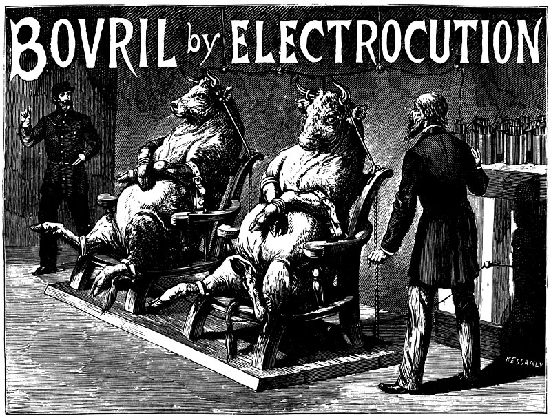
• Hog Callin’ Blues (1962) by Charles Mingus. Play loud and often.