Art et Décoration

aed1.jpg

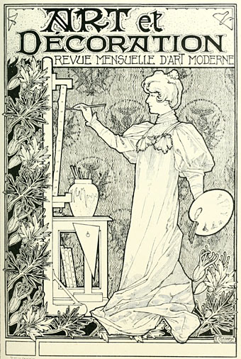
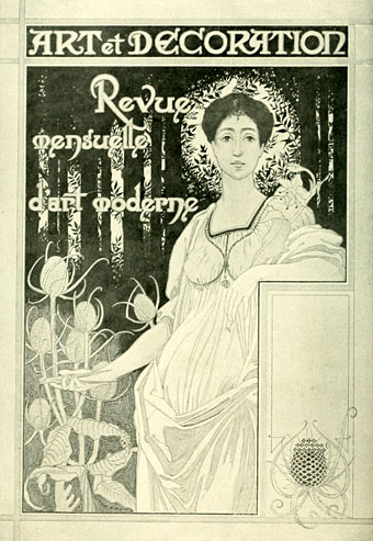
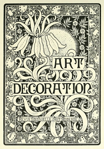
Another Art Nouveau journal partially emerged from the world’s libraries, Art et Décoration was a French equivalent of The Studio, launched a few years after its British counterpart in 1897. The examples here are from a cover design competition in the first issue which yielded the usual complement of decorous muses and florid borders; The Studio used to hold similar competitions. For now the Internet Archive only has the four issues of A&D, the first two then numbers 41 & 42. Here’s hoping that more become available, I’m naturally curious to see how they treated the Exposition Universelle of 1900.

aed2.jpg

aed3.jpg

Continue reading “Art et Décoration”

Joyce in Time

joyce-time.jpg

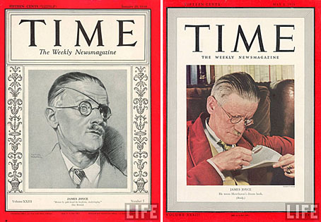
A post for Bloomsday. James Joyce made the cover of Time magazine on two occasions, each instance following the publication of his two greatest works. Ulysses was first published in France in 1922 but had to wait until 1934 to be presented in full to the American public after a trial for alleged obscenity. The edition for January 29, 1934 (left) included a review of the novel:

Is it dirty? To answer the man in the street in his own language, Yes. With the exception of medical books and out & out pornography, the only book of modern times that can compare with it for outspokenness in barnyard and backhouse terms is the late D. H. Lawrence’s Lady Chatterley’s Lover. But Ulysses is far from being “just another dirty book.” Judge Woolsey decided that its purpler passages are “emetic,” rather than “aphrodisiac”; that the net effect of its 768 big pages is “a somewhat tragic and very powerful commentary on the inner lives of men and women.”

I can imagine Joyce being amused (if not exasperated) by some of the ironies in this piece, not least for his novel having a “man in the street” as its central character, and that declaration, “Yes” (from the man in the street’s wife), being the very sign of affirmation upon which the narrative resolves.

Time for May 08, 1939 fares better in its review of Finnegans Wake although they still had to ask on behalf of the prurient reader: “Is the book dirty?” The answer? “Censors will probably never be able to tell.” Of greater interest is the description of the author which follows the review:

In appearance Joyce is slight, frail but impressive. He stands five feet ten or eleven, but looks as if a strong wind might blow him down. His face is thin and fine, its profile especially delicate. He wears his greying, thinning hair brushed back without a part. Joyce reads and writes sprawling in bed or on a couch but he does not like it known. He is very formal in public, in restaurants prefers straight-back chairs in which he sits bolt upright.

He dresses with conservative elegance, never goes out without a slender walking stick, which he manipulates expertly, accenting the delicacy of his beringed hands (he has a passion for rings). His voice is soft, rich and low with a gentle, melancholy brogue. He is rather vain of his tenor, which he likes to join with his son’s bass at small family celebrations.

For a list of Bloomsday events around the world, consult Google.
Hello, sailor

bossert.jpg

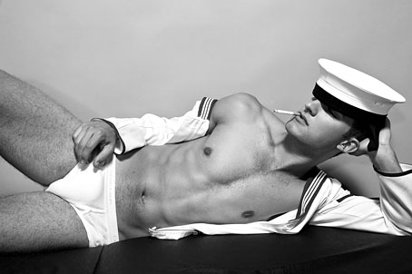
Homotography goes nautical again this week, sporting shots of model Lukas Bossert in a session by Mustafa Sabbagh. I’m not sure whether these have any purpose beyond showing off Mr Bossert’s physique but we don’t really need any other reason, do we? Homotography has bigger pics should you require them.

Incidentally, fashion photography is now the only place you regularly see photos of anyone smoking, whether posing or otherwise. With the march of prohibition, the cigarette-as-style-fixture seems to have shifted to become a vague signifier of rebellion. The fashion world loves its rebel iconography so I can see this trend continuing for some time, or at least until the habit starts to generate the inevitable complaints.

Previously on { feuilleton }
Querelle again
Sailors
Mikel Marton
Exterface

Sibylle Ruppert revisited

ruppert1-1.jpg

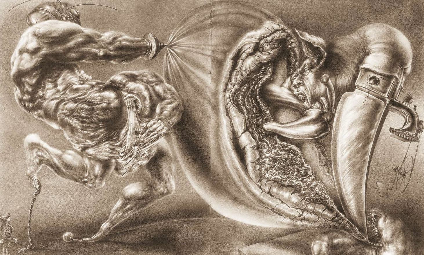
Empusae Raptus (1977).

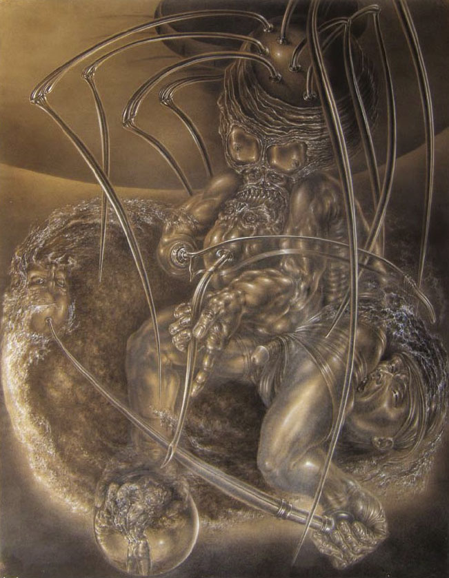
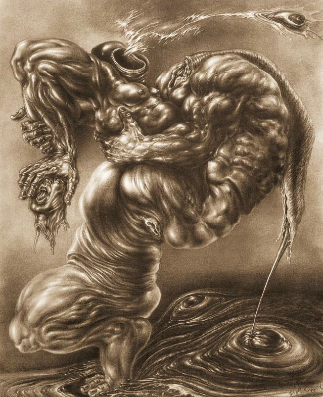
Another post about this astonishing artist (I’ll keep talking about her if no one else does…). The pictures here are taken from the catalogue for the 2010 Sibylle Ruppert exhibition at the HR Giger Museum, Gruyères, Switzerland. Leslie Barany was good enough to send me a copy of this, and the pictures are posted courtesy of the museum. To purchase a copy of the catalogue contact marcowitzig@gigerworkcatalog.com

ruppert2-1.jpg

Le Chant de Maldoror (1978).

Looking over Sibylle Ruppert’s work this week I’ve been pondering why she wasn’t better known. She was working throughout the 1970s and could easily have been swept up in the vogue for fantastic art when it was being popularised by Omni magazine. Giger, Mati Klarwein, Robert Venosa, De Es Schwertberger and others all benefited from Bob Guccione’s publication, and to a lesser degree from appearances in Heavy Metal magazine. Ruppert’s lack of visibility may have been a result of the usual situation whereby women artists were overlooked or marginalised. But I think it’s far more likely that her work was simply too intense and visceral for the newsstands. Giger could get by with paintings like the semi-abstract NY City series which were attached to science fiction stories without causing a stir. It’s difficult to imagine Ruppert’s work gaining such a popular acceptance, especially in the United States where, lest we forget, Giger’s Penis Landscape did cause a stir in 1985. One of the great benefits of the web is the way so much previously buried culture is surfacing and finding new and enthusiastic audiences. Sibylle Ruppert’s greatest audience has yet to find her but they’re surely out there, you can’t keep work of this quality buried forever.

For a few more Ruppert works see that haven of all things grotesque, Monster Brains.

ruppert3-1.jpg

Le Spectacle de l’Univers (1977).

Continue reading “Sibylle Ruppert revisited”

The Isle of the Dead in detail

bocklin1.jpg

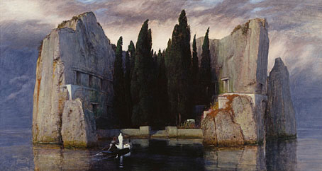
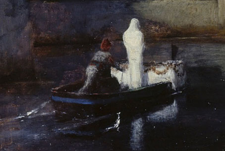
More from the Google Art Project where a couple of paintings by Swiss Symbolist Arnold Böcklin (1827–1901) may be explored, one of them an 1883 version of cult favourite The Isle of the Dead. No need to repeat the history of that work when I’ve already written about it. The version here is from the Alte Nationalgalerie, Berlin, and is the one I’ve seen reproduced in books the least so it’s good to find it in high-quality.

bocklin2.jpg

bocklin3.jpg

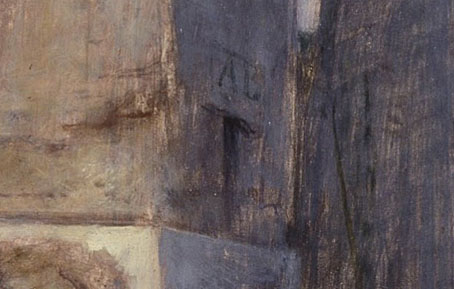
Böcklin painted five versions of this scene, one of which was lost during the Second World War. A couple of them, this one included, have his initials placed over the doorway of a tomb, a detail which isn’t always visible in reproductions.

bocklin4.jpg

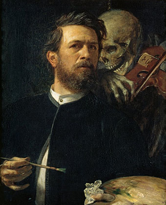
In the same collection is another gloomy Böcklin work, Self-Portrait with Death Playing the Fiddle (1872), and I hadn’t noticed before that the fiddle only has one string, the lowest, which would no doubt create a suitably dolorous melody.

For more on The Isle of the Dead see Toteninsel.net, a site dedicated to the many works in different media derived from the paintings. If you need a musical accompaniment whilst browsing, Rachmaninoff wrote the ideal piece.

Previously on { feuilleton }
Arnold Böcklin and The Isle of the Dead