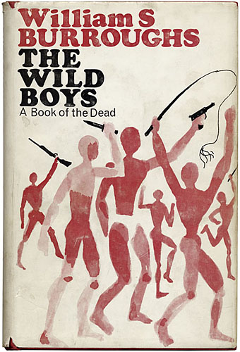
Calder & Boyars, 1972. Design by John Sewell.
This must be the first space novel, the first serious piece of science fiction—the others are entertainment.
Mary McCarthy defending The Naked Lunch in the New York Review of Books, June, 1963.
Mary McCarthy’s view—echoed a year later by Michael Moorcock and JG Ballard in the pages of New Worlds magazine—has never been popular or even particularly acceptable. William Burroughs gets touted as an sf writer by other writers, and John Clute gives him an entry in the Encyclopedia of Science Fiction, but Burroughs’ sf scenarios are guaranteed to offend those readers who prefer their narratives presented in a neat, linear form with detailed explanations of How The Future Would Actually Work, or the physics behind some piece of imaginary technology. The books which immediately follow The Naked Lunch—The Soft Machine, The Ticket that Exploded, and Nova Express—all feature sf scenes or ideas. The latter was deemed sufficiently generic to prompt Panther Books in the UK to publish it three times as “Panther Science Fiction” although given the severe criticism that Moorcock sustained for trying to broaden the horizons of readers in the late 60s I don’t expect sales were encouraging.
The Wild Boys, published in 1971 (1972 in the UK), was Burroughs’ first novel after Nova Express, and his first book of fresh material after mining the stack of writing that birthed The Naked Lunch and the titles which followed. The novel is subtitled A Book of the Dead (as in the Egyptian or Tibetan Books of the Dead), and is certainly science fiction although I’ve never seen it marketed as such or noticed any sf reader include it in a list of notable genre novels of the period. My Calder & Boyers hardback offers a précis of the fractured narrative:
The year is 1988. The Wild Boys, adolescent guerilla armies of specialized humanoids, are destroying the armies of the civilized nations and ravaging the earth. The wild boys, who began in the pre-present past as petrol gangs, dousing their victims with petrol and setting them on fire for kicks, have grown to an army, dedicated to violence. One of them is used in a cigarette commercial. He becomes a new cult figure, a demi-god responsible for great destruction, and it is left to strong man Arachnid Ben Driss to exterminate the wild boys. He slaughters them, but the battle continues underground until all civilization collapses, revealing a future of horrifying dimensions. The originality of the theme and the very special Burroughs style together make this one of the most unusual science fiction novels ever, a prophetic exploration of the future, that should quickly establish itself as one of the classics of the present time.
That’s accurate, up to a point, although like many book blurbs it misrepresents the content somewhat. It also neglects to say how funny the book is. For anyone with a black sense of humour Burroughs has always been a great comic writer, and The Wild Boys has some prime examples, not least the opening chapter, Tío Mate Smiles, which is best appreciated in the author’s own reading.
Having gone through the novel in the past week, and going through its follow-up/appendix/remix Port of Saints at the moment, a couple of things occurred to me. The first was the way The Wild Boys strongly prefigures later works like Cities of the Red Night and The Place of Dead Roads. This is a fairly obvious point but it’s one that hadn’t fully clicked until now. The Wild Boys takes the problems of repressive control systems posed in the first few novels and offers a possible solution: a homoerotic utopia/dystopia where gangs of teenage boys hide out in depopulated regions, waging war against the rest of humanity with sex, magic and a mastery of weapons, including biological and viral varieties. While doing this they are steadily mutating so they can leave behind all human concerns with nation, family, laws and written language. Cities of the Red Night was Burroughs first novel after The Wild Boys and presents a less radical proposal, ranging through time with its anarchist pirate colonies and the six cities of the title. In The Place of Dead Roads Kim Carsons has his band of outlaw cowboys, The Wild Fruits, and the book gives us the conflict between the Johnsons—those who “mind their own business”—and the Shits: lawmen, politicians, tycoons, all the usual agents of Control.
Continue reading “Looking for the Wild Boys”