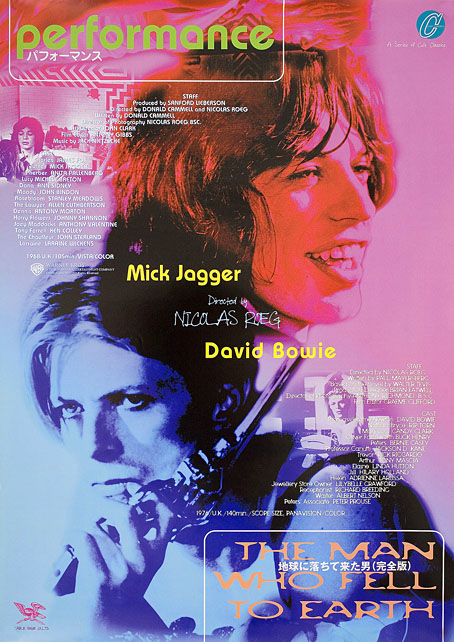
Japan, 1998.
I’m currently in the middle of a Nicolas Roeg rewatch season after acquiring a blu-ray of the recently reissued Castaway, Roeg’s 1986 adaptation of Lucy Irvine’s memoir (which shouldn’t be confused with 2000’s Cast Away). In the early 1980s when I was becoming more acquainted with his films I went through a phase of buying film posters, and managed to pick up copies of the UK quad sheets for Don’t Look Now and Bad Timing. I would have preferred the one for The Man Who Fell to Earth but Bowie-obsessives have made that particular item very collectible, and it never crossed my path. Foreign posters for Roeg films also tend to be uncommon since his films have never been really popular, and some, like Eureka, were plagued with distribution difficulties which made them difficult to see at all. Eureka is missing from this small collection of foreign posters due to a lack of suitable candidates.
Performance
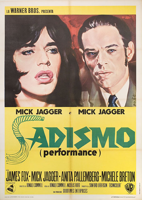
Italy, 1971.
One thing you notice when you look for details of foreign releases is how often a film title is changed to suit local tastes. The Italians changing Performance to Sadismo is one of the more ridiculous examples, picking out a minor detail—Joey’s whipping of Chas at the beginning of the film—while ignoring the rest of the film’s kaleidoscope of images and references.
Walkabout
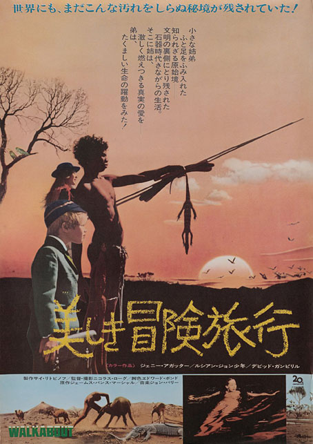
Japan, 1971.
Similar changes occur in poster art, when the movement to another country prompts the local designers to over-emphasise a film’s sensational elements. In the UK and US the posters for Walkabout stressed the story as being one about survival in a wilderness, and the differences between the Indigenous boy and the English girl and her brother. Elsewhere the posters were more concerned with Jenny Agutter’s skinny-dipping scene while telling you little else about the rest of the film.
Don’t Look Now
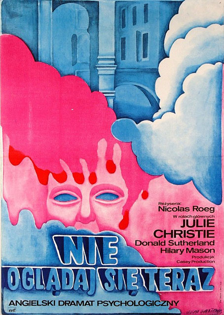
Poland, 1973. Art by Maria Mucha Ihnatowicz.
I was hoping there might be more Polish posters for Roeg’s films but this was the only one which turned up. Japanese posters can at times be as elusive as the celebrated Polish designs, with an approach to design that’s very different to the Western standard. The Japanese poster for a reissue of Don’t Look Now is one of the best I’ve seen for that particular film, condensing into a single image the two threads of the story—the dead girl and the murder mystery—while emphasising the film’s persistent use of the colour red.
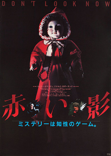
Japan, 1983.
Continue reading “Roeg abroad”