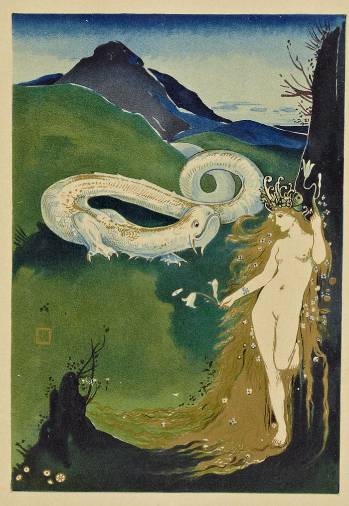
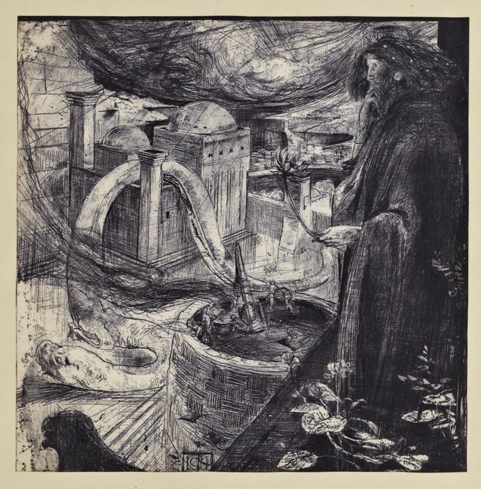
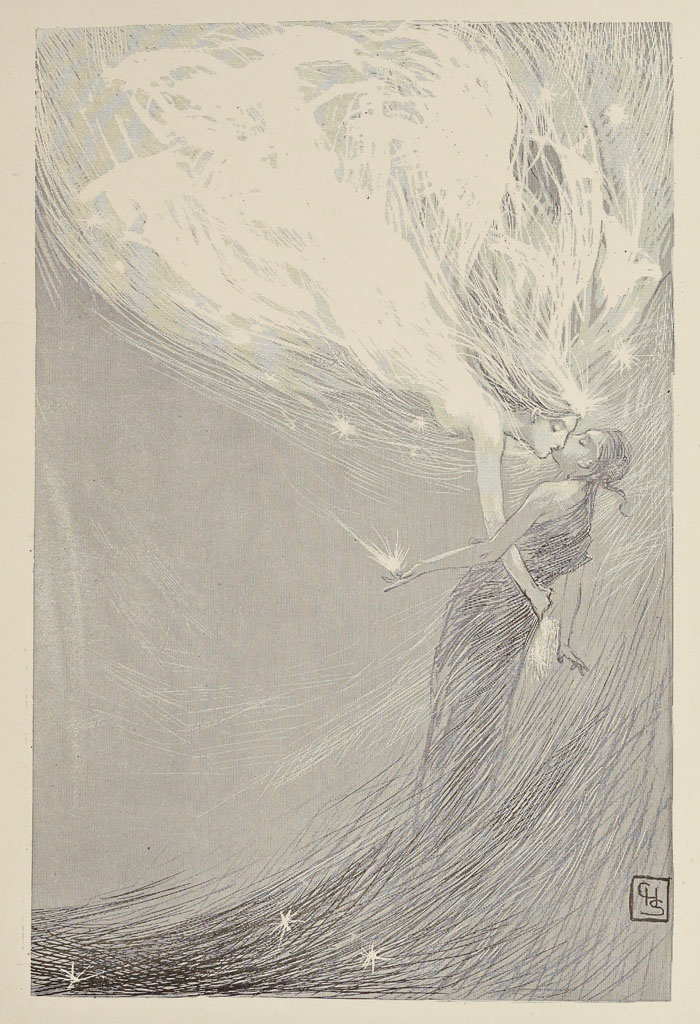
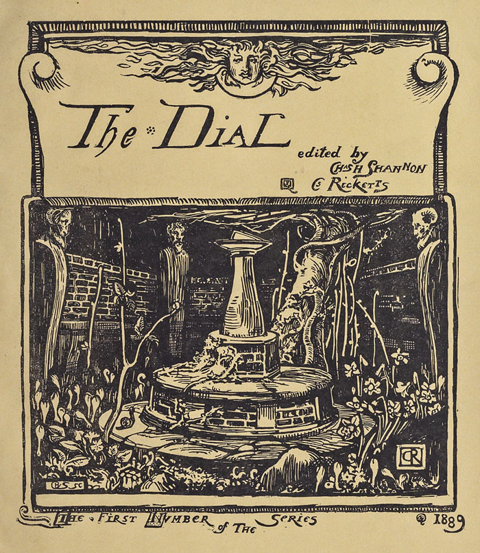
Yet another fin de siècle journal which we can now see in its entirety, The Dial was a short-lived British publication which expired at a time when more prominent titles were being launched. The publishers were Charles Ricketts and Charles Shannon, a couple who were partners in life as well as art and publishing, and members of Oscar Wilde’s small circle of circumspect gay and lesbian friends. Ricketts and Shannon published some of Wilde’s poetry—notably a beautiful edition of The Sphinx—and followed the William Morris ideal of using traditional techniques for art and printing rather than relying on the line block. Most of the illustrations in The Dial are woodcuts although Ricketts and Shannon also produced etchings and the occasional painting, as with Ricketts’ Moreau-like piece below. Many of the Dial pieces have been reprinted in books about the pair but these never show you everything so the journals contain a number of smaller works I hadn’t seen before. The Dial ran for five issues from 1889 to 1897. The Internet Archive has a couple of sets of which these are the better copies:
Weekend links 454
Octopus and Pike (1937) by Ilna Ewers-Wunderwald.
• At Expanding Mind: writer and avant-garde publisher Tosh Berman talks with Erik Davis growing up in postwar California, hipster sexism, the hippie horrors of Topanga canyon, his impressions of family friends like Cameron and Brian Jones, and his charming new memoir Tosh, about growing up with his father, the remarkable underground California artist Wallace Berman.
• At Haute Macabre: A Sentiment of Spirits: Conversations with Handsome Devils Puppets.
• “We felt a huge responsibility.” Behind the landmark Apollo 11 documentary.
Jarman’s work was a statement that conservatism did not, or at least should not, define the perception of Britishness. His vision extended all of the way back to the likes of William Blake, John Dee and Gerard Winstanley, the radicals, mystics and outcasts of English history. His era, on the other hand, looked inwards and pessimistically so. The outward world was solely a free market. Our projected national identity was little else but the retread of colonial fantasies, a faux benevolence to the world that handily discarded the violence and tyranny that built it. Jarman saw through this imaginary landscape, often skewering it in his films.
Adam Scovell on the much-missed radicalism of Derek Jarman
• Director Nicolas Winding Refn: “Film is not an art-form any more.”
• Mix of the week: Secret Thirteen Mix 281 by Blakk Harbor.
• At Greydogtales: Hope Hodgson and the Haunted Ear.
• Hans Prinzhorn’s Artistry of the Mentally Ill (1922).
• Michael Rother‘s favourite albums.
• Puppet Theatre (1984) by Thomas Dolby | Puppet Motel (1994) by Laurie Anderson | Maybe You’re My Puppet (2002) by Cliff Martinez
The art of James Marsh

Laughing Stock (1991).
The paintings of James Marsh came to mind this week following news of the death of Talk Talk singer Mark Hollis. Marsh’s art was a feature of all the Talk Talk releases, singles as well as albums, but his work was equally prominent throughout the 1980s on a range of book covers, particularly the series he produced for Angela Carter and JG Ballard. The hard-edged, post-Surrealist style favoured by Marsh was a popular one in the 70s and 80s (among British illustrators, Peter Goodfellow and the late John Holmes worked in a similar manner), and I’ve often had to look twice to see whether a cover is one of his. But while the Magritte-like visual games may be replicated elsewhere, Marsh has a preoccupation with animals—birds and butterflies especially—that sets his paintings apart.

The Bloody Chamber (1981).
I never saw Mark Hollis discuss Marsh’s work but the use of the paintings across all the Talk Talk releases has given the group’s output a coherent look lacking in many of their fashion-chasing contemporaries. The consistency also meant that the cover art was unlikely to overly influence prior perception of their music; there was little warning in 1988 of the musical gulf separating The Colour Of Spring from Spirit Of Eden until stylus met vinyl. Mark Hollis was remembered this week by Rob Young who interviewed him in 1998 when his one and only solo album was released. More from James Marsh’s prolific career may be seen at his website.

The Infernal Desire Machines of Doctor Hoffman (1982).

The Terminal Beach (1984).

Talk Talk (laserdisc, 1984).
Weekend links 453
The Moon photographed by Andrew McCarthy.
• Top twenties of the week: Anne Billson on 20 of the best (recent) Japanese horror films, and Britt Brown‘s suggestions for 20 of the best New Age albums. (I’d recommend Journey To The Edge Of The Universe as the best from Upper Astral.) Related to the latter: Jack Needham on lullabies for air conditioners: the corporate bliss of Japanese ambient.
• At Expanding Mind: Erik Davis talks with writer and ultraculture wizard Jason Louv about occult history, reality tunnels, his John Dee and the Empire of Angels book, Aleister Crowley’s secret Christianity, and the apocalyptic RPG the West can’t seem to escape.
• “It’s like someone looked at the vinyl revival and said: what this needs is lower sound quality and even less convenience.” Cassette tapes are back…again. But is anyone playing them?
• Mixes of the week: Secret Thirteen Mix 280 by O Yuki Conjugate, Bleep Mix #53 by Pye Corner Audio, and 1980 by The Ephemeral Man.
• The fifth edition of Wyrd Daze—”The multimedia zine of speculative fiction + extra-ordinary music, art & writing”—is out now.
• Midian Books has a new website for its stock of occult publications and related esoterica.
• Mark Sinker on three decades of cross-cultural Utopianism in British music writing.
• At Dennis Cooper’s: Nastassja Kinski Day.
• Utopia No. 1 (1973) by Utopia | Utopia (2000) by Goldfrapp | Utopian Facade (2016) by John Carpenter
Constructive Cover Designing

Not a guide from myself but a sample book from 1923 produced by the Hampden Glazed Paper and Card Co. of Holyoke, Massachusetts. Seventy-six designs by different artists are arranged by theme—landscape, architectural and so on—the common thread being the way they all give prominent space to the paper that provides the background of the design. The restrained colour palette and use of space reminds me of some of the posters produced by Noel Rook and others for the London Underground at this time. This isn’t an isolated style, in other words, and the prevalence of the look in the 1920s may have filtered into the cover designs Edward Gorey was creating for Doubleday in the 1950s. Mark Dery’s Gorey biography mentions Japanese prints being an influence on Gorey’s covers but he would have grown up around books and poster graphics that looked like this, designs which themselves (via Aubrey Beardsley, Will Bradley and others) possess a Japanese influence.


