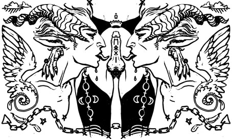
A Problem Glyph by Eliza Gauger. Problem Glyphs are “symbolic illustrations … drawn in response to problems sent in by tumblr users”.
• Kosmische Night takes place at the Museum of Bath at Work, Bath, Somerset, on January 25th (Rescheduled to February 22nd). “…a celebration of all things Teutonic for anyone who enjoys Neu!, Can, Tangerine Dream, Stockhausen and Kraftwerk,” say the organisers. Also on the bill, The Electric Pentacle, a Carnacki-esque collaboration between Narco Lounge Combo and The Levels.
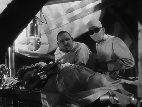
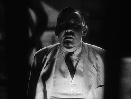
• Shock Headed Peters’ Fear Engine II: Almost As If It Had Never Happened. Joe Banks on Karl Blake, “…one of the most fascinating and colourful characters to emerge from the fertile loam of the post-punk scene”.
• “The great question in the film and the tale is not the existence of the ghosts but the way the governess understands their no-longer-lived lives and desires.” Michael Wood on The Innocents.
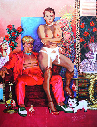
Nobody, however, is a greater authority on the intersection of porn and alternative spirituality than Annie Sprinkle. Beginning as a prostitute in the 1960s and 70s, she entered porn in the pre-AIDS era and made over two hundred films. She then jumped into a career as a sex-positive author and educator, which brought her into close conflict not only with feminists like Andrea Dworkin and Catharine MacKinnon, but also right-wing patriarch Jesse Helms, who denounced one of her sex magick performance pieces on the floor of the Senate. For Sprinkle, both sexuality and performance are explicitly spiritual and magical, part of her role as a cultural shaman.
In the Valley of the Porn Witches by Jason Louv.
• Stars of the Lid and Wordless Music Orchestra playing for two hours last month at the Basilica of Our Lady of Perpetual Help in Sunset Park, Brooklyn.
• Rick Poynor on the late Martin Sharp’s contributions to People, Politics and Pop: Australians in the Sixties (1968) by Craig McGregor.
• Maggie Greene on The Woman in Green: A Chinese Ghost Tale from Mao to Ming, 1981–1381.
• “TED actually stands for: middlebrow megachurch infotainment,” says Benjamin H Bratton.
• Geoff Manaugh on how corpses helped shape the London Underground.
• Tony White on Eduardo Paolozzi at New Worlds by David Brittain.
• Mix of the week: Secret Thirteen Mix 102 by Frank Bretschneider.
• At Dangerous Minds: film of Syd Barrett‘s first psychedelic trip.
• NYPL Wire: a New York Public Library Tumblr.
• Microbial art by Eshel Ben-Jacob and others.
• Interstellar Rock: Kosmische Musik (1974) by The Cosmic Jokers | I, Bloodbrother Be (1984) by Shock Headed Peters | Obscene and Pornographic Art (1991) by Bongwater