Baroque snowflakes

snowflakes.jpg

I haven’t done a seasonal card design for a couple of years, I often feel too enervated by the whole idea or else lack sufficient inspiration. But after seeing recent snowflake designs by the wonderful Marian Bantjes I thought I’d try some similar ones of my own. Looking back at her work just now I’m amused to see that she kept her designs simple and elegant while I went overboard with the detailing as usual. I created quite a few of these shapes but the ones that make up the final card are the best of the bunch. In a rare fit of generosity you’re welcome to download a high-res PDF and print it yourself. The size is A4 (210mm x 297mm) and—unlike most cards—when folded down the middle can either stand vertically or horizontally.

Previously on { feuilleton }
Kirsten Hassenfeld’s paper sculptures

The art of Mati Klarwein, 1932–2002

godjokes.jpg

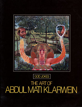
If book collecting is frequently a waiting game, some waiting periods can be longer than others. In the case of Mati Klarwein’s God Jokes, my patience and hope have sustained themselves for 28 years until I finally acquired a copy this Thursday afternoon. God Jokes was the second book of Mati Klarwein’s work, published by Harmony Books, New York, in 1976, a slim catalogue-style collection of his paintings, some of which were featured in the early issues of Omni magazine. In 1979 and 1980 God Jokes turned up in a chain of UK remainder shops and for a while it seemed like everyone I knew owned a copy which possibly explains my unaccountable decision to avoid buying one myself. As the years passed and I became increasingly enamoured with Mati Klarwein’s work I came to regret that decision, not least because the book seemed to disappear completely. Copies have turned up since on Abe.com but at bizarrely inflated prices (£50 for a 56-page art book?!). I paid £4.99; patience sometimes pays off.
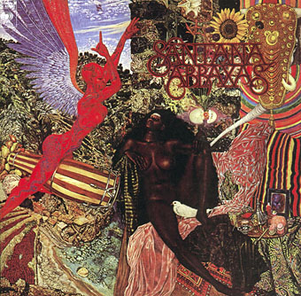
abraxas.jpg

Abraxas by Santana.

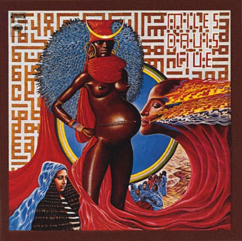
Mati Klarwein’s work has been most visible via the album sleeves of the Sixties and Seventies which borrowed his pictures for their covers. Chief among these is one of the best Santana albums, Abraxas (1970), which used his stunning 1961 painting The Annunciation (and a lettering design by Robert Venosa), and one of all-time favourite albums, the Miles Davis masterpiece Bitches Brew (1970). Miles Davis was a great Klarwein enthusiast for a while and commissioned new work for his Live-Evil album in 1971.

davis.jpg

Live-Evil by Miles Davis.

It’s not necessary to go into detail describing Mati Klarwein’s work when you can go to the web gallery maintained by his family and feast your eyes there. Klarwein is one of the few 20th century artists to have taken Salvador Dalí’s photo-realist painting style and make of it something unique to himself; his work is always immediately recognisable. That this work is still known mainly for its illustrative connections tells you more about the iniquities of the art world than it does about the value of the paintings as works of art.

maarifa.jpg

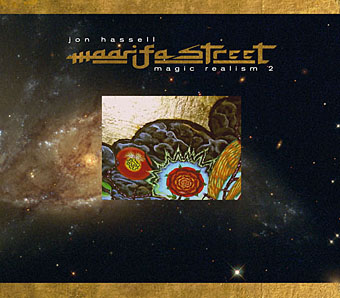
The most curious thing about having to wait so long to find a copy of God Jokes was that I ended up working with a picture of Mati Klarwein’s three years before I found the book; I would have expected to find the book one day but the latter eventuality was far less predictable. In 2005 Jon Hassell asked me to design his new CD, Maarifa Street, and Jon was keen to use a tiny video detail he made of a huge and incredible Klarwein painting, Crucifixion (1963–65). The detail is the rectangle in the centre of the cover, juxtaposed against some Hubble galaxies: the very small against the very large. We used the painting itself and further details inside the digipak. Jon was another of those who used Klarwein’s art for his album sleeves (for Earthquake Island, Dream Theory in Malaya and Aka-Darbari-Java/Magic Realism) and the two men became great friends as a result.

crucifixion.jpg

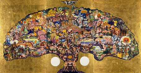
Crucifixion by Mati Klarwein.

Jon Hassell writes about Bitches Brew—and Mati Klarwein’s sleeve art—here. His site also includes a 1998 Mati Klarwein interview from The Wire in which the painter discusses his life and work. If you want a copy of God Jokes for yourself, be prepared to wait…or pay over the odds.

Elsewhere on { feuilleton }
The fantastic art archive

Elsewhere on { feuilleton }
The album covers archive

Previously on { feuilleton }
Ballantine Adult Fantasy covers
Visions and the art of Nick Hyde
The poster art of Marian Zazeela

Steampunk Horror Shortcuts

steampunk.jpg

steampunk2.jpgTime again for some work updates and other news. I mentioned in August that this Steampunk design—created to illustrate a formula definition of the genre by Jeff VanderMeer—was originally going to be a T-shirt. That idea fell by the wayside when an opportunity arose to submit it to Modofly who were asking for Steampunk-related work for a new line of their laser-etched Molekin books.

I’m pleased to announce that the books are now done and on sale at the Modofly store. These are available in two sizes, large (5.25ins x 8.25ins; 13.3cm x 20.9cm) and small (3.5ins x 5.5ins; 8.9cm x 13.9cm), $36 USD and $22 USD respectively.

penny_blood.jpg

Next up is issue 11 of Penny Blood, an American horror magazine due out shortly which includes a feature on David Britton’s Lord Horror character and runs through the often tormented history of Savoy Books. Savoy’s Mike Butterworth and I were both interviewed and the piece should also include some comments from Keith Seward whose Savoy title, Horror Panegyric, examines the Lord Horror mythos. They don’t say yet when the magazine is out but it’s available for pre-order now.

While we’re on the subject of his lordship, I recently updated my pages for the Reverbstorm comics with a lot more samples taken from the re-scanned and re-lettered artwork. Work is still progressing on assembling the definitive single-volume edition of Reverbstorm as time permits. I’ve finished work on all seven published issues and am now engaged with the eighth and final section. More about that, and Reverbstorm itself, at a later date.

shortcuts.jpg

Finally, there’s another new CD design out, my fourth this year and there are more on the way; I’m starting to feel prolific. As can be seen from the cover, this was a very minimal job. A Made Up Sound is a pseudonym of Dave Huismans, aka 2562, whose excellent Aerial album I also designed. Shorctuts is a collection of electronic sketches and Dave took the moodily anonymous photographs himself.

Heaven and Hell Calendar

hhcalendar_cover.jpg

It was only a week ago I announced a new calendar for 2009 and now here’s an additional CafePress creation which manages to offer more than another collection of Lovecraft illustrations. This is a sampling of my work from the past few years gathered under the vague rubric of Heaven and Hell. A couple of pieces are variations on earlier designs reworked so as to fit the square page format. Details follow below.

hhcalendar_pages.jpg

1: Angel Passage (CD cover)
2: The Lucid View (detail; book cover)
3: MBV Arkestra (magazine cover)
4: Emissaries (CD cover)
5: Snakes and Ladders (CD cover)
6: Salomé
7: Fallen Angel
8: The Highbury Working (CD cover)
9: Acid Mothers Temple (poster design)
10: Steps of Descent (CD cover)
11: Metal Sushi (detail; book cover)
12: “Mirage in time—image of long-vanish’d pre-human city” (detail)

Previously on { feuilleton }
Coulthart Calendar 2009

Coulthart Calendar 2009

calendar1.jpg

I’ve been a bit late with the new calendar this year but it’s finally available at CafePress. I’ve also been somewhat remiss in reusing last year’s pages rather than uploading new ones. Preparing 12 pages of art takes time even if you’re using old images—they have to be the right dimensions, after all—and I’ve been preoccupied this year with too many other things. So while the cover is new (based on this HP Lovecraft-derived picture), the pages are the same tinted versions of the art for The Great Old Ones from my Haunter of the Dark book. Considering the popularity of these pictures I’m guessing that some people will be quite happy with that; a selection from the series also appeared in the enormous Lovecraft Retrospective from Centipede Press earlier this year.

In other Lovecraft-related news, I’ve been slowly drawing a new Cthulhu portrait since demand for Cthulhoid work remains high. I’m not sure when this will be finished yet as other work takes precedence but this is where you’ll hear about it first.

calendar2.jpg

calendar3.jpg

Previously on { feuilleton }
The monstrous tome