Soviet posters

lenin.jpg

“Lenin is dead but the Russian Communist Party lives on” (no date).

More typography and yet more Soviet poster art which seems perennially popular with graphic designers. Bold Constructivist designs like this example are part of the reason why: over 80 years old yet still striking. Type foundry P22 have a set of Constructivist fonts similar to the typeface used here. Poster tip via Coudal.

siegheil.jpg

Sieg Heil Iconographers, title spread (2006).

I plundered the Soviet style in 2006 for the design of Jon Farmer’s Sieg Heil Iconographers for Savoy Books. The typeface this time was Jonathan Barnbrook’s contemporary design, Newspeak. Does the assertive bad taste of the book’s title undermine the Communist propaganda or do the Agitprop graphics ironically counterpoint the discussion of fascist history within? That’s left for the reader to decide.

Previously on { feuilleton }
Lenin Rising
Dead Monuments
Soviet ceramics of the 1920s
Enormous structures II: Tatlin’s Tower

DeZ did it first

mindscape1.jpg

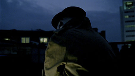
Rorschach from The Mindscape of Alan Moore.

The hype over the Watchmen film reached critical mass this week and as a consequence there’s been a spike of interest in the two Alan Moore interviews I posted in 2006, with Empire magazine and other movie sites linking here. I won’t bore you with my lack of interest in the film—read the book, it’s a masterpiece—but it’s worth noting that the feature-length DeZ Vylenz documentary, The Mindscape of Alan Moore, dramatised scenes from V for Vendetta and Watchmen back in 2003, long before Hollywood put either of them on screen. The Rorschach scene is especially interesting for having the opening monologue from Watchmen voiced by Alan himself. I’d never thought of Rorschach having such a gravel-throated delivery until I heard this. If Zack Snyder’s version is the same then you know where they swiped it from.

mindscape2.jpg

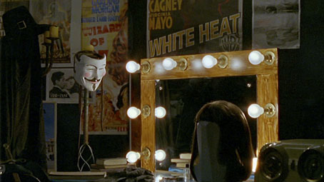
V’s dressing-room from The Mindscape of Alan Moore.

As I’ve mentioned a few times here, The Mindscape of Alan Moore is available on DVD in Europe and the US and includes a bonus disc of interviews with Alan’s collaborators, Dave Gibbons among them. All the packaging and interface was designed by yours truly.

Previously on { feuilleton }
The Mindscape of Alan Moore: US edition
The Demon Regent Asmodeus
New things for June
Alan Moore in Arthur magazine
Watchmen
Alan Moore interview, 1988

Steampunk framed

sp1.jpg

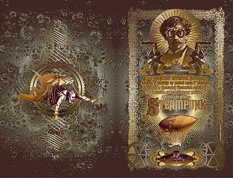
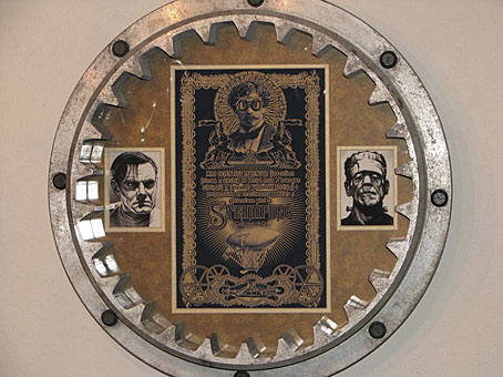
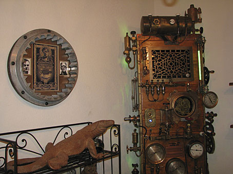
Dana Mattocks wrote to me a month or so ago asking if he could have a print of my Steampunk picture to go in a frame on the wall beside his jaw-dropping Steampunk Frankenstein case-mod. I immediately agreed after seeing his photos. A single picture doesn’t do justice to the amount of work and detailing that’s gone into this project which makes most other steampunk craftings look distinctly lacklustre. See his Flickr pictures for a better look at its wood-and-brass lusciousness. What I didn’t expect was that the frame would be an equally impressive heavy-duty item. And I’m especially pleased to see the picture in there along with Colin Clive and Boris Karloff from the first Universal Frankenstein films. Thanks Dana!

sp2.jpg

I’ve been working on an updated version of the Steampunk pic for something special which I’ll announce here shortly. Meanwhile, if anyone else has one of my pictures in an impressive frame, send me a photo and I’ll feature it here.

Previously on { feuilleton }
Steampunk Horror Shortcuts
Zeppelin vs. Pterodactyls

Designing Booklife

bl1.jpg

I created a cover design recently for Jeff VanderMeer‘s new novel, Finch, and shortly after completing that Jeff asked if I could put together some cover ideas for his forthcoming writer’s guide, Booklife, which Tachyon will be publishing later this year. Jeff is known as a fantasy writer but this book was intended to have a general appeal for any would-be or working writer. It also needed to look suitably contemporary and (possibly) reflect the discussion within which concerns the modern writer’s use of computers, the internet and social networks. Lastly, several lines of text needed to be placed on the cover without it looking confused or messy.

I agreed to this whilst busy with several other projects so the initial drafts were rather haphazard. (That’s my excuse, anyway.) The first version (above) came out of an idea to apply a kind of trompe l’oeil effect to the cover with a torn dustjacket and handwritten amendments. The red call-out/roundel highlights an important sub-section of the book. This was knocked up very quickly and, as well as not looking very contemporary, the title doesn’t look enough like gold blocking to be convincing. Jeff requested something more up-to-date.

Continue reading “Designing Booklife”

Font haiku

Nothing doing here for the past twenty-four hours due to things collapsing at the webhost end. Everything seems stable now (fingers crossed). In future when this happens check my Twitter feed for reports.

haiku.jpg

So then… The above is the better of my two entries for a Valentine’s day competition on the Extensis blog which required you to create a besotted ode to a typeface. The wonderful Gotham sans serif by Hoefler & Frere-Jones was used by the Obama campaign during the recent Presidential election, as I noted back in November. I didn’t win but they did give me an honourable mention which was a surprise. Some very witty and clever entries but it helps if you’re a type obsessive to appreciate many of the jokes.

Previously on { feuilleton }
The best font won