The White People by Arthur Machen

aklo.jpg

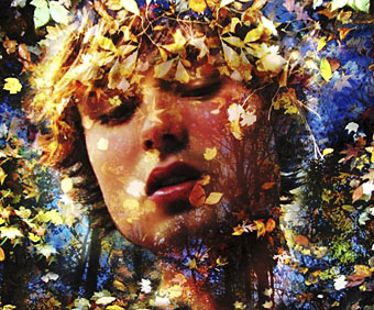
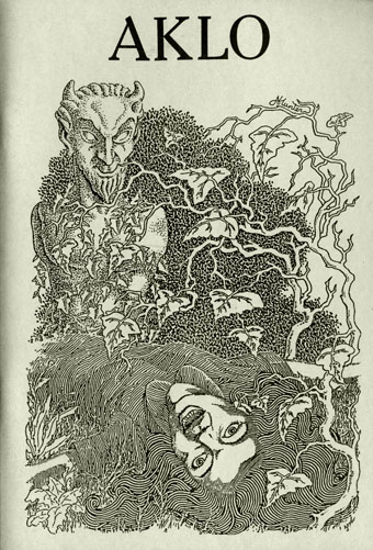
Aklo: A Journal of the Fantastic, Spring 1988 edition, edited by Mark Valentine & Roger Dobson. Illustration by Alan Hunter.
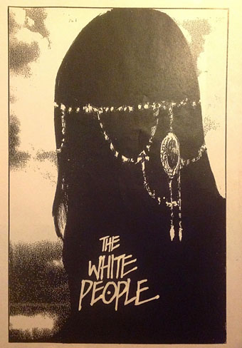
1: The White People

The White People by Arthur Machen was written in 1899 but not published until it appeared in Horlick’s Magazine, January 1904. The magazine, which ran for just over a year, was edited by Machen’s Golden Dawn colleague AE Waite which no doubt explains the unlikely venue. HP Lovecraft enthused about the story in Supernatural Horror in Literature (1927):

Less famous and less complex in plot than The Great God Pan, but definitely finer in atmosphere and general artistic value, is the curious and dimly disquieting chronicle called The White People, whose central portion purports to be the diary or notes of a little girl whose nurse has introduced her to some of the forbidden magic and soul-blasting traditions of the noxious witch-cult — the cult whose whispered lore was handed down long lines of peasantry throughout Western Europe, and whose members sometimes stole forth at night, one by one, to meet in black woods and lonely places for the revolting orgies of the Witches’ Sabbath. Mr. Machen’s narrative, a triumph of skilful selectiveness and restraint, accumulates enormous power as it flows on in a stream of innocent childish prattle, introducing allusions to strange “nymphs,” “Dols,” “voolas,” “white, green, and scarlet ceremonies,” “Aklo letters,” “Chian language,” “Mao games,” and the like. The rites learned by the nurse from her witch grandmother are taught to the child by the time she is three years old, and her artless accounts of the dangerous secret revelations possess a lurking terror generously mixed with pathos. Evil charms well known to anthropologists are described with juvenile naiveté, and finally there comes a winter afternoon journey into the old Welsh hills, performed under an imaginative spell which lends to the wild scenery an added weirdness, strangeness, and suggestion of grotesque sentience. The details of this journey are given with marvellous vividness, and form to the keen critic a masterpiece of fantastic writing, with almost unlimited power in the intimation of potent hideousness and cosmic aberration.

Lovecraft borrowed Machen’s naive narrator a year later for The Dunwich Horror: Wilbur Whateley’s diary is written “by a child of three-and-a-half who looked like a lad of twelve or thirteen”, and makes reference to “Aklo”, “the Dho formula” and “the Voorish sign”. (The journal in The White People refers to “a wicked voorish dome”.)

Lovecraft wasn’t alone in being impressed by the story, it’s long been regarded as Machen’s greatest piece of short fiction with good reason:

…it remains the purest and most powerful expression of what Jack Sullivan has called the “transcendental” or “visionary” supernatural tradition. Most other tales in that tradition, Blackwood’s The Wendigo, EF Benson’s The Man Who Went Too Far, and Machen’s own The Great God Pan, merely describe encounters with the dark primeval forces that reign beyond the edge of civilisation; The White People seems an actual product of such an encounter, an authentic pagan artefact…

TED Klein, The Penguin Encyclopedia of Horror and the Supernatural (1986)


2: The House of Souls

sime.jpg

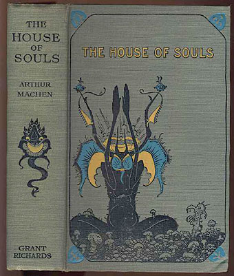
The House of Souls (1906). Cover illustrations by Sidney Sime.

The story was first collected in The House of Souls in 1906, a book that features a splendidly weird cover illustration by Sidney Sime. Inside there’s some of Machen’s finest supernatural writing including The Great God Pan, The Inmost Light and The Three Imposters. Also included is A Fragment of Life, a visionary piece that begins as a domestic drama but by the end has almost intersected with The White People.

And by coincidence (or is it?), I’ve just noticed that Tartarus Press are publishing a facsimile edition of the 1906 volume later this month.


3: The Ceremonies

ceremonies.jpg

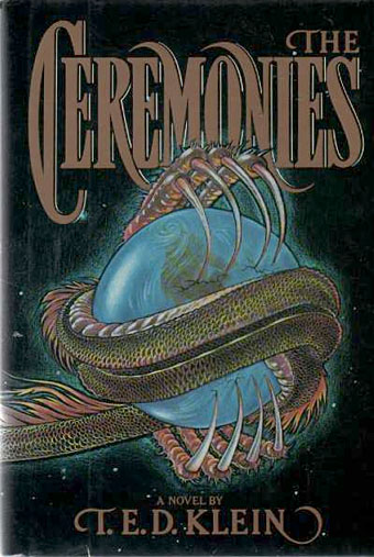
The Ceremonies (1984). Illustration by David Palladini.

TED Klein’s debut novel is also his only novel to date. Klein was editor of The Twilight Zone Magazine at this time, and he used the publication’s popularity to promote the weird fiction of the past; writers like Machen and Algernon Blackwood weren’t as visible in the mid-80s as they are today. The Ceremonies was expanded from a 1972 novella, The Events at Poroth Farm, and borrows much from The White People: the ceremonies of the title refers to those in the story, and the story itself—which a character is instructed to read by moonlight—is described as a key to occult mysteries. There’s a lot about the novel to recommend—Klein’s prose for a start—but I felt it could have been much weirder than it was. The book reads like a typical King/Straub narrative that’s aiming for more without quite getting there, and placing something as unique as Machen’s story at its heart only makes its eventual shortcomings all the more apparent.
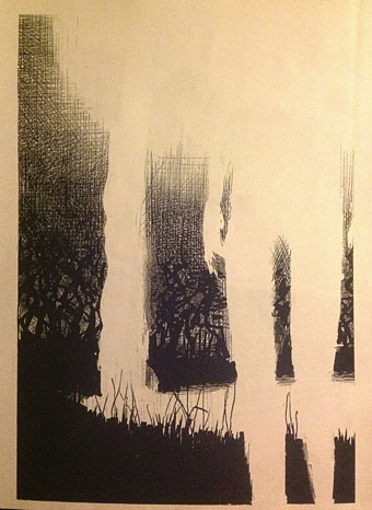
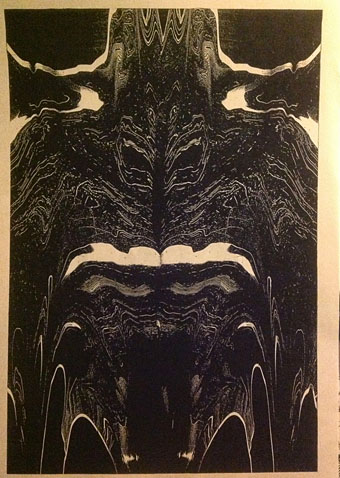

4: A drawing

whitepeople.jpg

The White People (1990) by John Coulthart.

And speaking of aiming for more without quite getting there, my drawing from 1990. This was going to be one of a series based on Machen’s story but I ran out of steam, feeling that the usual approach of drawing separate scenes wasn’t going to deliver the essence of the piece. If I tried this today I’d probably go for a more surreal approach the way Sätty did with Poe.


5: Roses

roses.jpg

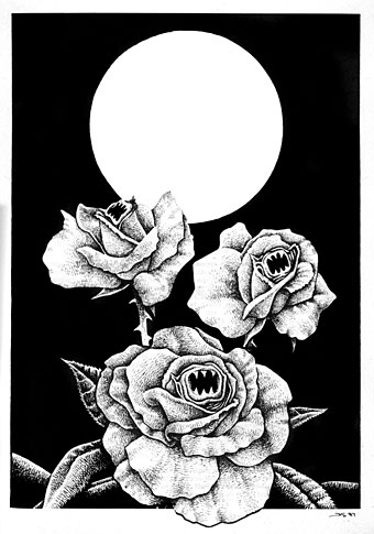
The Singing Roses (1987) by Jeffrey Salmon. From Dagon magazine no. 18/19, July–October, 1987.

“And what is sin?” said Cotgrave.

“I think I must reply to your question by another. What would your feelings be, seriously, if your cat or your dog began to talk to you, and to dispute with you in human accents? You would be overwhelmed with horror. I am sure of it. And if the roses in your garden sang a weird song, you would go mad. And suppose the stones in the road began to swell and grow before your eyes, and if the pebble that you noticed at night had shot out stony blossoms in the morning?

The White People

*

Sweet tortures fly on mystery wings / Pure evil is when flowers sing / My heart / My heart is a rose

Love’s Secret Domain (1991) by Coil


6: Ghost Box

zann.jpg

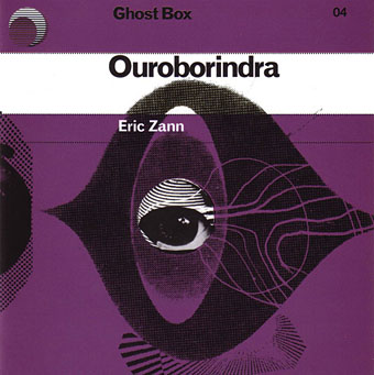
Ouroborindra (2005) by Eric Zann. Design by Julian House.

Track 4: Dôls
Track 6: Voolas

belbury.jpg

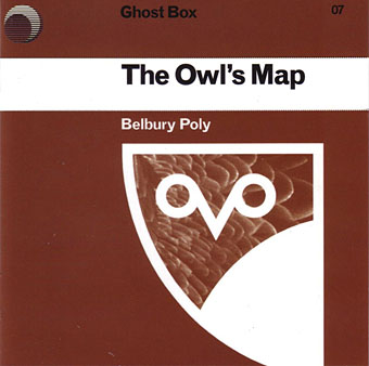
The Owl’s Map (2006) by Belbury Poly. Design by Julian House.

Track 11: Scarlet Ceremony

Among the sleeve notes there’s this:

And the noise and the singing would go on and on for a long time, and the people who were in a ring swayed a little to and fro; and the song was in an old, old language that nobody knows now, and the tune was queer.

Arthur Machen, The White People


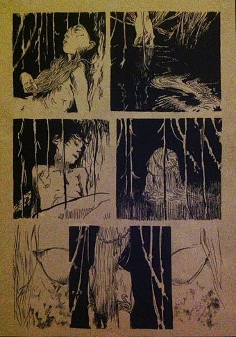
7: The White People by Ibrahim R. Ineke

ineke1.jpg

A very impressive comic-strip adaptation, the first of its kind, as far as I’m aware. See the full run of pages here. (And thanks to Ibrahim for getting in touch!)

ineke2.jpg

ineke3.jpg

ineke4.jpg

For those who can’t afford a limited edition from Tartarus Press, Machen’s story may currently be found in Penguin’s The White People and Other Weird Stories. The perfect thing now the nights are drawing in.

Update: See also The Forbidden Forest, a short animation based on the story. (Thanks, Richard!)

Elsewhere on { feuilleton }
The Lovecraft archive

Previously on { feuilleton }
The Bowmen by Arthur Machen
Rex Ingram’s The Magician
The Great God Pan

Icons

icon1.jpg

“Iconic” is a much abused word these days but this book from UK publisher Counter-Print can claim the term with some justification:

Icon contains over 200 examples of social media icons from many well-known, as well as up-and-coming, graphic designers and illustrators. This limited and concise canvas for self-expression is represented within this book through a host of examples collected from around the world, chosen for their creativity, intelligence and beauty.

My own icon/monogram/whatever is one of those featured in the “Shapes” section. It’s strange seeing this symbol subjected to any kind of attention even though it’s at the top of this web page and can also be found in much of my work. It appeared in drawings when I was about 15 or 16 and eventually became a personal identifier some time in the early 1980s. One reason I like it and continue to use it is because I don’t know what it is; it doesn’t originate out of any conscious expression, and doesn’t refer to any specific symbolic history even though it resembles other symbols. I always liked Whistler’s habit of using a peacock as his signature so he didn’t have to spoil his paintings with a scrawl; Aubrey Beardsley imitated his example for a while using three vertical lines as his signature. This icon has served a similar purpose for me although these days I’m as likely to use my surname and some Roman numerals.

Icon is a great little book, smartly designed by Leterme Dowling and brimming with equally smart content. Some page samples follow.

icon2.jpg

icon3.jpg

Continue reading “Icons”

Fuseli’s Nightmare

nightmare1.jpg

The Nightmare (1781).

Christopher Frayling’s Nightmare: The Birth of Horror (1996) opens with a prologue examining Henry Fuseli’s most celebrated painting:

Henry Fuseli, who later wrote that “one of the most unexplored regions of art are dreams”, and who was said to have supped on raw pork chops specifically to induce his nightmare, made his name with this painting. And engraved versions, produced in 1782, 1783 and 1784, distributed the image across Europe, until Fuseli’s masterpiece became the way of visualising bad dreams.

Although The Nightmare was painted just before the Romantic craze in Western Europe—which revelled in peeling back the veneer of rational civilisation to reveal the “natural” being or the raw sensations beneath, sometimes through the gateway of dreams—it was well-known to the writers and painters of the early nineteenth century. One of them wrote that “it was Fuseli who made real and visible to us the vague and insubstantial phantoms which haunt like dim dreams the oppressed imagination”.

The Nightmare was fascinating—and scary—because it operated at so many different levels at once. It was set in the present (the stool and bedside table are “contemporary” in style), and it was concerned not so much with an individual’s nightmare—the usual subject-matter of dream paintings, often involving famous individuals and their prophecies—as with nightmares in general. It was not A Nightmare, but The Nightmare; not a vision but a sensation. This gave it a direct impact, unmediated by history, which put a lot of critics off.

nightmare2.jpg

The Nightmare (1791).

Later generations of critics have had no such problems, of course, nor have the legions of artists and cartoonists who’ve plagiarised and parodied this memorable scene. I had a vague notion of collecting some of the derivations but a quick image search reveals an endless profusion of squatting figures and thrusting horse heads. Wikipedia did provide two of the engraved versions, however. Of the two paintings above I’ve always preferred the later one: the incubus, or “mara” as Frayling calls it, looks more sinister, and the horse head has become an almost unavoidable sexual symbol. No wonder that Siegmund Freud had a copy of The Nightmare on the wall of his waiting room.

nightmare3.jpg

Engraving by Thomas Burke (1783).

Continue reading “Fuseli’s Nightmare”

Heaven and Hell calendar

heavenhell00.jpg

Painting from the poster art for The Highbury Working (2000) by Alan Moore & Tim Perkins.

Unlike last year, this year’s CafePress calendar arrives on time, its creation being eased by the fact that it’s a reworking on an earlier version. The idea with the previous Heaven & Hell calendar had been to alternate various pieces of infernal Cradle of Filth artwork with contrasting imagery; as things turned out I had more offerings for Hell than for Heaven—no surprise there—so the reality wasn’t very satisfying.

This year I’ve managed to fill out the Heaven sequence with more recent works, all of which have been slightly adjusted to fit the square page ratio required by CafePress. So even though these are old pieces many of them are unique to this printing. Larger copies of the pages may be seen here while the CafePress purchase page is here. As always, my thanks to everyone who buys these things.

And as before, the calendars for previous years are now available all year round; see the full range here. Note that this means you need to select January as the starting month if you want the months to run for a single year only.

heavenhell01.jpg

JANUARY: Variation of the poster art for Angel Passage (2001) by Alan Moore & Tim Perkins.

Angel Passage was Alan and Tim’s album about the life and work of William Blake. I designed the CD, a poster, and also produced a video for the multi-media performance of the piece at the Purcell Room, London, in February 2001.

heavenhell02.jpg

FEBRUARY: Cover for Bitter Suites To Succubi by Cradle of Filth (2001).

My first piece of Cradle of Filth art. I was a little surprised when working on this that they really did want the wings and horns; Dani loved that kind of imagery. I was even more surprised when this cover was subsequently showcased in an entire window in Tower Records’ main London shop in Piccadilly.

Continue reading “Heaven and Hell calendar”

More vapour trails

jeter.jpg

Those covers everyone likes. My designs for KW Jeter’s steampunk novels from Angry Robot and Tor Books.

When I wrote a brief history of steampunk for Eye magazine last year I ended by somewhat provocatively declaring that until something better appeared this was the defining aesthetic of the moment. A year later, the movement (if we can use that term) continues to evolve despite the steady drip of complaints that it’s all reactionary, historically illiterate, and so on. Much of the ire remains nonsensical, and often seems to boil down to a common disdain for people enjoying themselves in some unorthodox manner.

manual.jpg

Design by Galen Smith after the Hetzel editions of Jules Verne’s novels.

If I hadn’t got involved on the art side I would have found it difficult to avoid being attracted by steampunk in one form or another since so much of it originates in areas I was already interested in, not least HG Wells and Victorian science fiction. The rapid evolution of the past few years means we’re currently seeing an aesthetic leaving behind its origins to become an international subculture. What’s striking about this activity—and this is something that doesn’t seem to have been discussed very much—is the way the whole thing has been birthed by genre fiction rather than by pop music, as was the case for the second half of the 20th century. This piece is meant to be a news post, however, not another cultural critique, but if I happen to write any more on the subject there’s something there that’s worth exploring.

manual2.jpg

As to the news: this month finds my steampunk artwork manifesting in three very different locations in one of those odd coincidences of timing that occur now and then. First up there’s the Steampunk User’s Manual edited by Jeff VanderMeer & Desirina Boskovich, a follow-up to 2011’s Steampunk Bible. For the new volume I designed spreads for three entries by Jess Nevins from The Encyclopedia of Fantastic Victoriana: Alternative History Edition.

Continue reading “More vapour trails”