Cocteau and Lovecraft

cocteau.jpg

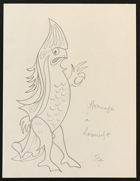
This one arrives via Tentaclii, via ST Joshi’s news page. Jean Cocteau paying homage in pencil to HP Lovecraft is both unlikely and almost too good to be true. But the drawing, circa 1951, is from a Beverly Hills gallery where other Cocteau artwork is up for sale so it can be accepted as the genuine article.

Cocteau’s enthusiasm for Lovecraft’s fiction doesn’t seem to be news either, even though this is the first I’ve heard of it. Another of Joshi’s links is to this newspaper feature from 1954 in which Cocteau together with various notables of the time are asked to choose their books of the year. While the other contributors list the kinds of titles you’d expect Cocteau has a book about Atlantis by Denis Saurat, books about parapsychology and “les soucoupes volantes” (flying saucers), plus the first French collection of Lovecraft’s stories, translated by Jacques Papy. I knew that Cocteau had a mystical side—you’d expect nothing less from the director of Orphée—but this combination of Lovecraft and full-on crankery is a surprise. He lived just long enough to see the first publication of Pauwels and Bergiers’ Ur-text of the 70s’ crankosphere, The Morning of the Magicians, so I can imagine him lapping up that one as well.
gessner.jpg

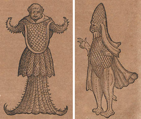
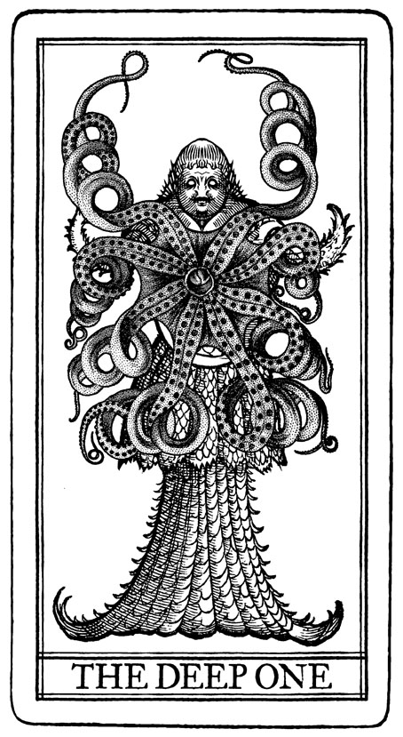
As for the doodle, this is Cocteau’s version of a sea-monster illustration from Conrad Gessner’s Historia Animalium (1551–1558), a five-volume study which includes a number of fantastic creatures among its descriptions of the animal life known to 16th-century Europeans. Gessner has a page or two about the so-called “sea bishop” which includes this illustration together with another one I adapted myself in 2013 for the Neil Gaiman story in Lovecraft’s Monsters. Good to know that Cocteau and I were on the same page, as it were.
deep-one.jpg

Elsewhere on { feuilleton }
• The Lovecraft archive

Previously on { feuilleton }
• Cocteau drawings
• Querelle de Brest
• Halsman and Cocteau
• La Belle et la Bête posters
• The writhing on the wall
• Le livre blanc by Jean Cocteau
• Cocteau’s sword
• Cristalophonics: searching for the Cocteau sound
• Cocteau at the Louvre des Antiquaires
• La Villa Santo Sospir by Jean Cocteau
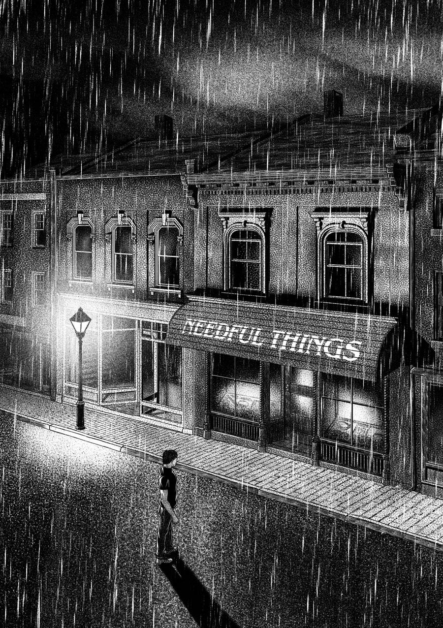
Needful Things

needful1.jpg

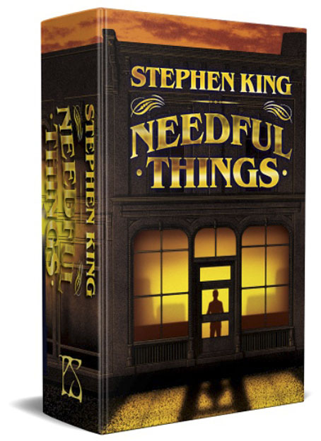
This is the first time I’ve mentioned this doorstop volume but it won’t be the last. I’ll be writing at greater length about last year’s heavy-duty illustration project once the book is in print. Needful Things is the latest in an ongoing series of reprints of Stephen King books from PS Publishing, each volume being limited to 1000 cased, hardback copies. Each book showcases the work of a different illustrator who also signs a tipped-in bookplate. There’s a thriving international market for deluxe reprints of King’s books so these things always sell out fast. This post serves as an alert to let interested purchasers know that the pre-ordering queue will open on the publisher’s website this Friday.

needful2.jpg

It was just over a year ago when PS asked if I’d like to illustrate Needful Things. I agreed with some trepidation, having already started work on another major illustration/design project (still in progress). The request from PS was for a cover design and 30 full-page interior illustrations; that’s only a little more than the amount of work I had to do when illustrating Dracula a couple of years ago, but those illustrations were mostly digital collages which took two or three days each to complete. A full-page drawing with this level of accuracy and detail takes me the best part of a week so I could see nine months of frantic plate-spinning ahead. Everything worked out, anyway, and I’m very pleased with the end results. So is Stephen King, which is good to know.

needful3.jpg

I’m afraid I don’t have price details for this one but the PS edition of Cujo was priced at £90. Anyone wanting to join the pre-order stampede is advised to first join the publisher’s mailing list. The most recent PS mail has some additional information about the ordering process. I’ll write a little more about the illustrations once the dust has settled.

Previously on { feuilleton }
• Long Live the New Flesh: The Films of David Cronenberg
• Berni Wrightson in The Mist

Pavonine pattern play

pattern1.jpg

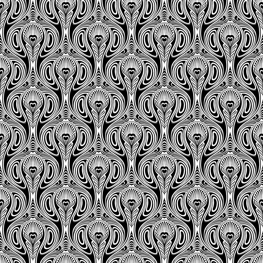
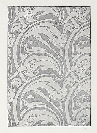
One of the projects I’ve been working on recently contains a large quantity of Art Nouveau design. I can’t discuss this any further for the usual embargo reasons, but I can show off this pattern which has been generated as a by-product of the main work. This is one of those fin-de-siècle designs that looks like it might have originated in the 1960s, a decade which saw a revival of interest in Art Nouveau graphics. Those sinuous lines would work well on a psychedelic poster, and there’s even a touch of Op art in the melting ovals that separate the peacock feathers.

pattern7.jpg

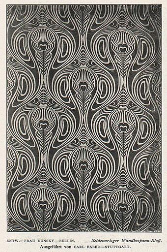
But this isn’t a design from 1970, it actually dates from 1900, the source being a small wallpaper sample that I spotted some years ago in issue 7 of Deutsche Kunst und Dekoration. “Frau Dunsky, Berlin” is named as the designer although there’s no further information about her design in the text. After seeing this I thought I’d have a go at copying the pattern in order to create a digital version but I soon gave up when it became apparent that too much work was required to convert the indistinct image into a sharp outline. I didn’t have a graphics tablet at the time, and my printer had broken down, so the only way to draw an outline was the hard way, using a mouse pointer.

pattern2.jpg

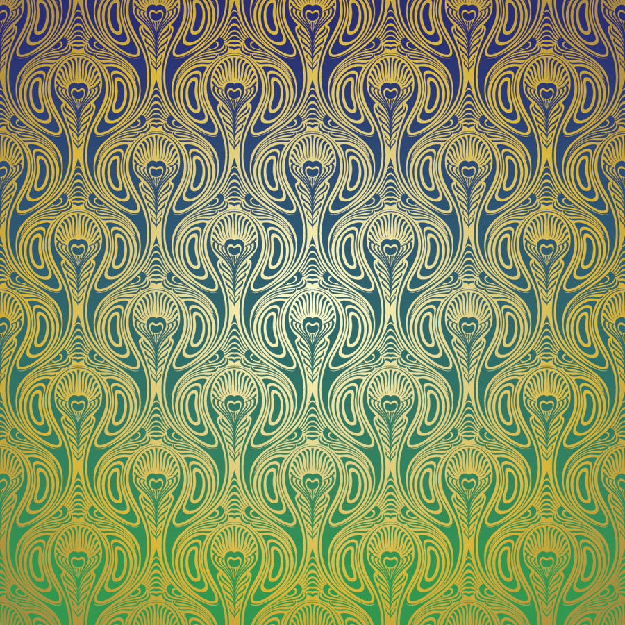
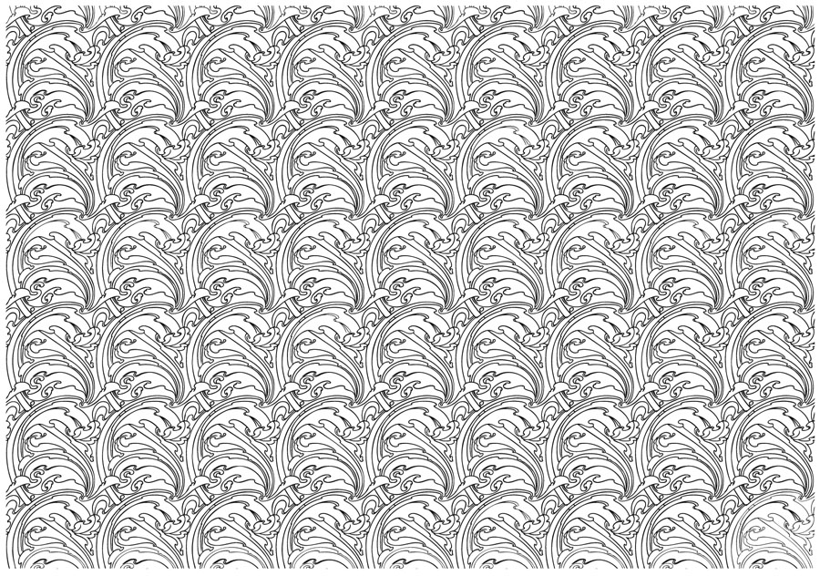
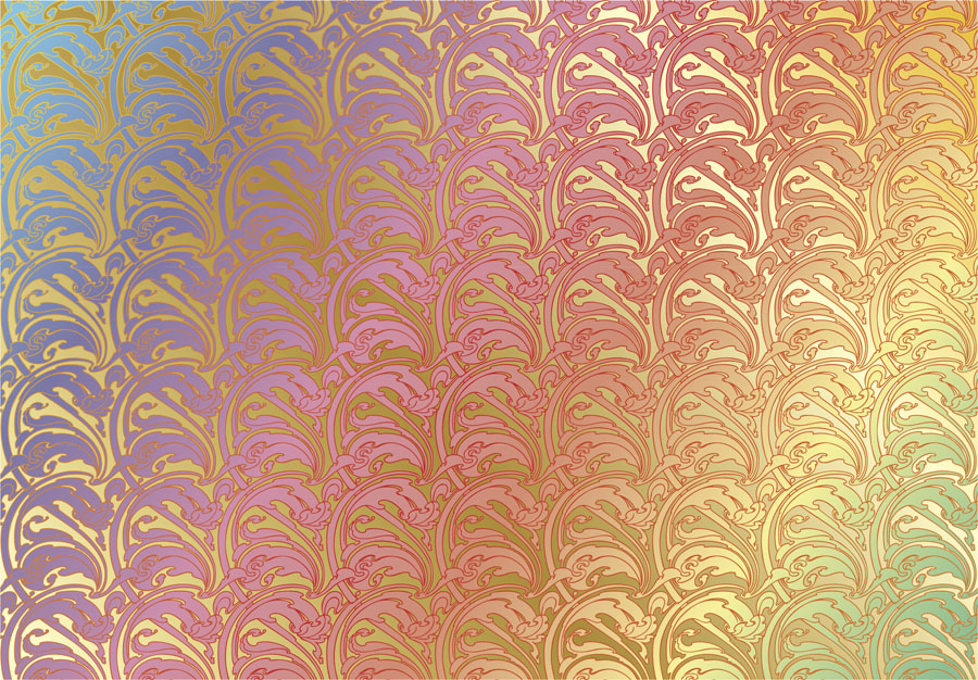
Vectorised and coloured.

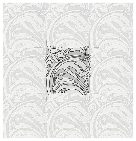
A few days ago I pulled out the copy I’d been working on and, since I now have a graphics tablet, decided to try again. Even though creating the outline was easier this time I still wasn’t sure whether a repeatable pattern would be possible. The magazine sample is slightly warped, and the repeated elements don’t match exactly when overlaid, but I was able to compensate for the flaws with some stretching and redrawing in Photoshop. It’s very satisfying getting something like this to work, even more so when it’s a 120-year-old design that you’ve managed to resurrect. I also feel a little familial continuity with this kind of pattern making. My mother worked as a textile designer for a few years in the 1950s, although she never worked on anything like this, the designs produced by her studio were generally chintz-like floral patterns.

pattern3.jpg

Prior to redrawing the peacock design I’d resurrected another wallpaper design from the same period. This is one of several examples by a French designer, André Morisset, that appeared in issue 15 of L’Art Decoratif. Monsieur Morisset’s design was easier to work into a digital version, being a better reproduction, while the design itself is a square that tiles vertically and horizontally so it’s easier to build into a pattern.

pattern4.jpg

Drawing the outline.

pattern5.jpg

A tessellated tiff.

pattern6.jpg

A coloured vector version.

I’ll be doing a few more things like this when I get the chance. I’m not sure yet whether they’ll find a place in the things I’m working on, but once you have a satisfactory vector outline you can file the art away until you need it later.

Previously on { feuilleton }
• Louis Rhead’s peacocks
• Peacocks
• Rene Beauclair
• Whistler’s Peacock Room
• Beardsley’s Salomé

Splendid Suns

suns.jpg

I answered a few interview questions recently for Shunga Gallery, a site concerned with the erotic side of Japanese prints, and with contemporary practitioners who work in a similar areas. (All NSFW, needless to say.) I’m not really an erotic artist but Marijn has selected a few examples of my artwork that contain prominent erections, going back to the badly-proportioned drawing of the Great God Pan that I did in 1986 for my late friend, Ed, when he was part of a Dutch music & performance group, Abrahadabra. The drawing appeared in the zine of the same name, and later provoked mild disapproval from the organisers of a video festival in Den Haag where Ed and friends were using it as a flyer to promote their activities. Also at Shunga Gallery are a few pages from the rebarbative Reverbstorm, a book that’s the darkest and nastiest thing I’ll ever do. Some of that artwork provoked a rather more serious form of disapproval, as I explain in the interview.

Continue reading “Splendid Suns”

Old Marvel versus Sherlock Holmes

oldmarvel4.jpg

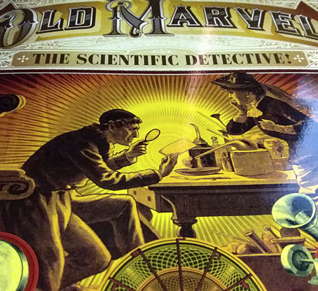
Arriving in the post this week, one of the books whose covers I was creating late last year. Work-wise, the past year has been busier than usual which means I’ve fallen behind with the logging of recent commissions. In the past few months I’ve created several album designs, more book covers, an entire book design (cover plus interior), and also been working on two bigger projects at the same time. Things have calmed down a little now so updates will be forthcoming.

oldmarvel1.jpg

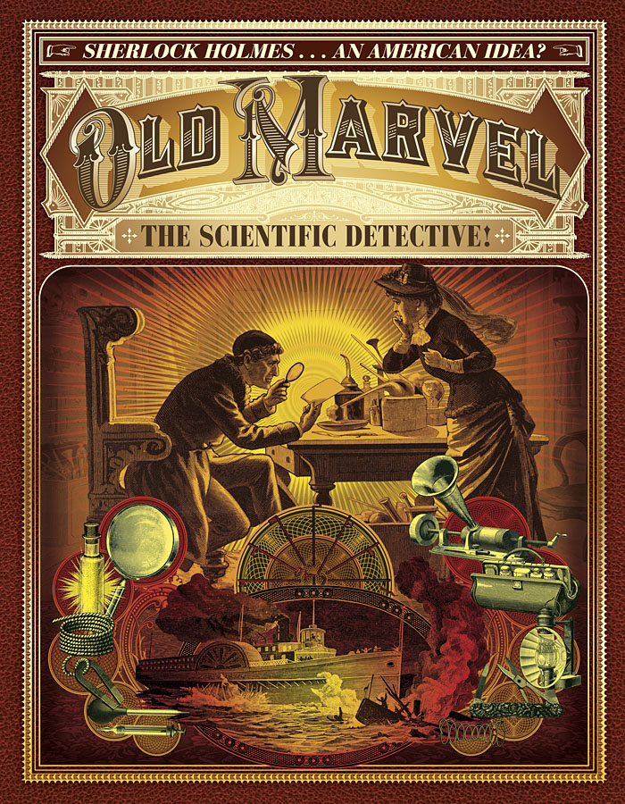
Old Marvel: The Scientific Detective is another design for Mark Williams’ Dark Lantern Tales imprint which once again resurrects a forgotten detective from pulp obscurity, and in a larger format than before. The new volume is significant for presenting a Sherlock Holmes-like character—credited to the pseudonymous “Grip”—who predates Holmes’ first appearance by three years, thereby suggesting a possible inspiration for Arthur Conan Doyle. Holmes collector Joe Rainone provides the details of publication and sets out the available evidence in an informative foreword. The Old Marvel character not only pre-empts Holmes by using his scientific knowledge to solve mysteries but he also pre-empts subsequent generations of spies and investigators with the various gadgets he uses, including what may be the first fictional deployment of an Edison voice recorder. My brief for the cover was to combine the illustration of the character with a vignette showing a shipping disaster from the story plus some of the contents of the detective’s tool kit.

oldmarvel2.jpg

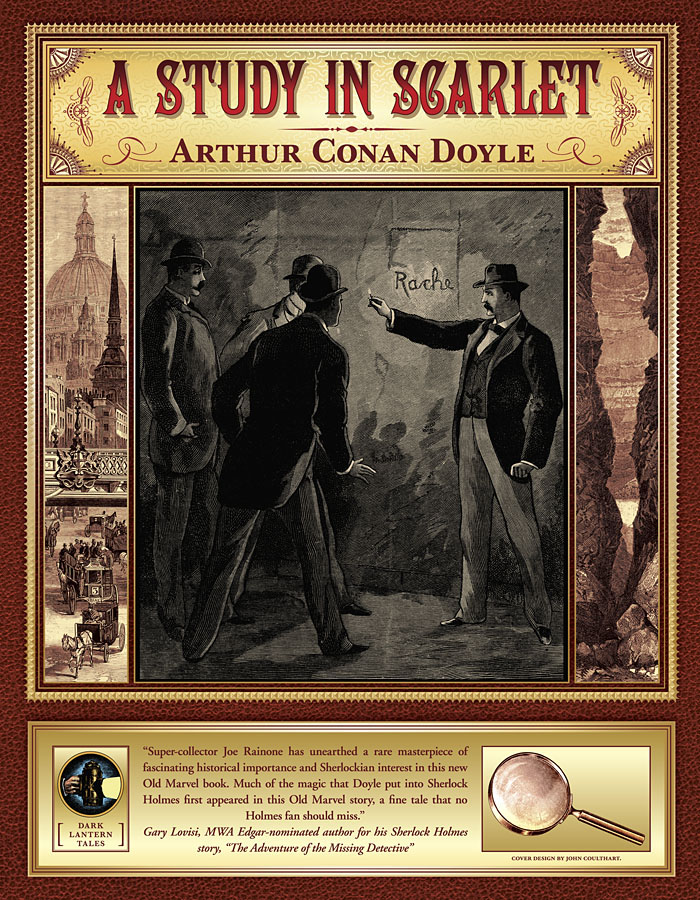
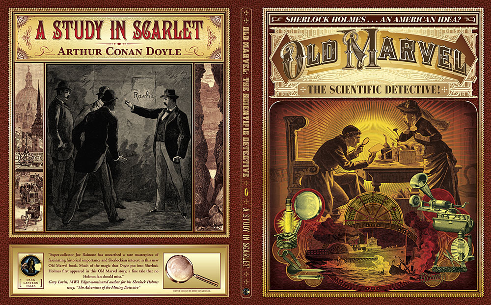
The book is actually two stories in one volume, with the second half being a reprint of the very first Sherlock Holmes novel, A Study in Scarlet. Both stories are presented as semi-facsimiles of their original US printings, together with reproductions of title pages and so on. The Holmes story is reproduced from its appearance in The Illustrated Home Guest in 1892, and includes rare illustrations one of which appears on the cover. Doyle’s first Holmes novel is the most controversial of all his stories—at least if you’re a Mormon—since this is the one where the inhabitants of Salt Lake City are depicted as a murderous religious cult. I filled out the cover with panels showing the two main story locations: a view of London via Ludgate Circus and a canyon in Utah. Finding a period engraving of St Paul’s Cathedral that remained visually interesting when narrowed down in this way took some time.

oldmarvel3.jpg

Previously on { feuilleton }
• More detectives
• The Joe Phenix Detective Series
• Illustrating Sherlock Holmes