The Bookman Histories

bookman.jpg

Now that Angry Robot books has revealed the cover design which kept me busy throughout July I can do the same here. The Bookman Histories is an omnibus reprinting of Lavie Tidhar‘s steampunk trilogy which comprises The Bookman, Camera Obscura and The Great Game. The stories are frenetic, crowded with incident and feature a huge range of characters that find real people such as Jules Verne and Harry Houdini encountering contemporaries—both human and non-human—from the fiction of the late 19th century. All the requisite steampunk boxes are ticked. David Icke will be thrilled to know that in these books the British royal family are a bunch of lizards from space…

My initial impulse when faced with far too much material was to cram every square centimetre of the cover with detail but if I’d have done that I’d probably still be working on it, and would also have run the risk of it turning into an incoherent mess. So this layout, which is crowded enough, is something of a compromise. I also wanted to save some space for the title design.

bookman2.jpg

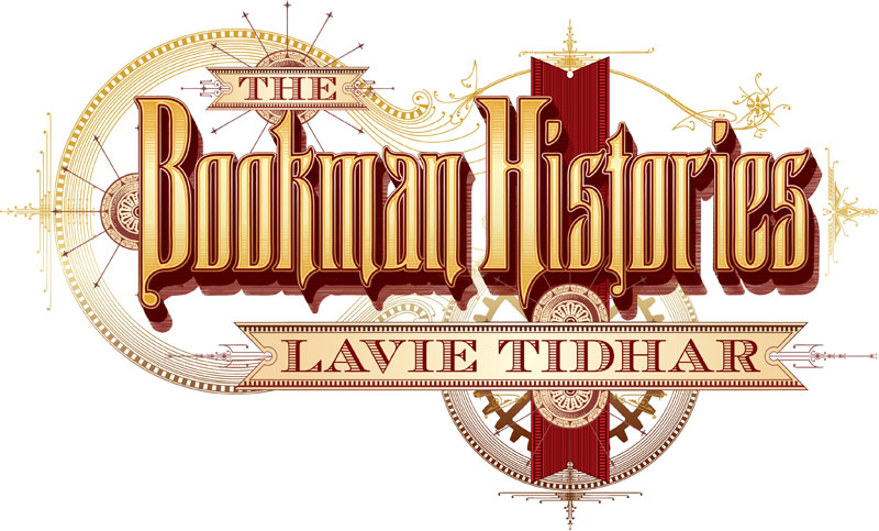
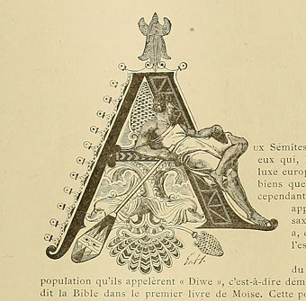
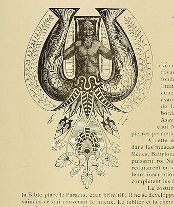
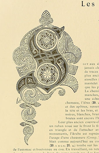
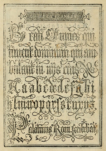
The main body of the title isn’t a font but was created from scratch based on letterforms and decorative elements from this fantastic set of fire insurance title pages. I’d been wanting to try something based on these hand-drawn designs ever since Mr Peacay posted them at BibliOdyssey last year. This particular design provided the basic letter shapes although I had to invent several of missing characters.

bookman3.jpg

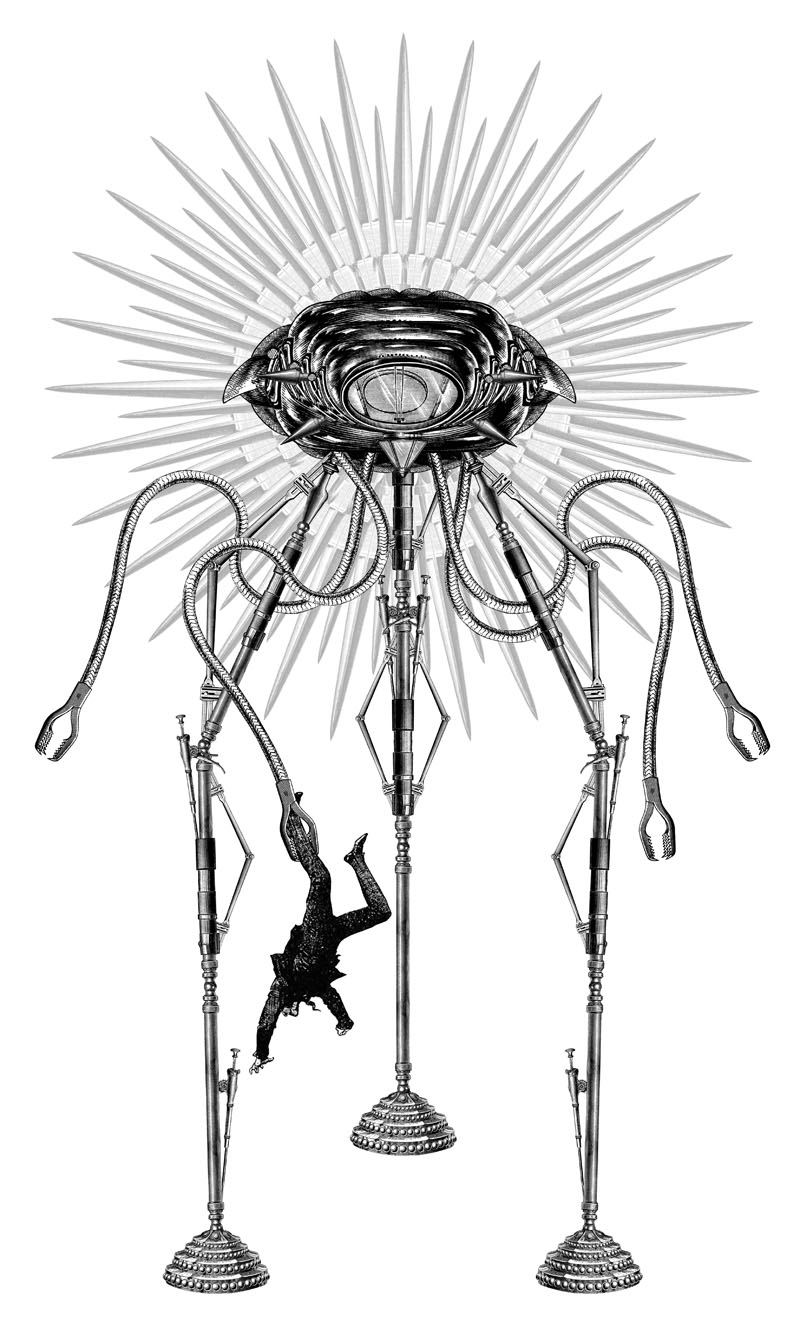
In the third part of the trilogy the Martians from HG Wells’ War of the Worlds invade, so I spent rather too much time fashioning a Martian tripod from lots of tiny bits of machinery. This is one of the earlier drafts. It was an odd thing finishing this cover (which includes the planet Mars in the background) whilst the world was getting excited by the real landing on Mars of the Curiosity Rover.

The Bookman Histories will be published in March next year. Meanwhile there’s more steampunk design on its way. Watch this space.

Previously on { feuilleton }
Aether Cola
Crafting steampunk illustrations
SteamPunk Magazine
Morlocks, airships and curious cabinets
The Steampunk Bible
Steampunk Reloaded
Steampunk overloaded!
More Steampunk and the Crawling Chaos
Steampunk Redux
Steampunk framed
Steampunk Horror Shortcuts

Reverbstorm: Bauhaus Horror

reverbstorm1.jpg

Lord Horror (after Klaus Barthelmess).

(No, not Pete Murphy and co.) Now that the Reverbstorm book is at the printers I have an excuse to discuss a few of the art and design appropriations that run through the narrative. I wanted to use some Bauhaus-style design back in the early 1990s when we were putting the first of the comic issues together but that idea got buried under conflicting demands and the need to actually finish all the drawing. It was only when I started designing the opening pages in 2008 that I was able to return to some of the original intentions. There were two reasons for this choice: one was that the minimalist graphics of the Bauhaus style worked well in black-and-white, and also provided an effective counterpoint to the very dense and detailed drawings that followed. The second was that the Bauhaus design school found itself in the early 1930s in opposition to the fascist forces which the figure of Lord Horror represents. (Many of the Bauhaus architects and designers eventually fled Germany for Britain and the United States.) This combination of antagonistic elements yielded another of Reverbstorm‘s collisions of counterposed philosophies and aesthetics.

reverbstorm2.jpg

Reverbstorm title page.

The title page is the most flagrant Bauhaus appropriation, a swipe worthy of Peter Saville at his plundering height. Joost Schmidt’s famous Bauhaus-Ausstellung poster is reworked with a Neville Brody typeface (Industria) and with Oskar Schlemmer’s face logo turned into a scowling profile.

On a typographic note, Industria was used right from the start with Reverbstorm since Brody designed it in the Thatcherite 1980s as a deliberate harking back to the authoritarian 1930s. It also has a very appropriate name. The other typefaces used in the book—Morris Fuller Benton’s Empire and Eric Gill’s Perpetua—date from 1937 and 1928 respectively.

reverbstorm3.jpg

Joost Schmidt (1923).

reverbstorm4.jpg

The reworked Oskar Schlemmer face/logo as it appears on the Appendix page. The lightning flash in Reverbstorm has multiple associations: adapted initially from the symbol used by Oswald Mosley’s British Union of Fascists (a symbol also appropriated at various times by David Bowie and Throbbing Gristle) it can also relate to storms, radio broadcasts and electricity in general. Here it becomes a minimal cipher representing Horror’s outrageous plume of hair.

reverbstorm5.jpg

Oskar Schlemmer (1923).

reverbstorm6.jpg

Reverbstorm, part 8.

In part 8 of Reverbstorm Horror ends up naked inside “a Soul” (don’t ask), and we see his figure juxtaposed against a series of backgrounds that recapitulate earlier aspects of the narrative. It was always the intention to end the series with a change of style so I did this by creating a kind of digital maquette figure using vector shapes that could be posed in a variety of ways. The origin of the figure was a sketch by Klaus Barthelmess, one of the students in Oskar Schlemmer’s drawing class. The sketch below appeared in a slightly altered form in issue 5 of the original publications but I always felt more could have been done with it: a posable figure turned out to be the perfect solution. By coincidence, while I was working on the final pages, Clive Hicks-Jenkins had been running a maquette exhibition on his blog. I was tempted to offer my example but a combination of too much work and a reluctance to throw Lord Horror’s obscene and reprehensible presence into the mix put paid to that. Besides which, my figure is a digital creation, not a bona fide paper cut-out.

reverbstorm7.jpg

Drawing by Klaus Barthelmess (1922).

For those who want more Bauhaus design, the Barbican in London is currently staging a major exhibition, Bauhaus: Art as Life, that will run throughout the summer.

Previously on { feuilleton }
Reverbstorm: an introduction and preview

Costume capitals

capital01.jpg

Another gem of a find at the Internet Archive, Le costume, les armes, les bijoux, la céramique, les ustensiles, outils, objets mobiliers, etc. : chez les peuples anciens et modernes (1896) is a lavish two-volume (?) guide to the costumes, artefacts, weapons, etc of various races through the ages. The books were compiled and illustrated by Friedrich Hottenroth (1840–1917) and comprise many detailed coloured plates, but what really caught my attention were the elaborate illuminated capitals used for each of the introductory essays. The common approach in 19th century books is to either have decoration that bears little relation to the content or to apply a single decorative style throughout the book. What’s notable about these designs is the way the style of each letter matches the decorative style of the race or civilisation under discussion. In addition to this feature they’re quite beautifully rendered. The FH initials indicate that they were all Hottenroth’s work. Volume 2 of the set can be found here.

capital02.jpg

capital03.jpg

capital04.jpg

Continue reading “Costume capitals”

Weekend links 106

oshiro.jpg

Gold Head 2 (2011) by Kouji Oshiro.

Josef Hartwig’s 1922 Bauhaus chess set. Contemporary copies can be bought from Naef Spiele but they’re not cheap. Related: Bauhaus: Art as Life, a major exhibition at the Barbican, London. Related, related: Art as life by Fiona MacCarthy.

• Rattera is a new font by Barnbrook Design for Fuse 1–20, Taschen’s collection of the experimental typography publication. Related: The Fuse poster explained.

Genesis (1981), video feedback and computer animation by Ron Hays with an electronic score by Ragnar Grippe.

Deadly Doris, a recording by Malcolm Mooney-era Can from the forthcoming Lost Tapes collection.

• “How did a pop band end up in a museum” Sasha Frere-Jones on Kraftwerk.

Philip Glass & Robert Wilson on how they made Einstein on the Beach.

• An astonishing aerial photo of post-quake San Francisco in 1906.

• More electronic music: Buddha Machine’s SoundCloud page.

My Baby, music and video from Julia Holter & Jib Kidder.

Homotography‘s photos can now be browsed at Pinterest.

Deviates, Inc., a Tumblr.

• Raoul Björkenheim live: Apocalypso pt. 1 | Apocalypso pt. 2 | 1-2-11 DMG, NYC

Giovanni Battista Palatino

palatino1.jpg

Say the name Palatino today and the only thing it brings to mind for most people is the elegant typeface designed by Hermann Zapf in 1948. Giovanni Battista Palatino (c.1515–c.1575) is the Italian calligrapher from whom Zapf took the name, and the pages here are from a 1550 reprinting of one of Palatino’s sample books, another of those volumes with a sprawling title: Libro di M. Giovambattista Palatino cittadino romano: nel qual s’insegna à scriuere ogni sorte lettera, antica, & moderna di qualunque natione. One of the fascinations for me in going through these old alphabet books is seeing the same designs reprinted down through the centuries until you arrive at the origin of a particular page or design. The third image in this post I have uncredited in a 1997 Pepin Press book of typography; I’ve seen someone wearing it at a gig on a T-shirt, and it turns up in a number of 19th century design books. But this is its origin, and for once the designer receives a credit (although he did sign some of his pages).

Also of interest in this book are the renderings of ancient alphabets. These range from familiar Greek and Hebrew letters to more obscure alphabets some of which resemble a number of occult alphabets that appeared around this time. Agrippa’s Passing the River and the Alphabet of the Magi by Paracelsus in particular look as though they might have been derived from a lettering book such as this.

palatino2.jpg

palatino3.jpg

Continue reading “Giovanni Battista Palatino”