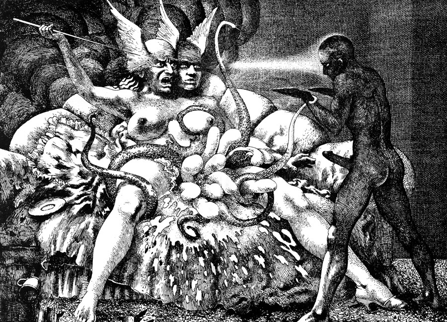
Psychopathia Sexualis (1967).
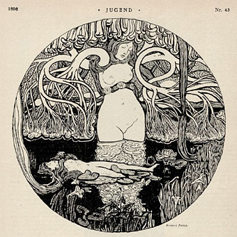
This, dear friends, is what the art of the fantastic could give us but rarely does, something which combines the metaphysical intensity of the Symbolists with a post-Freudian sensibility to create what Philip José Farmer once called “the pornography of the weird”. Jim Leon was a British artist whose work gained prominence via the underground magazines of the 1960s, especially Oz, although he was never really a psychedelic artist as such. Many of his earliest paintings show the influence of the Pop artists, it was only later in the decade that a distinctly original and surreal imagination came to the fore. Oz was always pretty scurrilous and had no qualms about challenging the authorities with bizarre sexual imagery which other magazines would never dare to print. Leon and other artists were fortunate to have such a public forum for outré work, a few years earlier or later and they might not have found an outlet at all.
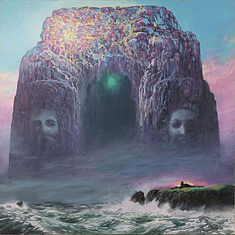
Untitled (1979).
His early work blended influences from Francis Bacon, surrealism and the baroque. Lurking there is also the English visionary William Blake, together with the obsessive Romanticism of the pre-Raphaelites. A number of his early paintings and drawings refer to William Burroughs’s Naked Lunch (first published in Paris in 1959). These were just some of the ingredients of an amazing, semi-abstract, spatially complex, ritualistic, orgiastic flesh-painting, expressing highly wrought morbidity, eroticism, transcendence and ecstasy; astonishing explorations of the murkier depths of the human mind. (More.)
A Very English Visionary by Simon Wilson.
I first encountered Leon’s work thanks to David Britton’s curating of a portfolio feature in Wordworks magazine which was republished in the Savoy Books anthology, The Savoy Book in 1980. Having seen a Leon painting in a back issue of Oz I was surprised that an artist with such a powerful imagination was so little-known. It turns out that he’d been working all along, albeit far from the public gaze, having moved to Lyons in France where he spent the 1970s and 80s painting many canvases of mystical scenes similar to those produced by the California artists featured in the Visions book. None of his later work explores the darker realms of his earlier Psychopathia Sexualis drawings, and since it’s the early work that I prefer, that’s what’s featured here. These drawings and paintings bear comparison with the art of Raymond Bertrand but where Bertrand has had his work published in lavish book collections, we have to rake through back issues of magazines for Leon’s endeavours. Leon’s later paintings at least have a website which is maintained by his family.