Through the Wonderwall

wonderwall1.jpg

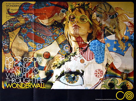
It’s taken me years but the recent obsession with UK psychedelia led me to finally watch Joe Massot’s piece of cinematic fluff from 1968, Wonderwall, a film distinguished primarily for its score by George Harrison (with Ringo Starr and Eric Clapton playing pseudonymously), and its title which was swiped years later by a bunch of Rutles-imitators from Manchester. The story is so slight it would have barely sustained an hour-long TV film: absent-minded scientist (Jack MacGowran) becomes intrigued by his glamorous neighbour (Jane Birkin playing “Penny Lane”; yeah, right…) and knocks holes in the walls of his flat in order to scrutinise her modelling, partying and frequent undressing. Unlike Blow Up (1966, and also featuring Jane Birkin) and the later Performance (1970), both of which attempted to accurately pin down some of the modish aspects of the period, this is a very kitsch piece. That wouldn’t be so bad if it was entertaining kitsch like, say, Smashing Time (1967), but Massott has to resort to scenes of limp comedy and some rather dull dream sequences in order to pad the thing out. Between the handful of actual dialogue scenes there’s a lot of gloating over Ms Birkin’s flesh which no doubt satisfied one half of the audience but by today’s standards is hardly thrilling. Iain Quarrier plays Penny’s duplicitous boyfriend (with a fake Liverpool accent) in his last screen role before he quit acting. Quarrier and MacGowran had appeared together in two of Roman Polanski’s British films, Cul-de-sac (1966) and Dance of the Vampires (1967). In the latter, MacGowran again plays an absent-minded scientist while Quarrier is cinema’s first (?) gay vampire.
wonderwall2.jpg

An interjection from The Fool.

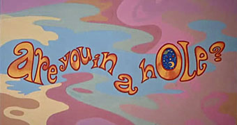
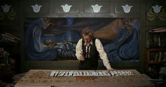
Of chief interest for me in Wonderwall was the decor and title card decorations by Dutch psychedelic collective, The Fool (who also appear in the party scene), famous for their earlier Beatles associations including the inner sleeve for Sgt Pepper and designs for the short-lived Apple Boutique in London’s Baker Street. I was also curious about the distinctive decor of MacGowran’s flat which contrasts with the psychedelia next door, all dark green walls embellished with Victorian murals and a Tennyson poem—very fittingly a piece called The Daydream—which circles the room.
wonderwall4.jpg

The professor prepares to attack the wall.

This was particularly interesting in that it made another connection between the psychedelic era and Victorian arts movements, especially from the Aesthetic/Arts & Crafts end of things, but it wasn’t at all obvious whether the connection was an intentional part of the film’s production design or an accident of location and budgetary convenience. Aside from the old-fashioned appearance of MacGowran’s rooms there seemed no reason why his otherwise cultureless character would have any interest in decorating his living space in this way.
wonderwall3.jpg

The street corner then…

google1.jpg

…and now.

google2.jpg

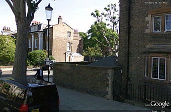
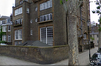
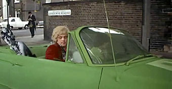
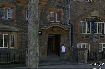
The building itself is equally distinctive and an exterior shot conveniently shows a street sign placing the location in Lansdowne House, a Victorian apartment block on the corner of Lansdowne Road and Ladbroke Road in the Notting Hill/Holland Park area of London.
google3.jpg

Lansdowne House.

What did the building look like today, I wondered? Google Earth proves indispensable at times like this and it was easy to find, in a street which looks more cramped than it does in the film. The presence of a blue plaque on the wall proved intriguing, a sign that the place once had famous residents. Googling for that revealed this photo which was a real surprise: Lansdowne House at one time contained studios for artists who included Charles Ricketts and Charles Shannon, a gay couple and leading lights of London’s fin de siècle art scene (also friends of Oscar Wilde), and another artist, James Pryde, who with William Nicholson worked as The Beggarstaffs. So my suspicion about the Arts & Crafts decor was correct, which means that MacGowran’s flat may have been decorated that way originally and remained untouched since the 1890s. I haven’t seen Rhino’s special edition of Wonderwall which contained additional information about the making of the film, so have no idea whether the history of the building is mentioned there. If anyone does know, please leave a comment. For now I’m quite happy to have stumbled upon another minor link between two of my favourite art decades.

For more visuals, this page has a host of screen grabs from the film as well as some gif animations, all of which manage to make Wonderwall seem more interesting than it is when you’re watching it.

Previously on { feuilleton }
• Charles Ricketts’ Hero and Leander
• Images by Robert Altman
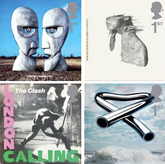
Album cover postage stamps

albums1.jpg

top row: The Division Bell by Pink Floyd; A Rush of Blood to the Head by Coldplay.
bottom row: London Calling by The Clash; Tubular Bells by Mike Oldfield.

The Royal Mail follows its series of British Design Classics postage stamps with a series dedicated to what they call “classic” album covers. The design classics in the earlier series deserved the term—a  Mini motor car, a Penguin book cover, the London Underground map, etc—whereas here we have the word “classic” being used in its lazy journalist sense where it becomes a synonym for “popular” and “familiar”, two attributes which often diminish with time.

albums2.jpg

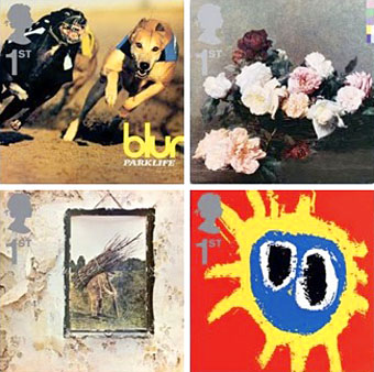
top row: Parklife by Blur; Power, Corruption and Lies by New Order.
bottom row: IV by Led Zeppelin; Screamadelica by Primal Scream.

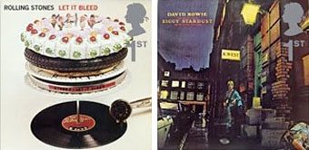
It should be noted that the choice of cover art was limited to releases by UK artists, and the designs had to be readable at the very small size of a postage stamp. Even so, I can’t help but regard this as a missed opportunity. There was no need to feature the Beatles since they’d been given their own set of stamps in 2006, but I’ve never thought of the cover of Let It Bleed (below) as a classic, even though musically it’s one of the best Stones albums. I’d rather choose Andy Warhol’s cover for Sticky Fingers but you can imagine the upset at stamp users being forced to lick a picture of a bulging pair of jeans. As for Pink Floyd’s Division Bell, it’s a typically striking design from Storm Thorgerson but does anyone really think it’s more classic than earlier Floyd covers, not least the Dark Side of the Moon prism which even people who hate the band can instantly recognise? Nearly all these choices seem confused or compromised; the Clash cover is the token punk offering—Royal Mail wouldn’t dare choose Never Mind the Bollocks—but Ray Lowry’s design was copied from an Elvis Presley sleeve; Led Zeppelin’s IV is a great album but other releases had far better covers; Primal Scream, another great album but the whole sleeve design is perfunctory; the Blur choice is merely bewildering.

albums3.jpg

left: Let It Bleed by The Rolling Stones; right: The Rise and Fall of Ziggy Stardust and the Spiders from Mars by David Bowie.

As far as designers go, Hipgnosis (via Storm T), Peter Saville (New Order), and Stylorouge (Blur) are included here but there’s nothing from Barney Bubbles, Malcolm Garrett, 23 Envelope, Neville Brody, Designer’s Republic or any of the other pioneering British designers of the past 30 years. The trouble with those names, of course, is that many of the artists they worked for aren’t popular or familiar enough to the average British stamp purchaser so their work can’t be deemed “classic”. A best of British, then, which could have been a lot better.

Classic Album Covers will be issued on January 10th, 2010.

Elsewhere on { feuilleton }
• The album covers archive

Previously on { feuilleton }
• British Design Classics
• Stamps of horror
• Endangered insects postage stamps
• James Bond postage stamps
• Please Mr. Postman

Michael English, 1941–2009

english1.jpg

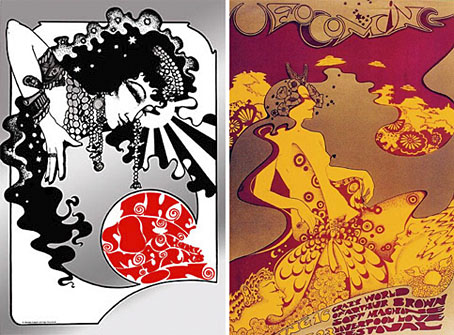
left: The Soft Machine Turns On (1967); right: UFO Coming (1967).

This was a bitter blow coming at a time when I’ve been working on something inspired in part by Hapshash and the Coloured Coat, the 1960s design duo comprised of Michael English and Nigel Waymouth. The two artists, together with associate Martin Sharp, are indelibly associated with the London psychedelic scene of the late Sixties. Whereas Sharp’s posters were often loose and dramatically bold explosions of shape and colour, the Hapshash posters were more carefully controlled in their curating of disparate elements borrowed from Art Nouveau—especially Mucha and Beardsely—comic strips, Op Art, Pop art and fantasy illustration. Their work perfectly complemented the very distinctive atmosphere of the capital’s psychedelic scene which, for a couple of hectic years, saw an explosion of new bands (or old bands in new guises) fervently engaged in a lysergic exploration of Victoriana, childhood memories and frequent silliness. UK psychedelia is generally more frivolous than its US equivalent which had the Vietnam War and civil disorder to deal with; English and Waymouth’s graphics captured the London mood.

english2.jpg

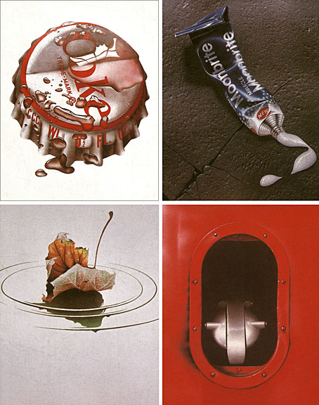
top left: Coke (1970); top right: Toothpaste (1974).
bottom left: Leaf Falls (1972); bottom right: Red no. 3 (1978).

In the 1970s English refashioned himself as a hyper-realist painter of foodstuffs and other consumer goods, and his meticulous airbrush style led to work as an advertising artist. Those paintings are beautifully rendered but often leave me feeling slightly queasy. I much prefer his work from later in the decade which depicted equally meticulous close-up views of oil-smeared buses and trains. Paper Tiger published a book collection in 1979, 3D Eye, which gathers the best of his work from the poster art on.

• Obituaries: Guardian | Times
• Hapshash poster galleries here and here

Previously on { feuilleton }
• The Look presents Nigel Waymouth
• The New Love Poetry

Gristleism

gristleism.jpg

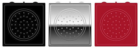
In which the Buddha Machine returns as a bespoke instrument/greatest hits package from Industrial music outfit Throbbing Gristle. Having been a TG aficionado for many years, and being the proud owner of a Buddha Machine, this item looks like an essential purchase.

Thirteen original TG loops: a mix of experimental noise, industrial drone, and classic melodies and rhythms.
Built-in 50mm speaker, volume control, pitch-shift control and loop selector switch.
Features more loops and almost twice the frequency range of the original Buddha Machines.
Powered by two AA batteries.
Palm-Sized: W 67mm x H 69mm x D 35mm
Available in three colours: Black, Chrome and Red
UK Retail Price: 19.99 GPB
Designed by: Throbbing Gristle & Christiaan Virant
Concept by: Christiaan Virant
Manufactured by: Industrial Records Ltd
Music by: Throbbing Gristle

While we’re on the subject of music/noise and musical noise, there’s a couple of other recent discoveries worthy of mention. Inudge is another music-making web toy using loops and a grid system. Very easy to use and fun to play with. Less frivolously, the British Library opened its Archival Sound Recordings to the public earlier this month. I grew up by the sea, and still miss being near it, so the lapping wave soundscapes are a pleasant balm.

Previously on { feuilleton }
• A=P=P=A=R=I=T=I=O=N
• Uncopyable
• Buddha Machine Wall
• God in the machines
• Layering Buddha by Robert Henke
• Generative culture