
Life magazine for August 5th, 1909, with an illustration by Coles Phillips.
02009? Read this.
Happy new year!
A journal by artist and designer John Coulthart.

Magazines
Life magazine for August 5th, 1909, with an illustration by Coles Phillips.
02009? Read this.
Happy new year!
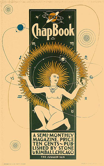
The Juggler Sun (1895).
On the shortest day of the year it seems fitting to post a picture of the sun and hope that in 2009 the clouds clear long enough for us Brits to see more than a month of it. Claude Fayette Bragdon’s poster is a remarkably stylised work for 1895 and might easily have been produced twenty or more years later. The Chap-Book was a periodical which included Bragdon among its illustrators although none of the cover designs to be found online are this striking. Bragdon wasn’t only an illustrator, however.
A man of many talents, Claude Fayette Bragdon (1866–1946) was an architect, artist, writer, philosopher, and stage designer. Bragdon’s work in these varied fields interrelated and overlapped, tied together by his theosophical belief in creating and communicating beauty. After a successful career as an architect in Rochester, NY, Bragdon entered the world of stage design in 1919, at the age of 53, by consenting to design a traveling production of Hamlet for actor-producer and personal friend Walter Hampden. Bragdon’s arrival in the world of theater came at a time when significant changes in staging techniques were on the horizon. (More.)
I usually celebrate polymathy but in Bragdon’s case his varied interests seem to have deprived us of more work by a unique illustrative talent. The indispensable VTS has further examples of his clean style from a 1915 treatise on architecture and design, Projective Ornament. It was increasingly common during this period to regard ornamentation in architecture as a 19th century evil to be purged from all future buildings, a concept expressed most notoriously by Adolf Loos in his 1908 essay, Ornament and Crime. Bragdon engaged with the argument by proposing that architects put aside historical and natural pastiche and look to geometry for a new style of decoration. His illustrations in Projective Ornament are beautifully done and some (like the one below) might almost be the work of an Art Deco illustrator such as George Barbier.

Elsewhere on { feuilleton }
• The illustrators archive
Previously on { feuilleton }
• The Decorative Age
• Images of Nijinsky
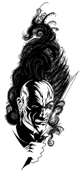
Lord Horror (1997).
Time for an end of year news round up.
• As mentioned earlier, issue 11 of US horror magazine Penny Blood features a look at Savoy Books and David Britton’s Lord Horror mythos. The magazine is now on sale and includes comments from Savoy’s Michael Butterworth and myself.
• I was interviewed last month by Creative Review, the UK’s leading design mag, as their January 2009 issue includes a feature on Barney Bubbles. This is also now on sale although I’ve yet to see a copy so I don’t know how much of what I was saying made the cut. I did finish by calling Barney B a “true pop artist” and I see they’ve used those words as their sub-heading so that may be one contribution.
• Back in the USA, book chain Barnes & Noble have licensed my 2004 Cthulhu Rising picture for an HP Lovecraft reprint. Not sure when that’s appearing yet. The same picture (which is also my most popular print) was licensed earlier by a Romanian publisher for (surprise) a Lovecraft collection. I’m told that volume will be published in May 2009.
• Finally, the recent Steampunk design which Modofly are now selling on their laser-etched Moleskin books will be appearing shortly in a surprise location. More about that later. I’ll probably be doing some prints and CafePress stuff with this picture eventually but for now Modofly has the monopoly.
Posting here may be rather sparse over the next couple of weeks since I’m very busy work-wise just now. So don’t be surprised if there’s a long run of picture-only posts. December and early January are often slack and moneyless so it’s good to be busy.
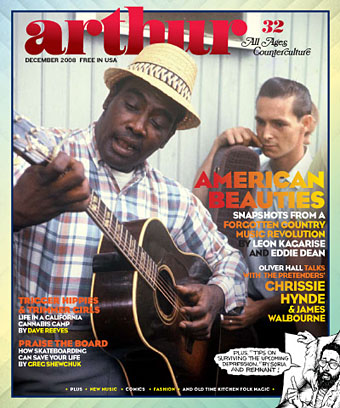
Arthur #32 is now out with a great cover. As usual you can download it from the Arthur site. Unfortunately that’s the only way you’ll be able to get hold of this issue since the paper copy won’t be printing. Arthur still needs your support, however, via subscriptions, donations and/or advertising if you haven’t wasted all your money helping investment bankers hang on to their bonuses.
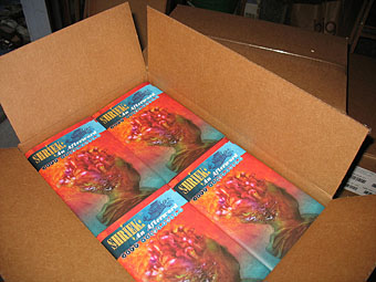
On the upside, Jeff VanderMeer notified me that Shriek: An Afterword, the novel of his which I designed earlier this year, has arrived from the printer and should be shipping forthwith. Read more about that (and order a copy) here.
Previously on { feuilleton }
• Fungal observations
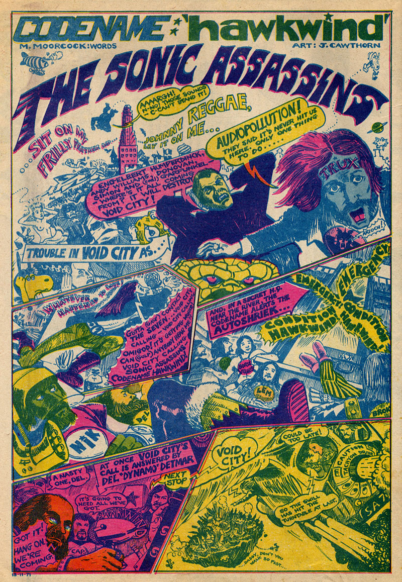
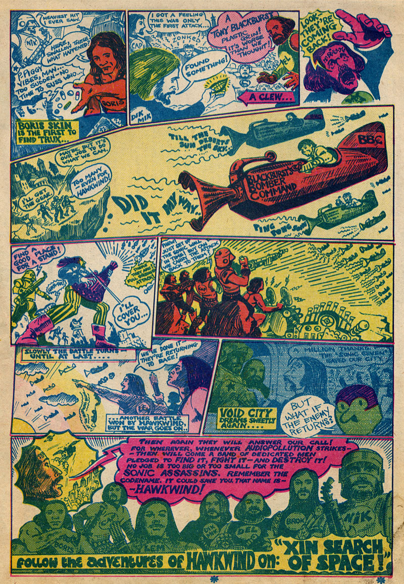
Searching through discs for scans of Jim Cawthorn art turned up this comic strip curio from a November 29th, 1971 issue of UK underground magazine Frendz. Cawthorn and writer Michael Moorcock present rock band Hawkwind as musical superheroes and although this is done largely as a promotional piece for that year’s new album, In Search of Space, the Sonic Assassins tag was one which stuck, becoming almost a secondary name for the band in later years. The name Void City also recurred later as the name of a track on the Choose Your Masques album. It may have been around this time that Cawthorn painted special T-shirt designs for Hawkwind; up to 1980 Dave Brock was still wearing his Baron Meliadus shirt on stage.
Previously on { feuilleton }
• Jim Cawthorn, 1929–2008
• Design as virus #7: eyes and triangles
• Barney Bubbles: artist and designer