Art that transcends

ca56.jpg

Late last year, US design magazine Communication Arts asked me to write a piece about psychedelic art, past and present. The resulting feature has been out for a couple of weeks in the May/June issue (no. 56) but I hadn’t seen it in print until a copy turned up today. Attempting to wrangle discussion of a very wide-ranging and amorphous field into 1500 words isn’t an easy task but I managed to sketch a history of psychedelic art beginning with Aldous Huxley and Humphrey Osmond’s mescaline experiments in the 1950s. Art that can be considered psychedelic goes back into prehistory but Huxley’s The Doors of Perception (1954) is the first book that considered art in general from a psychedelic viewpoint. That book, and the later Heaven and Hell (1956), are still valuable for their aesthetic meditations however much Huxley’s optimism may have been tainted by the ferment of the 1960s.

earth.jpg

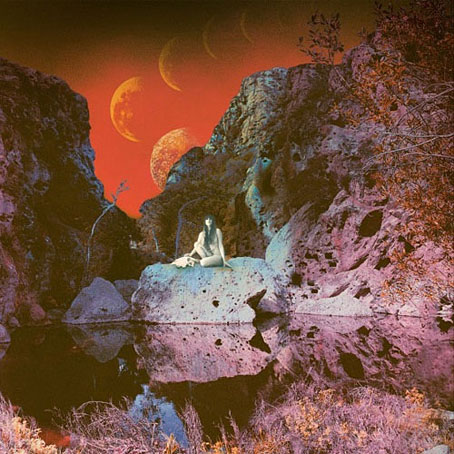
Primitive And Deadly (2014) by Earth. Art by Samantha Muljat.

The psychedelic art of the 60s isn’t exactly overlooked so I paid more attention to tracing the influence of the psychedelic style, and also mentioning painters such as Ernst Fuchs, Alex Grey, Martina Hoffmann and Mati Klarwein. Among the more recent artists, I was pleased that Samantha Muljat‘s album cover for Earth was featured. I’ve been listening to this album a great deal over the past few months, and loved that cover as soon as I saw it. One of the other contemporary names, Brazilian artist Duda Lanna, works in a very different style: bold, vivid, and often abstract. There seems to be a lot of this kind of work around at the moment, so much so that I kept spotting new examples after the article had been delivered. It’s difficult to say whether this is a developing trend or simply a case of there being more of everything around these days. I’ll play safe and suggest it’s probably a bit of both although, as I say at the end of the article, if the movement to legalise drugs gains momentum we can expect to see a lot more psychedelic art.

lanna.jpg

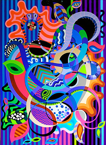
Garden of Psychedelic Delights by Duda Lanna.

In the Mind’s Eye

itme.jpg

One of the posts last December concerned a short TV film by Alan Garner, To Kill a King, the final entry in the Leap in the Dark series which the BBC ran from 1973 to 1980. Each half-hour episode concerned the supernatural, presented in either drama or documentary form, which for me would have meant prime viewing but I don’t recall ever seeing the series. The Garner film was a strange piece of drama whereas In the Mind’s Eye (1977) is a documentary about ghosts presented by writer Colin Wilson. The film is almost more interesting for its production details than its subject, the Phantom Vicar of Ratcliffe Wharf, an alleged spectre whose murderous life is shown in a piece of unconvincing dramatisation. The Phantom Vicar was the invention of writer Frank Smyth who needed a supernatural story for the Frontiers of Belief section of Man, Myth and Magic during its publication as a part-work in the early 1970s. Smyth and friend describe hatching the tale then we hear a number of subsequent reports which show the story quickly became an East End legend. Between the interviews you get to see bits of the docklands area before the spirits of old London had been exorcised by redevelopment.

Previously on { feuilleton }
To Kill a King by Alan Garner
Dreaming Out of Space: Kenneth Grant on HP Lovecraft
MMM in IT
Terror and Magnificence

The Reflected Faun

housman.jpg

Another one to add to the stock of fauns, satyrs and Pan figures that proliferate from the 1890s to the 1920s, Laurence Housman’s The Reflected Faun appeared in The Yellow Book in 1894. The magazine’s publisher, John Lane, also published Arthur Machen’s The Great God Pan in the same year although an early version of Machen’s story had appeared a few years before. What’s notable about Housman’s drawing is the way he combines in a single image several distinct themes: Faunus/Pan, the reflected Narcissus, and all those tales of beguiling spirits lurking in water. The nature of the spirit in this picture is distinctly androgynous, a detail that wouldn’t have impressed those critics who considered The Yellow Book to be an unwholesome publication. The androgyny may be taken as deliberate: Housman was one of London’s “Uranian” artists, and a few years later joined George Cecil Ives’ Order of Chaeronea, a secret society for gay men and lesbians. In the light of this, the drawing might be interpreted as a symbol for a clandestine existence where true desires remain buried or submerged.

Elsewhere on { feuilleton }
The illustrators archive

Previously on { feuilleton }
Aubrey Beardsley’s Keynotes
In the Key of Yellow
Ads for The Yellow Book
The Piper at the Gates of Dawn
The Great God Pan
Peake’s Pan

The case of the fin de siècle fleuron

artnouveau.jpg

I said yesterday that poppies are a common feature of the fin de siècle magazines for the convenient way they combine long-stemmed flowers—ideal for all those Art Nouveau flourishes—with narcotic connotations that signal Decadence. The spiralling fleuron above is one example that readers of Savoy books may recognise, an occasional company logo which has been in use since the mid-1980s. David Britton chose the design from one of the Dover Pictorial Archive books, Carol Belanger Grafton’s Treasury of Art Nouveau Design and Ornament, and I later made a digital version from this page scan.

heroes.jpg

One of the earliest Savoy uses, a label design for Heroes (1986) by PJ Proby.

Having spent a great deal of time in recent years trawling through Art Nouveau magazines I was sure I was going to run into the original printing of the fleuron eventually. Some of the page decorations in Jugend are very similar but it wasn’t there or in Pan, Deutsche Kunst und Dekoration or The Studio. I don’t have a copy of the Grafton book, and Dave says his copy is lost, so I’ve no idea whether there’s a credit for the source of the designs; not all Dover books credit their source material in any detail. Earlier this week I decided to look in Art et Décoration, a magazine that was the French equivalent of The Studio, since the header at the top of the scanned page implied that the other designs might be from the same magazine. Aside from a couple of copies at the Internet Archive this means looking through the poor-quality scans at Gallica; by a fluke—because they don’t seem to have a complete run of the early issues—the January 1898 edition contained the page below showing the Savoy fleuron, an endpiece for an article devoted to another French art magazine, L’Image.

Continue reading “The case of the fin de siècle fleuron”

Cocorico graphics

graphics01.jpg

A final visit to Cocorico, the French humour magazine of the fin de siècle. Where graphics are concerned I’ve ignored the cartoons to concentrate on the Art Nouveau decoration which is plentiful in the early issues. The star here is Louis Popineau, an artist I only knew from the excessively florid page above which is reprinted sans poem in one of my design books. Popineau enjoyed foliage running riot in this manner but the magazine also features several of his excellent coloured prints. There’s a lot more of this type of work in the complete run of the magazine which may be found at the Internet Archive.

graphics02.jpg

A paean to the poppy by Jérome Doucet illustrated by Adolphe Cossard. Poppies were a very popular plant in the 1890s for obvious naroctic reasons. Cossard made them a feature of his cover for issue 32.

graphics03.jpg

Continue reading “Cocorico graphics”