The Garden of Adompha

adompha1.jpg

…the growths of that garden were such as no terrestrial sun could have fostered, and Dwerulas said that their seed was of like origin with the globe. There were pale, bifurcated trunks that strained upwards as if to disroot themselves from the ground, unfolding immense leaves like the dark and ribbed wings of dragons. There were amaranthine blossoms, broad as salvers, supported by arm-thick stems that trembled continually.

And there were many other weird plants, diverse as the seven hells, and having no common characteristics other than the scions which Dwerulas had grafted upon them here and there through his unnatural and necromantic art.

These scions were the various parts and members of human beings. Consummately, and with never failing success, the magician had joined them to the half-vegetable, half-animate stocks on which they lived and grew thereafter, drawing an ichor-like sap. Thus were preserved the carefully chosen souvenirs of a multitude of persons who had inspired Dwerulas and the king with distaste or ennui. On palmy boles, beneath feathery-tufted foliage, the heads of eunuchs hung in bunches, like enormous black drupes. A bare, leafless creeper was flowered with the ears of delinquent guardsmen. Misshapen cacti were fruited with the breasts of women, or foliated with their hair. Entire limbs or torsos had been united with monstrous trees. Some of the huge salver-like blossoms bore palpitating hearts, and certain smaller blooms were centered with eyes that still opened and closed amid their lashes. And there were other graftings, too obscene or repellent for narration.

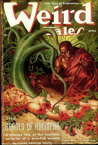
Thus Clark Ashton Smith in The Garden of Adompha, one of the stories in the author’s Zothique cycle which was first published in Weird Tales in April, 1938. Zothique was Smith’s contribution to the Dying Earth subgenre, sixteen stories set on the last continent in the final days of the Earth, and a home to no end of sorcery and cruelty. I’ve always enjoyed this subgenre, especially in the hands of Jack Vance whose later Dying Earth stories show the influence of Zothique, so these are some of my favourites among Smith’s prodigious output. The Garden of Adompha is a particularly grotesque piece, concerning the sequestered garden of the title to which King Adompha has undesirables removed. Once there his wizard, Dwerulas, drugs the victims and grafts parts of their bodies to the garden’s hothouse plants. Virgil Finlay’s cover painting downplays the horror somewhat, and Dwerulas’s supine prey, Thuloneah, looks like a very typical American girl, but then for a story that reads like a pulp equivalent of Octave Mirbeau it’s surprising it made the cover at all.

adompha2.jpg

Re-reading some of Smith’s stories over the past week, The Garden of Adompha among them, there’s been the additional pleasure of searching for illustrations from their original publication. I knew that Virgil Finlay had painted this cover, one of the few cover features Smith received from Weird Tales, but Alistair Durie’s Weird Tales (1979) collection only has a monochrome reproduction. The always reliable Golden Age Comic Book Stories not only has a copy of Finlay’s original painting but also the interior illustration which looks like a litho drawing rather than the artist’s more usual scratchboard. The most recent book collection featuring the story was The Collected Fantasies Of Clark Ashton Smith Volume 5: The Last Hieroglyph (2010) from Night Shade Books. (I would have linked to the publisher’s page but their site seems to be broken.)

Update: Golden Age Comic Book Stories changed its name then vanished altogether. The picture links here have been updated.

adompha3.jpg

Previously on { feuilleton }
• Vathek illustrated
• The Vengeance of Nitocris
• The House of Orchids by George Sterling
• Haschisch Hallucinations by HE Gowers
• Odes and Sonnets by Clark Ashton Smith
• The King in Yellow
• Clark Ashton Smith book covers

De Profundis

deprofundis.jpg

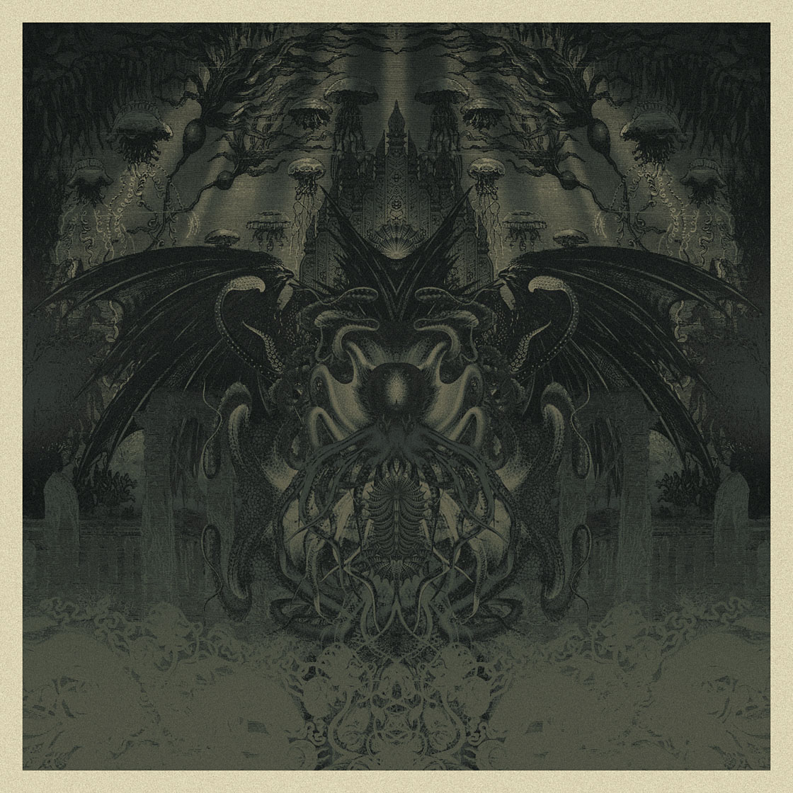
De Profundis (2012).

The title is nothing to do with Oscar Wilde’s famous epistle from prison, but then that should be obvious looking at my latest piece of tenebrous artwork. “De Profundis” means “From the depths” which in this case is applied to another piece with a Cthulhu theme. I made a decision earlier this year that my calendar design for 2013 would comprise a collection of all my Cthulhu portraits to date, from The Call of Cthulhu on. I didn’t have 12 pictures, however, so I’m currently making up the numbers between other jobs. This is the first completed piece which steals a background from the illustrations by Alphonse de Neuville and Édouard Riou for Jules Verne’s Twenty Thousand Leagues Under the Sea (1871). The voyagers in the Nautilus encountered some fearsome creatures but nothing quite like this. I can’t say at the moment when the calendar will be ready but I’m hoping to have it finished before the end of the month.

Elsewhere on { feuilleton }
• The Lovecraft archive

Weekend links 122

jackson.jpg

Transmitter Crowbar Discharge Unit, Bates Linear Accelerator. Photo by Daniel Jackson from his Dark Machines series.

The language we use for writing about art is oddly pornographic: We know it when we see it. No one would deny its distinctiveness. Yet efforts to define it inevitably produce squeamishness, as if describing the object too precisely might reveal one’s particular, perhaps peculiar, investments in it. Let us now break that unspoken rule and describe the linguistic features of IAE in some detail.

IAE has a distinctive lexicon: aporia, radically, space, proposition, biopolitical, tension, transversal, autonomy. An artist’s work inevitably interrogates, questions, encodes, transforms, subverts, imbricates, displaces—though often it doesn’t do these things so much as it serves to, functions to, or seems to (or might seem to) do these things. IAE rebukes English for its lack of nouns: Visual becomes visuality, global becomes globality, potential becomes potentiality, experience becomes…experiencability. […] Whatever the content, the aim is to sound to the art world like someone worth listening to, by adopting an approximation of its elite language.

International Art English by Alix Rule & David Levine

For years I’ve been calling it Artspeak: the frequently disingenuous, misleading or merely confused jargon that passes for descriptive writing in the art world. Alix Rule and David Levine apply the more neutral label of International Art English. In a lengthy essay at Triplecanopy they reveal the origins of IAE’s terminology and show why the stuff has spread like semantic kudzu.

• “What a bizarre focal point Anish Kapoor’s spiral callipers are: a Laocoönian observation platform strangled in red steel at a cost of many millions, while electricity pylons, with their austere elegance, once hymned by the poets of the 1930s, have been removed, at enormous cost, from the same site to be buried in the radioactive tilth of landfill dumps and industrial detritus.” Iain Sinclair reports on the Olympics.

• Alfred Kubin in…Nottingham! The Other Side, an exhibition of “haunting drawings of death, trauma and fantastical creatures inhabiting imaginary worlds”, running to the end of September.

• Francis Ford Coppola and Stewart Copeland discuss the making of Rumble Fish (1982). Over at The Rumpus there’s Coppola talking about his career and his latest film, TWIXT.

• Eraserhead: The Making of a Cult Classic. In the 1980s Kenneth George Godwin interviewed everyone responsible for making David Lynch’s film. Fascinating reading.

• Skin Job, the debut poetry collection by Evan J. Peterson, is twenty-one poems about monsters, horror, and science fiction. Evan made a trailer.

• Wood, brass and “the latest advances in nanotechnology”: Teka, an OLED lamp by Aldo Cibic and Tommaso Corà.

• Tonite Let’s All Make Love in London (1967): Peter Whitehead’s film of the capital at its swinging height.

• “Beam Us Up, Mr. Scott!”: Why Misquotations Catch On by Maria Konnikova.

• Hari Kunzru‘s ten favourite books about underground London.

• The Periodic Table of Heavy Metals.

• Alan Garner: A life in books.

• Fuck yeah, manuscripts!

• (HR) Giger Counter.

• This week was all about Vangelis in the 1970s: Creation du Monde (1973) | Spiral (1977) | Himalaya / Summit (1979).

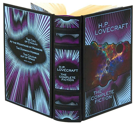
H.P. Lovecraft: The Complete Fiction

lovecraft1.jpg

Illustration by Sven Geier, design by Jo Obarowski and Rebecca Lysen.

HP Lovecraft would have been as surprised as anyone if he could have witnessed the tremendous posthumous triumph he and his work have achieved.

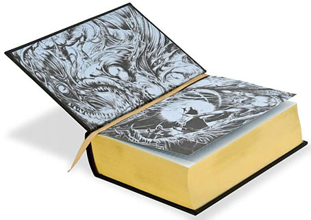
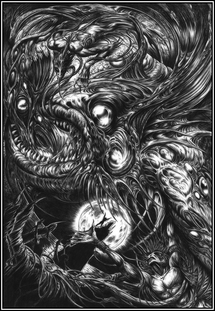
Thus leading Lovecraft biographer and scholar ST Joshi in the introduction to this suitably monstrous book. H.P. Lovecraft: The Complete Fiction was published in a new edition last year after first appearing in 2008 as part of Barnes & Noble’s Leatherbound Classics Series. My drawing of Dagon from 1999 adorns the silvered endpapers, and the reason for this belated mention is because I was only sent copies this week after moaning about not having seen a copy in a Tor.com post about the series. In truth the oversight was partly my own fault: one hazard of this line of work is that artwork is requested months (or even years) in advance of publication, so if the work in question is a reprint it’s easy to forget all about it as you get involved with other things.

lovecraft2.jpg

So anyway, this is a handsome volume of over a thousand pages, not quite leather, it’s more of a leatherette with the design blocked into it. Sven Geier’s cosmic illustration has been given an iridescent finish, and the copies I was sent have metallic silver on the edges as well as a purple ribbon which makes a better match with the colour scheme. The contents comprise all of Lovecraft’s solo fiction (no collaborations, in other words) from the juvenilia through to the non-fiction of his Supernatural Horror in Literature essay. In addition to the introduction there’s a short note from ST Joshi for each story. Needless to say, I’m very pleased to be associated with Lovecraft’s work in this way.

Anyone considered buying a copy should note that the book is currently cheaper at B&N than at Amazon. Also, complaints about typos would appear to apply to the earlier edition although I’ve not had a chance to read any of the stories.

My Dagon picture below appears here larger than it has done before. The drawing was done with a Biro pen, something I’ve always liked using, then tweaked slightly in Photoshop to blur the lines a little and bring out the highlights. I’m not sure now the tweaking was necessary so I may dig out the original at some point to see how it compares.

dagon.jpg

Dagon (1999) by John Coulthart.

Elsewhere on { feuilleton }
• The Lovecraft archive

The art of Ismael Álvarez

alvarez1.jpg

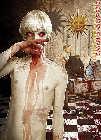
Sangre Virgen.

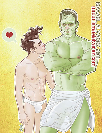
Yeah, trust me to pick the gore-drenched teen out of a gallery of otherwise wholesome drawings… Ismael Álvarez is a Spanish artist with a nice clean line, a sense of humour and an imagination that can encompass comic imagery like the pictures below or run to full-on erotica. Of the latter there’s a separate gallery replete with the Enormous Cocks that now seem de rigueur for a certain kind of gay art in the same way that Enormous Breasts are a feature of much straight erotica. I’m not complaining—heaven forbid!—merely acknowledging a trend. In addition to his art, Señor Alvarez also maintains a blog and creates his own YouTube broadcasts, all of which are of course in Spanish.

alvarez2.jpg

My boy is a monster (cock).

alvarez3.jpg

Oh My Cock.

Elsewhere on { feuilleton }
• The gay artists archive