Bergling’s Art Alphabets

bergling02.jpg

Old type catalogues seldom contain any unusual typefaces so you have to look to craft books for original letterforms. Art Alphabets and Lettering (1914) is an American book for artists and sign painters written and designed by JM Bergling which contains several pages of novel designs among its more familiar typefaces. Bergling evidently had a flair for alphabet design, there are more unique examples here than you’d usually find in a book of this kind, and Bergling’s letterforms are consistently stylish and inventive. In addition to providing a number of spiky variants on the Art Nouveau style (which by 1914 was going out of fashion), he also found time to draw his own version of a 19th-century staple, the Rustic Alphabet. There are two copies of the book at the Internet Archive: a complete one and an incomplete one, the latter volume possibly being a later printing since it contains a number of pages not included in the former.

bergling01.jpg

bergling03.jpg

bergling04.jpg

bergling05.jpg

Continue reading “Bergling’s Art Alphabets”

Robot Artists and Black Swans

robotartists.jpg

Four years ago I designed and illustrated a book for Tachyon written by Bruce Sterling, Pirate Utopia. Robot Artists and Black Swans is a kind of sequel, being the work of the same author for the same publisher, and with a similar geographical focus on southern Europe. The new book differs from the earlier one by being a collection of stories rather than a single piece, many of which are set in or near the city of Turin where Sterling and his wife, Jasmina Tesanovic, spend much of their time. Sterling has been living in Europe for many years, long enough to have cultivated an alter-ego, Bruno Argento, an Italian science-fiction writer who is offered as the real author of the stories in Robot Artists and Black Swans.

Pirate Utopia was an easy book to design because of the Futurist theme which I illustrated by adapting graphics by artist and designer Fortunato Depero. For the cover of the new volume I considered trying something similar with another Italian artist/designer, Franco Grignani (1980–1999). In addition to having studied in Turin, Grignani was commissioned by David Pelham to create cover art for a handful of Penguin science fiction titles in the late 1960s. Much of Grignani’s artwork is heavily indebted to the Op Art style popularised by Bridget Riley and Victor Vasarely, especially the early Riley formula of dazzling arrangements of parallel lines, a formula he made his own after Riley’s work evolved in other directions. Despite these favourable qualities, Grignani’s art proved too abstract for my purposes, and for Tachyon’s who wanted something more illustrative, so I ended up co-opting a very different Italian artist/designer, Leonardo da Vinci. The figure of Da Vinci’s Vitruvian Man has been parodied and pastiched many times so this isn’t remotely original (I’ve also used the original drawing on a pastiche book cover I designed for the Lambshead Disease Guide), but making the figure a robot was a convenient way of combining the title with Italian history. One of the stories in the collection, Pilgrims of the Round World, concerns the inhabitants of Turin during the Renaissance years, and mentions Leonardo (or “the Vinci boy”) several times, so the figure does have some actual relevance beyond being recognisably Italian. The background is, of course, the city of Turin given a slightly futuristic tweak, although it’s more Turinesque than a match for the place itself.

As usual, I’ll save discussion of the book’s interior until after publication which will be in March, 2021. Watch this spacetime.

Previously on { feuilleton }
Pirate Utopia by Bruce Sterling
Futurismo!

Jodorowsky times three, or The box that never was

jodorowsky1.jpg

The first three feature films by Alejandro Jodorowsky—Fando y Lis, El Topo and The Holy Mountain—are released this week on Region B blu-ray by Arrow Video, but the box they’re packaged in won’t look like any of the designs shown here. It was almost three years ago that Arrow asked me to create something for this box set, but backstage wrangles meant the project moved out of my hands in the early stages. This was a great disappointment since Jodorowsky’s interests and aesthetics align with my own much more than many other directors whose work has been released by Arrow. And having written the notes for the Arrow release of Henri-Georges Clouzot’s The Mystery of Picasso, I was looking forward to working with the company again.

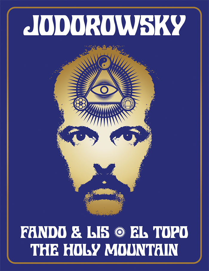
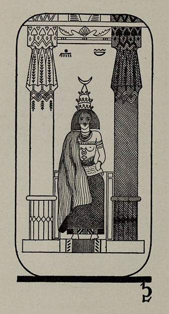
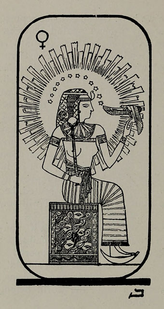
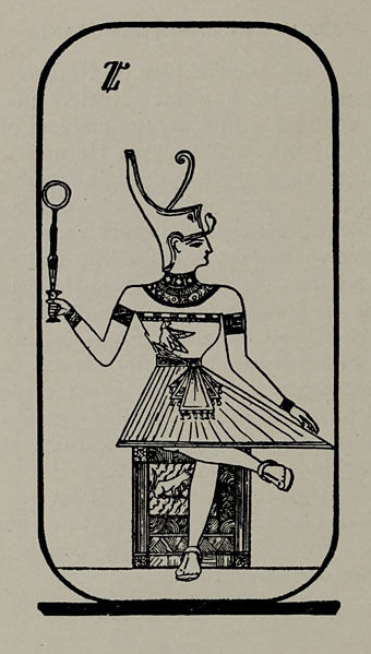
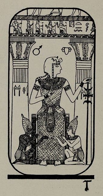
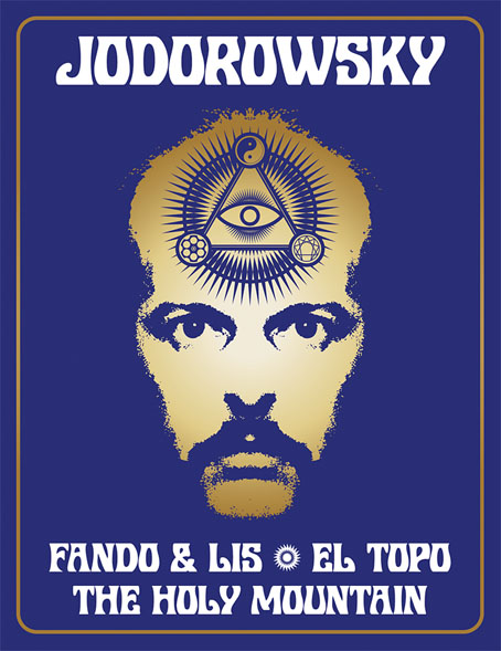
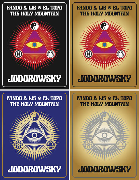
In preparation for the work I rewatched almost all of Jodorowsky’s films (I still haven’t seen Tusk or The Rainbow Thief), then drew up a detailed proposal with sketches, something I seldom do for commissions. Arrow releases all have double-sided inserts in the boxes that hold the discs, one side of which shows a poster design from the film’s original release, the other a new design. My idea for the new art was to connect the three films using Tarot-like iconography (the director is a Tarot scholar, among other things), with each film also being assigned a symbol of some kind. The Surrealist fable of Fando y Lis lacks any suitable graphics so for this I chose a yin and yang symbol to represent the film’s opposed-yet-connected brother and sister characters; El Topo was to be represented by a cross-section through a revolver chamber, while the seven characters from The Holy Mountain are represented by the enneagram that Jodorowsky himself wears in the film. All three symbols are connected by the eye-in-a-triangle from El Topo, a symbol that worked while a three-film box was being planned but which wouldn’t have worked for the final release which adds Jodorowsky’s most recent film, Psychomagic, A Healing Art. For the box design I suggested metallic inks (or foils) either as highlights or in other combinations. The font was a further suggestion, Roberta being one of the typefaces of the occult revival of the 1970s. The art for each film didn’t go further than the sketch stage although I was asked to work up the El Topo design into a final piece; I wasn’t very satisfied with the end result so it isn’t posted here. One problem with the extended negotiations was they were taking place at a time when I was extremely busy with other projects, including contracted illustration work for Editorial Alma. There was no contract for the Arrow commission so it had to take second place even though it was the work I most wanted to be concentrating on at the time. Collisions such as these are an occupational hazard when you’re working freelance.

jodorowsky2.jpg

As things turned out the stumbling block wasn’t my art and design suggestions (which Arrow liked) but the parties described in communications as “the rights-holders”. These individuals apparently disliked the Arrow Video aesthetic and wanted something more directly connected with the films, preferably photographic material which is what you now see on the discs and the box art. It should be emphasised that the rights-holders are not the director, whose wishes for the presentation of his work were never part of the discussion. Given the previous activities of the rights-holders we should probably be grateful that the first three films have been reissued at all. For details of Jodorowsky’s difficulties with one rights-holder in particular, see this interview by Jay Babcock.

On the upside (there is one!), the box set is a typically high-quality Arrow release, with new transfers of the films approved by the director. The bonuses include Jodorowsky’s short films (including his explanation of Tarot symbolism), Louis Mouchet’s feature-length documentary, La Constellation Jodorowsky (1994), soundtrack CDs of El Topo and The Holy Mountain, a small poster and set of postcards, and a substantial booklet. In the end the most important thing is that the films are available for home viewing once again, not their exterior decoration.

Previously on { feuilleton }
Fabulas Panicas by Jodorowsky
• Alejandro Jodorowsky’s Dune
• Jodorowsky on DVD

Weekend links 531

miller.jpg

Cover art by Ian Miller, 1979.

• Ray Bradbury was born 100 years ago today. Emily Temple expresses surprise that Truman Capote encouraged the publication of a Bradbury short story at Mademoiselle in 1946. I’m more surprised that Bradbury was paid $400 for his work; no wonder he was so eager to write for the non-genre magazines. Elsewhere: Ray Bradbury—The Illustrated Man: the BBC’s Omnibus arts strand profiled Bradbury in 1980 with enthusiastic assistance (narrating/reading/performing) from the man himself; Ray Bradbury book and magazine covers at Flickr.

Anna Smith asks whether Linda Fiorentino was the greatest femme fatale ever in The Last Seduction (1994). A substantial claim, especially for a neo-noir playing so self-consciously with the theme, but it’s a very good film, and one I’d like to see again.

• “Bad as a work of art, and morally bad…” Vladimir Nabokov’s Lolita being reviewed by Kingsley Amis, a writer who preferred the peerless prose and stainless morals of Ian Fleming. Dan Sheehan looks at other contemporary reactions to Nabokov’s novel.

• At Dennis Cooper’s: Mary Ellen Bute Day, and (how could I avoid it?) ClicketyClack presents…Brothers Quay Day.

• More from The Art of the Occult: S. Elizabeth offers a glimpse of the contents of her forthcoming book.

• Make the letter bigger: John Boardley on the development of the illuminated capital.

• In 1987 Anne Billson talked to Nicolas Roeg about his latest film, Castaway.

• Five controversial arthouse features from Japanese filmmaker Sion Sono.

• It’s that group again: Joe Banks on the strange world of Hawkwind.

C82: Works of Nicholas Rougeux.

Fahrenheit 451 (1982) by Hawkwind | Something Wicked This Way Comes (1996) by Barry Adamson | The Martian Chronicles (2007) by Dimension X

The Egyptian Tarot

tarot01.jpg

I: The Magus

While looking at Tarot designs for work purposes (again) I remembered a book I used to own that demonstrated the symbolism of the Major Arcana by using side-by-side comparisons of cards from the more well-known decks: the Tarot de Marseille, Aleister Crowley’s Thoth deck, the Rider-Waite-Smith cards, and so on. One of the decks shown wasn’t so familiar, a 19th-century design that purported to depict the Ancient Egyptian figures from which the modern Tarot is derived. Like much occult history, this is an invention but I liked the look of the cards with their simple line drawings and clever matching of Egyptian motifs with the traditional symbols. My book was borrowed years ago and never returned (the second Tarot book I’ve had this happen to; don’t lend people your Tarot books!), so I couldn’t look for a reference, but this account of the history of the so-called Egyptian Tarot supplies all the relevant details and more.

tarot02.jpg

II: The Gate of the Sanctuary

The examples shown here are from Practical Astrology (1901), a book by Edgar de Valcourt-Vermont writing under the preposterous pseudonym “Comte C. de Saint Germain” (a real person, albeit dead by 1901, with a long history of appropriation by writers and charlatans). The drawings are reworkings of the first appearance of the Egyptian designs in an earlier book, Les XXII Lames Hermètiques du Tarot Divinatoire (1896) by R. Falconnier, the drawings there being the work of one M.O. Wegener. In addition to copying the designs Valcourt-Vermont filled out the set with a Minor Arcana of his own devising that looks distinctly amateurish next to the Wegener set. Since then the cards have continued to evolve, a more recent version being the Ibis Tarot which colours the drawings in a manner that doesn’t really suit this type of art. The cards shown in my errant book were memorable in part because they stood out from their vividly-coloured counterparts.

tarot03.jpg

III: Isis-Urania

It’s good to see these again, and also surprising to discover a further detail, that the Wegener drawings had been based on descriptions by Paul Christian in another occult study, Histoire de la Magie (1870). Christian’s book was the subject of a previous post for also being the source of an illustration of a witches’ sabbat that turns up all over the place, usually without credit. Not for the first time, the occult world is smaller than it seems.

tarot04.jpg

IV: The Cubic Stone

Wikipedia has copies of the drawings from the Falconnier book which may also be seen at Gallica, although the copy I found there was incomplete. The Valcourt-Vermont designs were published as a complete deck, The Egyptian Tarot, by Müller in 1978.

tarot05.jpg

V: Master of the Arcanes

Continue reading “The Egyptian Tarot”