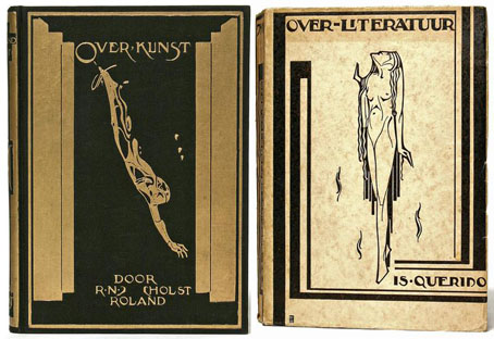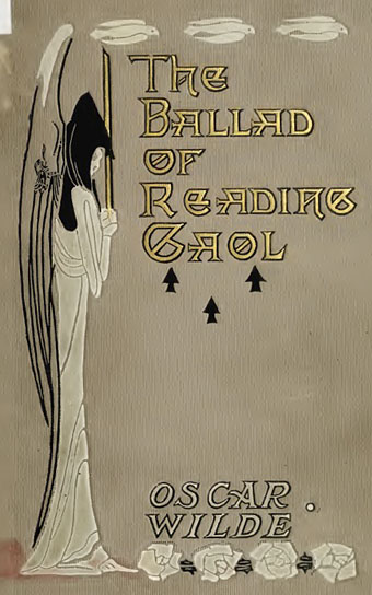
The Ballad of Reading Gaol (1907).
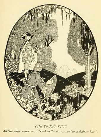
I finished reading Neil McKenna’s excellent biography recently, The Secret Life of Oscar Wilde, a book which makes an ideal companion to Richard Ellmann’s 1987 life of Wilde. Whilst reading about the two trials I remembered that among five pages of digitised Wilde volumes at the Internet Archive there’s a 1906 book, The Trial of Oscar Wilde: From the Shorthand Reports whose contents are what you’d expect from the title. Browsing through the other files there revealed further items of note such as this edition of The Ballad of Reading Gaol published a year later and illustrated throughout by J Latimer Wilson. The page layout of text plus a narrow picture is uncommon, and from the date of publication it’s interesting to see that despite Wilde’s shattered reputation there was still money to be made printing his books.
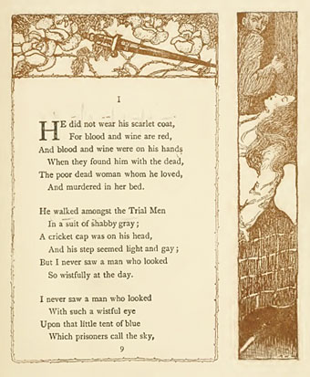
The Ballad of Reading Gaol (1907).
Among the other volumes are two finely illustrated editions of his short stories. The edition of A House of Pomegranates below comes with drawings by Ben Kutcher, an artist about whom I know nothing other than his style is very similar to that of the great Harry Clarke. The introduction is a surprise, a serious appraisal of Wilde’s life by HL Mencken who admired the way the author stood against the prevailing morality of the day. There’s also an edition of The Happy Prince and Other Tales from 1920 illustrated by Charles Robinson.
The House of Pomegranates (1918).
These books are mainly of note for their decoration, however. Of more interest to Wilde enthusiasts is a first edition of Robert Hichens’ The Green Carnation from 1894. Hichens was a friend of Wilde and Lord Alfred Douglas and, according to McKenna’s book, a fellow Uranian (ie: gay) who knew the pair well enough to be able to pen a scandalous roman à clef based on their relationship, helping to confirm for public opinion much that was suspected about Wilde’s outrageous lifestyle. Both Wilde and Douglas disowned Hichens and repudiated the novel but, coming a year before the Queensbury libel trial, it did neither of them any favours. Those curious to read the exploits of “Esmé Amarinth” and “Lord Reginald Hastings” may download a copy here.
Elsewhere on { feuilleton }
• The Oscar Wilde archive
• The book covers archive
• The illustrators archive