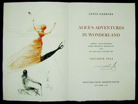
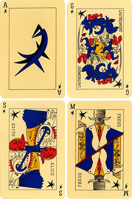
Shared Worlds is a fantasy writing-oriented summer camp for teenagers created by Jeremy Jones and Jeff VanderMeer, and hosted at Wofford College, South Carolina. Jeff asked me to design a small booklet to be printed at the end of this year’s activities as a means of showcasing examples of the writings produced during the various events. He’s posted photos of the printed booklets, including pictures of the young authors autographing pages for each other, and should be writing more about Shared Worlds later.
Category: {design}
Design
Digital alchemy
Methodus scientiarum by Girolamo Brisiani (1588).
A work-related search for lettering designs by calligrapher Johann Neudörffer led me to the Munich Digitisation Centre, a site dealing with the digitisation and online publication of the holdings of the Bavarian State Library. The catalogue there holds a wealth of very old books and manuscripts which you can either view online or download as PDFs. Most of the works are in German or Latin but I still like to see the page designs even if I can’t read the text. Among their collection they have a large number of the classic works of alchemy. The texts of those are freely available on various alchemy websites but you rarely have the opportunity to examine in detail copies of the original publications. Lots of tasty wood engravings, vignettes and decorated borders.
Coelum Philosophorum Seu De Secretis naturae Liber by Philipp Ulsted (1528).
Elsewhere on { feuilleton }
• The etching and engraving archive
The Fabulous Fifties
Okay, so it’s not all Fifties’ design—the Moog album is from 1974—but these are more choice Flickr postings from a set devoted to album sleeves of the Easy Listening variety. Much of the music would no doubt erode my patience very quickly but there’s some nice (uncredited) design work going on. Viva! Percussion! has a distinct Saul Bass quality while The Sound of Chris Cross looks like something from the Designers Republic 20 years before its time. The Bolero album I picked solely out of shameless nostalgia. My mother used to have this among her collection of light classical albums and I’d completely forgotten about it until today. This recording would have been the first I heard of any of Ravel’s works. My sister and I used to find the cover slightly rude due to the red points on the ends of the model’s steel brassiere.
Lots more great sets at the same Flickr account; go and lose yourself. Thanks to Thom for the tip!
Elsewhere on { feuilleton }
• The album covers archive
Previously on { feuilleton }
• Exotica!
Harry Lachman’s Inferno
Looking at Willy Pogány’s work last week I was reminded that as well as illustrating books he worked in Hollywood for a while as an art director and set designer. Among those jobs was a credit for “Technical staff” on the only film for which director Harry Lachman is remembered today, a curious 1935 melodrama, Dante’s Inferno. This stars Spencer Tracy as a fairground barker whose talent for drawing an audience helps an old showman boost the attendance at his moralising “Dante’s Inferno” attraction.
Entrance to the fairground attraction.
A hubristic rise and fall follows for Tracy, and the film spends much of its running time in routine business and family scenes. What sets it apart is some striking fairground designs (no doubt Pogány’s involvement) and a truly startling self-contained sequence when the old showman describes for Tracy the true nature of the Inferno. This sequence takes Gustave Doré’s celebrated illustrations and brings them to life in a series of atmospheric tableaux which even manage to contain brief glimpses of nudity. Hell, it seems, is the one place you can get away with not wearing any clothes. I’ve read many times that this sequence was borrowed from an earlier silent film, also called Dante’s Inferno, but have yet to come across any definite confirmation. It’s certainly possible since studios at that time treated other films in a very cavalier fashion; when a film was remade the studio would try to buy up and destroy prints of the earlier film. If anyone can point to more information about the origin of the Hell sequence, please leave a comment.
Stone tombs from the Inferno sequence.
If the Inferno sequence wasn’t already stolen in 1935, it works so well that it’s been plundered many times since; Kenneth Anger borrowed shots which he mixed into Inauguration of the Pleasure Dome (1954), Derek Jarman did the same for TG: Psychick Rally in Heaven (1981), and Ken Russell slipped some tinted scenes into Altered States (1980). I tinted the entire sequence red and dumped it into the one-off video accompaniment I made for Alan Moore and Tim Perkins’ stage performance of Angel Passage in 2001; it wouldn’t surprise me if it’s been used elsewhere. As with many of Hollywood’s products, Lachman’s film pretends to condemn prurience—Tracy’s character exploits Hell’s lurid attractions for gain—while revelling in the opportunity to show as much bare flesh as the censors would allow. As with Doré, Lachman’s Inferno seems populated solely by men and women in the peak of physical fitness.
Inevitably, you can see the Inferno sequence on YouTube here and here. The film doesn’t seem to be available on DVD but it’s worth seeking out to watch in full. In addition to the infernal delights, you also get to see 16-year-old Rita Hayworth’s screen debut as a dancer on a cruise ship.
Previously on { feuilleton }
• Willy Pogány’s Lohengrin
• Willy Pogány’s Parsifal
• Maps of the Inferno
• A TV Dante by Tom Phillips and Peter Greenaway
• The art of Lucio Bubacco
• The last circle of the Inferno
• Angels 4: Fallen angels
Science fiction and fantasy covers
Two samples from a great Flickr set of science fiction and fantasy paperback covers. Both these titles were first published in 1976 and, unlike many Flickr postings, this set gives credit to the cover artists where known. The Moorcock book is one of his Elric volumes and while it isn’t a favourite of mine, the painting by Michael Whelan certainly is. Whelan produced several Elric covers in the 1970s of which this is easily the most successful, and one of the few works by any artist after Jim Cawthorn to capture the weird inhumanity of the Melnibonéan.
The Ellison collection, on the other hand is one of his finest, with a wraparound cover by the author’s favourite artists Leo & Diane Dillon. Just last week I completed the interior design for Tachyon’s forthcoming The Very Best of Fantasy & Science Fiction which included among a host of great stories The Deathbird by Harlan Ellison, a remarkable piece of writing and one of the best pieces in the entire book. That’s now gone off to the printer so I’ll be posting samples of the pages here shortly.
Elsewhere on { feuilleton }
• The book covers archive
• The illustrators archive
Previously on { feuilleton }
• Groovy book covers
• Jim Cawthorn, 1929–2008
• Harlan Ellison: Dreams with Sharp Teeth
• Revenant volumes: Bob Haberfield, New Worlds and others