Will Bradley’s Fringilla

bradley1.jpg

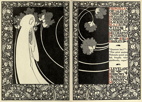
Title spread.

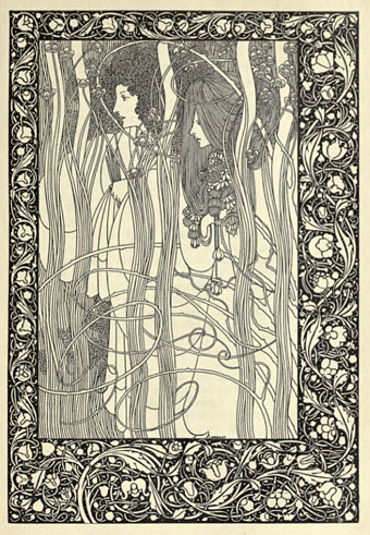
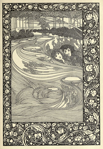
Like Marcus Behmer, another Beardsley follower from the Internet Archive, Will Bradley‘s work has been featured here before and should be familiar to anyone interested in illustrators of the 1890s. As well as being one of the great American illustrators, Bradley was also a very accomplished and successful practitioner of what we now call graphic design, and you see some of his design sensibility at work in these pages which illustrate RD Blackmore’s “tales in verse”, Fringilla (1895). The page borders are in the William Morris style which Beardsley imitated for Le Morte Darthur; Aubrey dropped this kind of heavy decoration when he moved to other books but Bradley made the borders his own for a while, using them in unlikely places such as adverts for that new-fangled transport device, the bicycle.

bradley2.jpg

Pausias and Glycera.

The Internet Archive also has A Booklet of Designs by Bradley, a collection of motifs and very cartoony advertising illustrations from 1914. As art it’s a lot less worthwhile than Frangilla but for anyone interested in early design methods it’s worth a look for the insight it offers into how things were done in the days of scissors and paste.

bradley3.jpg

Kadisha.

Elsewhere on { feuilleton }
• The illustrators archive

Previously on { feuilleton }
• Bradley does Beardsley

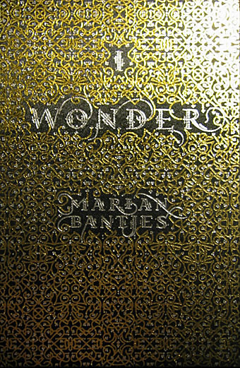
I Wonder by Marian Bantjes

bantjes1.jpg

Book of the year, without a doubt. I only bought this yesterday and it’s been another hectic week so I’ve barely had a chance to look at it, never mind read the thing. What we have is 208 pages of unique creations by one of my favourite graphic designers, Marian Bantjes, in a truly beautiful production from one of my favourite publishers, Thames & Hudson. The text comprises Bantjes’ musings on art, design, decoration, pattern, and her personal development, together with some well-chosen quotes from other writers. I could waste a lot of pixels larding the book with superlatives but you really have to see a copy for yourself, words and pictures do it little justice.
bantjes2.jpg

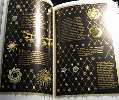
More than anything I’ve seen recently this book is a tactile experience, and yet another volume (that designation which Borges always used to emphasise) which makes a nonsense of the idea of screens as an adequate replacement for all books. The boards are blocked with a gold and silver pattern, the page edges are also blocked in gold and there’s a liberal use of gold ink throughout. There’s so much gold ink on the exterior that leafing through the pages leaves your clothes and fingertips lighted dusted with a glittering residue. As an additional grace note, each volume comes with a length of purple bookmark ribbon.
bantjes3.jpg

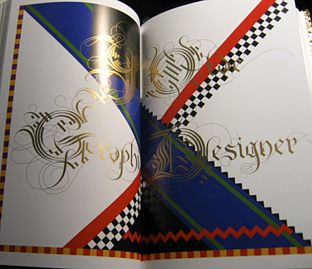
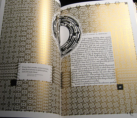
Unlike many monographs from graphic designers this isn’t a “greatest hits” collection (although I’d still buy it if it was), all the layouts were created for the book alone. It’s not all gold ink and florid decoration, there are 21st century designs as well as hand-drawn pieces. And pasta. She doesn’t need a computer or even a pencil, she can work wonders with pieces of dried flour and water. Of the quotes, two stood out following a cursory perusal. The first is a humorous occurrence of the famous “Less is more” from Mies van der Rohe, placed in small type on an otherwise blank page. The second is from Oscar Wilde’s The Critic as Artist (1890):

Still, the art that is frankly decorative is the art to live with. It is, of all our visible arts, the one art that creates in us both mood and temperament. Mere colour, unspoiled by meaning, and unallied with definite form, can speak to the soul in a thousand different ways. The harmony that resides in the delicate proportions of lines and masses becomes mirrored in the mind. The repetitions of pattern give us rest. The marvels of design stir the imagination.

You can have your imagination marvellously stirred for nineteen pounds and ninety-five pence.
bantjes4.jpg

Update: The Bantjes Covers, in which the designer explains how her cover design came together.

Elsewhere on { feuilleton }
• The book covers archive

Previously on { feuilleton }
• T&H: At the Sign of the Dolphin

Weekend links 34

austin.jpg

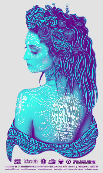
Halloween in Austin, Texas this year will look and sound like this.

• “Blade Runner will prove invincible“: Philip K Dick’s letter of praise to the film’s producers. Related: one of the Blade Runner designers, Syd Mead, has recently styled New York’s Bar Basque and Foodparc.

• “I decided to go into fields where mathematicians would never go because the problems were badly stated…I have played a strange role that none of my students dare to take.” RIP Benoît Mandelbrot.

• Science and poetry: “a richly vexed topic badly in need of rethinking”. Related: Why the Singularity isn’t going to happen.

• In case you missed this week’s earlier announcement, a reminder that I was interviewed at Coilhouse. My vanity: it knows no bounds.

• Franklin Booth’s illustrations for The Flying Islands of the Night (1913) by James Whitcomb Riley.

• On the Verge (1950) by Maurice Sandoz, illustrated by Salvador Dalí. Also this and this.

bowie.jpg

Bowie Sphinx, 1969. Photo by Brian Ward.

• The Laughing Gnostic: David Bowie and the Occult.

• “Moonlighting as a Conjurer of Chemicals“: Isaac Newton’s alchemical interests.

• “A sense of otherness that goes right back“: Alan Garner at Alderley Edge.

• Jimmy’s End—Alan Moore’s new feature film and spin-off TV series.

• A Guide to the New Ruins of Great Britain by Owen Hatherley.

• The It Gets Better Project now has a dedicated website.

• Quicksand (1971) by David Bowie.

Forbidden volumes

house1.jpg

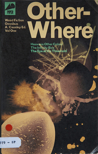
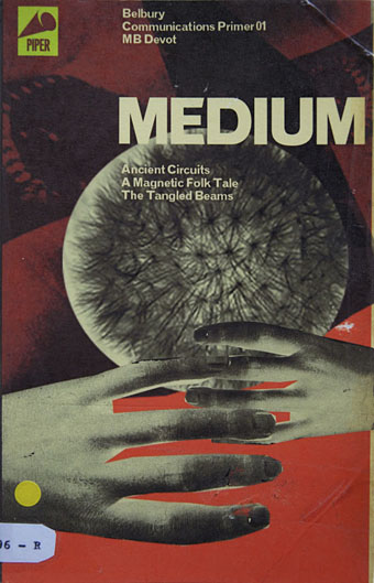
Forbidden in the sense that these books can’t be bought or borrowed from any library other than Borges’ Library of Babel. The designs are by Julian House and can be seen along with other work “exploring memory as trace and fragment” at the Architect’s Gallery, Teddington, UK, until 20th November. Via Belbury Parish Magazine.

house2.jpg

Elsewhere on { feuilleton }
• The book covers archive

Previously on { feuilleton }
• Strange Attractions
• Strange Attractor Salon
• The Séance at Hobs Lane
• Ghost Box

Pavomania

peacock1.jpg

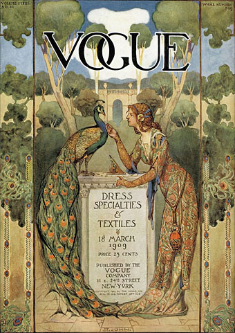
Colour me Mr Popular as I’m interviewed once again, the venue on this occasion being Coilhouse which is a fine place to be featured. My thanks to S. Elizabeth for the indulgence. In the course of our discussion I mentioned The Peacock Obsession, and by coincidence these pages have been receiving links recently from Peacock’s Garden, a site devoted to that ubiquitous fowl. These two pieces can be found there with the Vogue cover being a new one to me. The artist is the great J. Allen St John, better known for his Edgar Rice Burroughs illustrations and distinctive title designs; Golden Age Comic Book Stories has many examples of his work.

peacock2.jpg

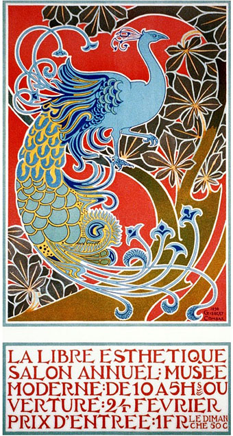
This splendid Art Nouveau poster is by Gisbert Combaz (1869–1941) and those who’ve seen my Dodgem Logic cover may recognise the peacock whose outline I rather shamelessly swiped. Combaz’s poster turns up regularly in Art Nouveau histories but his other work is less visible which is a shame, he has a very bold graphic style and I’d love to see more. Lastly, I’ve linked to this before but it’s worth mentioning again, Seasons of the Peacock at Animalarium which also has Combaz’s poster.

Previously on { feuilleton }
• The Art Nouveau dance goes on forever
• Dodgem Logic #4