Weekend links 723

manrique.jpg

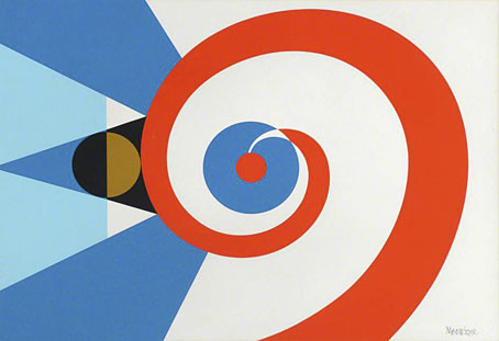
Flags of the Undiscovered Planets: 3 (1985) by César Manrique.

• “That mysterious font is Festive, not Stymie.” Ray Newman goes looking for a typeface that immediately says “Britain in the 1950s”. I used to refer to one of its relatives as “the launderette font”, although it was also a common sight on shopfronts, public buildings and other mid-century signage. Today I know it as the slab serif named Profil (aka Decorated 035), although as Newman demonstrates, this is only one of several slab-serif variants popular in the 1950s and 60s.

The Man Who Killed Google Search is a deep dive by Ed Zitron into why Google’s search has turned to shit. I recently changed the search option for all the browsers on my machines to DuckDuckGo. It’s not perfect but it’ll do for now.

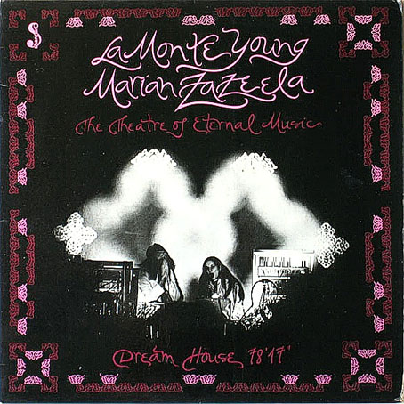
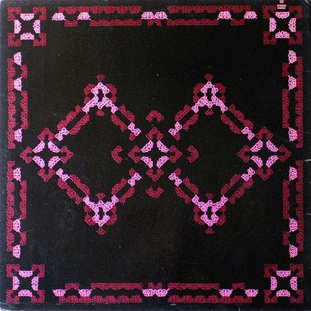
• New music: Daddy’s Gonna Tell You No Lie, music by Sun Ra performed by Laraaji and the Kronos Quartet; Chroma by Loscil / Lawrence English; Homage To Hennix (The Electric Harpsichord Reinterpreted) by Dave Seidel.

• At Colossal: Tune into your own brain waves with Steve Parker’s suspended constellations of salvaged brass.

• At Bajo el Signo de Libra: Caspar David Friedrich (1774–1840): Icono del Romanticismo Alemán.

• At Public Domain Review: Maria Catharina Prestel’s Printed Cabinet of Drawings (ca. 1780s).

• At Unquiet Things: The teeming, tumbling, tangled cosmos of Madeline Von Foerster.

• Mix of the week: A mix for The Wire by FUJI||||||||||TA.

• At Dennis Cooper’s: 77 planetariums.

Planet D (Portishead Remix) (1994) by The Sabres Of Paradise | Planet Munich (1998) by Add N To (X) | Planet Vega (2000) by Air

Weekend links 721

reigl.jpg

Incomparable Pleasure (1952–3) by Judit Reigl.

• Steven Heller’s Font of the Month is Atol. Heller’s other haunt, The Daily Heller, looked this week at the incredible calligraphy and illuminated graphics of Arthur Szyk.

Okashi, an exhibition of Japanese art and photography at the Michael Hoppen Gallery in London. Hoppen talks about the exhibition here.

• At Unquiet Things: A Vibrant Rascality of Shenanigans: The Fantasticalicizm of Anna Mond.

• At Public Domain Review: Signs and Wonders: Celestial Phenomena in 16th-Century Germany.

• New music: Alchemia by Scanner, and Disconnect by KRM And KMRU.

• Mix of the week: Artificial Owl Recordings Mix by Niko Dalagelis.

• At Bandcamp: Jóhann Jóhannsson’s Luminous Sounds.

• DJ Food found some Victor Moscoso poster originals.

• At Dennis Cooper’s: Luis Buñuel Day.

Meow.camera

Alchemistry (1991) by Jon Hassell | Surrealchemist (1992) by Stereolab | Alchemagenta (1996) by Zoviet France

Marian Zazeela album covers

zazeela01.jpg

Drift Study 4:37:40-5:09:50 PM 5 VIII 68 NYC (1968) by La Monte Young.

One of the links at the weekend was to the late Marian Zazeela’s poster designs of the 1960s and 70s. She also designed a number of album covers around the same time, mostly for recordings by her husband, La Monte Young, and for associated groups and individuals like Young’s Theatre of Eternal Music—in which Zazeela played the tambura—and raga master Pandit Pran Nath. Some of the albums shown here haven’t always been easy to find thanks to Young’s refusal to reissue his earlier recordings (although he did relent recently and allow digital reissues), but the music has nevertheless been influential. Artists as diverse as the early Velvet Underground, many electronic musicians, and metal bands such as Earth and Sunn O))) owe debts to Young’s compositions.

zazeela02.jpg

31 VII 69 10:26 – 10:49 PM / 23 VIII 64 2:50:45 – 3:11 AM The Volga Delta (1969) by La Monte Young / Marian Zazeela.

This is about Marian Zazeela’s cover designs, however, not her husband’s music, designs which are immediately recognisable for Zazeela’s calligraphy and the abstract decorative elements which resemble tiles or fabric prints. The calligraphy is the consistent element, present even when the cover is mostly photographic. This degree of consistent aesthetic attention is unusual in the world of avant-garde composition where the packaging of a composer’s recordings is often little better than the perfunctory appearance of classical albums. Without Marian Zazeela’s involvement it’s unlikely that La Monte Young’s albums would look as good as they do.

zazeela03.jpg

Ragas (1971) by Pandit Pran Nath.

zazeela04.jpg

Dream House 78’17” (1974) by La Monte Young, Marian Zazeela, The Theatre Of Eternal Music (front cover).

zazeela05.jpg

Dream House 78’17” (1974) by La Monte Young, Marian Zazeela, The Theatre Of Eternal Music (back cover).

Continue reading “Marian Zazeela album covers”

Weekend links 720

moreau.jpg

The Poet and the Siren (1893) by Gustave Moreau.

• “Some books become talismans. Because they are strange, wildly different to the common run of literature; because they are scarce, and only a few precious copies are known to exist; because, perhaps, they liberate by transgressing the moral limits of the day; because their authors are lonely, elusive visionaries; because, sometimes, there is an inexplicable glamour about the book, so that its readers seem to be lured into a preternatural reverie. This book possesses all those attributes.” Mark Valentine in an introduction he wrote for a 1997 reprint of The Book of Jade (1901) by David Park Barnitz. The book’s author was an American writer who died at the age of 23 after publishing this single volume, a collection of poetry inspired by his favourite Decadent writers. Praise from HP Lovecraft, Clark Ashton Smith and Thomas Ligotti has since helped maintain the book’s reputation. The Book of Jade turned up recently at Standard Ebooks, the home of free, high-quality, public-domain texts. Also the home of an increasingly eclectic list of publications.

• At n+1: The Dam and the Bomb by Walker Mimms, a fascinating essay about the entangling of Cormac McCarthy’s personal history with his novels which makes a few connections I didn’t expect to see. Also a reminder that I’ve yet to read McCarthy’s last two books. Soon…

• The latest installation from teamLab is Resonating Life which Continues to Stand, an avenue of illuminated eggs on the Hong Kong waterfront.

• At The Wire: Symphony of sirens: an interview with Aura Satz, David Toop, Elaine Mitchener, Evelyn Glennie and Raven Chacon.

• At Unquiet Things: The Art of Darkness presents The Sleeper May Awaken: Stephen Mackey’s Unrestful Realms.

• RIP Marian Zazeela. There’s a page here with a selection of her beautiful calligraphic poster designs.

• At Spoon & Tamago: Tomona Matsukawa’s realistic paintings reconstruct fragments of everyday life.

• At Public Domain Review: Thom Sliwowski on The Defenestrations of Prague (1419–1997).

Trinity (2024), a short film by Thomas Blanchard. There’s a lot more at his YouTube channel.

• At Dennis Cooper’s: Lotte Reiniger’s Day.

Sirens (1984) by Michael Stearns | Sirens (1988) by Daniel Lanois & Brian Eno | Siren Song (2009) by Bat For Lashes

The groovy video look

strfkr1.jpg

Under Water/In Air.

This recently-released video for Under Water/In Air by Starfucker (or STRFKR, as they often have to style themselves) is an animated production by Edward Carvalho-Monaghan, an artist whose visuals may be seen to similar effect in an earlier animation for Starfucker’s Armatron. Carvalho-Monaghan’s artwork has appeared on a number of the group’s record sleeves, including the latest album, Parallel Realms, which combines a Surrealist dose of the visual style that I refer to as the groovy look with the kind of impossible architecture popularised by MC Escher. Armatron, meanwhile, features more architecture in what may be borrowings from Giorgio de Chirico.

strfkr2.jpg

Armatron.

I lost interest in music videos years ago, I’d much rather listen to the music than have to experience it as a soundtrack to some director’s attempt to illustrate a song with visual novelty. But animated music videos are easier to take, in part because the pairing of animation with music goes back to the earliest days of the medium. The Starfucker videos have had me wondering how much video or animation might suit the “groovy” definition if you went looking for it. And by this I mean following the limits defined by my earlier post which is predominantly concerned with heavy outlines and flat, bold colours rather than quasi-psychedelic effects. I don’t have the time just now to start searching for other examples but The Beatles’ Yellow Submarine is the Ur-text in this department, and the film’s influence may be found in both Carvalho-Monaghan animations.

air.jpg

Sing, Sang, Sung.

One other music video that does come to mind is for Sing, Sang, Sung by Air, directed by Mrzyk & Moriceau. The colour palette is desaturated but the rest of the graphics are definitely in the groovy zone, with the video as a whole coming across like a Surrealist take on those endlessly scrolling, mutating computer games. When the black ball reaches its destination you’re tempted to watch it all again.

(Under Water/In Air tip via Scotto Moore’s This Newsletter Cannot Save You.)

Previously on { feuilleton }
The groovy look
Tadanori Yokoo animations