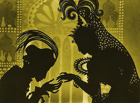
A still from The Adventures of Prince Achmed (1926), a feature-length animated film by Lotte Reiniger.
• Hélice 39 is a speculative-fiction journal (in Spanish) whose current issue includes an article by Marcelo Sanchez: “What did Borges think of Lovecraft?”
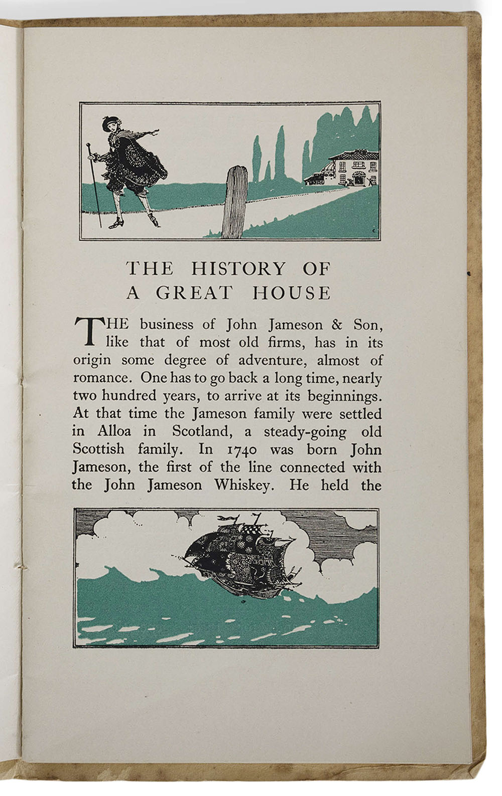
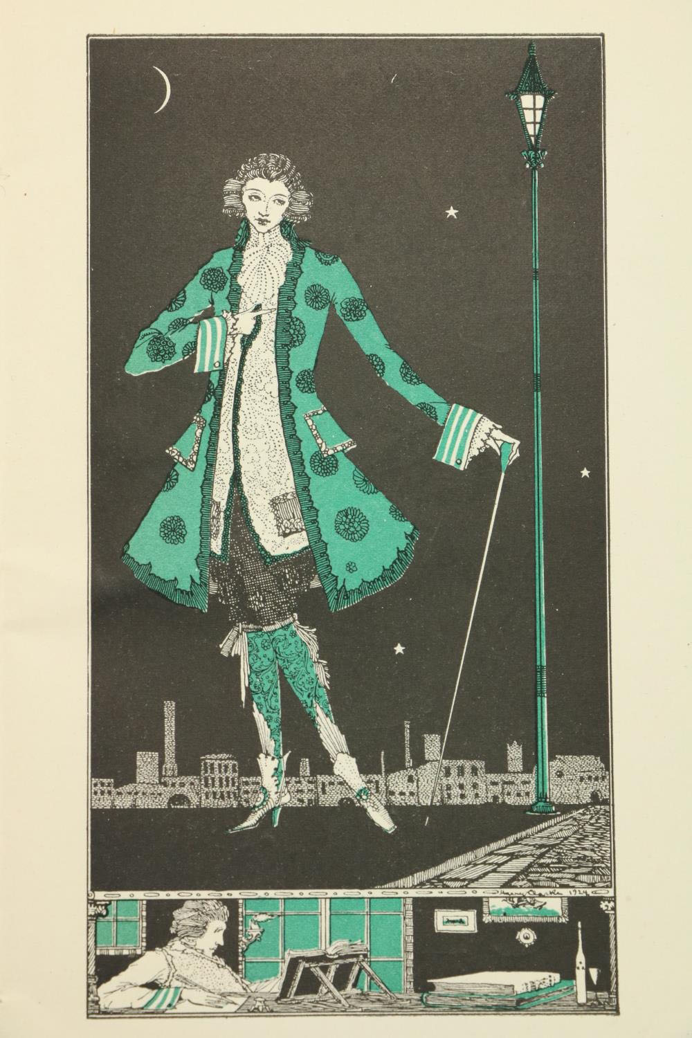
• Among the new titles at Standard Ebooks, the home of free, high-quality, public-domain texts: The Maltese Falcon by Dashiell Hammett.
• Old music: Hydrophony For Dagon by Max Eastley & Michael Prime; The Adventures Of Prince Achmed by Morricone Youth.
• Public Domain Review lists some of the writers whose works will enter the public domain this year.
• “Modern Japanese Printmakers celebrates vibrant mid-20th-century innovation“.
• At Nautilus: “Here’s what’s happening in the brain when you’re improvising.”
• At the BFI: Pamela Hutchinson selects 10 great films of 1926.
• New music: The Future Is Now by Pietro Zollo.
• At Dennis Cooper’s: Phil Solomon Day.
• 2026 is the Year of the Fire Horse.
• Runaway Horses (“poetry written with a splash of blood”) (1985) by Philip Glass | Unicorns Were Horses (1996) by New Kingdom | Red Horse (2002) by Jack Rose