
Reverbstorm: Bauhaus Horror

reverbstorm1.jpg

Lord Horror (after Klaus Barthelmess).

(No, not Pete Murphy and co.) Now that the Reverbstorm book is at the printers I have an excuse to discuss a few of the art and design appropriations that run through the narrative. I wanted to use some Bauhaus-style design back in the early 1990s when we were putting the first of the comic issues together but that idea got buried under conflicting demands and the need to actually finish all the drawing. It was only when I started designing the opening pages in 2008 that I was able to return to some of the original intentions. There were two reasons for this choice: one was that the minimalist graphics of the Bauhaus style worked well in black-and-white, and also provided an effective counterpoint to the very dense and detailed drawings that followed. The second was that the Bauhaus design school found itself in the early 1930s in opposition to the fascist forces which the figure of Lord Horror represents. (Many of the Bauhaus architects and designers eventually fled Germany for Britain and the United States.) This combination of antagonistic elements yielded another of Reverbstorm‘s collisions of counterposed philosophies and aesthetics.
reverbstorm2.jpg

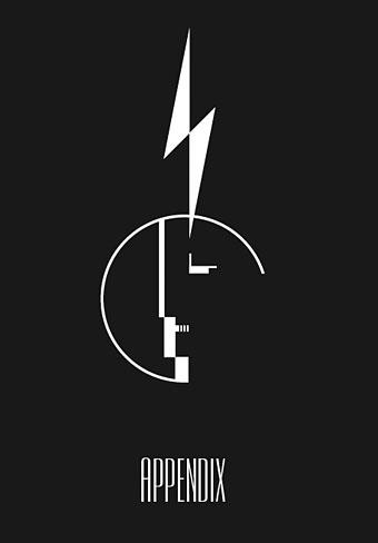
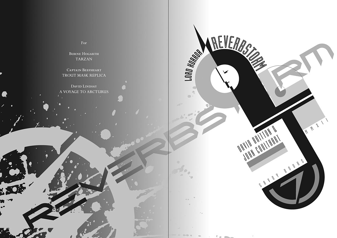
Reverbstorm title page.

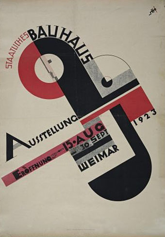
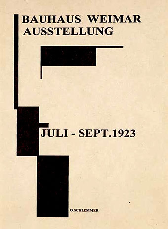
The title page is the most flagrant Bauhaus appropriation, a swipe worthy of Peter Saville at his plundering height. Joost Schmidt’s famous Bauhaus-Ausstellung poster is reworked with a Neville Brody typeface (Industria) and with Oskar Schlemmer’s face logo turned into a scowling profile.

On a typographic note, Industria was used right from the start with Reverbstorm since Brody designed it in the Thatcherite 1980s as a deliberate harking back to the authoritarian 1930s. It also has a very appropriate name. The other typefaces used in the book—Morris Fuller Benton’s Empire and Eric Gill’s Perpetua—date from 1937 and 1928 respectively.
reverbstorm3.jpg

Joost Schmidt (1923).

reverbstorm4.jpg

The reworked Oskar Schlemmer face/logo as it appears on the Appendix page. The lightning flash in Reverbstorm has multiple associations: adapted initially from the symbol used by Oswald Mosley’s British Union of Fascists (a symbol also appropriated at various times by David Bowie and Throbbing Gristle) it can also relate to storms, radio broadcasts and electricity in general. Here it becomes a minimal cipher representing Horror’s outrageous plume of hair.
reverbstorm5.jpg

Oskar Schlemmer (1923).

reverbstorm6.jpg

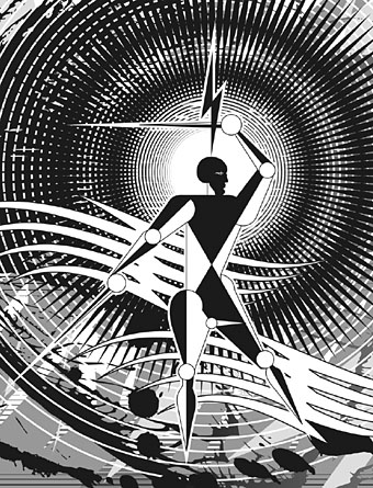
Reverbstorm, part 8.

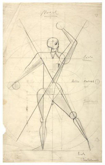
In part 8 of Reverbstorm Horror ends up naked inside “a Soul” (don’t ask), and we see his figure juxtaposed against a series of backgrounds that recapitulate earlier aspects of the narrative. It was always the intention to end the series with a change of style so I did this by creating a kind of digital maquette figure using vector shapes that could be posed in a variety of ways. The origin of the figure was a sketch by Klaus Barthelmess, one of the students in Oskar Schlemmer’s drawing class. The sketch below appeared in a slightly altered form in issue 5 of the original publications but I always felt more could have been done with it: a posable figure turned out to be the perfect solution. By coincidence, while I was working on the final pages, Clive Hicks-Jenkins had been running a maquette exhibition on his blog. I was tempted to offer my example but a combination of too much work and a reluctance to throw Lord Horror’s obscene and reprehensible presence into the mix put paid to that. Besides which, my figure is a digital creation, not a bona fide paper cut-out.
reverbstorm7.jpg

Drawing by Klaus Barthelmess (1922).

For those who want more Bauhaus design, the Barbican in London is currently staging a major exhibition, Bauhaus: Art as Life, that will run throughout the summer.

Previously on { feuilleton }
Reverbstorm: an introduction and preview
Against Nature in New York

huysmans.jpg

I’ve always preferred Against Nature as an English translation of Huysmans’ À rebours, it’s a snappier and more provocative title than Against the Grain which these days might be taken as a prescription for a paleo diet.

À rebours this month is also the title of an art exhibition opening Venus Over Manhattan, a new exhibition space in New York City created by art collector and writer Adam Lindemann:

À rebours at Venus over Manhattan explores the notion of “against the grain” through a selection of more than 50 works including African fetishes. The artists represented range from Odilon Redon – the favorite of the book’s protagonist – to Henri Fuseli, Gustave Moreau, Felicien Rops, Franz von Stuck, Lucas Samaras, William Copley, Jeff Koons, Glenn Brown, Salvador Dalí, Walter Dahn, David Hammons and Bernard Buffet, as well as Jeni Spota, Andra Ursuta and Gavin Kenyon.

A document detailing the exhibits may be downloaded in pdf form here. Few of the works have any direct connection with Huysmans’ novel but there are some book covers there I hadn’t seen before. The exhibition runs to 30th June, 2012. (Thanks to @supervert for the tip.)

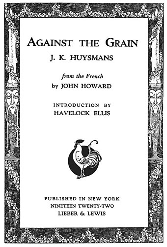
Looking around for some more Huysmans-related imagery turned up the uncredited title page above (the entire book is here), and the following quote from Theophile Gautier which Havelock Ellis uses in his introduction. Gautier was discussing Baudelaire but, as Ellis says, it’s an excellent statement of the principles of Decadence as an artistic concept:

The poet of the Fleurs du Mal loved what is improperly called the style of decadence, and which is nothing else but art arrived at that point of extreme maturity yielded by the slanting suns of aged civilisations: an ingenious complicated style, full of shades and of research, constantly pushing back the boundaries of speech, borrowing from all the technical vocabularies, taking colour from all palettes and notes from all keyboards, struggling to render what is most inexpressible in thought, what is vague and most elusive in the outlines of form, listening to translate the subtle confidence of neurosis, the dying confessions of passion grown depraved, and the strange hallucinations of the obsession which is turning to madness. The style of decadence is the ultimate utterance of the Word, summoned to final expression and driven to its last hiding-place. One may recall in this connection the language of the later Roman Empire, already marbled with the greenness of decomposition, and, so to speak, gamy, and the complicated refinements of the Byzantine School, the last forms of Greek art falling into deliquescence. Such indeed is the necessary and inevitable idiom of peoples and civilisations in which factitious life has replaced natural life, and developed unknown wants in men. It is, besides, no easy thing, this style disdained of pedants, for it expresses new ideas in new forms, and in words which have not yet been heard. Unlike the classic style it admits shadow… One may well imagine that the fourteen hundred words of the Racinian vocabulary scarcely suffice the author who undertakes the laborious task of rendering ideas and things in their infinite complexity and multiple coloration.

Previously on { feuilleton }
À Rebours illustrated
Arthur Zaidenberg’s À Rebours

Weekend links 108

newyorker.jpg

Bob Staake’s cover illustration acknowledges President Obama’s statement last week in favour of gay marriages.

• Related to the above: Gay rights in the US, state by state, an infographic and a useful riposte to people like Orson Scott Card (yes, him again) who claim that gay Americans are equal in everything but the right to marry. On the same theme, “Now Obama’s come out on same-sex marriage, maybe so will I,” says Edmund White (yes, him again), and Eric Berkowitz, author of Sex & Punishment: 4,000 Years of Judging Desire, who writes that “In the period up to roughly the thirteenth century, male bonding ceremonies were performed in churches all over the Mediterranean.”

• The fifth edition of A Humument by Tom Phillips will be published soon by Thames & Hudson. The Tom Phillips website has just been relaunched in a form which now incorporates the notes I made in December about Phillips’ album cover designs.

• The Greenfriars are encouraging people to follow their example and get involved with their local communities (the habits are optional). Kudos for the choice of a Dürer knot.

The action centres on the arrival of a man who may or may not be a prophet, or the devil, or just a violent con-man, in a rotting, rain-drenched Hungarian hamlet. This is the “estate”, apparently some sort of failed collective, where all hope has been lost and all the buildings are falling down. It is inhabited by a cast of semi-crazed inadequates: desperate peasants cack-handedly trying to rip each other off while ogling each other’s wives; a “perpetually drunk” doctor obsessively watching his neighbours; young women trying to sell themselves in a ruined mill; a disabled girl ineptly attempting to kill her cat.

Sátántango by László Krasznahorkai is published in a new translation by George Szirtes

• The Quietus interviewed Kevin Shields following the long-awaited reissue of the My Bloody Valentine catalogue.

• The first volume of Russ Kick’s Graphic Canon (to which I’m a contributor) has been sighted in the wild.

Rise of the Living Type: Stylised 17th century floriated letterforms & grotesque mask sprinkles.

Ed Jansen’s Camera Obscura III, a tour of museums, galleries and venues, 2009–2011.

• io9 reports on the new translation of Roadside Picnic by Arkady & Boris Strugatsky.

Shanghai Expression: Graphic Design in China in the 1920s and 30s.

Liberty Realm, a monograph of drawings by Catharyne Ward.

• 100 mins of Adrian Sherwood‘s best dub productions.

Strange Flowers checked into the Chelsea Hotel.

Chelsea Girls (1967) by Nico | Chelsea Morning (1968) by Fairport Convention | Chelsea Hotel #2, Rufus Wainwright sings Leonard Cohen.

Costume capitals

capital01.jpg

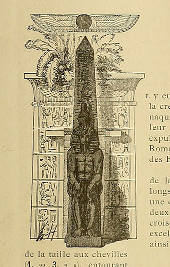
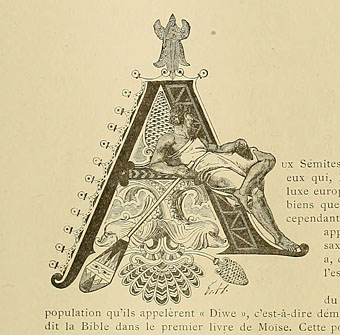
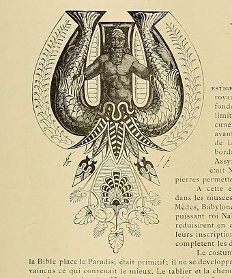
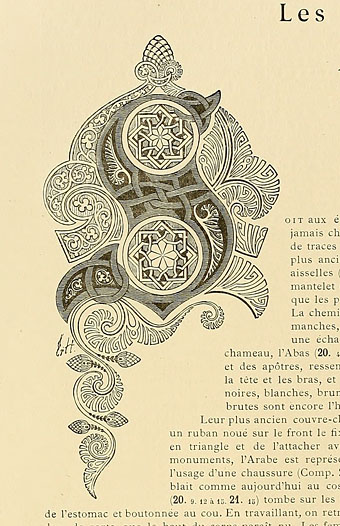
Another gem of a find at the Internet Archive, Le costume, les armes, les bijoux, la céramique, les ustensiles, outils, objets mobiliers, etc. : chez les peuples anciens et modernes (1896) is a lavish two-volume (?) guide to the costumes, artefacts, weapons, etc of various races through the ages. The books were compiled and illustrated by Friedrich Hottenroth (1840–1917) and comprise many detailed coloured plates, but what really caught my attention were the elaborate illuminated capitals used for each of the introductory essays. The common approach in 19th century books is to either have decoration that bears little relation to the content or to apply a single decorative style throughout the book. What’s notable about these designs is the way the style of each letter matches the decorative style of the race or civilisation under discussion. In addition to this feature they’re quite beautifully rendered. The FH initials indicate that they were all Hottenroth’s work. Volume 2 of the set can be found here.

capital02.jpg

capital03.jpg

capital04.jpg

Continue reading “Costume capitals”

Maurice Sendak, 1928–2012

sendak1.jpg

From Zlateh the Goat and Other Stories (1966) by Isaac Bashevis Singer.

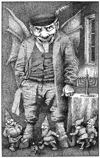
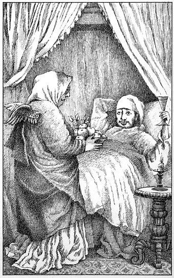
All the obituaries of the late Maurice Sendak have focused inevitably on Where the Wild Things Are. That gives me a chance to draw attention to some less familiar Sendak drawings whose finer crosshatching naturally appeals to an inveterate crosshatcher such as myself. The combination of bold characterisation and dense shading makes these pieces look remarkably similar to Mervyn Peake’s illustrations of the 1940s. Sendak spoke to Nick Meglin about some of the influences on his drawing in The Art of Humorous Illustration (1973). Given what he says here it’s evident that he and Peake (who also admired Cruikshank and Rowlandson) shared antecedents:

Many of the artists who influenced me were illustrators I accidentally came upon. I knew the Grimm’s Fairy Tales illustrated by George Cruikshank. I just went after everything I could put my hands on illustrated by Cruikshank and copied his style. It was quite as simple as that. I wanted to crosshatch the way he did. Then I found Wilhelm Busch and I was off again. But happily Wilhelm Busch also crosshatched so the Cruikshank crosshatching wasn’t entirely wasted. And so an artist grows. I leaned very heavily on these people. I developed taste from these illustrators.

The 1860’s, the great years of the English illustrators from whom so much of my work is derived, are familiarly known as “the sixties” to admirers of Victorian book illustration. The influence of Victorian artists such as George Pinwell and Arthur Hughes, to name just two, is evident in the pictures I created for Higglety Pigglety Pop! (Harper and Row, 1967), Zlateh the Goat (Harper and Row, 1966), and A Kiss for Little Bear (Harper and Row, 1968). And I’ve learned from other English artists as well. Randolph Caldecott gave me my first demonstration of the subtle use of rhythm and structure in a picture book. Hector Protector and As I Went Over the Water (Harper and Row, 1965) is an intentionally contrived homage to this beloved teacher.

sendak2.jpg

From Zlateh the Goat and Other Stories (1966) by Isaac Bashevis Singer.

For other fine points in picture book making, I’ve studied the works of Beatrix Potter and William Nicholson. Nicholson’s The Pirate Twins certainly influenced Where the Wild Things Are (Harper and Row, 1963).

A retrospective of my English passion can be found in Lullabies and Night Songs (Harper and Row, 1965). The illustrations for this book, which skip from Rowlandson to Cruikshank to Caldecott and even to Blake, are a noisy pastiche of styles, though I believe they still resonate with my own particular sound. Mr. Rabbit and the Lovely Present (Harper and Row, 1962) is as far as I am aware the only book I’ve done that reveals my admiration for Winslow Homer.

sendak3.jpg

Higglety Pigglety Pop! Or, There Must Be More to Life (1967).

About two-and-a-half years after the publication of Where the Wild Things Are, I finally became conscious of my reviving interest in the art I’ve experienced and loved as a child. The trigger was an exhibit (at The Metropolitan Museum) of pages from Little Nemo in Slumberland, Winsor McCay’s famous newspaper comic strip of the years 1905 to 1911. Before the exhibit I was ignorant of this popular American artist’s pure genius for graphic fantasy. It now sent me scooting back with new eyes to the popular art of my own childhood.

This recognition of personal roots is in no way meant as a triumphant revelation or as reverse snobbism, a put-down of my earlier, more ‘refined’ influences. What I’ve learned from English as well as French and German artists will, if I have my wish, become more absorbed into my creative psyche, blending and living peaceably with my own slice of the past. But of course all this happens on its own or it doesn’t happen at all.

Elsewhere on { feuilleton }
The illustrators archive