Art on film: Providence

providence01.jpg

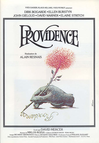
Art by René Ferracci.

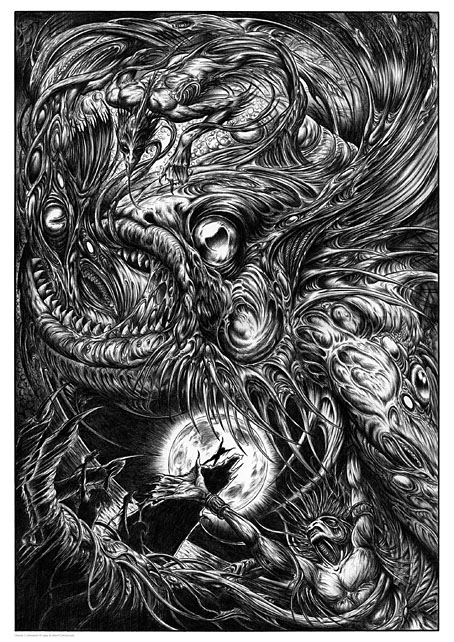
Continuing an occasional series about artworks in feature films. Most people know HR Giger’s work via his production designs for the Alien films; a much smaller number of people also know about his designs for Jodorowsky’s unmade film of Dune, but hardly anyone knows that his art first appeared in a major film two years before Alien was released. This isn’t too surprising when the film in question, Providence, directed by Alain Resnais, has been increasingly difficult to see since 1977; the film isn’t mentioned in any of Giger’s books either, a curious omission for an artist who spent his career logging every public appearance of his work.

Providence began life as a collaboration between Resnais and British playwright David Mercer, with the resulting script leading to a Swiss/French co-production that was filmed in English. The film has an exceptional cast—Dirk Bogarde, Ellen Burstyn, John Gielgud, Elaine Stritch, David Warner—marvellous photography by Ricardo Aronovitch, and a sumptuous score by Miklós Rózsa. If you’re the kind of person who regards awards as designators of quality then it’s worth noting that Providence won 7 Cesar Awards in 1978, including the one for best picture. Yet despite all this, and despite being regularly described as a peak of its director’s career there’s only been a single DVD release which is now deleted. I’d been intending to write about the film for some time but first I had to acquire a decent copy to watch again; this wasn’t an easy task but I managed to “source” a version that was better than the VHS tape I used to own.

providence13.jpg

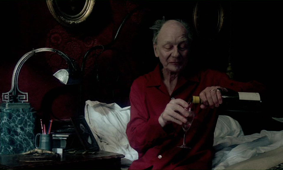
For most of its running time Providence is a film about artistic invention, more specifically about the process of writing. Clive Langham (John Gielgud) is an ailing author spending a sleepless night alone in his huge house, “Providence”, wracked by unspecified bowel problems, painful memories and fears of impending death. To distract himself from his troubles he drinks large quantities of wine while mentally sketching a scenario for a novel in which the people closest to him are the main characters. In this story-within-the-story Langham’s son, Claude (Dirk Bogarde), is a priggish barrister whose primary conflicts are with his absent father, his bored wife, Sonia (Ellen Burstyn), and a listless stranger, Kevin (David Warner), who Sonia has befriended and seems attracted to even though Kevin won’t reciprocate. While Claude cajoles and insults the pair he also conducts an affair of his own with Helen (Elaine Stritch), an older woman who resembles his dead mother. The scenario is elevated from being another mundane saga about middle-class infidelities by its persistently dream-like setting, and by the interventions and confusions of its cantankerous author. If you only know John Gielgud from his later cameos playing upper-class gentlemen then he’s a revelation here, boozing and cursing like the proprietor of Black Books. Between spasms of illness and self-pity Langham shuffles his playthings around like chess pieces, revising scenes while trying to keep minor characters from interfering; “Providence” isn’t only the house where Langham lives but also the watchful eye of its God-like author. Meanwhile, his characters bicker and chastise each other, paying little attention to the disturbing events taking place in the streets outside: terrorist bombings, outbreaks of lycanthropy, and elderly citizens being rounded up for extermination.

Continue reading “Art on film: Providence”

Victor Valla book covers

valla01.jpg

Lancer Books, 1971.

Victor Valla’s cover for The Dunwich Horror has appeared here before, and his cover for The Colour Out of Space is very familiar, but I hadn’t gone looking for anything else of his until this week. There isn’t much to be found on genre titles, just the rest of these covers plus a handful of undistinguished paintings for Gothic dramas and Dracula novels. His Lovecraft and Derleth covers are the kind of thing I always like to see more of, however, being less illustrations of story details than renderings of the feelings the story generates when you read it. This is especially the case with The Colour Out of Space, a story that suggests far more than it shows, and whose central motif—a colour alien to the Earth—is impossible to depict at all. In the 1970s it was easier to get away with this on paperback covers; Lovecraft was still a niche author and there wasn’t the legacy of imagery there is today. Incidentally, the Richard Lupoff book below isn’t as anomalous as it may seem if you know that Lupoff later wrote a novel, Lovecraft’s Book, with HPL as one of the main characters.

valla02.jpg

Lancer Books, 1971.

valla10.jpg

Beagle Books, 1971.

valla05.jpg

Beagle Books, 1971.

valla03.jpg

valla06.jpg

Beagle Books, 1971.

valla07.jpg

Beagle Books, 1971.

valla04.jpg

Beagle Books, 1971.

valla08.jpg

Beagle Books, 1971.

valla09.jpg

Beagle Books, 1971.

Elsewhere on { feuilleton }
The book covers archive
The illustrators archive
The Lovecraft archive

Das Letzte Ritual

letzte.jpg

Arriving in the post this week, the German edition of The Last Ritual by SA Sidor, a novel with one of the Art Deco-styled cover designs that I’ve been producing recently for Aconyte Books. This isn’t the first example of my artwork being published in Germany—the Magic: The Gathering cards I was painting in the 1990s were sold in many different countries with translated captions and credits—but I think it’s my first German book cover. If that statement sounds unnecessarily vague it’s because things can sometimes be published or reprinted in other countries without anyone telling you about them, especially if a large company is behind the production.

Anyway, my congratulations to Mr Sidor on having his book translated by Cross Cult. There’s also an audio version of this one available. Meanwhile, I’ve just finished another cover for the Arkham Horror series but I can’t show it yet until the title has been announced. More on that later.

Previously on { feuilleton }
The Devourer Below
Litany of Dreams
The Last Ritual

Prints update

tarot.jpg

The Major Arcana (2006): a C-type print on Fuji gloss paper. A1 or A2 sizes.

I’m continuing to add artwork to Etsy which will be available as prints in a variety of sizes and papers. I would have done more of this by now but I’m still very busy working through the commissions of the past few months so progress has been slow. The system does actually work as intended, however, with orders being routed automatically to the printer then printed and shipped within 24 hours. The initial setup may take longer than places like CafePress but the benefits are multiple, not only a faster turnaround (and cheaper worldwide postage) but now I can create prints of any size I want, and with a variety of papers and finishes. Most of the items there at the moment are the things I consider “greatest hits” so the latest additions include new poster versions of my psychedelic Alice in Wonderland artwork, together with the International Symbols Tarot poster and yet more Lovecraftiana. Requests are, of course, still welcome.

wonderland.jpg

Psychedelic Wonderland (2009): a C-type print on Fuji gloss paper. A1 or A2 sizes.

looking-glass.jpg

Psychedelic Looking-Glass (2010): a C-type print on Fuji gloss paper. A1 or A2 sizes.

cthulhu.jpg

Cthulhu (1998): a giclée print on Canson Aquarelle rag paper. A3 size.

dagon.jpg

Dagon (1999): a giclée print on Canson Aquarelle rag paper. A3 size.

Previously on { feuilleton }
Prints at Etsy

Weekend links 597

okazaki.jpg

Untitled art by Toshio Okazaki from JCA Annual 5, 1984.

• “Yeah, when I first started writing it, nobody knew what to call it at all. I mean, the publishers didn’t know what to call it. They thought that Tolkien was (writing about) a post-apocalyptic nuclear world. That’s the only way they could perceive an alternate world, in other words. And it was the same with Mervyn Peake… they’re all interpreted that way. The idea of putting ‘fantasy’ on a book meant usually meant that it was a children’s book. And if you put fantasy as the genre, they usually put ‘SF’ larger than ‘fantasy’ to show that it was what it was.” Michael Moorcock (again) talking to Derek Garcia about fiction, games, and (of course) Elric.

• “Non-payment, low payment, late payment and promises of jam tomorrow, or at some unspecified future date, bedevil the freelance life as they did five centuries ago.” Indeed. Boyd Tonkin on Albrecht Dürer, patron saint of stroppy freelancers.

• “All at once, Non-Stop Erotic Cabaret is tender, outrageous and daft.” Patrick Clarke compiles an oral history of Soft Cell’s debut album.

Yeah, it was kind of a media hype. In January [1967], the media said, [breathless] ‘Oh my god, San Francisco is the place to be. Come to San Francisco, wear flowers in your hair.’ So we had a meeting of the people in the Haight-Ashbury about how we were going to deal with so many people coming. The Diggers decided to kind of make it a university of the streets, an alternative anarchist culture.

We knew that all these people were coming to San Francisco, and we knew they weren’t going to stay. And we thought, well, the best thing we could do would be to kind of educate them about the kinds of things that are possible in society, and then let them go back to where they’re from, and they would carry these ideas. And that is what happened. We were quite successful in that.

Judy Goldhaft of the San Francisco Diggers talking to Jay Babcock for another installment of Jay’s verbal history of the hippie anarchists

• “What ‘impossible’ meant to Richard Feynman; what I learned when I challenged the legendary physicist,” by Paul J. Steinhardt.

• At Strange Flowers: part one of James Conway’s essential end-of-year shopping list, Secret Satan.

• Mixes of the week: Part II and Part III of the three-part At The Outer Marker series by David Colohan.

• At Dennis Cooper’s: Olivia Duval presents…Suave: A History of Les Disques du Crépuscule.

Mystery and Truth of the Cthulhu Myth, a Japanese guide to the Cthulhu Mythos.

• Intimacy, Loss and Hope: Inside Florian Hetz’s beautiful 2020 photo diary.

• New music: The Tower (The City) by Vanessa Rossetto/Lionel Marchetti.

Nite Jewel’s favourite albums.

• RIP Stephen Sondheim.

Nothing Is Impossible (1974) by The Interns | Mission Impossible Theme (1981) by Ippu-Do | Impossible Guitar (1982) by Phil Manzanera