Covering Genet

pelham-genet1.jpg

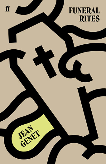
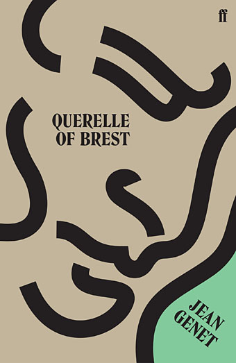
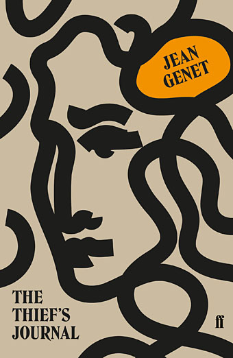
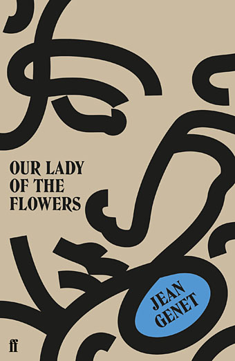
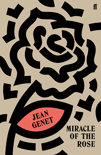
While writing Monday’s post I came across this series of new cover designs for the most recent Faber editions of Genet’s novels. I hadn’t seen these before but I liked the way they look as a set. Jonathan Pelham is the designer. At first glance the covers infringe one of my personal rules for cover design, that you should try and create something that couldn’t easily be used on another book by a different author; this is more of a challenge when a design is minimal or tending towards abstraction as these are. But Genet’s covers from British publishers have veered from the featureless (the Anthony Blond hardbacks of the 1960s) to the bizarrely random (the 1971 Penguin edition of Miracle of the Rose with a detail from Max Ernst’s Europe After the Rain—see below), so anything that looks this smart and consistent is a plus. I still like the series of paperbacks that Panther published in the early 1970s (also below) but they only did three of the books, with the Rubens typeface being a carry over from the Grove Press hardbacks designed by Roy Kuhlman. The new editions from Faber also feature new introductions by Neil Bartlett (Funeral Rites), Terry Hands (Miracle of the Rose), Jon Savage (Querelle of Brest), and Ahdaf Soueif (The Thief’s Journal).

pelham-genet2.jpg

pelham-genet3.jpg

pelham-genet4.jpg

pelham-genet5.jpg

Continue reading “Covering Genet”

Notre Dame des Fleurs: Variations on a Genet Classic

genet1.jpg

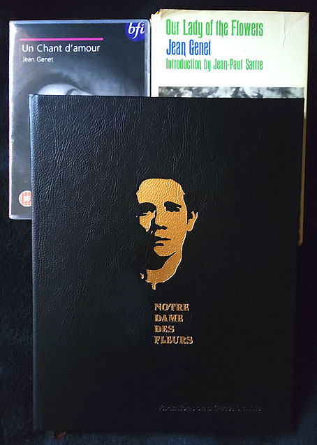
Another week, another book release. Notre Dame des Fleurs is a collection of artistic responses to Jean Genet’s debut novel, compiled and published by Jan van Rijn, for which I contributed three pieces:

Based on the English translation of the unabridged original edition, published in 1949 by Edition Paul Morihien, it is by no means a consistent illustration of the book nor is it a cohesive interpretation in form of a graphic novel. It is a truly personal collection that throws highlights on a beautiful piece of literature, printed in a run of 150 signed and numbered copies. The participating artists in alphabetical order: Michael AmpersantAntoine BernhartWim BeullensSusie Bright – John Coulthart – Lauri ElexsenRinaldo HopfAnja MolendijkBrane MozeticJohn Thomas ParadisoRexApollonia Saintclair Jan van RijnVilela Valentin

Genet’s novel caused a considerable stir when it was first published in France in 1943. Part memoir, part fiction, part masturbation aid, the book was famously written by Genet on sheets of wrapping paper in his Paris prison cell, and is probably the first account of homosexual lives—especially of homosexual erotic lives—lived on their own terms, without any apologies made to straight society or, for that matter, the straight reader. (“Straight” here applies to criminality as much as sexuality.) Antecedents exist, like Teleny Or the Reverse of the Medal, but Teleny is more assertively pornographic, which means it wanders into the fantasy world that porn always creates, a place where desire is everything and introspection doesn’t exist. Genet was writing about the people he knew in Paris before the war, the thieves and pimps and male prostitutes of Montmartre, and doing so in a manner that had to be considered as literature however transgressive the content might be for the literary establishment of the day.

genet2.jpg

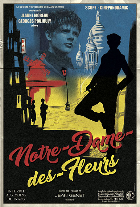
The unique qualities of the novel present difficulties for an illustrator. Literary fiction tends to look inside its characters much more than genre fiction, summoning thoughts, moods and feelings which resist easy depiction in a visual form. I’d first been asked to consider illustrating Notre Dame des Fleurs several years ago for a Graphic Classics collection of crime fiction, a request to which I agreed then had to turn down after deciding that the task of condensing the book into a few pages was a near impossibility. For Jan’s book, rather than illustrate a scene or two from the novel I opted for a conceptual approach. My three pages are intended to be promotional materials from a parallel universe in which Notre Dame des Fleurs was made into a French feature film some ten years or so after its publication, complete with hardcore sex scenes. The latter may seem unlikely but Genet was in the vanguard of presenting gay sex on the cinema screen in Un Chant d’Amour, the 26-minute silent film he made in 1950. He subsequently disowned the film, as he disowned—or “forgot”—many of his creations in later years, but it remains a pioneering and influential work.

Continue reading “Notre Dame des Fleurs: Variations on a Genet Classic”

Weekend links 555

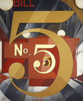
demuth.jpg

I Saw the Figure 5 in Gold (1928) by Charles Demuth.

• “Reading the new edition in 2021, I’m struck by his dismissal of CD-ROMs, of VR, of interactivity; how he anticipates contemporary debates about algorithmic bias…his prescient exhaustion.” Sukhdev Sandhu reviews Brian Eno’s diary for 1995, A Year with Swollen Appendices. Meanwhile, Eno himself says “Artists like me are being censored in Germany—because we support Palestinian rights.”

• “Kink is often pathologized in popular culture: it’s shamed, used as a punchline, and, on the whole, relegated to the margins of desire.” Greg Mania interviews R.O. Kwon and Garth Greenwell about Kink a collection of new stories about unorthodox desires.

• “This album is the king of hauntology. From where I’m sitting, I’m going back to the past, listening to an album imagining the future, imagining the past.” Tom Herdman on the fabulous Time (1981), a science-fiction concept album by the Electric Light Orchestra.

Cavafy, the ultimate Alexandrian, gave us an Alexandria that was already not quite there in his own lifetime. It kept threatening to disappear before his eyes. The apartment where he had made love as a young man had become a business office when he went to revisit it years later; and the days of 1896, of 1901, 1903, 1908, 1909, once filled with so much eros and forbidden love, were already gone and had become distant, elegiac moments that he remembered in poetry alone. The barbarians, like time itself, were at the gates, and everything would be swept in their wake. The barbarians always win, and time is hardly less ruthless. The barbarians may come now or in a century or two, or in a thousand years, as indeed they had come more than once centuries earlier, but come they will, and many more times after that as well, while here was Cavafy, landlocked in this city that is both the transitional home he wishes to flee and the permanent demon that can’t be driven out. He and the city are one and the same, and soon neither will exist. Cavafy’s Alexandria appears in antiquity, in late antiquity, and in modern times. Then it disappears. Cavafy’s city is permanently locked away in a past that refuses to go away.

André Aciman on the poetry of Cavafy and the Alexandrias of memory

DJ Food on the package design for The Superceded Sounds of…The New Obsolescents, which uses a similar foil card to the “Héliophore” stock used by Philips in their cult series of electroacoustic compositions, Prospective 21e Siècle.

Onlyou by Can, is “A relaxed studio session, recorded on a mono taperecorder in 1976 at the Innerspace”. Released in 1982 on a 34-minute cassette sealed inside a can (geddit?), and limited to 100 copies.

Olivia Rutigliano ranks 45 films containing prison escapes. I’d put the Bresson at number one but otherwise, yes.

• “…some kind of future unrealised time…” Mix of the week is a mix for The Wire by Muqata’a.

• RIP Christopher Plummer. Never mind the musical, watch him in The Silent Partner (1978).

• At Ubuweb: short films by Erkki Kurenniemi soundtracked by his own electronic music.

• New music: Neurogenesis by Robert Rich.

Kinky Boots (1964) by Patrick McNee & Honor Blackman | David Watts (1967) by The Kinks | The Dominatrix Sleeps Tonight (Dominant Mix) (1984) by Dominatrix
The Stormbringer Sessions by James Cawthorn

stormbringer15.jpg

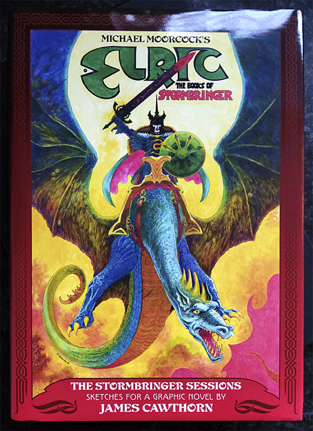
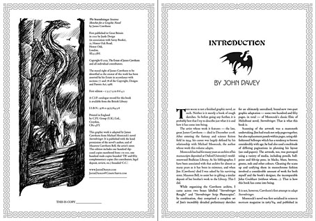
One of the books I was designing last year is published next month. The Stormbringer Sessons is a resurrection by John Davey of a sketchbook created by James Cawthorn in the mid-1980s for an Elric graphic novel that Cawthorn was commissioned to adapt and illustrate for Savoy Books. This is a limited edition that’s unlikely to be reprinted so anyone interested is advised to pre-order. (See below.)

stormbringer16.jpg

Slipcase decoration.

The original Stormbringer by Michael Moorcock isn’t a novel as such but a collection of the second series of linked novellas about Elric of Melniboné that Moorcock wrote for Science Fantasy from 1961 to 1964. Over the course of ten stories Moorcock introduced a character and a world that acted as a riposte to the Tolkienite school of heroic fantasy, where the divisions between Good and Evil are clear and fixed. Elric is like one of Sergio Leone’s characters: the difference between Clint Eastwood’s “Good” in The Good, the Bad and the Ugly and Lee Van Cleef’s “Bad” is merely a matter of degree; both men are killers chasing the same hoard of gold coins. (By coincidence, Leone was preparing to the upset the Western genre with A Fistful of Dollars just as Moorcock was finishing the first Elric stories.)

stormbringer03.jpg

James Cawthorn was one of Moorcock’s oldest friends, and a frequent collaborator. He not only illustrated the first Elric stories but also co-wrote the fourth one, Kings in Darkness. Despite having created many Elric illustrations Cawthorn always seemed to want to draw comics based on other characters, notably Moorcock’s Dorian Hawkmoon whose adventures have recently been reprinted in three volumes by Titan Books. The Stormbringer commission was a result of the late David Britton’s obsession with Elric in general and the Stormbringer book in particular. Stormbringer begins with Elric having retired from adventuring; his soul-stealing sword is locked away and he’s settled down to married life. The opening scenes parallel (and prefigure) many Hollywood plots: Elric’s wife is abducted for unknown reasons so Elric has to take up his sword and go after her. What follows is a pursuit into a world growing increasingly dark and chaotic, and with it the realisation that the events taking place are a part of a long-foretold apocalypse that will (and does) destroy that world. The progression from a regular sword & sorcery tale to doom-laden widescreen baroque, with a dragon army flying over a churning Boschian hellscape, is one of the enduring attractions of the book.

stormbringer04.jpg

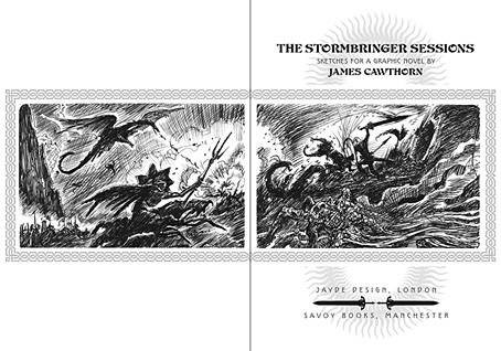
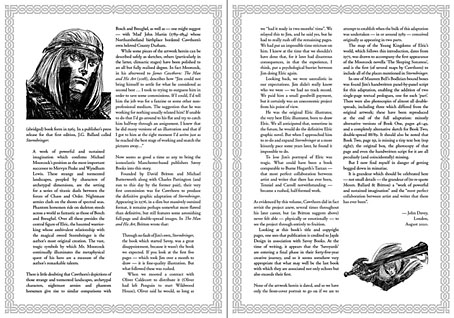
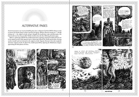
Britton had first persuaded Cawthorn to adapt Stormbringer into comic form in 1976 but the work on that occasion was compromised by lack of time. The sketches in The Stormbringer Sessions are Cawthorn’s roughs which were drawn in preparation for the second attempt, with the entire story worked out in panel form over 250 pages, complete with dialogue and captions. Some of the opening pages are rough indeed, but the drawings for the apocalyptic finale, presented in many double-page spreads, are almost finished pieces. The sketches may lack the finesse of Cawthorn’s other comics work but the power of his drawing and his imagination shines through. Nobody seems to know why he abandoned this project despite having a publisher waiting for it, but he was also adapting the third Hawkmoon book at the time, and had already spent the past decade working on the Hawkmoon trilogy.

stormbringer05.jpg

My design for this one is fairly straightforward, mostly a matter of framing and typesetting the opening and closing pages, as well as creating graphics for the cover and the slipcase. As with the Elric-themed Hawkwind album, The Chronicle of the Black Sword, I opted for Celtic-style knotwork for the decoration. Elric’s world isn’t our world but knotwork designs are universal (maybe even multiversal) while being satisfyingly antique and abstract. The publication is a co-production between Jayde Design and Savoy Books, with the book being limited to 100 numbered hardbacks in a decorated slipcase. Each copy also contains a colour print of the cover painting. The book may be ordered here. More page samples follow.

stormbringer06.jpg

Continue reading “The Stormbringer Sessions by James Cawthorn”

More Isles of the Dead

janny.jpg

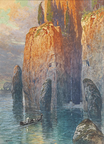
Die Toteninsel by Georg Janny.

Arnold Böcklin’s masterpiece, The Isle of the Dead, is a perennial source of fascination here, in part for the way the picture has fascinated other artists, writers, film-makers, etc, for the past 140 years. Something about the image compels people to rework it according to their own predilections, or to incorporate it into a narrative. Böcklin began this process himself, painting five different versions from 1880 to 1886, one of which was lost during the Second World War. The final version, which is now at the Museum der bildenden Künste in Leipzig, seems to be the favourite among the copyists. Toteninsel.net is a site devoted to cataloguing the influence of the picture but despite considerable thoroughness they don’t seem to have added this watercolour homage by Georg Janny (1864–1935), an Austrian artist and scenic designer.

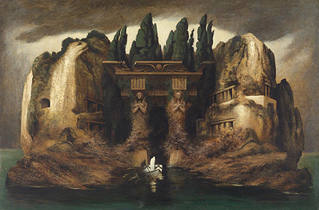
diefenbach.jpg

Toteninsel (c. 1905) by Karl Wilhelm Diefenbach.

They do have an entry for Karl Wilhelm Diefenbach’s painting but not the painting itself which is a surprising reworking of the Leipzig version. An ostensibly Greek island has gained a domineering portico in an Egyptian style. Böcklin was Swiss but his paintings made a huge impression on the younger generation of German and Austrian artists.

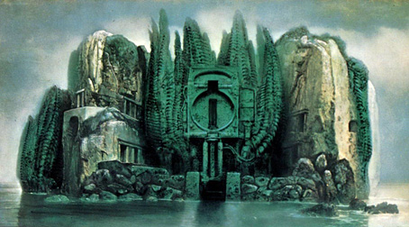
giger.jpg

Toteninsel (nach Böcklin) (1975) by HR Giger.

Diefenbach’s picture reminds me of a favourite variation by another Swiss artist, HR Giger, who painted two homages to the Leipzig version in the 1970s. One of these is a fairly close copy, albeit without the funeral boat, and with the addition of Giger’s usual biomechanical details. The other version adds an industrial structure to the stand of cypresses. This is a hatch from the rear of a German refuse vehicle which had provided Giger with a subject for several paintings in his Passagen series. The Surrealist juxtaposition is worthy of Magritte (who also alluded to Böcklin in The Annunciation), drawing a parallel with bodily interment and waste disposal.

Previously on { feuilleton }
Isles of the Dead
A Picture to Dream Over: The Isle of the Dead
The Isle of the Dead in detail
Arnold Böcklin and The Isle of the Dead