Jim Cawthorn, 1929–2008

cawthorn1.jpg

“Jim Cawthorn and I have been inseparable for over twenty-five years, sometimes to the point where I can’t remember which came first—the drawing or the story. It is his drawings of my characters which remain for me the most accurate, both in detail and in atmosphere. His interpretations in strip form will always be, for me, the best.” Michael Moorcock.

Jim Cawthorn—illustrator, comic artist and fantasy historian—died this week. Cawthorn was the first illustrator employed by Savoy Books and one of the key factors in drawing me to their doors in the early 1980s. His illustrations made their books special and his comics adaptation of Moorcock’s The Jewel in the Skull was a big influence on my early black and white work.

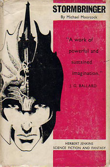
Mike Moorcock, Dave Britton and I seem to be in a minority in regarding Cawthorn as one of the finest fantasy illustrators of his generation. His carefully stipled drawings of the late Fifties and early Sixties are all miniature masterpieces and I don’t care how many artists attempt lavish paintings of Moorcock’s Elric character, for me the definitive representation remains the drawing used on the cover of the first edition of Stormbringer in 1965. Cawthorn was Moorcock’s illustrator of choice for many years and was involved with the Moorcock-edited run of New Worlds right from the start with his cover illustrating Ballard’s Equinox story. He also provided reviews for New Worlds, and his critical faculties were demonstrated to the full in 1987 with Fantasy: The 100 Best Books, an overview of the genre credited to Cawthorn and Moorcock for which Cawthorn himself wrote most of the entries.

I wrote in more detail about Cawthorn’s work for the Savoy site several years ago. For an overview of his career and influences, there’s Dave Britton’s interview from 1979.

Update: some extra pictures added.

cawthorn2.jpg

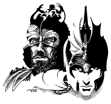
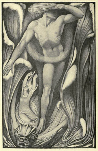
Jagreen Lern and Elric (1963).

Continue reading “Jim Cawthorn, 1929–2008”

Fizeek Art

fizeek.jpg

Baccant (1956) by George Quaintance.

Fizeek Art Quarterly was an American magazine of gay art and erotica which ran for 26 issues from 1961 to 1969. Artists included Tom of Finland and—as can be seen above—George Quaintance. The Fizeek Art Weblog continues the tradition of the magazine by posting extracts from old issues as well as more contemporary material (below) in a similar vein. “Vein” is perhaps an apt choice of description given the quantity of tumescent penises on display. Most of the images are quite gleefully hardcore (and often deliciously silly with it); as usual, if that’s not your thing then don’t look. Perfectly fine for the rest of us, however.

fizeek2.jpg

Virgo by Kit.

Elsewhere on { feuilleton }
The gay artists archive

Previously on { feuilleton }
Let’s get physical: Bruce of Los Angeles and Tom of Finland
Philip Core and George Quaintance

December and Vernon Hill

hill1.jpg

Who was Vernon Hill? A good question since he’s another of those illustrators about whom detailed information is in short supply. He was born in Halifax, England, which makes him a Yorkshireman, and this page gives his birth date as 1887. A biographical note here states that:

Hill was primarily a wood-carver, most of whose illustrative work was done in the years 1910–12. His major achievements here were his designs for Ballads Weird and Wonderful and The New Inferno, both of which were collections of verse, the literary form most suitable for symbolic illustration. An important influence on him was Blake; it is seen in his often symmetrical compositions, the differences of scale of his figures, and their physique (which also show Hill’s feeling for sculpture).

Hill’s curious depiction of the year’s end comes from a set of equally curious lithograph illustrations for John Lane, The Arcadian Calendar (1910), produced in a style which resembles a hybrid of Sidney Sime and other post-Beardsley artists. This seems to have been atypical, unfortunately, subsequent book work shows more fully his Blake influence. The Demon Lover is one of the better illustrations from Ballads Weird and Wonderful (1912) which can be downloaded at the Internet Archive.

hill2.jpg

The Demon Lover.

Elsewhere on { feuilleton }
The illustrators archive

Previously on { feuilleton }
Sidney Sime and Lord Dunsany
Harry Clarke’s The Year’s at the Spring

The art of Mati Klarwein, 1932–2002

godjokes.jpg

If book collecting is frequently a waiting game, some waiting periods can be longer than others. In the case of Mati Klarwein’s God Jokes, my patience and hope have sustained themselves for 28 years until I finally acquired a copy this Thursday afternoon. God Jokes was the second book of Mati Klarwein’s work, published by Harmony Books, New York, in 1976, a slim catalogue-style collection of his paintings, some of which were featured in the early issues of Omni magazine. In 1979 and 1980 God Jokes turned up in a chain of UK remainder shops and for a while it seemed like everyone I knew owned a copy which possibly explains my unaccountable decision to avoid buying one myself. As the years passed and I became increasingly enamoured with Mati Klarwein’s work I came to regret that decision, not least because the book seemed to disappear completely. Copies have turned up since on Abe.com but at bizarrely inflated prices (£50 for a 56-page art book?!). I paid £4.99; patience sometimes pays off.

abraxas.jpg

Abraxas by Santana.

Mati Klarwein’s work has been most visible via the album sleeves of the Sixties and Seventies which borrowed his pictures for their covers. Chief among these is one of the best Santana albums, Abraxas (1970), which used his stunning 1961 painting The Annunciation (and a lettering design by Robert Venosa), and one of all-time favourite albums, the Miles Davis masterpiece Bitches Brew (1970). Miles Davis was a great Klarwein enthusiast for a while and commissioned new work for his Live-Evil album in 1971.

davis.jpg

Live-Evil by Miles Davis.

It’s not necessary to go into detail describing Mati Klarwein’s work when you can go to the web gallery maintained by his family and feast your eyes there. Klarwein is one of the few 20th century artists to have taken Salvador Dalí’s photo-realist painting style and make of it something unique to himself; his work is always immediately recognisable. That this work is still known mainly for its illustrative connections tells you more about the iniquities of the art world than it does about the value of the paintings as works of art.

maarifa.jpg

The most curious thing about having to wait so long to find a copy of God Jokes was that I ended up working with a picture of Mati Klarwein’s three years before I found the book; I would have expected to find the book one day but the latter eventuality was far less predictable. In 2005 Jon Hassell asked me to design his new CD, Maarifa Street, and Jon was keen to use a tiny video detail he made of a huge and incredible Klarwein painting, Crucifixion (1963–65). The detail is the rectangle in the centre of the cover, juxtaposed against some Hubble galaxies: the very small against the very large. We used the painting itself and further details inside the digipak. Jon was another of those who used Klarwein’s art for his album sleeves (for Earthquake Island, Dream Theory in Malaya and Aka-Darbari-Java/Magic Realism) and the two men became great friends as a result.

crucifixion.jpg

Crucifixion by Mati Klarwein.

Jon Hassell writes about Bitches Brew—and Mati Klarwein’s sleeve art—here. His site also includes a 1998 Mati Klarwein interview from The Wire in which the painter discusses his life and work. If you want a copy of God Jokes for yourself, be prepared to wait…or pay over the odds.

Elsewhere on { feuilleton }
The fantastic art archive

Elsewhere on { feuilleton }
The album covers archive

Previously on { feuilleton }
Ballantine Adult Fantasy covers
Visions and the art of Nick Hyde
The poster art of Marian Zazeela

Guy Peellaert, 1934–2008

diamond_dogs.jpg

Diamond Dogs (1974).

Many people know this classic album sleeve even if they don’t recognise the name of the Belgian artist who painted it. Guy Peellaert died this week and this is easily his most famous picture. I remember being very struck by its appearance in the local record shop window which always displayed gatefold album sleeves opened out as above. By then the notorious dog’s genitals would have been removed from the picture to protect the delicate sensibilities of Bowie’s listeners; the copy here is from a later CD reissue.

taxi_driver.jpg

Taxi Driver (1976).

Peellaert’s work was very visible in the 1970s, especially his book of rock star portraits, Rock Dreams, a ubiquitous pop culture item along with Roger Dean’s Views and Alan Aldridge’s psychedelic whimsy. I always liked the Bowie cover, it hinted at weirder music than the rather mundane post-Velvets/Mott the Hoople rock which the album contained, but much of the work in Rock Dreams seemed garish and awkward. Far more successful was Peellaert’s painting for Martin Scorsese’s Taxi Driver, undoubtedly commissioned on the strength of his earlier work but superior to nearly everything in his book.

Peellaert’s official site has several galleries of his paintings.

Elsewhere on { feuilleton }
The album covers archive
The illustrators archive