Weekend links 143

empire.jpg

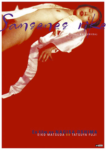
Ai No Corrida poster design by Egil Haraldsen (2001).

• “Back then, publishing an interview with Félix Guattari alongside little chats with rough trade and street walkers was unheard of — it still is for the most part.” BUTT on Kraximo, a gay Greek magazine of the 1980s.

13 books for 2013: A selection of forthcoming titles at Strange Flowers which so closely aligns with my preoccupations that I worry he’s reading my mind.

• “The Macaulay Library is the world’s largest and oldest scientific archive of biodiversity audio and video recordings.”

• A free BitTorrent Robert Anton Wilson audio and video pack. See also the RAW files at the Internet Archive.

beijing.jpg

The Pangu Building, Beijing, January 12th, 2013. Blade Runner arrives six years early.

Wired celebrates 100 years of Edward Johnston’s typeface for the London Underground.

Borges’ translation of Ulysses. Or of the last page of Ulysses as a translation of Ulysses.

0181, a new album by Four Tet, can be heard in full at SoundCloud.

• The Edge question for 2013: “What should we be worried about?

JG Ballard documentaries at Ubuweb.

Unlocking Dockstader.

• RIP Nagisa Oshima.

Ai No Corrida (1980) by Quincy Jones | Empire Of The Senses (1982) by Bill Nelson | Forbidden Colours (1983) by David Sylvian & Riuichi Sakamoto

Weekend links 142

bowie.jpg

Gratifying this week to see album cover art under discussion even if the heat-to-light ratio was as unbalanced as it usually is when pop culture is the subject. Jonathan Barnbrook, who also designed the Heathen (2002) and Reality (2003) packaging for David Bowie, wrote about the thinking behind the new cover on his blog. (And for the time being let’s note that this is still only a cover design, we don’t know what else is on its way.)

For my part I’ll point out that the artist-as-cover-image is the great cliché of album design, and the bigger the name the more the rule applies; Neville Brody complains about this in the first book of his work, as does Storm Thorgerson in the Hipgnosis books. In Bowie’s case the rule has been applied almost universally since his debut album in 1967, the only variations being illustrational ones or slight dodges like having his feet appear on the front of Lodger and his back facing the viewer on Earthling. Consequently the new design is a radical gesture from an artist who could have got away with a photo of himself du jour. By way of contrast, consider that Rod Stewart is a year older than David Bowie and presented the world with this artefact in October 2012.

Related: Hard Format responds to the cover, Chris Roberts on “Picasso resurrected in a Rolf Harris era“, and Alexis Petridis on The inside story of how David Bowie made The Next Day.

The Quicksilver typeface, designed by Dean Morris when he was only 16, bought by Letraset and now an indelible feature of pop design from the 1970s. Morris describes his experience here (“they shunned rapidographs!”) and collects examples of the print history here.

When the days are short, we are closest to the medieval world. To the avoidance of mirrors where death improves our portraits every morning with a few more lines and shadows. What would once have been a sermon, a conjuring of hellfire, a phantom slide show, is now an entertainment. But before we can begin again, we have to kick free of the embrace of our inconvenient predecessors, that compost legion of the anonymous dead. They come uninvited, requiring us to sign up for what the late Derek Raymond called the general contract: a brief turn in the light, then extinction. Eternal darkness. How to live with such knowledge? William Burroughs admired the unswerving bleakness of Beckett’s gaze, the way he reduced compensatory illusions to zero. Nowhere left to crawl. And nothing to crawl on. Last breath is last breath. Stare into the abyss and the abyss will stare right back.

Iain Sinclair reviews The Undiscovered Country: Journeys Among the Dead by Carl Watkins

Broadcast’s James Cargill on Morricone, Minidiscs and Scoring Berberian Sound Studio. Related: Melmoth the Wanderer posts a new mix, The Curious Episode of the Wizard’s Skull, and more spooky sounds are on their way from The Haxan Cloak.

• A Firm Turn Toward the Objective: Joanne Meister on meeting the great Swiss designer Josef Müller-Brockmann.

duchess.jpg

Twitter user @thisnorthernboy reworked Paul Emsley’s portrait of Kate Middleton. @barnbrook approved.

• The Beatles of Comedy: David Free on the Monty Python team.

• The history of the London Underground poster.

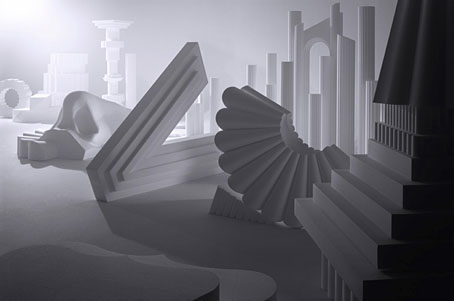
Impossible Architecture by Filip Dujardin.

• At Pinterest: Art Dolls & Sculpture

• Grace Jones’ Nightclubbing album has been on repeat play this week: Warm Leatherette/Walking In The Rain | I’ve Seen That Face Before (Libertango) | Demolition Man

Repulsion locations

r01.jpg

More Polanskiana. This film location site made the tracking down of locations in Repulsion (1965) an easy business. I was hoping they might have an entry for The Tenant, much of which is filmed around the Porte Saint-Denis in Paris but the only other Polanski entries are for Chinatown and Rosemary’s Baby. No matter, one thing I like about the outdoor scenes in Repulsion is the views of South Kensington which Polanski fixed a year or so before Donovan was celebrating the area in a rather more positive manner. I have fond memories of South Kensington in the 1970s since it was the area we stayed in every February during an annual school trip. Barring a slight change of street furniture, the busy traffic island outside the Tube station looked just the same when we were there.

r02.jpg

The exterior of Kensington Mansions in Trebovir Road, the location for Carol’s apartment. I’d always thought this was in a street near the Tube station but it’s actually some distance away in Earl’s Court.

r03.jpg

Colin (John Fraser) and Carol (Catherine Deneuve).

The hair salon where Carol works is Thurloe’s in Thurloe Place, and the shop in question is still a hair salon. Google’s Street Views were taken in May 2012 so the flags are out for the Queen’s Jubilee.

r04.jpg

r05.jpg

Just down the road from Thurloe’s is the Hoop & Toy, the pub where Carol’s would-be boyfriend, Colin, goes drinking with his misogynist friends.

r06.jpg

The traffic island outside the Tube station which in the latest Street View was still looking like a building site. The most surprising thing about the row of shops around the Tube station is that Dino’s, a restaurant visible in some of the film shots, is still there almost fifty years later.

r07.jpg

Previously on { feuilleton }
Polanski details
Repulsion posters
Through the Wonderwall

Geschichte der Nacht

klopfenstein.jpg

Houses, lines of houses, streets, miles of pavements, piledup bricks, stones. Changing hands. This owner, that. Landlord never dies they say. Other steps into his shoes when he gets his notice to quit. They buy the place up with gold and still they have all the gold. Swindle in it somewhere. Piled up in cities, worn away age after age. Pyramids in sand. Built on bread and onions. Slaves Chinese wall. Babylon. Big stones left. Round towers. Rest rubble, sprawling suburbs, jerrybuilt. Kerwan’s mushroom houses built of breeze. Shelter, for the night.

Epigraph from Geschichte der Nacht; a quote from Ulysses by James Joyce

Commissioning the Third Ear Band to create the score for Roman Polanski’s Macbeth was an assuredly good move. Using their music to embellish static scenes of European cities at night is a less obvious one but not as inappropriate as it might seem. Swiss filmmaker Clemens Klopfenstein uses the group’s music sparingly in Geschichte der Nacht (1979), an hour-long record of unidentified streets in unidentified cities after dark. When there’s no music you have the location sound. There’s no narrative, not even in the common documentary sense, simply the atmosphere of neglect that falls over a city during the night and the early hours of the morning. The copy linked here is at Ubuweb where the contents aren’t always permanent. Watch it while you have the chance. Via Ghetto Raga, a Third Ear Band blog.

Athanasius Kircher’s pyramids

kircher.jpg

Athanasius Kircher’s pyramids aren’t as vast as Thomas Cole’s dream construction—for size you need Kircher’s Tower of Babel—but they’re still eccentric inasmuch as they don’t correspond to any group of Egyptian structures. One of the great things about the etchings in Kircher’s books is the way their detail gives a sense of veracity to their depictions. Go slightly further back in time and you’ll find scenes that are just as eccentric but much more crudely rendered; go forward a few years and too much was known about ancient ruins to ever depict them this way again. The illustration is the frontispiece to Kircher’s Sphinx Mystagoga (1676) which can be seen in full at the University of Heidelberg. The details in Kircher’s illustrations benefit from the high-resolution scans.

Steve in the comments to yesterday’s post mentions another painting featuring an impossible view of architecture through the ages (pyramids included), The Professor’s Dream (1848) by Charles Robert Cockerell. BLDGBLOG ran a post about Cockrell’s paintings a couple of years ago.

Elsewhere on { feuilleton }
The etching and engraving art archive

Previously on { feuilleton }
Athanasius Kircher’s Tower of Babel
China Monumentis by Athanasius Kircher