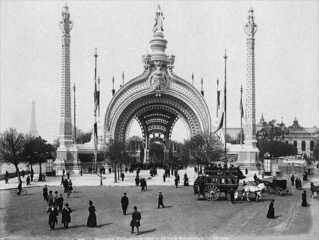
A final visit to the Exposition Universelle of 1900 with this photograph of the Palais Lumineux, a piece of period Chinoiserie built in the Champ de Mars close to the Eiffel Tower. I forget where I found this tinted view but Wikipedia has what appears to be the same photograph coloured so as to resemble a night scene.
Previously on { feuilleton }
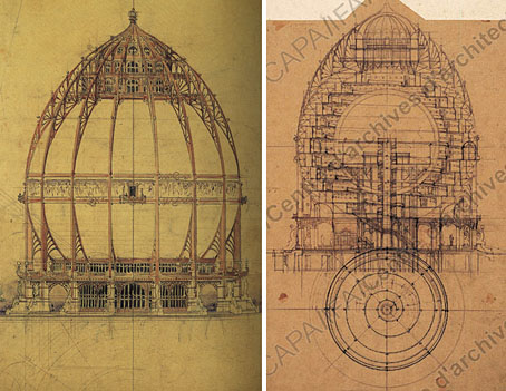
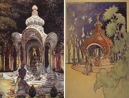
• Louis Bonnier’s exposition dreams
• Exposition Universelle, 1900
• The Palais du Trocadéro
• The Evanescent City
• Winsor McCay’s Hippodrome souvenirs