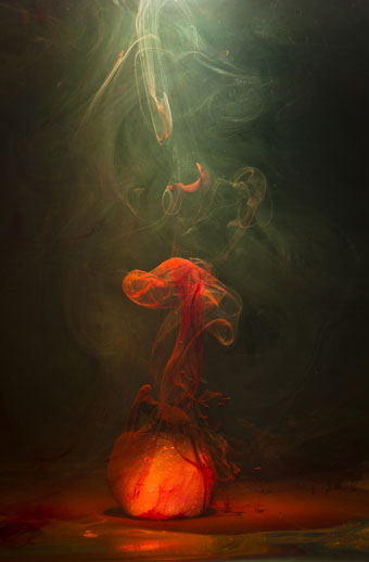
A suspended fluid photograph from Demersal, a series by Luka Klikovac.
• “Soon, Mr. Lachman was writing occult music. His song “(I’m Always Touched by Your) Presence, Dear,” which appeared on Blondie’s 1977 album Plastic Letters, was an example.” Gary Lachman: from Blondie to Swedenborg.
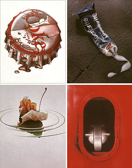
• Neil Krug’s cover art for the new Scissor Sisters album, Magic Hour, channels the cloudless skies and photographic surrealism of Storm Thorgerson.
• Implicate Explicate, a multiple 16mm film installation by Rose Kallal. Sound by Rose Kallal & Mark Pilkington using modular synthesizers.
Despite conservative queerdom’s best efforts to hide its “otherness” behind a velvet wall of “same as you” Tom and Hank and Jill and Janes, Mattilda and her like will not be ignored. As parades of neo-nuclear same sex families mug for the cameras on courthouse steps, queer body boys parade and flex impossibly taut muscles across our nation’s gym runways and circuit parties, and far, far too many proudly proclaim in knee-jerk defensiveness how “straight-acting” they are across the net, Sycamore blows raspberries at the forced mirage and holds up faded pictures of yesteryear boys and girls whose one claim to fame once was their difference.
Mattilda Bernstein Sycamore is interviewed at Lambda Literary
• Paul Oestreicher, an Anglican priest, sets the cat squarely among the pigeons with the question (and answer) “Was Jesus gay? Probably.”
• Andromeon, video by Alexander Tucker and Serena Korda for a new song by Alexander Tucker.
• Museums of Melancholy: Iain Sinclair on London’s memorials. An LRB essay from 2005.
• FACT mix 325 is by Battles: from Boredoms to Cluster and The Alchemist.
• The glass hills of Mars, “a region the size of Europe”.
• Labyrinths and clues, an essay by Alan Wall.
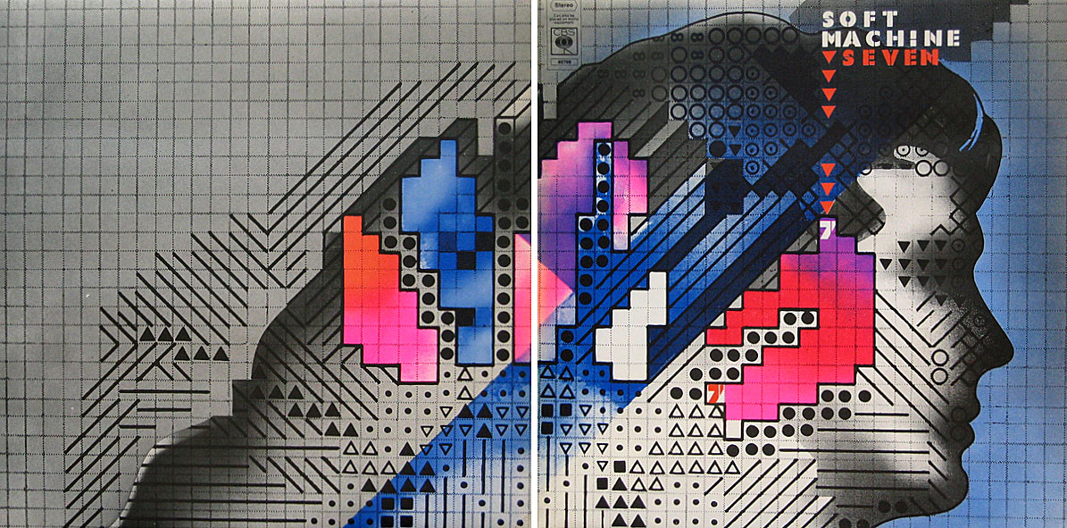
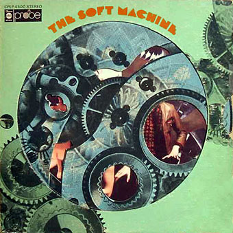
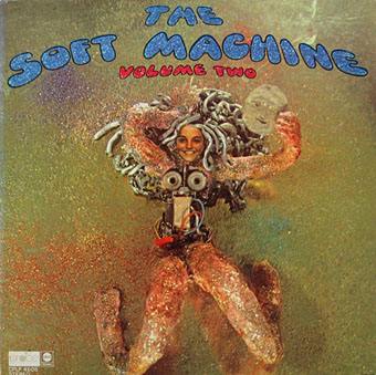
• Drop (1972) by Soft Machine | Drop (2002) by Hope Sandoval & The Warm Inventions | Airdrop (2006) by Kashiwa Daisuke.