The original Yuggoth collage, 1994.
Three years ago I resurrected my panorama of R’lyeh from The Call of Cthulhu, a process that took five months from start to finish as I redrew a large and very detailed picture. Last month I spent a much shorter time doing the same for one of the other pieces of art that went missing after being printed in 1994, the Haeckel collage that I titled Yuggoth. I don’t think I’ve mentioned before that this was originally created as a potential cover for the first edition of the Starry Wisdom collection published by Creation Books. My Cthulhu strip had already been accepted for the book when I was asked to create something for the cover. The painting I eventually submitted was rather mediocre, not terrible but I’d only been painting with acrylics for a year or so and was still getting used to the medium. By the time Creation rejected the cover the print deadline was approaching so I had little time to create anything new. Having recently bought a copy of the Dover edition of Ernst Haeckel’s Art Forms in Nature I decided to try and make a suitably Lovecraftian collage using Haeckel’s prints.

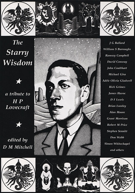
The original collage as it appeared on the cover of HP Lovecraft: Tales of Horror in 2022. Cover design by Jo Obaroswki.
Yuggoth was the result, created in a day or so after I’d rushed to the local copy shop and returned with a large quantity of paper which I chopped up then tried to assemble into a coherent form. I duly posted the result to Creation unaware that they’d already decided to use some of Peter Smith’s Lovecraft art on the cover. I was okay with this, I liked Smith’s drawings and Yuggoth ended up appearing inside the book. Despite the hasty production process I’d taken the precaution of photocopying the collage before it went into the post, something I did with the rest of the artwork, so even though the original Yuggoth was lost (or stolen or whatever actually happened to all that artwork) I’ve still had something which was usable years later. It was this photocopied version that appeared a few years later in my Haunter of the Dark book, as well as on the cover of the Fall River Lovecraft collection, Tales of Horror, in 2022.

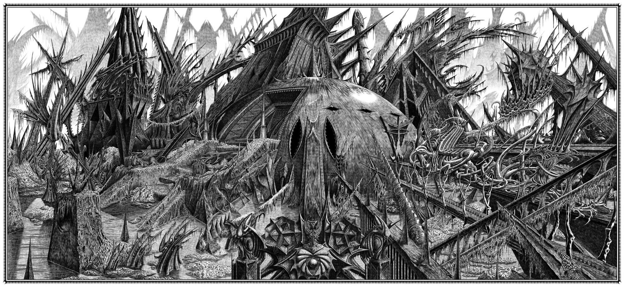
The reworked Yuggoth collage, 2024.
The photocopied version was usable, then, but not ideal. The original collage had been made with photocopies produced by a machine which didn’t deal very well with the halftones in Haeckel’s plates. This gave the final piece a rough, posterised quality, the roughness being intensified once the whole thing was copied again. The resurrected version has been pieced together from scans of the original Haeckel book with everything in the same size and (almost) the same placement as before, only now all of the halftones and other fine detail are intact. And while I was going to all this trouble I decided to change the architectural details in the original to something more in keeping with the rest of the picture. The planet Yuggoth (or Pluto as human beings know it) is more alluded to than actually described in Lovecraft’s fiction, but we do know that the place is inhabited by a race of fungoid aliens. I’ve always thought of Yuggoth as being architecturally rich as well as inhabited, rather like the alien worlds that Frank R. Paul used to paint for the back covers of Fantastic Adventures magazine, but in my haste to create the collage I’d resorted to copying Cambodian and Thai temples from a book of architectural engravings. These have now been replaced by structures that are more in keeping with the other elements. Using Haeckel for architectural inspiration has a minor history, as I’ve noted before. The French architect and designer René Binet had been looking at Haeckel’s plates in 1900 when he designed the arched gateway for the Exposition Universelle in Paris. Binet later expanded on this design with Esquisses Décoratives, a book of proposals for more Haeckel-derived architecture produced in collaboration with Gustave Geffroy.

The tinted version you see here is now available as prints and other products at Redbubble. My shop there is still a little understocked but I intend to keep adding to it in the coming months. As before, I’ll mainly be doing prints at Redbubble, all my T-shirt sales are now being handled by Skull Print. The latter emailed their final dates for pre-Xmas orders today: 6th December for overseas and 18th December for the UK. Skull Print will also be taking a break at the beginning of January so they won’t be dealing with any new orders until the 15th of that month. Thanks.
Elsewhere on { feuilleton }
• The Lovecraft archive
Previously on { feuilleton }
• Ghost Box and The Infinity Box