The Song of the Dead by Carrie Patel

patel1.jpg

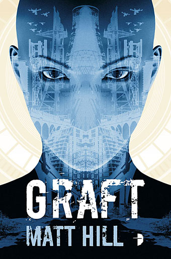
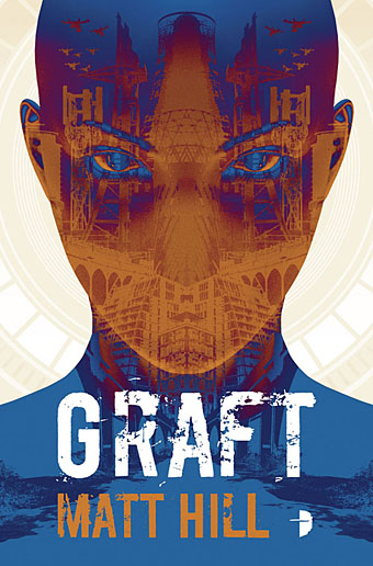
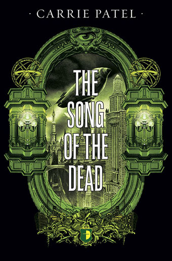
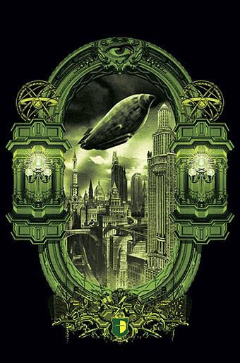
Presenting my latest cover for Angry Robot books, and the third cover I’ve done for Carrie Patel. The Song of the Dead is a sequel to Carrie’s two previous novels in the Recoletta series, The Buried Life and Cities and Thrones. For the new volume I maintained continuity by keeping the architectural frame while changing some of the details; the use of green after doing the previous covers in blue and red means that this is now the second series I’ve done for Angry Robot (KW Jeter’s being the first) using a red/green/blue colour scheme. This wasn’t intentional but was the result of choosing colours that differ from each other as much as possible. (Or almost as much: red, blue and yellow are primary colours, green is a secondary colour.) The requirement for the pictorial content was to show a city of disparate architecture but with less of an antique style than that seen on The Buried Life. Almost all the buildings in my palimpsest creation are taken from renderings of unbuilt skyscrapers or views from the early 20th century showing New York “as it will be in the future”. The airship is my own invention, based on the French model of dirigible which favoured pointed ends. The Song of the Dead will be published at the beginning of May.

patel2.jpg

And while I’m writing about recent work, it’s worth mentioning that The Thing: Artbook is now available for pre-order from Printed In Blood. This is a 400-page tribute to John Carpenter’s horror masterwork laden with responses and interpretations of Thingery from a wide range of international artists, myself included. The book will be out in July, and copies pre-ordered from the publisher will come with two bonus prints. More about this later.

Previously on { feuilleton }
Things
Two covers

The George Dower Trilogy by KW Jeter

infernal.jpg

My latest covers for Angry Robot are a return to the world of steampunk, and also a return to the novels of KW Jeter, the man who not only wrote some of the pioneering novels of the sub-genre but also invented the term steampunk in the first place. Infernal Devices was one of the pioneering texts, and it’s a book that’s been very good to me in its earlier Angry Robot edition, with a cover design that’s been well-received around the world. (It still pops up regularly on the front page of Goodreads.)

infernal.jpg

The brief for the republication was to create fresh covers for Infernal Devices and for its two sequels; the second of these, Fiendish Schemes, was first published by Tor with (at the author’s request) another cover of mine that matched the Angry Robot design. Grim Expectations is a new novel which makes George Dower’s adventures in an alternate-history Britain into a trilogy. The request for the new designs was to avoid the detailed Victoriana of the earlier editions in favour of something that would suit the content but be a little more restrained. Mention was made of the Picador covers for Italo Calvino that Gary Day-Ellison designed with the Quay Brothers in the 1980s. Those covers are personal favourites so I was happy to use a similar vertical division with small illustrative elements, the details of which relate to the stories but without being too literal. My designs are a lot more florid in comparison to the Calvinos but then the content demanded a shift of emphasis. After having created a lot of steampunk art emblazoned with cogs of all shapes and sizes the one thing I didn’t want to do was use more cogs on these covers. So the background pattern for Infernal Devices is cog-like but is actually an abstract design I found in a book of 19th-century decoration. Similarly, the circle motifs at the top of each cover are also cog-like but are more Victorian embellishments.

infernal.jpg

All three books will be published in June 2017; a long time to wait but there’s more about the new novel—and the series as a whole—at Tor.com.

Previously on { feuilleton }
Steampunk in the Tank
More vapour trails
Steampunk catalogued
Steampunk: The Art of Victorian Futurism
Steampunk Calendar
Words and pictures
Nathanial Krill at the Time Node
Fiendish Schemes
Ghosts in Gaslight, Monsters in Steam
Steampunk Revolution
The Bookman Histories
Aether Cola
Crafting steampunk illustrations
SteamPunk Magazine
Morlocks, airships and curious cabinets
The Steampunk Bible
Steampunk Reloaded
Steampunk overloaded!
More Steampunk and the Crawling Chaos
Steampunk Redux
Steampunk framed
Steampunk Horror Shortcuts

Bulgarian Bee

bee.jpg

It’s unusual but not unprecedented for foreign publishers to use the first-edition cover art when they publish a translation of a book. One of my cover designs for Mike Shevdon’s Courts of the Fayre series was reused for a French edition published by Panini/Eclipse in 2014. This year it’s the turn of The Singular & Extraordinary Tale of Mirror & Goliath by Ishbelle Bee which appeared in a Bulgarian edition last month from Ciela. In this instance I supplied the publisher with many of the work files so that the designers were able to refashion the title using Cyrillic characters. I’m very pleased with the way they’ve done this, the task wasn’t an easy one when some of the lettering was unique to this design. If you live in Sofia (or are on holiday there) watch out for it.

Previously on { feuilleton }
The Contrary Tale of the Butterfly Girl
The Singular & Extraordinary Tale of Mirror & Goliath

Foreign appearances

steam1.jpg

My work has appeared in a couple of foreign collections recently, each approaching popular culture from very different directions. The volume above is called Steampunk Japan Fashion Book according to a German bookseller although the title may read differently to Japanese speakers. This was published at the end of last year, and features my ever-popular covers for the Angry Robot editions of two steampunk novels by KW Jeter, Infernal Devices and Morlock Night. The book is the work of a collective who call themselves The Japanese Steampunkers.

steam2.jpg

popculture1.jpg

Meanwhile in France, Imaginaires #19: Les cultures populaires aujourd’hui is a collection of academic pieces about popular culture published by ÉPURE, Éditions et Presses universitaires de Reims. Inside there’s an essay by Xavier Giudicelli (University of Reims Chamapgne-Ardenne), The Picture of Dorian Gray et la culture populaire: du texte à la bande dessinée, which compares Wilde’s novel to various graphic adaptations. Xavier wrote to me some time ago about my Dorian Gray adaptation for the Russ Kick-edited Graphic Canon (2012) so the piece includes some of my remarks about my interpretation together with two of the pages.

popculture2.jpg

Previously on { feuilleton }
Picturing Dorian Gray

Graft by Matt Hill

graft1.jpg

UK edition.

This latest cover design has been made public much sooner than some of the other things I’ve been working on this year. Graft is another cover for Angry Robot, a novel set in near-future Manchester by local author Matt Hill. The title plays on the multiple meanings of the word “graft”, not only the colloquial term for work (honest or otherwise) but also the sense of a medical graft. Once again, Barnes & Noble have provided a convenient précis:

Manchester, 2025. Local mechanic Sol steals old vehicles to meet the demand for spares. But when Sol’s partner impulsively jacks a luxury model, Sol finds himself caught up in a nightmarish trans-dimensional human trafficking conspiracy.

Hidden in the stolen car is a voiceless, three-armed woman called Y. She’s had her memory removed and undertaken a harrowing journey into a world she only vaguely recognises. And someone waiting in the UK expects her delivery at all costs.

Now Sol and Y are on the run from both Y’s traffickers and the organization’s faithful products. With the help of a dangerous triggerman and Sol’s ex, they must uncover the true, terrifying extent of the trafficking operation, or it’s all over.

Not that there was much hope to start with.

A novel about the horror of exploitation and the weight of love, Graft imagines a country in which too many people are only worth what’s on their price tag.

graft2.jpg

US edition.

The challenge with this one was to create something that might be read as futuristic yet also included elements of the real Manchester. All the buildings are worked up from photos of my own, many of them taken during a long day out spent wandering around the Cornbrook area and Salford Quays. The latter has been extensively redeveloped in recent years so there’s a lot of new architecture out there, including the new BBC headquarters. The elegant pylons are the supports of the Lowry Bridge which can be raised to allow ships into the docks.

I couldn’t settle on a final colour scheme for this one so I made a number of variations then let author and publisher decide. This resulted in three covers: the UK edition, US edition and e-book. It took a while but I think I’m happiest now with the blue-and-purple version. Matt Hill talks about Graft here.

graft3.jpg

E-book.