Weekend links 502

wilson.jpg

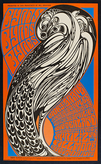
The Byrds (1967) by Wes Wilson.

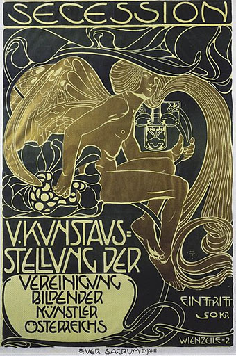
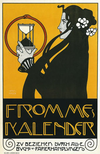
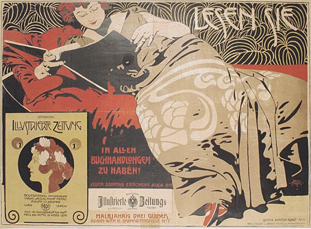
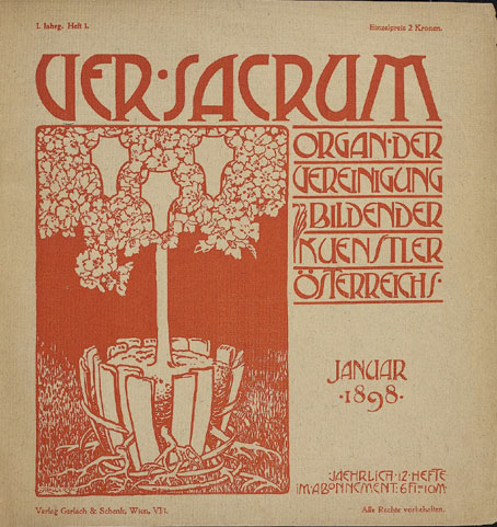
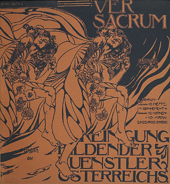
• RIP Wes Wilson, one of the first of the San Francisco psychedelic poster artists of the 1960s, and also one of the more visible thanks to the popularity of his compressed type designs, some of which were derived from a style developed by Alfred Roller for the Vienna Secession circa 1900. When Playboy magazine wanted a cover that reflected the psychedelic art trend in late 1967 it was Wilson they called. Related: Wes Wilson’s posters at Wolfgang’s.

• “In the ’70s, New Age music offered listeners, trapped in the urban rat-race, audio capsules of pastoral peace to transform their homes into havens. Today the Internet and social media form a kind of post-geographic urban space, an immaterial city of information whose hustle ‘n bustle is even more wearing and deleterious to our equilibrium.” 2010–19: Back To The Garden: The Return Of Ambient And New Age by Simon Reynolds.

• “This pointed-finger symbol goes by many names: mutton fist, printer’s fist, bishop’s fist, pointer, hand director, indicule, or most unimaginatively as ‘a hand’. Scholarly consensus has pretty much settled on the word ‘manicule’, from the Latin maniculum, meaning ‘little hand’.” John Boardley on the typographic history of the pointing hand.

Tales Of Purple Sally (1973) by Alex. All instruments by Alex Wiska apart from bass by Holger Czukay, and drums by Jaki Liebzeit. The latter pair also produced the album. Related: Jah Wobble talking to Duncan Seaman about working with Czukay and Liebeziet.

• “On Jan 25, 2020, tired of negative film lists on Twitter, I asked people for ‘obscure [or] underseen films you adore and think more people should know about.’ This was the result.”

Flash Of The Spirit by Jon Hassell & Farafina “hails from a time when the possibilities of music seemed less well-defined, and borders felt more open,” says Geeta Dayal.

The Art Of Computer Designing: A Black and White Approach (1993) by Osamu Sato. There’s more of Sato’s print work at the Internet Archive.

• At the Morgan Library: Jean-Jacques Lequeu: Visionary Architect. Drawings from the Bibliothèque nationale de France.

• New from Strange Attractor: Inferno: The Trash Project: Volume One by Ken Hollings.

• At Dennis Cooper’s: Storm de Hirsch Day.

Celeste by Roger Eno & Brian Eno.

Ben Watt‘s favourite music.

The Inferno (1968) by The Inferno | Inferno (1990) by Jah Wobble’s Invaders Of The Heart | Inferno (1993) by Miranda Sex Garden

Single sleeves

singles01.jpg

A septet of 7-inch single sleeves from Eastern Bloc Songs, a small but well-selected repository of sleeve art from the record labels of the Eastern Bloc. I’d looked at the album art before but had missed the singles, some of which feature more impressive designs than their 12-inch counterparts. Of special interest are designs that show how the psychedelic styles of the decadent West were transmuted for a Communist audience. The Nautilus sleeve above dates from 1969, and uses the lettering adapted by Wes Wilson from a much earlier design by Alfred Roller. Elsewhere the generic sleeves from venerable Czech label Supraphon stand out for their modish graphics. (Via Record Envelope and Things Magazine.)

singles02.jpg

singles03.jpg

Continue reading “Single sleeves”

Ver Sacrum, 1903

vs-1903-01.jpg

Concluding the series of posts about Ver Sacrum, the art journal of the Viennese Secession. The volume of issues for 1903 continues the bi-monthly format from the previous year only this time the calendar supplement is at the end of the volume. This was the last year for the journal, unfortunately, not least because the Secession had run its course, having perhaps proved its point in providing an alternative to the prevailing trends in Austrian art and design. Koloman Moser, Alfred Roller and Josef Hoffmann left to found the Wiener Werkstätte while Gustav Klimt, who again has an issue devoted to his drawings, went on to paint some of his most famous pictures, including The Kiss.

Ver Sacrum certainly ended on a high note. Most of the issues for 1903 contain woodcuts by a variety of artists with some superb examples of the form. For once there’s work by women—Irma von Dutczynska, Nora Exner and Hilde Exner—there’s more strange art from Marcus Behmer, and also a translated extract from the memorial book written by Arthur Symons following Aubrey Beardsley’s death in 1898. As before, anyone wishing to see more can browse all 498 pages or download the entire volume here.

vs-1903-02.jpg

vs-1903-03.jpg

Continue reading “Ver Sacrum, 1903”

Koloman Moser posters

moser2

Secession poster (1899).

Since I’ve been delving over the past year into the fin de siècle culture of Germany and Austria, the name of Koloman Moser (1868–1918) has kept recurring. This is partly because of Moser’s associations with the Viennese Secession and the Wiener Werkstätte, of course, but I’ve made a point of drawing attention to his work since it’s struck me as some of the most remarkable being produced anywhere in Europe during the period 1895–1910. Moser’s poster designs are a good example of his authority as an artist and graphic designer who quickly evolved from Mucha-derived Art Nouveau flourishes to a degree of stylisation that was incredibly advanced for the early 1900s. The graphics of Moser and fellow artist/design Alfred Roller point the way to Art Deco twenty years later, and also to the psychedelic era whose poster artists eagerly borrowed motifs, figures and lettering designs from Moser, Roller, Mucha and others.

moser3

Frommes Kalender poster (1899).

Wikimedia Commons has a generous sampling of Moser’s work that shows his incredible versatility in a variety of media. The Secession designers, and Moser in particular, and memorialised in Paul Shaw’s typeface design, Kolo.

moser8

Illustrierte Zeitung poster (1900).

Continue reading “Koloman Moser posters”

Ver Sacrum, 1898

vs-1898-01.jpg

There are art magazines, and then there’s Ver Sacrum. I’m tempted to say there are magazines, and then there’s Ver Sacrum but that’s going a little far. Suffice to say that among the many fine art magazines of the period 1890 to 1910, a number of which have been featured here already, Ver Sacrum stands apart for its design and the consistent quality of its contents. Having seen back numbers of Jugend and Pan made available at the University of Heidelberg I’d been hoping the archivists there would eventually turn their attention to the art journal of the Viennese Secession, and they finally have, with the first bound number digitised here.

vs-1898-01.jpg

The volume for 1898 collects the first year of the journal cum manifesto of the Union of Austrian Artists, as the Secession group called themselves. That union is represented by the triple shield symbol which recurs in different forms across all the media produced by the group, the shields representing painting, sculpture and architecture. (On the cover of the first issue, the shields are shown growing from a tree whose roots have burst the confines of their container.) Ver Sacrum was a team effort with design contributions by Koloman Moser, Alfred Roller, Josef Hoffmann and Gustav Klimt, and what really sets it apart for me is its striking square format and the wide margins which provided a very flexible template for presenting a variety of graphic content. Other magazines of the period such as Pan shared some of the content but their presentation didn’t greatly differ from the more staid magazines of the era. Ver Sacrum was a break with the style of 19th century journals, and its graphic design points the way to much of the magazine and book design which would follow. It’s also a superb showcase for the Austrian development of the Art Nouveau style, and the overlap between Art Nouveau and the final flourishes of the Symbolist movement.

vs-1898-01.jpg

There’s far too much in this first volume to easily select, all I can do is advise that anyone interested has a browse through the entire book. As with Deutsche Kunst und Dekoration some of the art is the typically conservative fare of the period but the presentation makes up for that, and there’s enough of interest elsewhere to prevent things from getting dull. Here’s hoping the other volumes are made available very soon.

Update: Paul in the comments draws my attention to additional scans of Ver Sacrum at the Österreichische Nationalbibliothek. Heidelberg does a better job of making the issues browsable but it’s still great to have more than one source for this material.

Continue reading “Ver Sacrum, 1898”