Bob Haberfield: The Man and His Art

haberfield01.jpg

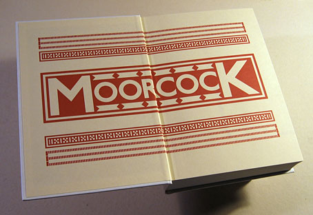
Presenting a new book design, and a very substantial production. Bob Haberfield: The Man and His Art is a two-volume slipcased collection of the late Bob Haberfield’s drawings, paintings and illustrations, dating from his youth in Australia to his retirement in Wales. As a commercial artist, Haberfield is best known for the many cover paintings he produced in the 1970s for fantasy, horror and SF books, especially those for the Michael Moorcock novels published in the UK by Mayflower. He continued to work as a cover illustrator in the 1980s but his career encompassed album cover design during the 1960s in Australia, advertising and product illustration in Australia and Britain, and a great deal of personal work, all of which is covered here. The books were commissioned by Bob’s son, Ben Haberfield, who contributes a personal reminiscence and biographical note; the books also feature a discussion of Bob’s art by an old friend, Garry Kinnane, along with shorter pieces and remembrances by Michael Moorcock, Rodney Matthews, Peter Meerman, John Guy Collick, and John Davey.

haberfield02.jpg

As for the artwork, this covers an extraordinary range of styles and media. The first volume, The Man, is Haberfield’s personal catalogue of his career, covering his days at art school in the 1960s to his years in Wales. The second volume, His Art, is the commercial work: book covers, record and magazine covers, and a large amount of product illustration for advertising, supermarkets and food companies. Haberfield was a versatile artist with a flair for imitation, something which helped his later illustrations for product packaging (biscuits, chocolates, etc) where he was often him to create paintings or drawings in very different styles. So too with his book covers, many of which have gone unidentified for years because the publishers didn’t give Haberfield a credit, while the artwork wasn’t easily identifiable as being Haberfield’s own. I’m pleased that we’ve been able to confirm that several uncredited Panther paperbacks are Haberfields.

haberfield13.jpg

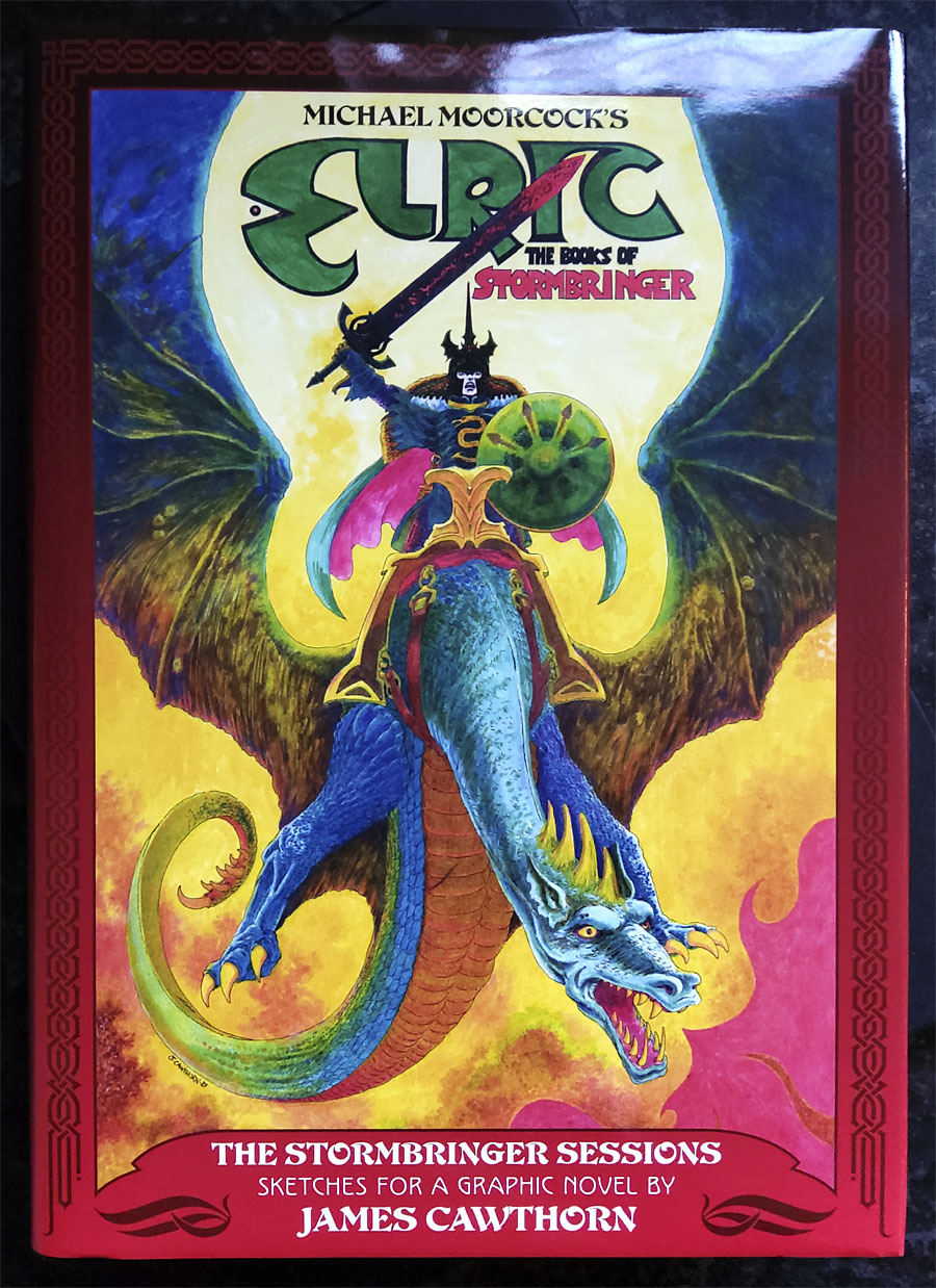
Genre illustrators tend to fall into two camps: the first group enjoy doing the kinds of drawing or painting that they’re requested to do for cover commissions, and are happy to do more of the same when left alone. The second group approach cover work as a job and nothing more; when left to their own devices you find them painting landscapes or portraits or whatever. Bob Haberfield was definitely in the second category. He landed in London in 1968 just as Mayflower Books was scaling up its publishing with a line of books that included UK paperback debuts of Michael Moorcock novels. Haberfield’s covers immediately stood out from Mayflower’s other books of the period, most of which were unimpressive photographic productions. Moorcock’s career took off shortly after; the Mayflower books were reprinted in larger quantities, and for a several years those books and Haberfield’s Buddhist-themed paintings were unavoidable in British bookshops. The Moorcock covers only occupy a small percentage of the pages in this collection but for many people they’ll be the main point of interest. It wasn’t possible to present all of the original paintings, many of them having been lost over the years or sold to unknown private collectors. But the collection does include a complete gallery of Haberfield’s Moorcock cover art, along with covers and original paintings for Panther (mostly horror titles), Penguin and others.

haberfield04.jpg

My design for the collection is fairly restrained, the main concern having been the presentation of hundreds of individual pieces of artwork; there are 608 pages altogether, containing around 800 individual paintings and drawings. The headlines are set in various weights of Busorama, a font launched in 1970 which is a common sight in design from that decade. Putting this lot together involved considerable effort, especially on the part of co-editor/publisher John Davey. It’s good to see it out at last.

haberfield03.jpg

The books are published by Jayde Design and are available here. RRP is £52 which is a lot but pretty much the standard for a two-volume slipcased set. More page samples follow below. There’s also an early review by The Outlaw Bookseller at YouTube.

Continue reading “Bob Haberfield: The Man and His Art”

The Stormbringer Sessions by James Cawthorn

stormbringer15.jpg

One of the books I was designing last year is published next month. The Stormbringer Sessons is a resurrection by John Davey of a sketchbook created by James Cawthorn in the mid-1980s for an Elric graphic novel that Cawthorn was commissioned to adapt and illustrate for Savoy Books. This is a limited edition that’s unlikely to be reprinted so anyone interested is advised to pre-order. (See below.)

stormbringer16.jpg

Slipcase decoration.

The original Stormbringer by Michael Moorcock isn’t a novel as such but a collection of the second series of linked novellas about Elric of Melniboné that Moorcock wrote for Science Fantasy from 1961 to 1964. Over the course of ten stories Moorcock introduced a character and a world that acted as a riposte to the Tolkienite school of heroic fantasy, where the divisions between Good and Evil are clear and fixed. Elric is like one of Sergio Leone’s characters: the difference between Clint Eastwood’s “Good” in The Good, the Bad and the Ugly and Lee Van Cleef’s “Bad” is merely a matter of degree; both men are killers chasing the same hoard of gold coins. (By coincidence, Leone was preparing to the upset the Western genre with A Fistful of Dollars just as Moorcock was finishing the first Elric stories.)

stormbringer03.jpg

James Cawthorn was one of Moorcock’s oldest friends, and a frequent collaborator. He not only illustrated the first Elric stories but also co-wrote the fourth one, Kings in Darkness. Despite having created many Elric illustrations Cawthorn always seemed to want to draw comics based on other characters, notably Moorcock’s Dorian Hawkmoon whose adventures have recently been reprinted in three volumes by Titan Books. The Stormbringer commission was a result of the late David Britton’s obsession with Elric in general and the Stormbringer book in particular. Stormbringer begins with Elric having retired from adventuring; his soul-stealing sword is locked away and he’s settled down to married life. The opening scenes parallel (and prefigure) many Hollywood plots: Elric’s wife is abducted for unknown reasons so Elric has to take up his sword and go after her. What follows is a pursuit into a world growing increasingly dark and chaotic, and with it the realisation that the events taking place are a part of a long-foretold apocalypse that will (and does) destroy that world. The progression from a regular sword & sorcery tale to doom-laden widescreen baroque, with a dragon army flying over a churning Boschian hellscape, is one of the enduring attractions of the book.

stormbringer04.jpg

Britton had first persuaded Cawthorn to adapt Stormbringer into comic form in 1976 but the work on that occasion was compromised by lack of time. The sketches in The Stormbringer Sessions are Cawthorn’s roughs which were drawn in preparation for the second attempt, with the entire story worked out in panel form over 250 pages, complete with dialogue and captions. Some of the opening pages are rough indeed, but the drawings for the apocalyptic finale, presented in many double-page spreads, are almost finished pieces. The sketches may lack the finesse of Cawthorn’s other comics work but the power of his drawing and his imagination shines through. Nobody seems to know why he abandoned this project despite having a publisher waiting for it, but he was also adapting the third Hawkmoon book at the time, and had already spent the past decade working on the Hawkmoon trilogy.

stormbringer05.jpg

My design for this one is fairly straightforward, mostly a matter of framing and typesetting the opening and closing pages, as well as creating graphics for the cover and the slipcase. As with the Elric-themed Hawkwind album, The Chronicle of the Black Sword, I opted for Celtic-style knotwork for the decoration. Elric’s world isn’t our world but knotwork designs are universal (maybe even multiversal) while being satisfyingly antique and abstract. The publication is a co-production between Jayde Design and Savoy Books, with the book being limited to 100 numbered hardbacks in a decorated slipcase. Each copy also contains a colour print of the cover painting. The book may be ordered here. More page samples follow.

stormbringer06.jpg

Continue reading “The Stormbringer Sessions by James Cawthorn”

James Cawthorn: The Man and His Art

cawthorn-cover.jpg

The past year would have been busier than usual with the amount of illustration work I had to deal with, but it was made even busier with my having to design this book at the same time. James Cawthorn: The Man and His Art was originally intended to be a modest memorial by Maureen Cawthorn Bell for her artist brother following his death in 2008, but the book grew into a heavyweight volume of 448 pages containing over 800 individual pieces of art: book covers, illustrations for magazines and fanzines, private pieces for friends and relatives, and many sketches or preliminary works, most of which have never seen print before.

cawthorn-coverspread.jpg

Given Jim Cawthorn’s long association with Michael Moorcock, as both friend and collaborator, the task of collating the artwork and editing the book went to Moorcock bibliographer John Davey, who also serves as the book’s publisher. John spent three years locating over 3000 pieces of artwork, large and small. Some of these pieces are now lodged with the Moorcock archives in the Bodleian Library, Oxford, while others may only be found in the pages of the many science fiction and fantasy fanzines that Jim illustrated, copies of which are stored at the British Library. From this body of material Maureen and John selected a core of representative work from Jim’s private as well as public life, although no-one at the outset of the project was expecting the final picture tally to be so high.

cawthorn-spread-01.jpg

My task as the book’s designer involved making the text presentable (easy) and corralling the artwork (not so easy, and I also had to either clean or colour-adjust every single piece). Maureen had divided the book into several sections, beginning with a lengthy biographical reminiscence. Following this was “Jim by Jim”, a selection of interviews, magazine pieces, some fiction, essays and book reviews. There was also a lengthy extract from Fantasy: 100 Best Novels (1988), a book credited to Jim and Michael Moorcock but, by Moorcock’s admission, mostly Jim’s work. Jim Cawthorn was very well-read, especially in the genres—he was old enough and interested enough to have read The Lord of the Rings when it was first published—and could also present his erudition engagingly for a reader, so the text section of Maureen’s book is far from indulgent.

cawthorn-spread-02.jpg

The book design isn’t as elaborate as some I’ve worked on but it didn’t need to be when the pictorial material is rich with what Moorcock calls “wizardry and wild romance”. Maureen wanted a particular picture of Moorcock’s Elric character on the cover so I took details and motifs from some of Jim’s many Elric illustrations to give the book a thematic thread and internal consistency. Cawthorn was present at the creation of Elric in the early 1960s; he not only provided Moorcock’s characters with their first illustrations but even helped plot one of the earliest stories, Kings in Darkness.

cawthorn-number.jpg

Page numbers are framed by the swords from the Elric stories.

Using motifs such as the sword silhouette and Elric head is something I frequently do with book designs but for this book I also went to the trouble of creating a one-off font for the drop capitals based on Jim’s hand-drawn lettering. Jim drew titles and other lettering throughout his career, so again this was a decision warranted by the book’s contents. The few times we met I never asked him about this but I’ve always thought his lettering designs were derived from the stylised titles that J. Allen St. John created for many of the early Edgar Rice Burroughs books. Jim spent most of his life drawing Burroughs’ characters, and was very familiar with the work of Burroughs’ original illustrators. I was hoping to find a title design of Jim’s that I could rework for the book’s title but none of the examples worked as well as I hoped. For this reason the title lettering is based on different styles from the John Carter novels that were Jim’s favourites among Burroughs’ works.

cawthorn-spread-03.jpg

Other features include a foreword by Alan Moore, an afterword by Michael Moorcock, a gallery of Jim’s Lord of the Rings drawings and character sketches from the early 1960s (which predate all others bar those by Tolkien himself), artwork for Hawkwind (including Dave Brock’s “Meliadus” T-shirt), and even a handful of photos from the set of The Land that Time Forgot (1975), the ER Burroughs-derived feature film scripted by Jim with Michael Moorcock. The page samples here are necessarily few given the size of the book.

cawthorn-spread-04.jpg

For the moment James Cawthorn: The Man and His Art is available exclusively from publishers Jayde Design at a special pre-publication price of £20. After publication on 6th August the price will rise to £35. Further page samples follow.

Continue reading “James Cawthorn: The Man and His Art”

Ten titles and a cover

cdlcover.jpg

The Very Best of Charles de Lint. Art by Charles Vess.

Over the weekend I found the time to finally update the book design section of the site, adding new pages for most of the titles I’ve been working on recently. There’s still a couple of things missing but I’ll add those in due course. Many of these design jobs have been for the interiors only so what follows is a comparison of title spreads from books I’ve worked on that have been published this year. Lest it seem that I have an army of clones at my service it should be emphasised that I was working on several of these last year (and Engelbrecht was completed in 2008) but the nature of release schedules means they all carry 2010 publication dates.

sr.jpg

Steampunk II: Steampunk Reloaded, edited by Ann & Jeff VanderMeer.

I invariably make a feature of title pages, usually creating them as a spread in order to heighten their impact. The title page is a kind of gateway to the rest of the book which gives you an opportunity to establish a mood for what follows. It’s also the area where you can be most lavish with your graphic treatment and, where necessary, add illustrative material without worrying too much about intruding on the content. With a number of these designs I was following typographic choices from pre-designed covers so the challenge was to find something that would match the cover and connect to the rest of the interior. The Charles de Lint book was a variation on this process in that the author had chosen a Charles Vess drawing for the cover art. I designed a cover to accommodate the drawing then carried the design inside. The colours were chosen to match Vess’s artwork while the general Art Nouveau style came from an Alphonse Mucha poster he’d placed on the wall. With a different cover picture the entire book would have had a very different design.

pkd.jpg

The Search for Philip K Dick by Anne R Dick.

Continue reading “Ten titles and a cover”

Into the Media Web by Michael Moorcock

itmw11.jpg

Here at last is the book I spent a good part of last year designing. Into the Media Web is a huge volume as befits a huge talent, 720 pages of Michael Moorcock’s non-fiction spanning fifty years of his career from his days writing for sf and fantasy fanzines, through to journalism, reviews and articles for major newspapers and magazines. Moorcock expert John Davey did an amazingly thorough job of compiling, editing and annotating it all, and it’s been a considerable pleasure to design such an important collection. Alan Moore provided the substantial introduction. Savoy Books haven’t announced a price yet but it’s going to be about £45 since it’s another limited edition and weighs a ton. Into the Media Web makes a fine companion to last year’s The Best of Michael Moorcock from Tachyon, also edited by John Davey (with Ann & Jeff VanderMeer) and whose interior I also designed. Details about Into the Media Web‘s design follow below.

itmw12.jpg

The dust jacket is matt white with a spot UV layer which picks out the titles and lines in gloss.

itmw13.jpg

Continue reading “Into the Media Web by Michael Moorcock”