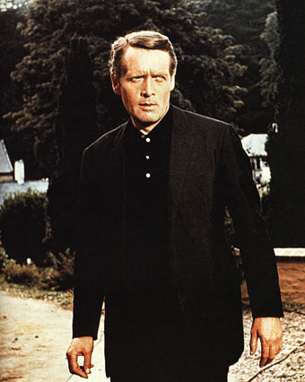
Patrick McGoohan as The Prisoner.
“I will not be pushed, filed, stamped, indexed, briefed, debriefed or numbered. My life is my own.”
The Prisoner, which ran for seventeen episodes from 1967 to 1968, was the best original drama series there’s ever been on television. Period, as Harlan Ellison would say. Best because it grabbed the format of the TV adventure series with both hands to subvert the expectations of the audience and the people who were paying for it. Best because it dared to do this at a time when there was little precedent for experiment in a medium that was barely a decade old. Best because it had something important to say while still being entertaining. And best because it had Patrick McGoohan in the central role at the peak of his acting career.
Fiction can be anything, but to look at what we’re offered by TV channels you wouldn’t know it. Cop shows, hospital shows, detective shows and soap operas proliferate, ad infinitum. The Prisoner came out of Danger Man, an immensely successful post-James Bond spy series which may have been popular but, McGoohan’s presence aside, has little to recommend it today. It lacked the camp bravura of The Avengers and couldn’t compete with the budgets of the Bond films. But it’s fair to say that without it McGoohan wouldn’t have had the chance to do something radical. ITC’s Lew Grade thought he was getting Danger Man 2 with better production values; what he received—to his eventual dismay—was the kind of television one would expect if the staff of Michael Moorcock’s speculative-fiction magazine New Worlds had been given a fat budget and free reign. Like New Worlds, The Prisoner seized familiar genre themes but took them as a means to an end, not an end in themselves. The series borrowed from science fiction and spy thrillers—brainwashing and mind control, Cold War paranoia, the limitless surveillance and duplicity of Orwell’s Nineteen Eighty-Four—and used a drama format to say something direct and personal to its audience about individual freedom, the limits and excesses of the state, and the importance of being able to say “No” when the world insists that you capitulate.
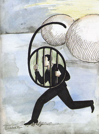
Number Six by Roland Topor.
McGoohan was the driving force as well as the star. His own company, Everyman Films, produced the series for ITC; he planned everything with the writers, wrote three episodes and directed five of them himself. The Prisoner only lasted for a season and a half—cut short after Grade lost his patience—but the form was potentially endless, flexible enough to present a familiar Cold War spy story on the one hand, while having an entire episode play as a Western, on the other. In one of the later episodes McGoohan is largely absent when his mind is transferred to another man’s body and he finds himself living a new life, ostensibly a free man. (But freedom in The Prisoner is always circumscribed.) The last three episodes collapse everything that’s preceded them into intense and increasingly surreal psychodrama. Like Moorcock’s fluid character Jerry Cornelius, whose exploits were running in New Worlds while The Prisoner was being broadcast, McGoohan had found a vehicle to say what he wanted about the world using popular culture. It’s a coincidence but I’ve always found it apt that the cover illustration for Moorcock’s novella The Deep Fix (1966) included a figure obviously modelled on McGoohan’s Danger Man. The book’s tagline “Drugs took him into a nightmare world where logic ceased to exist” could be a description of a later Prisoner episode. Apt too that the first novel based on the series in 1969 was by New Worlds regular Thomas M Disch.
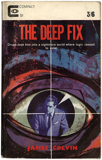
(James Colvin was a Moorcock nom-de-plume.)
The Prisoner was produced in the era of the social dramas of The Wednesday Play and Play for Today yet it remains relevant in a way its worthier contemporaries could scarcely manage. Social realism dates as quickly as yesterday’s news but allegory stays fresh. And it’s a dismal truth that the world of infinite surveillance has crept closer in a way that few would have imagined possible in 1968. The cameras that follow McGoohan’s Number Six everywhere are a familiar sight on Britain’s streets; a headline in yesterday’s Independent newspaper read: “Big Brother database a ‘terrifying’ assault on traditional freedoms“. McGoohan, who was raised in Ireland, would have appreciated the adherence of another Irishman, James Joyce, to the Luciferian cry of disobedience in Ulysses, “Non serviam!”—”I will not serve”. Joyce’s Stephen Dedalus defies God and his family; McGoohan’s Number Six defies everything else. That example, of the man who can “make putting on his dressing gown appear as an act of defiance”, is something we need as much now as we did in 1968. Hollywood is currently threatening a big-screen version but why wait for more compromised studio product when you can go to the source. Get yourself a deep fix—it’s a masterpiece.
Previously on { feuilleton }
• Thomas M Disch, 1940–2008
• Revenant volumes: Bob Haberfield, New Worlds and others