The Barney Bubbles revival continues with news of Space Ritual 09, a concert dedicated to BB by ex-Hawkwind members at the Roundhouse, London on March 8th. The headline band is a new version of Hawklords, notably sans Dave Brock who controls the Hawkwind name and hasn’t been too happy recently with Nik Turner’s revisionist activities. Quarrels aside it’s good to see them honouring Barney’s memory and the Roundhouse is the place to do it, being the venue where Hawkwind played a very stoned set in 1972 as part of the Greasy Truckers concert.
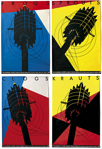
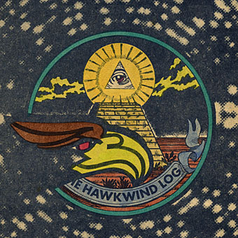
All of which had me searching in vain for a double-page ad from the NME for Hawkwind’s Urban Guerilla single; you can see the ad in a smaller vertical version on the original Barney Bubbles post. I was hoping to find the full thing and scan it for display here but it seems to have gone astray for the time being. As it was the search turned up these photocopies of some later Bubbles Hawkwind ads created for the band’s UK tour of winter 1973/74. A pair of typically meticulous ink and Letratone renderings and also another example of what you might call Barney’s interactive design since these instruct the reader to glue the masks to card, colour them in then cut them out and wear them to the gig. David Wills has featured some other examples along these lines, including this cut-out doll birthday card. Did anyone ever try wearing these masks? And if so, is there photo evidence?

Previously on { feuilleton }
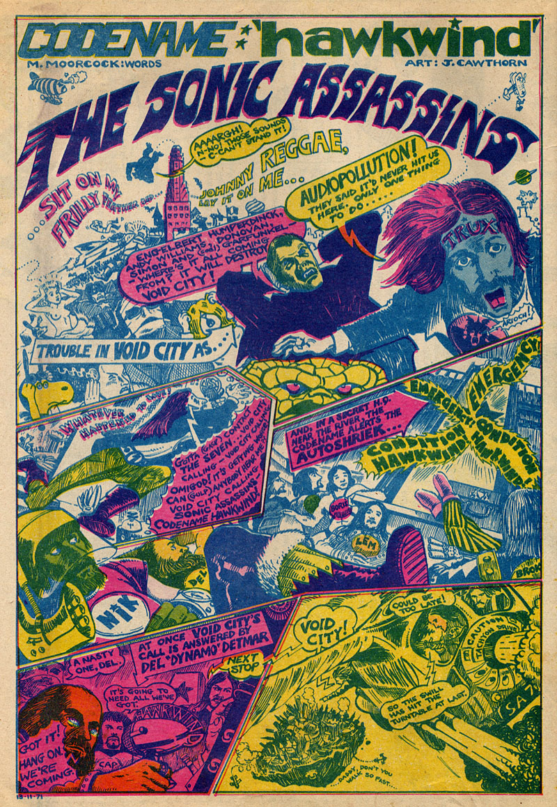
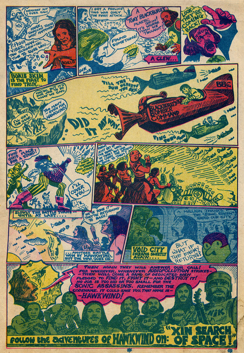
• The Sonic Assassins
• Reasons To Be Cheerful, part 2
• Barney Bubbles: artist and designer