The art of Karel Thole, 1914–2000

thole4.jpg

The Disciples of Cthulhu (1976).

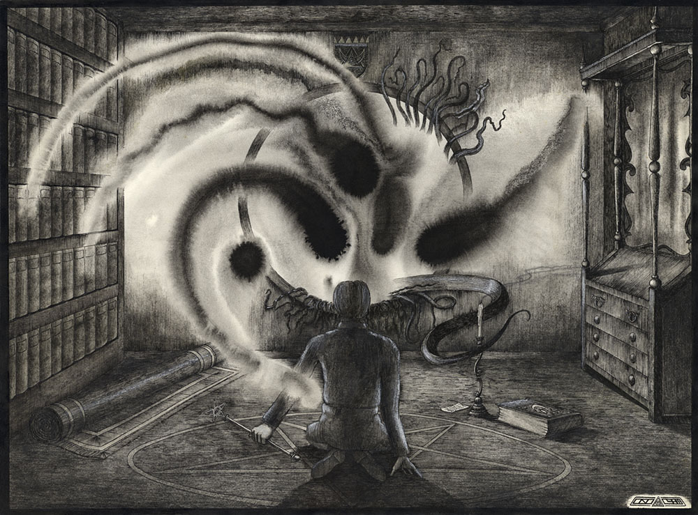
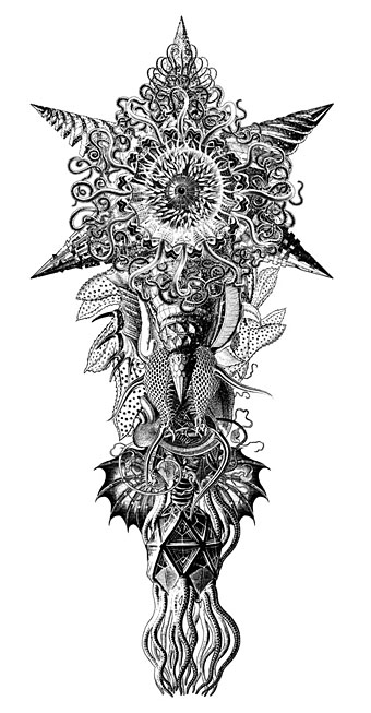
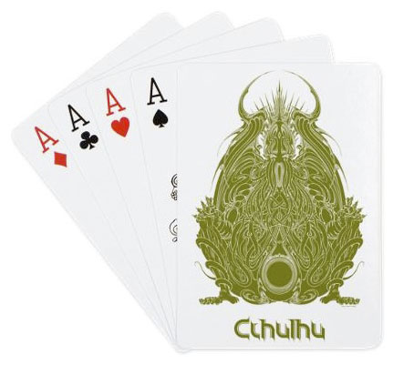
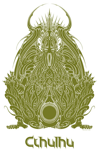
A disagreement I have with the burgeoning world of Lovecraft art is the relentless focus on monsters—and I say this in a week when I’ve been working on a new commission of exactly this: six pictures of Lovecraftian creatures. Lovecraft famously emphasised atmosphere as the paramount ingredient in a weird story, and atmosphere in his fiction is often generated by his descriptions of landscape and architecture; Angela Carter’s insightful essay in the George Hay Necronomicon (1978) was entitled Lovecraft and Landscape. Architecture often receives considerable attention in the stories: The Call of Cthulhu, The Dreams in the Witch House, The Haunter of the Dark, and At the Mountains of Madness all concern invented (or reimagined) architectural settings. Given this, you’d expect architecture to be more represented in Lovecraft art but this is seldom the case. When it comes to Cthulhu, a creature whose myriad representations must be reaching some kind of critical mass, artists will lavish great attention on tentacles, claws and flourished wings but the Cyclopean stones of R’lyeh are invariably reduced to a tentative backdrop.

thole1.jpg

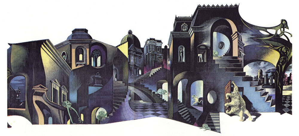
I mostri all’angolo della strada (The Monsters on the Street Corner, 1966).

Hence the attraction of the wraparound cover by Karel Thole for I mostri all’angolo della strada, a Lovecraft story collection with one of the few cover designs I’ve seen that attempts to communicate anything of the writer’s preoccupations with angled space. Thole was a very prolific Dutch artist, producing many covers for Italian publisher Mondadori, and painting covers for Mondadori’s SF magazine, Urania, for over 20 years. The first paintings of Cthulhu I saw were those by Thole (above) and Bruce Pennington in Franz Rottensteiner’s The Fantasy Book (1978); Thole’s monster doesn’t have the required scale (and Pennington’s cover is a favourite) but for me it still carries a Proustian charge. The art for I mostri all’angolo della strada was featured in The Cosmical Horror of HP Lovecraft (1991), one of the first attempts to anthologise Lovecraft-related illustration past and present. The book contains many excellent reprints together with dubious material from European comics. Thole’s street scene—a curious combination of Escher, De Chirico and Art Nouveau—stood out among page after page of slavering abominations. I’d like to see more art that follows this direction; less of the monsters, more of the monstrous architecture.

thole2.jpg

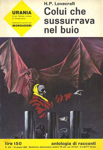
Colui che sussurrava nel buio (The Whisperer in Darkness, 1963).

Continue reading “The art of Karel Thole, 1914–2000”

The Gable Window

gable.jpg

The Gable Window (1984) by John Coulthart.

Presenting some of my first Lovecraftian illustrations, neither of which have been made public before. This drawing, and the one below, are as much Derlethian as they are Lovecraftian, depicting scenes from a short story and a short novel written by August Derleth from fragments and notes found in Lovecraft’s papers. The Gable Window was collected in The Survivor and Others (1957) which happens to be the only Lovecraft-related title I own in its original Arkham House printing. Derleth’s posthumous collaborations are often more Derleth than Lovecraft but I liked the central idea of The Gable Window which, like The Music of Erich Zann, concerns a window that also serves as a portal to other dimensions.

lurker.jpg

The Lurker at the Threshold (1982) by John Coulthart.

Before I began adapting The Haunter of the Dark in 1986 I hadn’t made much of an attempt to illustrate Lovecraft seriously. These drawings and a handful of other pieces were more like experimental sketches, although The Gable Window is obviously a very polished piece of work. Rather than depict anything overtly monstrous, each piece began as an arrangement of ink splotches and washes applied to cartridge paper soaked with water. The Lurker at the Threshold is one of several small pictures made with this technique in 1982, none of which are very successful. This one doesn’t look too bad but the best one, depicting the climax of The Dunwich Horror, I sent to the late Roger Dobson for possible use in an issue of Aklo, and haven’t seen it since. The Gable Window refined the technique by using fewer splotches and a more detailed drawing applied afterwards. I’ve never been happy with the figure, and the books on the left are lazily done, but it’s one of the better things I was doing in 1984. The biggest surprise looking at the drawing again was noticing the crest over the window which features a triangle/crescent motif that’s very similar to the one I designed a year later for Hawkwind’s Chronicle of the Black Sword album. This wasnt intentional.

gable-detail.jpg

Today The Gable Window seems like an indicator of where my head was at during this time. I was tired of doing Hawkwind-related things, and eager to immerse myself in something different; a series of Ballard illustrations was one potential way forward, Lovecraft was another. A year later I’d made a decision and, as it were, stepped through the window.

Elsewhere on { feuilleton }
The Lovecraft archive

NecronomiCon Providence 2015

necro.jpg

Next month I’ll be in Providence, Rhode Island, where I’m the Artist Guest of Honour for NecronomiCon Providence 2015. This is an honour for me in more ways than one: the city of Providence, or its representation in the spectral prose of HP Lovecraft, has occupied a fair amount of my creative life, especially in the comic-strip adaptations I was drawing in the 1980s. I just hope the citizens of Providence can forgive the liberties I took with the city’s architecture in The Haunter of the Dark where the buildings owe far more to the architecture of Scotland than they do to New England.

lm19.jpg

A nameless entity from Lovecraft’s Monsters (2014).

The main event where I’m concerned will be the Ars Necronomica art show at the Providence Art Club on Thomas Street. This is a few doors away from the beautiful Fleur-De-Lys Studios, a building that Lovecraft mentions in The Call of Cthulhu, and which (having done some research this time) filled a panel in my adaptation. In the story the building is the home of eccentric artist Henry Wilcox so it’s a dizzying prospect to find my own art being exhibited a few doors away. Among my works there will be print enlargements of some of the illustrations from last year’s Lovecraft’s Monsters, Ellen Datlow’s expertly edited collection of recent Lovecraftiana; and the piece I created in 2007 for the Exhibition of Unspeakable Things at Maison d’Ailleurs, Switzerland, has been refashioned especially for this show. My work isn’t the only art on display, there’ll be contributions from 50 other artists which I think must make the event one of the largest Lovecraftian art shows staged anywhere. The show opens on August 11th but the official opening will be on the 20th which happens to be Lovecraft’s 125th birthday. Big thanks to Joe Shea, Niels Hobbs et al for arranging everything.

The convention begins on the 21st, and rather than attempt to summarise the astonishing range of events it’s easier to provide links to the main schedule and the additional programming. For anyone interested in attending, there are still day passes available, while many of the additional events are open to the public. Oh, and I’ve also designed the cover for the convention booklet so attendees will be able to get their copy defaced by my signature. (I’m probably making work for myself here, aren’t I?) And I’ve just noticed that there’s a preview of the booklet cover on the convention Facebook page.

Elsewhere on { feuilleton }
The Lovecraft archive

Rock shirts

shirt1.jpg

Arriving in the post at the end of last week was this T-shirt for British Doom band The Wounded Kings. The Shadow Over Atlantis (2010) was the band’s second album, and they asked permission a while ago to use my Cthulhuesque De Profundis piece on this limited edition shirt. Permission was granted happily enough, my only concern was that the fine detail and dark tones might not reproduce well on black fabric. The printing is remarkably good, however, and the circular design and type layout works very well. The shirts are on sale here.

shirt2.jpg

All of which reminded me that I have a couple of shirts from the Hawkwind era in the 1980s. I’ve not aired these designs before, mainly because the Earth Ritual design is one of my many pieces of Hawk-art that I find amateurish. I used to put considerable effort into the cover designs (some of them, anyway; a few were pieces of art sent to Dave Brock as samples that were later used as official covers); but much of the art I produced for the tour programs and merchandise was done in haste, and should have been a lot better considering it was being used for costly souvenirs.

Earth Ritual was the title of an EP released in 1984 that was notable for having Lemmy as guest bassist, his first appearance on a Hawkwind record after being sacked from the band in 1975. I did the cover for that one but I don’t like it very much. The 1984 tour was named after the EP, hence the shirt, although the show was nothing remotely like the elaborate Space Ritual concept. The triangle with a bar on the skull is the alchemical symbol for Earth, a detail the band used in their stage set. I’ve never liked that skull which is very badly drawn, I’d have been better off using a photocopy of the skull on this drawing from the same year. The design was drawn in black ink on white paper; I had no say in the colouring which was done by the merchandise company. From the same drawing they also made small enamel badges (where the skull looks even worse!), and a sew-on patch which looks much better since they dispensed with the skull.

shirt3.jpg

This was the shirt design for the 1985 tour, one of the final designs for the Chronicle of the Black Sword project, and one of the very last pieces I did for Hawkwind. The design of this one is a little more successful although once again the colours weren’t my choice.

These aren’t the only shirts I’ve done for the music world, in addition to other occasional work for metal bands I produced many exclusive designs for Cradle of Filth from 2001–2005 but they never sent me any of those. To return to De Profundis, I ought to note that the artwork is available as a print from CafePress.

Previously on { feuilleton }
The Cosmic Grill
Void City
Hawk things
The Sonic Assassins
New things for July
Barney Bubbles: artist and designer

Cthulhu playing cards

cthulhucards.jpg

You know, there was a time when HP Lovecraft’s dreaming monster was a rare entity known only to aficionados. Cthulhu may not have achieved Hello Kitty-style ubiquity yet but it’s only a matter of time (or strange aeons).

Adding some new products to my CafePress pages recently I noticed that the ever-expanding product line there now includes playing cards, so here’s a new addition to the growing mountain of Cthulhuiana. I was going to add a playing card option to some of my recent designs (the Summerisle one in particular) but there seems to be a fault in the processing at the moment so the ones I’ve tried haven’t shown up. This design seems to have worked because it was a png rather than the usual jpg. If I can persuade the software to behave I’ll add more in future. As usual the price is relatively steep, a consequence of the high base price rather than my rapacity.

Update: After another CafePress malfunction (or something) my shop vanished. But you can now get a similar set of cards at Zazzle.

cthulhugod3.jpg

Previously on { feuilleton }
More CthulhuPress
Cthulhu Calendar
Cthulhu for sale
Cthulhu God
CthulhuPress