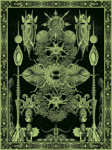
Tsathoggua rising

tsathoggua.jpg

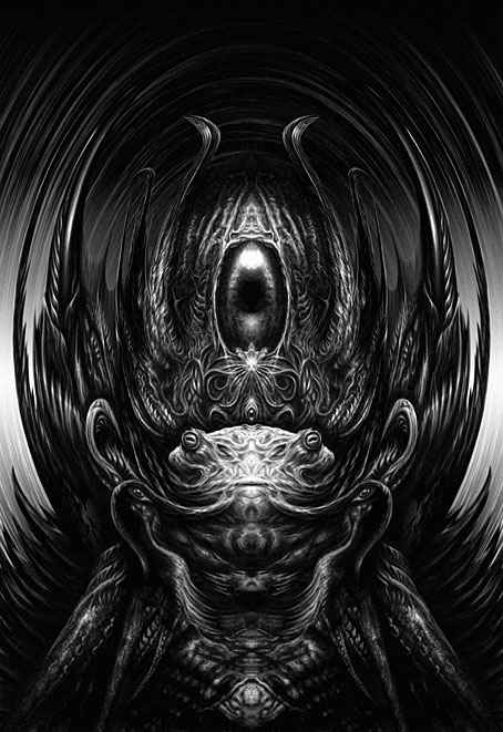
I said last week that I’d almost finished reworking my portrait of Tsathoggua for the Lovecraft book, and here it is. Tsathoggua first came into the world in a Hyperborea story by Clark Ashton Smith, The Tale of Satampra Zeiros, before being incorporated into the Cthulhu Mythos by HP Lovecraft who refers to the god-creature in several of his stories. Where Smith describes a hideous toad-like being, Lovecraft avoids being too closely bound by material specifics, referring to an “amorphous” entity which suggests a range of possibilities for illustration. To be fair to Smith, there is an amorphous and very deadly creature lurking in the temple of Tsathoggua in The Tale of Satampra Zeiros but we never learn whether this is Tsathoggua itself or some other being.

The amorphousness of Lovecraftian entities is a factor which is too often ignored in the world of weird illustration. Cosmic horror thrives on the fluidity of physics and physical matter but many illustrators seem content to copy one another instead of inventing new teratisms, a process that results in the accretion of stereotypes. Cthulhu, as I’m always reminding people, explodes into pieces after being struck by a ship at the end of The Call of Cthulhu, the remnants then recombining when the ship sails away from the scene. Lovecraft never intended his “spawn from the stars” to resemble the accreted stereotype we see today, a kind of Jolly Green Giant with squid mask and bat wings, reaching a brawny and very human arm towards the viewer. The ultimate expression of cosmic amorphousness may be found in the Shoggoths, those alien entities whose default condition is a mass of shapeless, iridescent protoplasm.

It was the amorphous nature of Tsathoggua that I wanted to honour with my original Photoshop creation in 1999. The starting point was a photograph of a cephalopod (I forget now whether it was an octopus or a squid) torn from an old issue of National Geographic. My initial experiments with the picture weren’t intended to develop into Tsathoggua; I didn’t have anything specific in mind when I started but at some point during the production of The Great Old Ones I decided to turn the picture into Smith’s entity with the addition of a toad-like head. Rather than mould the rest of the picture into more recognisable organic shapes it was left in a largely amorphous state. The eye-like shape at the top is a complete mystery to me now, I can’t say why it was there but it felt right so there it stayed. Alan Moore’s text for Tsathoggua identifies the creature with the Kabbalistic sphere of Geburah, “Strength”, a zone imbued with the martial qualities of the planet Mars. This is one of the more arbitrary assignations in The Great Old Ones—there’s nothing especially warlike about the toad-god—but something had to occupy the space, and I’d already finished the picture before Alan started writing his pieces. For the new version I’ve redrawn some areas of the original, but most of the work has been a case of sharpening edges and improving the contrast and modelling. The spiky, crown-like upper half has been emphasised a little in order to complement the martial aspect. And the bulging, convex appearance of the original has been slightly enhanced, giving the impression that the creature’s gravitational mass is of a sufficient density to bend the light around it. None of this should be taken as a negation of Smith’s description of a squatting, pot-bellied toad-god. The icons of the Great Old Ones created by human beings are exactly this: human attempts to represent alien monstrosity. Some acolyte who happens to envision the real Tsathoggua might stammer that “It looked like…a giant toad!” thereby giving a form to the subsequent iconography. But the map is not the territory. Cthulhu doesn’t, and shouldn’t look like the statues either. The Jolly Green Giant needs to ditch the mask and wings and get back to selling canned vegetables.

Elsewhere on { feuilleton }
The Lovecraft archive

Previously on { feuilleton }
H.P.L.
The Return of the Crawling Chaos
Lettering Lovecraft
Weird ekphrasis and the Dunwich Horrors
Kadath and Yog-Sothoth
Another view over Yuggoth

Weird ekphrasis and the Dunwich horrors

dunwich1.jpg

The Seal of Yog-Sothoth, or Old Whateley’s conception of the same. A detail from the delightful kitchen autopsy scene which you’ll find below.

My thanks to Tentaclii for bringing the following to my attention in the most recent HPLinks post. The Actual Anatomy of the Terrible: Gou Tanabe, Weird Ekphrasis, and the History of Lovecraft in Comics is a lengthy academic essay by Timothy Murphy which I doubt I would have seen otherwise. Since Lovecraftian comics is the subject, a combination of vanity and curiosity made me click the link to see whether any of my own work rated a mention. I was surprised to find much more than this, with Murphy discussing and contextualising my adaptations of The Haunter of the Dark and The Call of Cthulhu. The bulk of his essay concerns the series of doorstop adaptations that Gou Tanabe has been producing for the past decade (most of which I’ve only seen as extracts), but Murphy’s knowledge of both Lovecraft’s fiction and comics history is very thorough. Particular attention is paid to Alberto Breccia’s pioneering adaptations of the 1970s; Breccia’s version of The Dunwich Horror was the story that impressed me the most when it appeared in the Heavy Metal Lovecraft special in October 1979. Seeing someone approach Lovecraft’s fiction in a sober, realistic manner was a welcome riposte to the jokey EC formula, and very much in my mind when I decided to start adapting Lovecraft myself seven years later.

books-big.jpg

Previous hauntings: Caermaen Books (1988), Oneiros (1999), Creation Oneiros (2006).

The biggest surprise in Murphy’s essay (and the reason for my writing all of this) was the end of his appraisal when he says “Lovecraft devotees may regret Coulthart’s abandonment of further adaptations…”, referring to my own version of The Dunwich Horror which stalled in late 1989 when I was asked to start working on the Lord Horror comics series from Savoy Books. A few Dunwich pages and panels were included in my Haunter of the Dark book, most of them in collage form, but the bulk of the story has never been made public. In one of those striking coincidences that often occur when you’ve embarked on a new project, I happened to have resumed work on The Dunwich Horror only a week ago, 36 years after leaving page no. 25 in its pencilled form. A few weeks prior to this I’d been scanning all of my Lovecraft comic art for the new edition of the Haunter of the Dark that I’ve been preparing since January. I’ve already mentioned reworking some of the illustrations from the first edition of the book but this process has scaled up considerably in the past two months. I’d been a little mortified to find that the artwork scans I used for the slightly upgraded edition in 2006 were the same ones I made in 1999 using a desktop scanner that wasn’t as good as those I’ve had since. Sorting through all the artwork again reminded me that my adaptation of The Dunwich Horror had been abandoned very near the end, with only the last two parts of the ten-part story left unfinished. This in turn prompted me to seriously consider finishing the story at last, an idea I’d always dismissed as being difficult if not impossible. My work on the Lord Horror comics in the 1990s led to a change in my penmanship and working methods which meant abandoning the very fine (0.2 mm) Rotring Variant pen that I’d used for drawing all the Lovecraft comics. I still have all my old Rotring pens; what I no longer have is the desire to spend months covering sheets of A3-size paper with lines like those made by an etching needle.

Continue reading “Weird ekphrasis and the Dunwich horrors”

Another view over Yuggoth

yuggoth1.jpg
The original Yuggoth collage, 1994.

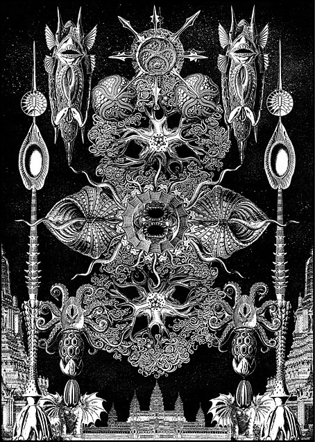
Three years ago I resurrected my panorama of R’lyeh from The Call of Cthulhu, a process that took five months from start to finish as I redrew a large and very detailed picture. Last month I spent a much shorter time doing the same for one of the other pieces of art that went missing after being printed in 1994, the Haeckel collage that I titled Yuggoth. I don’t think I’ve mentioned before that this was originally created as a potential cover for the first edition of the Starry Wisdom collection published by Creation Books. My Cthulhu strip had already been accepted for the book when I was asked to create something for the cover. The painting I eventually submitted was rather mediocre, not terrible but I’d only been painting with acrylics for a year or so and was still getting used to the medium. By the time Creation rejected the cover the print deadline was approaching so I had little time to create anything new. Having recently bought a copy of the Dover edition of Ernst Haeckel’s Art Forms in Nature I decided to try and make a suitably Lovecraftian collage using Haeckel’s prints.

yuggoth4.jpg
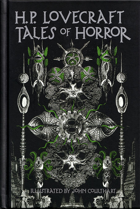
The original collage as it appeared on the cover of HP Lovecraft: Tales of Horror in 2022. Cover design by Jo Obaroswki.

Yuggoth was the result, created in a day or so after I’d rushed to the local copy shop and returned with a large quantity of paper which I chopped up then tried to assemble into a coherent form. I duly posted the result to Creation unaware that they’d already decided to use some of Peter Smith’s Lovecraft art on the cover. I was okay with this, I liked Smith’s drawings and Yuggoth ended up appearing inside the book. Despite the hasty production process I’d taken the precaution of photocopying the collage before it went into the post, something I did with the rest of the artwork, so even though the original Yuggoth was lost (or stolen or whatever actually happened to all that artwork) I’ve still had something which was usable years later. It was this photocopied version that appeared a few years later in my Haunter of the Dark book, as well as on the cover of the Fall River Lovecraft collection, Tales of Horror, in 2022.

yuggoth2.jpg

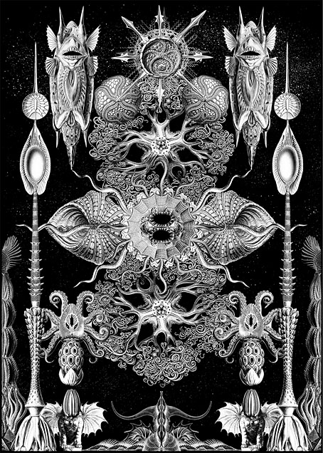
The reworked Yuggoth collage, 2024.

The photocopied version was usable, then, but not ideal. The original collage had been made with photocopies produced by a machine which didn’t deal very well with the halftones in Haeckel’s plates. This gave the final piece a rough, posterised quality, the roughness being intensified once the whole thing was copied again. The resurrected version has been pieced together from scans of the original Haeckel book with everything in the same size and (almost) the same placement as before, only now all of the halftones and other fine detail are intact. And while I was going to all this trouble I decided to change the architectural details in the original to something more in keeping with the rest of the picture. The planet Yuggoth (or Pluto as human beings know it) is more alluded to than actually described in Lovecraft’s fiction, but we do know that the place is inhabited by a race of fungoid aliens. I’ve always thought of Yuggoth as being architecturally rich as well as inhabited, rather like the alien worlds that Frank R. Paul used to paint for the back covers of Fantastic Adventures magazine, but in my haste to create the collage I’d resorted to copying Cambodian and Thai temples from a book of architectural engravings. These have now been replaced by structures that are more in keeping with the other elements. Using Haeckel for architectural inspiration has a minor history, as I’ve noted before. The French architect and designer René Binet had been looking at Haeckel’s plates in 1900 when he designed the arched gateway for the Exposition Universelle in Paris. Binet later expanded on this design with Esquisses Décoratives, a book of proposals for more Haeckel-derived architecture produced in collaboration with Gustave Geffroy.

yuggoth3.jpg

The tinted version you see here is now available as prints and other products at Redbubble. My shop there is still a little understocked but I intend to keep adding to it in the coming months. As before, I’ll mainly be doing prints at Redbubble, all my T-shirt sales are now being handled by Skull Print. The latter emailed their final dates for pre-Xmas orders today: 6th December for overseas and 18th December for the UK. Skull Print will also be taking a break at the beginning of January so they won’t be dealing with any new orders until the 15th of that month. Thanks.

Elsewhere on { feuilleton }
• The Lovecraft archive

Previously on { feuilleton }
• Ghost Box and The Infinity Box

Weekend links 752

nemo.jpg

Captain Nemo by Alphonse de Neuville, from Twenty Thousand Leagues Under the Seas (1875) by Jules Verne.

• “…physical remoteness is a category of its own. It is an enhancer: It can make the glorious better and the terrible worse. The oceanic pole of inaccessibility distills physical remoteness on our planet into a pure and absolute form. […] Point Nemo is nearly impossible to get to and offers nothing when you arrive, not even a place to stand. It is the anti-Everest: It beckons because nothing is there.” Cullen Murphy explores the remotest place on Earth. A long and fascinating read, but no mention of Point Nemo’s dreaming tenant.

• More Bumper Book business: Smoky Man has posted the second part of his analysis of the book for (Quasi) (in Italian) which includes some comments from myself about the origin of the Moon and Serpent Magical Alphabet, and why the letter Q in the alphabet is assigned to Cthulhu. Elsewhere, Panini have announced an Italian edition of the Bumper Book for May next year, while at The Beat Steve Baxi reviewed the book from a philosophical perspective.

• At the BFI: David Parkinson on where to begin with Louis Feuillade. I’d suggest starting with Fantômas rather than Les Vampires but then I’m biased.

The combination of magic(k)al, ceremonial action, vivid colour and paradoxically serious camp in Jarman’s Super 8 films of the ’70s bears the influence of Kenneth Anger, but the differences between Jarman’s sensibility and Anger’s are more striking than the resemblances. Jarman’s vision is more materialist, austere and hermetic, and less sociological; where Anger identifies the glamour of American popular culture with the Will of the Crowleyan magician, Jarman situates the discovery of the cinematographic mechanism imaginatively within the history of alchemy. Anger cast rock stars as gods and adepts with the intention of harnessing the energy of their recognition; Jarman casts Fire Island, then in its heyday as a gay resort, as a desert defined by sculptural details and occupied by a single masked figure, in scenes that both recall his landscape paintings of the ’60s and ’70s and anticipate the design of his garden at Dungeness.

Luke Aspell on Derek Jarman’s hermetic film/painting, In the Shadow of the Sun

• At Smithsonian Magazine: “Visions of nuclear-powered cars captivated Cold War America, but the technology never really worked”.

• At The Spectator podcast: host Sam Leith talks to Michael Moorcock about 60 years of New Worlds magazine.

• At Public Domain Review: “Light from the Darkness” — Paul Nash’s Genesis (1924).

• At Bandcamp: “Disco godfather Cerrone’s enduring influence on dance music”.

• At Unquiet Things: The Art of Survival: Eyeball Fodder in Dark Times.

• Mix of the week: DreamScenes – November 2024 at Ambientblog.

• New music: The Laugh Is In The Eyes by Julia Holter.

• At The Daily Heller: The College of Collage.

• RIP jazz drummer Roy Haynes.

Thermonuclear Sweat (1980) by Defunkt | Nuclear Drive (1982) by Hawkwind | Nuclear Substation (2005) by The Advisory Circle

Weekend links 748

leighton.jpg

• In Tate Britain yesterday afternoon I finally got a proper look at Frederic Leighton’s An Athlete Wrestling with a Python (1877). It’s been part of the Tate collection for years but I never used to see it there, my only sighting being a view through a glass door into a locked gallery where the exhibits were being rearranged. I put the statue into my adaptation of The Call of Cthulhu in 1988 (see this post). Virgil Finlay also borrowed the pose for a Tarzan illustration in 1941.

• At Smithsonian magazine: See the first section of the largest-ever cosmic map, revealed in stunning detail by the Euclid space telescope.

• At The Daily Heller: Your Next Stop, The Twilight Zone. An interview with Arlen Schumer about the TV series.

• At Wormwoodiana: Mark Valentine on Punch and the Surrealists.

• Mix of the week: DreamScenes – October 2024 at Ambientblog.

• New music: A House Where I Dream by Mattias De Craene.

• RIP Lillian Schwartz, pioneering computer animator.

• At Bandcamp: The Acid Mothers Temple Dossier.

• Where to start with Alan Garner.

Jim Reid’s favourite music.

The Twilight Zone (1963) by The Ventures | The Twilight Zone (1979) by The Manhattan Transfer | Twilight Zone (1998) by Helios Creed