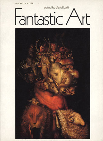
Fantastic Art (1973).
Cover: Earth by Arcimboldo.
I’d thought of writing something about this book series even before I started this blog since there’s very little information to be found about it online. I can’t compete with the serious Penguin-heads, and I’m not much of a dedicated book collector anyway, but I do have a decent collection of the art books that Pan/Ballantine published in the UK throughout the 1970s. The books were published simultaneously by Ballantine/Peacock Press in the US, and nearly all were edited by David Larkin, with Betty Ballantine overseeing the American editions. Two of the series, the Dalí and Magritte, were among the first art books I owned. Over the years I’ve gradually accumulated most of the set, and I always look for their distinctive white spines in secondhand shops.
The Pan books were a uniform size, approximately A4 (297 x 210 mm), with a single picture on each recto page surrounded by generous margins. The reproductions were excellent, printed on quality paper, and all featured specially-commissioned introductions (JG Ballard for the Dalí book) with those pages printed on textured sheets. Each book was beautifully designed, the opening pages and introductions often featuring black-and-white vignettes if the artists in question produced line drawings. David Larkin’s focus was on art that tended to the fantastic, visionary or imaginative, something that was in vogue throughout the Seventies after psychedelic art had ransacked the Victorian and Edwardian eras for inspiration a few years earlier. Aubrey Beardsley had been rediscovered in the mid-Sixties (turning up on the cover of Sgt. Pepper) and underground magazines such as Oz and IT helped create a renewed interest in art that would look good when you were stoned or tripping. The Pan books weren’t “head books” as such but its probably fair to say that the series was supported and made possible by the prevailing attitudes of the time.
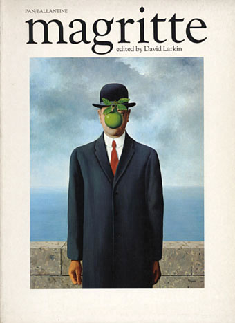
Magritte (1972).
Cover: The Son of Man.
As the series developed the format evolved away from fine art towards contemporary fantasy art, and as a result became less interesting for me, although the success of the Frank Frazetta books undoubtedly meant that this was the way the sales were going. The demand for the Ernst and Rousseau titles can be gauged by the remainder cut-outs on their covers. The final volumes (which I’ve never bought) featured artists such as Brian Froud (The Dark Crystal), Alan Lee (The Lord of the Rings) and others, with their Faeries, Giants, Castles and Gnomes books. I’m still missing a couple of the earlier numbers which I could now order online but that would spoil the game of letting chance deliver the goods, wouldn’t it?
Fantastic Art is easily my favourite, a great collection of visionary work through the ages beginning with Bosch and proceeding through Goya, John Martin, Richard Dadd, the Symbolists and the Surrealists to what was then contemporary work by artists such as Hundertwasser. This was one of the first of the series and seems to be the key volume in the way it provides an overview of the art that would follow.
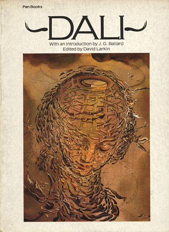
Dali (1974).
Cover: Raphaelesque Head Exploding.
A great introduction by JG Ballard in this one, replete with the usual phrases about “the dark causeways of our spinal columns”.
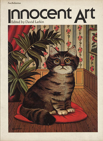
Innocent Art (1974).
Cover: Cat by André Duranton.
A collection of what used to be called naive painting, ie: work by unschooled “Sunday painters” such as Rousseau. Outsider art is the preferred term these days even though the work itself hasn’t always changed.
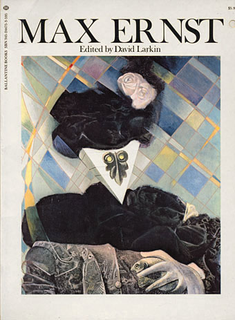
Max Ernst (1975).
Cover: Euclid.
Ernst’s later work in this book was the most abstract and experimental of the series. Europe After the Rain was printed across a fold-out sheet so that its full width could be displayed.
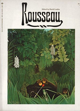
Rousseau (1975).
Cover: The Merry Jesters.
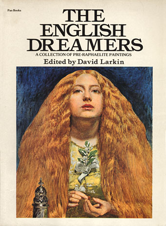
The English Dreamers (1975).
Cover: The Bridesmaid by John Everett Millais.
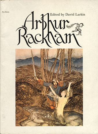
Arthur Rackham (1975).
Cover: Clerk Colville (from Some British Ballads).
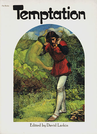
Temptation (1975).
Cover: Ferdinand Lured by Ariel by John Everett Millais.
An unusual collection with a wide range of pictures (Bosch, Alma-Tadema, Balthus). Mainly concerns sexual temptation for female bodies but also includes Biblical and other temptations.
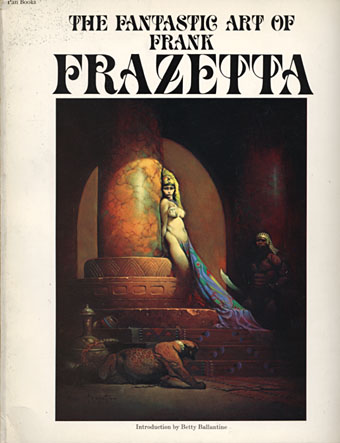
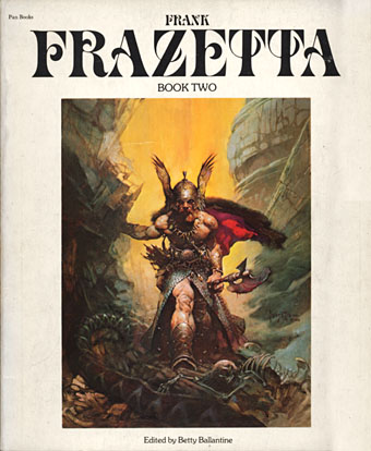
The Fantastic Art of Frank Frazetta (1975).
Cover: Egyptian Queen.
The book that launched a thousand metal albums. Volume One here was the first attempt to collect Frazetta’s work and was easily the most popular title of the series, going through many reprintings and prompting three follow-up volumes. Many of the reproductions are superior to their equivalents in Taschen’s later Icon collection. This was the first one I bought after the Surrealist books and, while I’ve never been a muscle obsessive, I couldn’t help but notice all the male flesh on display.
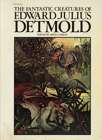
The Fantastic Creatures of Edward Julius Detmold (1976).
Cover: Shere Khan in the jungle (from The Jungle Book).
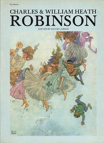
Charles and William Heath Robinson (1976).
Cover: Elfin Mount (from Hans Andersen’s Fairy Tales).
A collection of the Robinsons’ fairy tale paintings. A break from the format with a blue cover.
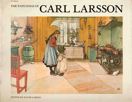
The Paintings of Carl Larsson (1976).
Cover: The Kitchen.
Another break with the format, the book being printed landscape to suit Larsson’s drawings and paintings. As with the Ernst book, a fold-out page was a special feature.
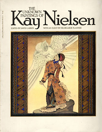
The Unknown Paintings of Kay Nielsen (1977).
Cover: The Tale of the Third Dervish.
A collection of Nielsen’s work derived from Turkish and Persian miniatures.
Frank Frazetta, Book Two (1977).
Cover: Dark Kingdom.
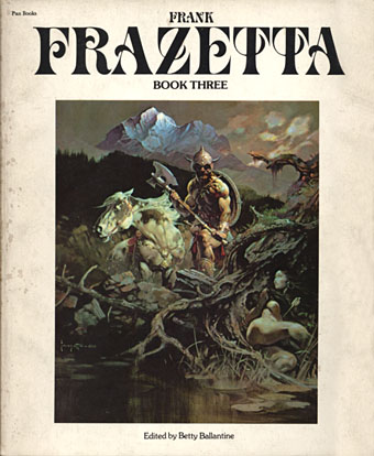
Frank Frazetta, Book Three (1978).
Cover painting: Nightwinds.
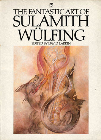
The Fantastic Art of Sulamith Wülfing (1978).
Cover: The Big Dragon.
Part of the series but published by Fontana/Collins, not Pan.
Elsewhere on { feuilleton }
• The fantastic art archive
• The book covers archive
• The illustrators archive

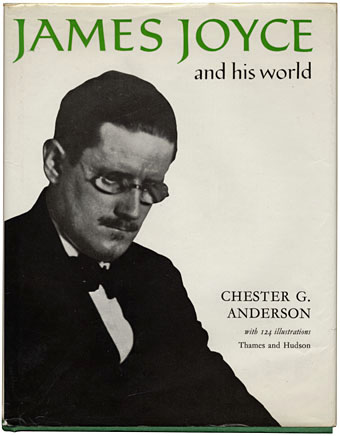
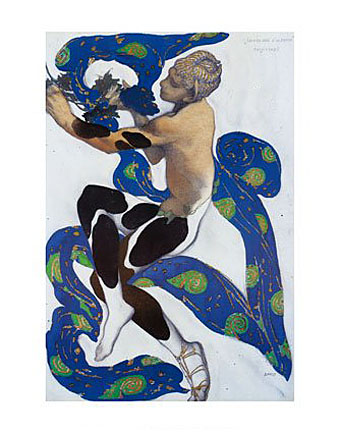
 Despite my earlier statement about not being much of a collector, today’s book purchase (above) was enough to confirm some well-established patterns (obsessions, even) that should make me reconsider any hasty pronouncements. Not so much for the subject in this case—I already have enough books by and about James Joyce—the significant thing here is the three magic words on the cover: Thames and Hudson. The sight of Joyce’s name on the spine above the old T&H dolphin logo (signifying the two rivers that comprise the company’s name; or maybe a discourse between London and New York via the Atlantic) was enough to demand further investigation. I realised I’d been hoping to eventually find this book after seeing it listed in the back of its companion title, Beardsley and his World by Brigid Brophy. Both books form part of a series that T&H produced in the Seventies, a collection of heavily illustrated mini-biographies of writers, with the odd artist among them. Very worthwhile they are too, with lots of photographs, paintings or drawings of the people and places relevant to their subjects’ lives.
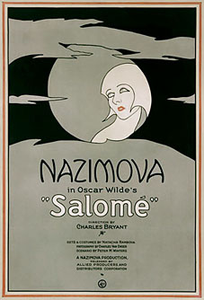 We tend to think of cinema as a modern medium, quintessentially 20th century, but the modern medium was born in the 19th century, and the heyday of the Silent Age (the 1920s) was closer to the Decadence of the fin de siècle (mid-1880s to the late-1890s) than we are now to the 1970s. This is one reason why so much silent cinema seems infected with a Decadent or Symbolist spirit: that period wasn’t so remote and many of its more notorious products cast a long shadow. Even an early science fiction film like Fritz Lang’s Metropolis has scenes redolent of late Victorian fever dreams: the vision of Moloch, Maria’s parable of the tower of Babel, the coming to life of statues of the Seven Deadly Sins, and—most notably—the vision of the Evil Maria as the Whore of Babylon. Woman as vamp or
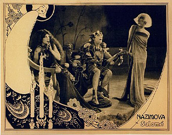
 I have an abiding fascination with the