Weekend links 846

borges.jpg

Design by Randoll Coate for the Labirinto Borges, a hedge maze at the Giorgio Cini Foundation, Venice, which was renovated earlier this year.

• “Code was probably our most overtly political record, which is interesting, touring and playing it in these very different but scary political times.”​ Stephen Mallinder of Cabaret Voltaire talking about the experience of touring America again.

• At The Daily Heller: A look at the work of designer/illustrator George Hardie whose five-decade career is to be celebrated in a retrospective exhibition in London. There’s more George Hardie here.

• “Almost as soon as weird began circulating outside of Macbeth, its meaning broadened too, from ‘eerie’ and ‘uncanny’ to ‘odd’ or ‘unusual’.” Colin Gorrie on the weird history of the word “weird”.

• At The Quietus: Toby Manning on 40 years of Gone To Earth by David Sylvian. A minor nitpick: the album’s art and design was by Russell Mills, not Vaughan Oliver.

• New music: Burning Song by Kali Malone; Obsessive Surrealism by Parallel Worlds.

• At Door Of Perception: The radical architectural designs of Eugene Tssui.

• DJ Food’s latest accumulation of psychedelic graphics from the desktop.

• Old music: When The Music’s Over (Live, 1970) by The Doors.

Arthur Brown‘s favourite songs.

Weird Dream (1976) by Harmonia | It’s So Weird (1983) by Bush Tetras | Ballad Of The Weird Sisters (2013) by Blood Ceremony

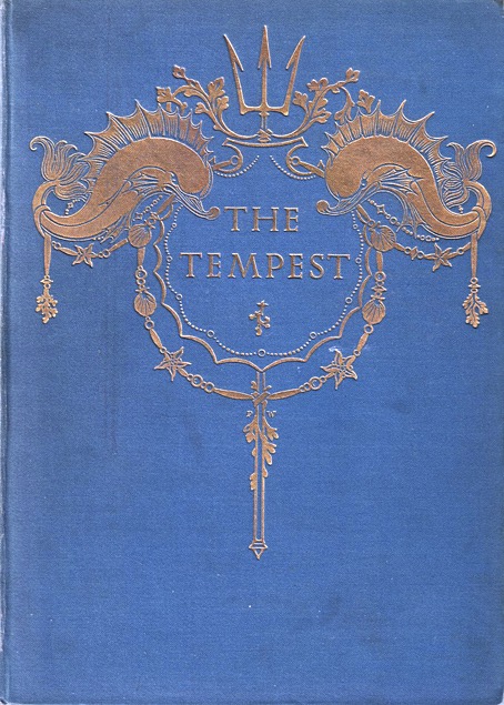
Paul Woodroffe’s Tempest

woodroffe12.jpg

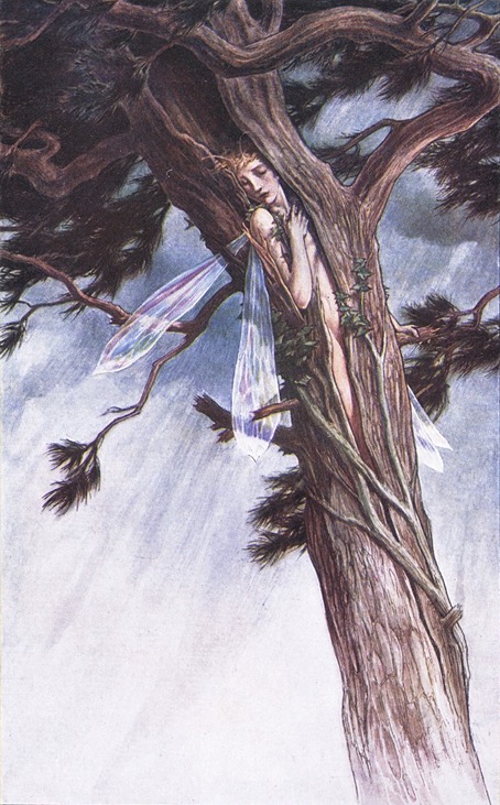
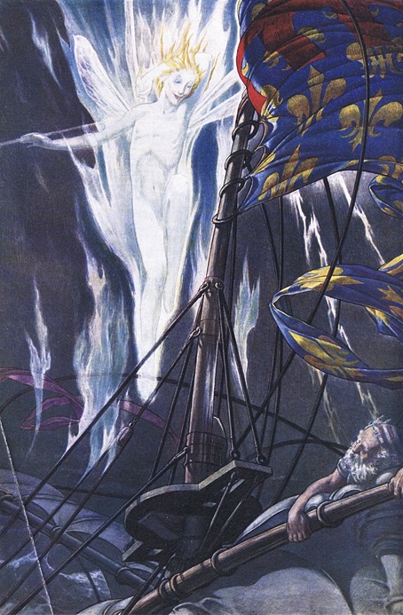
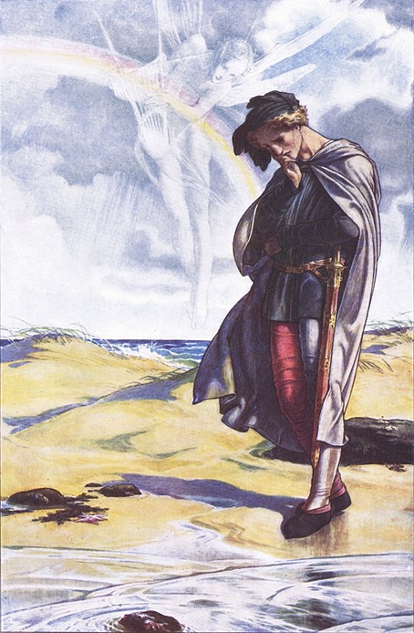
Paul Vincent Woodroffe (1875–1954) was a British illustrator and stained-glass artist, a kind of British equivalent of Harry Clarke in that he seems to have spent more time creating stained glass than he did illustrating books. Woodroffe was also an exact contemporary of Aubrey Beardsley, and both artists provided illustrations in 1897 for The Parade, a heavily-illustrated gift book of stories for children. I’ve known about Woodroffe’s illustrated Tempest for some time but I’ve had to wait to find a decent collection of all the colour plates. Woodroffe was an excellent watercolourist whose nebulous effects are so delicate they might easily be spoiled by poor reproduction. I’m at a loss to say exactly how some of these effects were achieved. He evidently used washes to fill in the sky, a technique where the paint can’t be manipulated before it dries, yet he still has the translucent figures of Ariel and Prospero hovering over some of the scenes. What he seems to have done is painted the transparent figures in very diluted white tones over the backgrounds, a difficult process when you don’t want any pencil outlines showing underneath.

woodroffe20.jpg

Where the subtance of the text is concerned, Woodroffe adds more to some of the familiar scenes than you find with other artists. For the scene where Ariel is transformed into a harpy Edmund Dulac shows the spirit as an eagle-sized bird; Woodroffe’s Ariel is a larger creature with a fearsome pair of claws. For Ariel’s Song he shows a cowled and enthroned skeletal figure sitting at the bottom of the sea, like Death waiting to make an appearance in The Rime of the Ancient Mariner. Woodroffe’s human figures are less interesting although still well-drawn, a parade of statuesque types with similar faces and a distinctly Pre-Raphaelite appearance. His book also features three double-page scenes, something you don’t find so often in these coloured editions.

woodroffe17.jpg

woodroffe16.jpg

woodroffe09.jpg

Continue reading “Paul Woodroffe’s Tempest”

It’s Fantastic! It’s Futuristic! It’s Fatalistic! It’s Science Fiction!

SF1.jpg

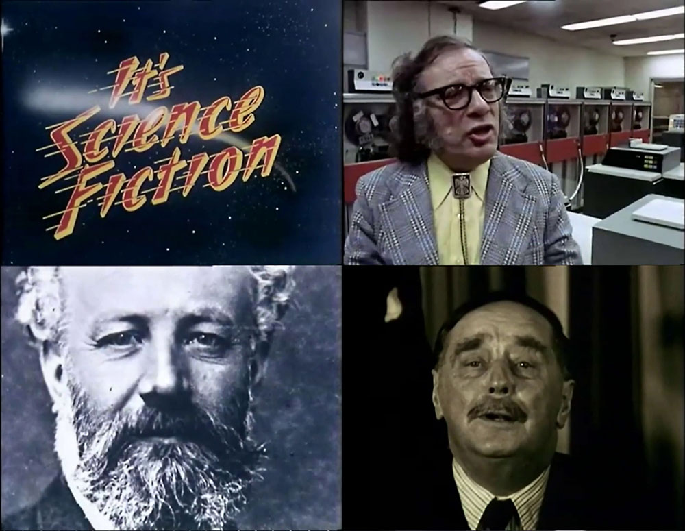
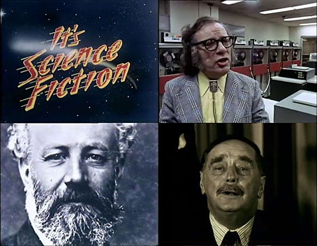
There’s a worthwhile documentary struggling to be born in this film which is compromised by its hyperbolic title and a running time of 48 minutes, not nearly enough to contain a history of science fiction, past and present. I’m not a media historian so I can’t say whether this was the first serious examination of written science fiction made for British TV but if it wasn’t there wouldn’t have been many that preceded it. It’s Fantastic! It’s Futuristic! It’s Fatalistic! It’s Science Fiction! was broadcast in 1973 as part of the BBC’s Omnibus art strand; Harley Cokeliss (credited here as “Cokliss”) was the director, and also the co-writer with Michael Abrams. Two years prior to this Cokeliss had made a shorter BBC film, Crash!, which explored JG Ballard’s ongoing preoccupation with automobile accidents via the rehearsals for Crash in The Atrocity Exhibition. Ballard turns up again here, theorising energetically about his usual concerns (mass advertising, the media landscape, etc) from a balcony overlooking Heathrow airport.

SF2.jpg

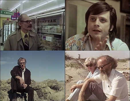
Cokeliss opens proceedings with the inevitable collage of clips from Flash Gordon and Hollywood films of the 1950s, most of which are appalling quality. If nothing else, this is a good reminder of how terrible feature films used to look when shown on TV. More interesting for today’s viewer is the record of a handful of writers who were seldom personally visible in the mass media even while their stories were being adapted by film and television. Ballard and Brian Aldiss are the representative Brits, all the other writers are Americans: Isaac Asimov, Ray Bradbury, Harlan Ellison, Damon Knight, Frederik Pohl and Kurt Vonnegut. Also interviewed is Fritz Lang, who repeats his anecdote about Metropolis being inspired by his visit to New York in the 1920s, and Forrest J. Ackerman is filmed inside his memorabilia-filled house. The absence of women interviewees is unfortunately typical of the time. Kate Wilhelm appears on camera with husband Damon Knight but it’s Knight that does all the talking.
SF3.jpg

All of the interviews are far too brief for such a wide-ranging subject but it’s still fascinating to see Harlan Ellison at his peak, talking (and typing) at speed. It’s also surprising to find JG Ballard and Frederik Pohl in near agreement when they both describe science fiction as being a reflection of the present as much as it is it is a look into the near or distant future, “a mythology of the Space Age” as Ballard liked to describe it. Science fiction is often both these things simultaneously, predictive and reflective, something its critics don’t always seem to appreciate.

SF4.jpg

Documentaries also reflect the times in which they’re made, and this is another arts documentary that plunders the prog-rock shelves for its soundtrack music, placing a few bars of Close To The Edge by Yes over shots of New York’s teeming crowds. Harley Cokeliss really should have been given a series instead of a single film in which he flies all over America to capture nothing more than a few brief soundbites. But in 1973 the genre was lucky to get this much attention from one of the BBC’s serious arts outlets. Managerial attitudes did change later in the decade, probably as a result of the resurgence in popularity of SF cinema. In 1979 the BBC made a five-part series about science fiction, Time Out of Mind, where four of the programmes were profiles of single writers—Arthur C. Clarke, John Brunner, Michael Moorcock, and Anne McCaffrey—with other writers appearing in each film. A fifth episode concerned the SF convention that took place in Brighton that year. Ray Bradbury was given the full Omnibus treatment a year later in The Illustrated Man, a typically fine David Wheatley profile, while Philip K. Dick received a posthumous appraisal from Arena in 1994.

Here in 2026 we find ourselves in the future being grasped at in the 1970s where television has now abandoned expensive author profiles unless the author in question is massively popular or the winner of a Nobel prize. With everyone owning a pocket-sized recording device anyone can now make their own television, and so YouTube fills up with hours of amateurish video of people talking into laptops and webcams with poor visuals and dreadful sound. A good documentary is always more than a stream of raw footage; contextualisation and editorial point-of-view are essential, as well as whatever artistry the director might bring to the material. The frame is important, in other words, however compromised that frame may be.

Previously on { feuilleton }
Future Life magazine
Science Fiction Monthly
Weekend links 845

belbury.jpg

Cover design by Jim Jupp, art by Arik Roper.

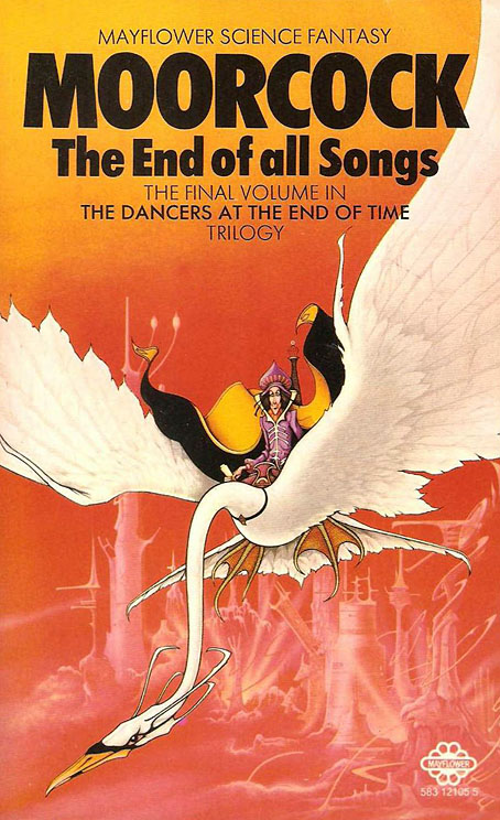
• New music: Sorcery by Belbury Poly, or “The Belbury Poly” as the credit on the cover art has it. The description of the forthcoming release says “it grew from [Jim] Jupp’s love of early to mid-80s electronic music and a rediscovery of how that music had soundtracked his childhood love of all things sci-fi and fantasy. It’s moody and melodramatic electronica rendered in bright and evocative 80s sounds.” And concerning the cover art there’s this: “Some may notice the typographical nod to Mayflower Books’ Michael Moorcock novels.” Indeed.

matthews.jpg

Cover art by Rodney Matthews, 1977.

• Among the new titles at Standard Ebooks, the home of free, high-quality, public-domain texts: The Mummy! A Tale of the Twenty-Second Century (1827) by Jane C. Loudon, and The Place Called Dagon (1927) by Herbert S. Gorman.

• More new music: Materia by Julia Holter; Avaeken by Stephen O’Malley; Witchcraft & Black Magic In The United Kingdom by Various Artists.

• The Natural History Museum presents competition photos from Wildlife Photographer of the Year.

• This week I drew a new header design for the Endless Bookshelf website.

• At the BFI: Brogan Morris chooses 10 great films about screenwriters.

• At Dennis Cooper’s it’s Palimpsest Day.

• RIP Tim Curry and Yayoi Kusama.

Sorcery #1 (1974) by Jack DeJohnette | Sorcerer (1977) by Tangerine Dream | Return Of The Sorcerer (2011) by The Wounded Kings

Mug-wump Specific

mugwump1.jpg

Mugwump (mŭg´ wŭmp). An Algonquin word meaning a chief; in Eliot’s Indian Bible the word “centurion” in the Acts is rendered mugwump. It is now applied in the United States to independent members of the Republican party, those who refuse to follow the dictum of a caucus, and all political Pharisees whose party vote cannot be relied on. —Brewer’s Dictionary of Phrase and Fable, 1954

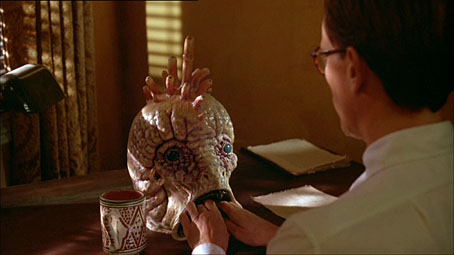
Such is the usual explanation given for the origin of the word “mugwump”, a term better known today, of course, for its use in Naked Lunch, and that mainly via David Cronenberg’s feature film. Why William Burroughs came to name his sinister creatures mugwumps is something I’ve never seen an explanation for although one may well exist somewhere.

mugwump2.jpg

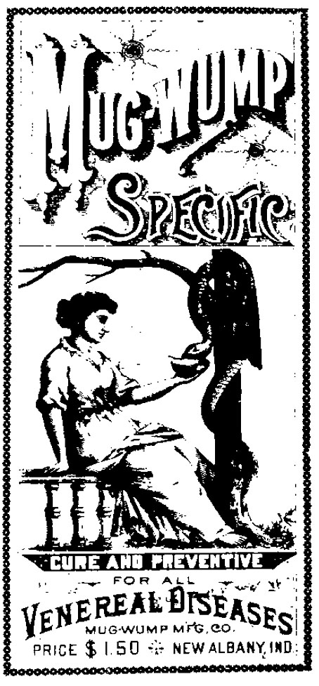
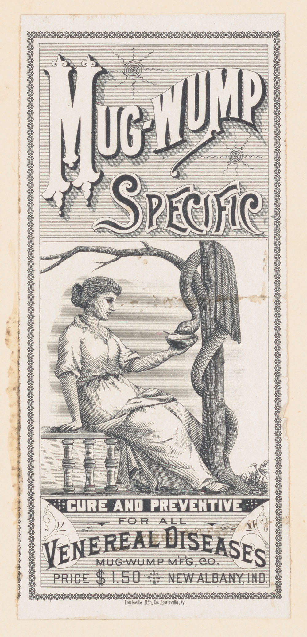
A few years ago I wrote a short post showing how the first description of the mugwumps in Naked Lunch was a kind of science-fictional rewrite of a similar passage from Junkie, a description a predatory character that a drug-user might encounter in the narcotic underworld of the 1940s. As an addendum to the post I added a crude image of a label for a 19th-century patent medicine, “Mug-wump Specific”, which had turned up at Wikipedia without any attendant information. At first sight the label seemed too good to be true in its Burroughsian combination of the mugwump name, sexual disease and—since it claims to be a cure—Dr Benway-style crank medicine. These associations were further compounded by the Freudian illustration of a woman offering a bowl to a very large snake. (The latter detail shouldn’t necessarily be taken as a reference to snake oil, however. The snake twined around a staff is a common medical symbol, derived from Asclepius, the Greek god of medicine.) Why a medicine manufacturer in Indiana should choose mugwump as the name for its alleged cure is yet another mystery, and one unlikely to be resolved. I’d guess it’s a result of the impulse that still prevails today when new products have to be named in a distinctive manner that’s both memorable and copyrightable.

mugwump3.jpg

This mass of conundrums was percolating through my mind last week as a result of which I embarked on a fairly determined search to find the image above, a first-generation printing of the medicine label affixed to a US trademark application. Ever since the cruder image had turned up at Wikipedia I’d been wondering why there wasn’t a better copy to be found anywhere. Surely something with so many cultural connections should be flying around the Tumblr labyrinth by now? I’d previously tried all the obvious sources like the image section of the Wellcome collection, where you’ll find a variety of medicine labels, as well as the product catalogues at the Internet Archive. Since Google has taken to ruining its search engine it’s become increasingly difficult to find uncommon images but I was lucky on this occasion when I found one of the trademark applications for sale at eBay. Knowing that the Library of Congress has an online archive of such things I zipped over there and immediately found the sample above. I’ve since seen the same image plastered with proprietorial watermarks at Etsy where someone is selling reproductions. This happens a lot in print-on-demand circles and at image-resellers like Alamy where ownership is claimed over material which is demonstrably in the public domain. Well, if you’re desperate to own a “Mug-wump Specific” T-shirt or poster you can save yourself some money by downloading a high-resolution tiff of the label here.

Elsewhere on { feuilleton }
The William Burroughs archive