Man is the Animal, issue two

coil.jpg

Postcard not included.

In the post this week, the second issue of the Coil zine, Man is the Animal. 64 pages of esoteric exploration, plus a portrait of everyone’s favourite Elizabethan magus, Dr John Dee.

Contents:
A Slip (or a Jump) In Beverley Road by Nick Soulsby
Letter to the Esoteric Order of Dagon by John Balance
Towards a Magickal Appreciation of Coil by Patrick Weir
Agapanthus: Four Poems for John Balance by Jeremy Reed
The Chaosphere by Stephen Sennitt
Shakespeare, Jarman, Coil: A Conversation by Cormac Pentecost
Everything Keeps Dissolving by Sheer Zed

Previously on { feuilleton }
Man is the Animal: A Coil Zine

Study II (Hallucinations) by Peter Weiss

weiss1.jpg

If you hadn’t noticed by now, this year is the centennial anniversary of the publication of Ulysses and The Waste Land. It’s also a centenary year for the Surrealist movement although the same could be said of last year and the next couple of years when Surrealism, like most art movements, doesn’t have a definite point of departure. Apollinaire first coined the term in 1917, after which it became attached by a process of accretion to some of the moves being made in the wake of Dada. André Breton and Philippe Soupault’s collection of automatic writing, The Magnetic Fields, was published in 1920 but it would be another four years before the appearance of the first Surrealist manifesto, and there were two of those produced by rival groups within a few weeks of each other as a result of the childish factionalism that plagued the movement from the outset.

weiss2.jpg

Anyway, Study II (Hallucinations) (1952) is a short film that can be regarded as Surrealist even if it wasn’t intended as such. I didn’t know playwright Peter Weiss had made any films but then I only really know him at all from his extraordinary Marat/Sade. Study II is a long way from Marat/Sade in both form and content, being an attempt to capture the fleeting impressions that enter the mind before the onset of sleep. The juxtaposition of naked figures and isolated body parts is reminiscent of many Surrealist paintings or collages, although filmed tableaux such as these are seldom as effective as still images or animated ones when there’s always the distracting awareness of watching people holding an awkward pose. But Weiss’s film would suit a screening with similar Surrealist shorts, especially Eric Duvivier’s La femme cent têtes, another display of awkward poses and hallucinatory moments.

Previously on { feuilleton }
The Marat/Sade

Clichés & Gravures

cliche01.jpg

The clichés we have here aren’t the verbal variety but those which the OED defines as:

1. The French name for a stereotype block; a cast or ‘dab’; applied esp. to a metal stereotype of a wood-engraving used to print from. Originally, a cast obtained by letting a matrix fall face downward upon a surface of molten metal on the point of cooling, called in English type-foundries ‘dabbing’.

Clichés & Gravures is a two-volume collection (Volume 1 and Volume 2) of emblems, icons, small illustrations, initials, headings, frames and other print details published by the Deberny type foundry in 1912. Carol Belanger Grafton’s 3,800 Early Advertising Cuts is an edited selection of the same images which Dover Publications added to their Pictorial Archive series in 1991. I’ve been borrowing from Ms. Grafton’s book for many years, during which time I’ve wondered what might have been omitted from her selection. Once again the Internet Archive turns up the goods. The Dover reprint gives no indication that Deberny’s collection ran to two volumes and included colour printing in the second volume, plus a few pages of type designs; the Art Nouveau-styled design shown below is one that I can find immediate use for. If all of this somehow wasn’t enough, there are yet more clichés et gravures (and a lot more typefaces) in this type catalogue which Deberny published a few years later.

cliche02.jpg

cliche03.jpg

cliche04.jpg

cliche05.jpg

Continue reading “Clichés & Gravures”

Weekend links 611

ltpf.jpg

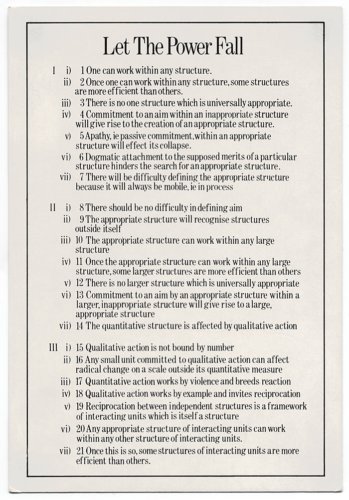
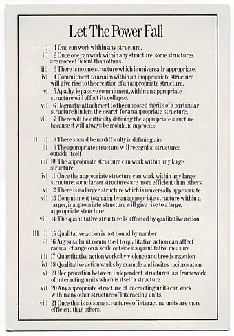
Let The Power Fall (1981) by Robert Fripp. A postcard included with the original vinyl release of the Let The Power Fall album.
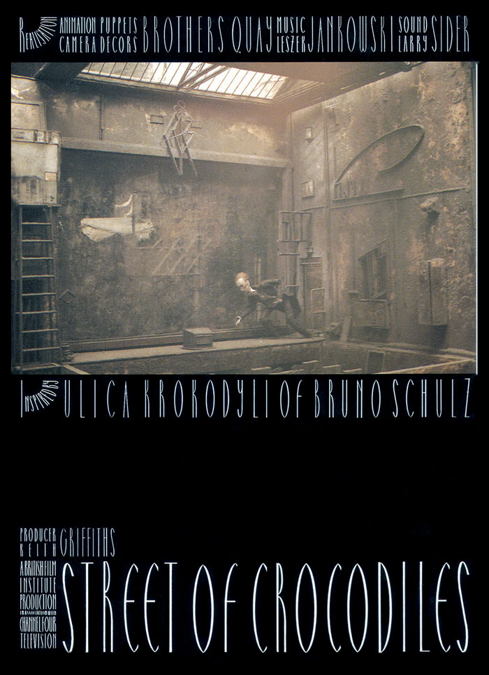
Exposures 1977–1983 is the title of another wallet-busting CD/DVD/blu-ray box which will be released by DGM at the end of May. Unlike the previous King Crimson sets this one will be devoted to Robert Fripp’s first run of solo releases, covering the albums that emerged from the artistic campaign he described at the time as “The Drive to 1981”: Exposure (1979), God Save The Queen/Under Heavy Manners (1980), The League Of Gentlemen (1981), and Let The Power Fall (1981). If you’re as interested as I am in this period of Fripp’s career then this is all very exciting. Exposure has been reissued several times over the years, and exists in three different “editions” featuring alternate mixes and song variations, but the other albums have been unavailable in any form for decades, possibly as a result of the turmoil caused by the mismanagement and eventual collapse of the EG label. In addition to the reissues the box will include live recordings, a League Of Gentlemen Peel session plus a substantial quantity of Frippertronics material, including the loops that were recorded for Eno & Byrne’s My Life In The Bush Of Ghosts. Fripp retained a credit for his contribution to Regiment but the results are so far down in the mix that they’re easy to miss. Related: The Drive to 1981: Robert Fripp’s Art-Rock Classic Exposure.

• Galerie Georges-Philippe & Nathalie Valloisin, Paris, is currently creeping out visitors to Strange Aeons—We will meet you there, an exhibition by Peybak (Peyman Barabadi and Babak Alebrahim Dehkordi) that borrows its title from HP Lovecraft and includes a number of creatures, “neither embryos nor chimeras”, which may be found prostrate and breathing on the gallery floor.

• New music: Sub Zero, in which Kevin Richard Martin returns to the subterranean/subaqueous/subarctic zones he charted on his Isolationism and Driftworks compilations in the 1990s; plus The Carrier by Large Plants, an album of “psych rock belters” coming soon on the Ghost Box label.

• Science fiction as revolution: Joe Banks talks to Iain McIntyre, co-editor of Dangerous Visions and New Worlds—Radical Science Fiction, 1950–1985, about the flourishing of the New Wave of SF in the 1960s and 70s.

• “We know from his letters that Joyce sent a Greek flag to Nutting for him to colour-match. So, he was aiming for ‘Greek’ blue.” It’s that book again. Cleo Hanaway-Oakley on Ulysses, blindness and blue.

• Intermittent Eyeball Fodder: More visual delights gathered by S. Elizabeth.

• Steven Heller’s font of the month is Nicholas.

• Galerie Dennis Cooper presents…Liz Larner.

Let The Power Fall (1971) by Max Romeo | Minor Man (1981) by The League Of Gentlemen ft. Danielle Dax | Heptaparapashinokh (1981) by The League Of Gentlemen

Quay Brothers posters

quays01.jpg

This Sweet Sickness (1977).

Looking around for Quay Brothers designs turned up an item I hadn’t seen before, a poster for the UK release of a French film by Claude Miller, This Sweet Sickness, starring Gérard Depardieu. I’ve not seen the film either, nor have I read the Patricia Highsmith novel on which it was based although a copy of the book has been sitting on my shelves for some time, together with a couple of other unread Highsmiths. The poster dates from just before the Quays started to get serious about their own film-making.

quays02.jpg

Nocturna Artificiala: Those Who Desire Without End (1979). The organ pipes, which don’t appear in the film, are an allusion to the improvised organ score by Stefan Cichonski.

Being graphic designers as well as film-makers puts the Quay Brothers in a very rare class, one where they not only make the films but also design the posters used to promote their films. Offhand, I can only think of the late Eva Švankmajerová as being in the same company so it’s perhaps fitting that her husband and artistic collaborator, Jan Švankmajer, was the subject of an early film by the Quays.

quays03.jpg

Street of Crocodiles (1986).

quays04.jpg

quays05.jpg

Stille Nacht: Dramolet (1988). An early use of Heinrich Holzmüller’s typographic designs.

Continue reading “Quay Brothers posters”