Design as virus 7: eyes and triangles

eye0.jpg

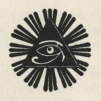
Continuing this occasional series. The above motif is the Golden Dawn’s Wedjat or Eye of Horus emblem as reproduced in the hardback edition of The Confessions of Aleister Crowley, an “autohagiography”. Crowley was under discussion here a few days ago and the eye in a triangle symbol can also be seen on the sleeve of the single featured in that posting, forming a part of the seal of the Ordo Templi Orientis, the occult order which Crowley joined in 1910. Crowley’s use of the eye in a triangle caught the attention of writer Robert Anton Wilson and the first part of his Illuminatus! trilogy (written with Robert Shea) is titled The Eye in the Pyramid. That latter symbol appears on the reverse of the American dollar bill, of course, and some of the conspiracy theories surrounding that usage are explored in the novel. Wilson went on to make the eye in a triangle something of a personal symbol and his obsessive use of the motif caught my attention in turn when I began reading his books.

All of which leads us to Hawkwind and a person whose name keeps turning up on these pages, designer Barney Bubbles.

eye1.jpg

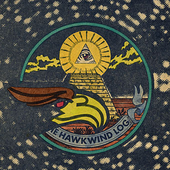
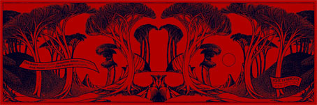
Hawklog cover (detail) by Barney Bubbles.

The booklet which BB designed for Hawkwind’s second album, In Search of Space (1971), featured a version of the dollar bill symbol on its cover. This is the only eye in a triangle design I’ve seen among Barney Bubbles’ work although he was so prolific there may well be others. When I began producing my own significantly inferior Hawkwind graphics in the late Seventies I incorporated eyes in triangles partly as a way of avoiding having to draw hawks all the time but mainly because of Robert Anton Wilson. BB had already established a precedent and it so happens that the eye in the Golden Dawn/Crowley version is the eye of a hawk-headed Egyptian god.

Continue reading “Design as virus 7: eyes and triangles”

1 Top Class Manager

rg1.jpg

1 Top Class Manager is a book bearing the subtitle “The notebooks of Joy Division’s manager, 1978–1980” published this week by Anti-Archivists, Manchester. I’ve been working on the design for this on and off since March although we actually started putting it together this time last year.

Rob Gretton, manager of Joy Division and later New Order, died in 1999 so this is something of a memorial to his work in giving Joy Division the status they have today. Rob’s widow, Lesley, oversaw (and paid for) the production. She and editor Abigail Ward contributed much to my design efforts which underwent considerable back and forth adjustment until we had something everyone was happy with. Some spreads from the book follow below and when I get the time I’ll add larger page views to the book design section of the main site. Music critic and historian Jon Savage wrote the foreword. This was an exciting and fascinating project to be involved, not least for the wealth of rare documentary material which it reveals.

1 Top Class Manager is available via mail order from the book’s website.

Continue reading “1 Top Class Manager”

Dark horses

equus1.jpg

A juxtaposition of old and new theatre posters in the New York Times caught my eye this week, part of a feature about the current Broadway run of Peter Shaffer’s play. The news there, of course, has been Daniel Radcliffe’s on-stage nudity; understandable, perhaps, but celebrity trivia has overshadowed appraisal of Shaffer’s work as a piece of art.

What struck me seeing these was the two very different approaches to the same design problem. Given the subject matter, using an image of a horse is somewhat unavoidable as well as being immediately attractive since horses nearly always look good. The freight of historical and cultural association they carry is also one of the themes of the play. I really like the spare treatment of Gilbert Lesser’s 1976 poster for the National Theatre (left) and much prefer it to the new version used for the London and New York shows. The Lesser poster has the quality of a puzzle, matching the psychological piecing together of the story and Alan Strang’s accusation that Dysart the psychiatrist is always “playing games”. It also has a sinister quality lacking in the contemporary version; Shaffer’s Equus is an unforgiving god and the black eyes could refer to the blinded horses. The Photoshop horse looks altogether too mundane and is it my imagination or is the horse head misshapen slightly in order to fit the torso?

Continue reading “Dark horses”

The Mindscape of Alan Moore: US edition

mindscapecover.jpg

Yes, it’s that film again. The feature-length documentary by DeZ Vylenz about the Northampton Magus receives its official US release through Disinformation on September 30th. I designed the packaging (the original EU inlay is shown above) and the DVD menus.

As I’ve said before, this is a great film—shot on film, not video—a revealing insight into Alan’s life and work. The set includes a bonus disc of interviews with Alan’s artist collaborators: his wife, Melinda Gebbie (Lost Girls), Dave Gibbons (Watchmen), David Lloyd (V for Vendetta), Kevin O’Neill (The League of Extraordinary Gentlemen) and José Villarubia (Promethea, The Mirror of Love); also an interview with comics historian Paul Gravett.

Big Shiny Robot interviewed director DeZ this week and there’s a trailer at the Shadowsnake Films site. The Mindscape of Alan Moore should be available from all the usual DVD retail outlets.

Previously on { feuilleton }
The Demon Regent Asmodeus
New things for June
Alan Moore in Arthur magazine
Watchmen
Alan Moore interview, 1988