The Monstrous

monstrous01.jpg

One of the books I was working on over the summer is officially published this week. The Monstrous is a horror anthology edited by Ellen Datlow, and the third Datlow collection that I’ve designed for Tachyon Publications after Lovecraft’s Monsters (2014) and Darkness: Two Decades of Modern Horror (2010).

My work on this new collection isn’t as full-on as for the Lovecraft volume: I designed the interior, and also illustrated each story but this time many of the illustrations are details or vignettes rather than full-page pictures. There are still 20 stories and over 20 illustrations, however, illustrating pieces by Jeffrey Ford, Peter Straub, Dale Bailey, Caitlín R. Kiernan, Gemma Files, Livia, Adam-Troy Castro, Kim Newman, Jack Dann & Gardner Dozois, Carole Johnstone, Brian Hodge, Stephen Graham Jones, Adam L. G. Nevill, Sofia Samatar, Terry Dowling, Glen Hirshberg, A. C. Wise, Steve Rasnic Tem, Christopher Fowler, and John Langan. Not everything here is a monster in the common sense of that word, the collection explores monstrousness in many different forms, from Sumerian demons and Japanese ghosts to Peter Straub’s disturbing portrait of a psychotic school teacher.

monstrous02.jpg

Missing from this selection of pages is additional pictorial material from Fortunio Liceti’s De Monstris (1665). The capitals on the contents pages are the collaged letterforms by Roman Cieślewicz taken from Dover’s book of bizarre and ornamental alphabets.

monstrous03.jpg

Continue reading “The Monstrous”

The Chronicle of the Cursed Sleeve

blacksword7.jpg

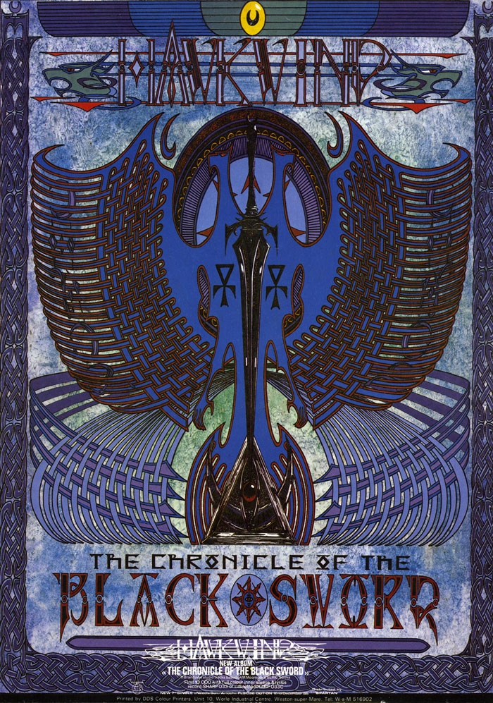
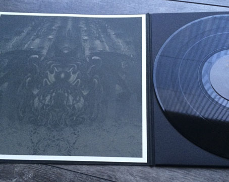
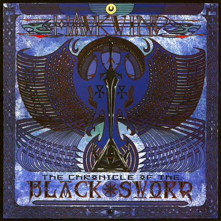
A copy of the cover art that I attempted to colour-correct some years ago to compensate for the poor print reproduction.

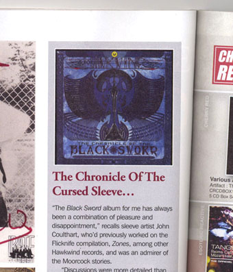
This month I’m in Record Collector magazine talking in a sidebar feature about my work on the Hawkwind album The Chronicle of the Black Sword. The issue is Hawkwind-heavy, with a Nik Turner interview, a history of Flicknife Records (the label that released COTBS), and a retrospective feature on the Black Sword album which was released in December 1985. My words were slightly cut to fit the allotted space but I can run the full text here in which I describe my ambivalent feelings towards this particular cover.

blacksword8.jpg

The Black Sword album for me has always been a combination of pleasure and disappointment. I was very pleased initially to hear that Hawkwind were writing a concept based on the Elric books, a series I’d enjoyed for many years. Cover discussions were a little more detailed than usual since this design was sketched out beforehand then approved by the Dave Brock and co. Prior to this I’d been creating something vague after equally vague requests; communication back then was all done via post and call box as I didn’t own a phone.

This was the first album where I was able to create an integrated front and back cover design. A friend had recently found me a copy of George Bain’s Celtic Art: Its Methods of Construction (1951), a study of the creation of Celtic knotwork, and I was keen to use this somehow. Rather than do a cover that looked like a fantasy paperback the idea was to use the knotwork style to create something that was suitably Hawkish whilst also fitting the Elric theme. The front cover has some nods back to earlier Hawkart in the winged sphere—which goes back to Barney Bubbles and his obsession with Ancient Egypt—and the eye-in-a-triangle, a symbol which first appeared on the cover of the Hawklog booklet in the In Search of Space album, and which I scattered throughout many of my Hawkwind designs.

All the lettering on the album was hand-drawn (not very well in places) using letterforms based on Bain’s examples from the books of Kells and Lindisfarne. I drew the track listing onto the artwork for the back cover, a decision that later proved to be a bad one when the band decided to change the running order of the songs, hence the large purple square that spoils the design. My lack of any direct contact with the record company made problems like this inevitable; I was trying to do graphic design at a distance without having any communication at all with the printers responsible for the sleeve. Before digital design, the creation of an album cover could be a complicated business involving photo-mechanical transfers, knockout areas, overlays, typesetters and more; if you weren’t in direct contact with the printer (or somebody who was) then you simply had to hope for the best.

This process of design-at-a-distance led to the disaster with the cover printing, the front of which has an unwarranted blue cast that dulled the impact of the sleeve and, for me, ruined the whole thing. You can see how the cover should have looked by comparing the background colours of front and back; the front was also printed in its true colours on the back page of the 1985 tour programme. It was this, and the messy appearance of the lettering on the back, that pushed me further towards ending my involvement with Hawkwind and doing something of my own over which I’d have complete control.

blacksword1.jpg

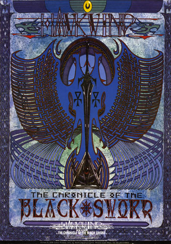
The retrospective feature in the magazine includes a picture of the back cover of the tour programme (above) so those familiar with the album can see the difference in reproduction. The difference isn’t so noticeable on the copies posted here after I tried altering the tones of the cover. Over the years I’ve grown used to the blueness but the back cover remains blighted by its purple boxes.

Continue reading “The Chronicle of the Cursed Sleeve”

Weird metal

shadow1.jpg

Weird metal isn’t A Thing, is it? I reckon it ought to be A Thing, especially when so much black/death/doom/drone metal intersects with The Weird. I mentioned last month that British doomsters The Wounded Kings had used my De Profundis piece for the gatefold and poster insert in their reissue of The Shadow Over Atlantis. My copy of the album arrived this week; it’s a handsome production that sounds tremendous so I’m very pleased to be associated with it. The relationship to Cthulhu isn’t as overt as more well-known compositions such as The Call of Ktulu by Metallica or Cthulhu Dawn by Cradle of Filth. But those are one-off pieces whereas The Shadow Over Atlantis sustains its atmosphere of cosmic dread throughout. It’s available from Ván Records, and I recommend it highly.

shadow2.jpg

All of which reminded me that my Lovecraftian art has featured sporadically in the metal world over the past few years. In the margins of my discographic work you’ll find the following releases.

otao.jpg

Thought-Cathedral (2000) by Of Trees and Orchids.

The perennially popular view of R’lyeh is featured on the cover of the second album by a German death metal band who later changed their name to Ingurgitating Oblivion. Inside the CD there’s also a detail from a Cthulhu drawing of mine.

azathoth.jpg

Azathoth (2007) by Azathoth.

There are many bands named after Lovecraft’s chaotic deity. This group is from the US, and this EP is their only substantial release to date.

portal.jpg

Demonstration 1998 (2009) by Portal.

And there are many groups named Portal. This lot are Australian, and have been going longer than most. Demonstration 1998 is a reissue on 7-inch vinyl of a cassette demo from 1998; the sleeve art shows a fuzzy detail from my R’lyeh spread from The Call of Cthulhu. Nobody asked permission to use the artwork, I only discovered this release since I get a credit for it on Discogs. So there may well be other releases out there that I haven’t seen yet. If you know of one then leave a comment or send an email.

Previously on { feuilleton }
The Shadow Over Atlantis by The Wounded Kings
Rock shirts
De Profundis

Lovecraftiana calendar

lovecraftiana1.jpg

It may have been delayed by a week but the Coulthart calendar for 2016 arrives earlier in the year than some of its predecessors. A few months ago I had no idea what I was going to do for a calendar this year; I had a lot of work in progress, and more scheduled for the autumn, so creating all-new artwork wasn’t the best idea. Then on the plane back from Providence I thought, “Oh, yeah…Lovecraft…” So here’s a selection of Lovecraftian artwork old and new. The most recent pieces are from the front and back cover of the NecronomiCon convention booklet; among the older works there are two paintings which weren’t intended to be illustrative of The Weird but can be if you give them suitable labels, hence The Yellow King for February (see the pages at larger size here). The capitals on the cover are from the wonderful collaged set designed by Roman Cieślewicz, and which can be found in Dover’s Bizarre and Ornamental Alphabets.

lovecraftiana2.jpg

I’ve mentioned the problem caused by CafePress cancelling the line of portrait-oriented calendar templates that I’d been using for several years. The calendar templates at Zazzle didn’t quite match the old CafePress ones but with some fine-tuning of the options I’ve got as close as I could. There’s a slight disadvantage in the way the dates are overlaid on the artwork but then the artwork is already pierced by a hole at the top so this seems negligible. Zazzle’s template improves on CafePress by offering a range of coloured pages and coloured wire-binding so I’ve gone for a none-more-black interior. Zazzle also lets you design a back cover which means this is the first calendar where I’ve been able to provide credits and dates for all the pictures. Buyers also have the option of choosing their own regional holidays; CafePress is resolutely US-centric with all its products. The purchase page is here.

For the moment all the previous calendars, including the popular Psychedelic Alice ones, are unavailable although I’ll be moving them to Zazzle when I have a spare moment. Watch this space.

lovecraftiana3.jpg

Continue reading “Lovecraftiana calendar”

Of cards and calendars

calendars.jpg

Ex-calendars.

Last weekend I was preparing to upload a set of new calendar pages to CafePress when I discovered that the wall calendar option I’ve been using there for years is no longer available. In place of the portrait calendar with square artwork pages there’s now a landscape-oriented calendar with artwork pages that are wider than they are tall. This is fine for people wanting to print their photos but it’s useless to anyone whose work is predominantly portrait-oriented. The square page was never ideal but with a little adjustment I could usually tailor a few things to fit the ratio; I also produced the two Alice in Wonderland calendars (above) especially for the square pages.

So that was the end of that. Suggestions from Twitter sent me to Zazzle where I’d forgotten I already had an account, required some years ago when I had to complain to the company about someone selling products featuring my artwork. Zazzle have a better range of calendars but none have square artwork pages. Zazzle does, however, offer more options for page layout than CafePress so after some playing around I’ve found a compromise which allows for square artwork to fit the portrait page (half of which is filled with the days of the month) with some slight overlap from the dates grid. This will be made more apparent when I’ve uploaded everything at the weekend. I may do the same with the older calendars but it’s a lot of work uploading these things, and at the moment I have more important things to do. One consequence of all this turmoil is that if you’ve ever bought one of my CafePress calendars you now have something of a collector’s item since these things are unlikely to be seen again in that form.

cards.jpg

Breaks the ice at eldritch parties.

So having set out a stall at Zazzle I can now start selling other things there, something I’m looking forward to since they have a different range of products, and the back-end is a lot better than CafePress. I’ve stuck with the latter since 2001 but their site has always been awkward to use, with things malfunctioning or not working at all. Earlier this year I tried putting playing cards on sale featuring one of my Cthulhu designs; this seemed to work at first, unlike attempts to make similar cards using other artwork, then the shop page vanished for some reason. As a test I’ve done the same thing at Zazzle with immediate success. Expect more announcements along these lines in the near future.