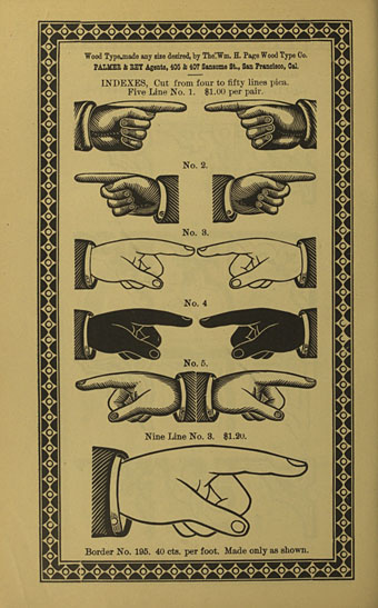
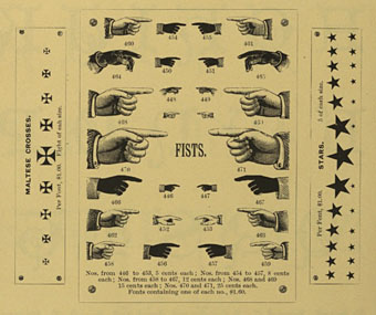
Third revised specimen book and price list of printing material (1887), Palmer & Rey, San Francisco.
Browsing through old type foundry catalogues recently reminded me of a question posed by Callum James a few years ago over at Front Free Endpaper, namely: what is the official description of those pointing hands favoured by pre-20th century typesetters? Writer Mark Valentine in a follow-up post mentions a term invented by William H Sherman—”manicules”—since Sherman also believed that the pointing hands were nameless. That’s not quite the case, however, as these pages show, with two descriptors being used: “indexes” and “fists”. Just to confuse matters both terms are used on different pages of the same catalogue which implies that the names may have been a convenience term to avoid having to repeatedly discuss “those pointing hand things” with customers. “Manicule” seems a better choice since “index” already has a standard meaning in printing, while “fist” doesn’t suit at all.
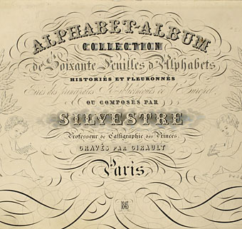
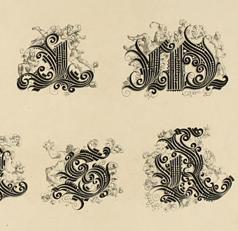
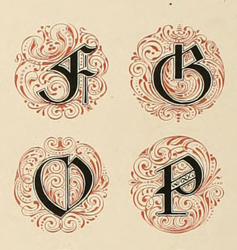
These catalogues contain many pages of similar type decorations and embellishments. All can be downloaded at the Internet Archive, just follow the links.
Third revised specimen book and price list of printing material (1887), Palmer & Rey, San Francisco.
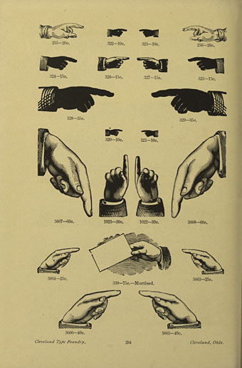
Catalogue and book of specimens of type faces and printing material and machinery (1895), Cleveland Type Foundry.
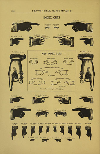
Copper alloy type book (1901), Pettingill & Co., Boston.
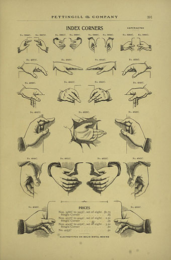
Copper alloy type book (1901), Pettingill & Co., Boston.
Update: Thanks to Alan in the comments for pointing the way (so to speak) to William Sherman’s Toward a History of the Manicule.
Update 2: See this manicule Flickr group for many contemporary examples.
Previously on { feuilleton }
• Victorian typography