Les Astronautes (1959).
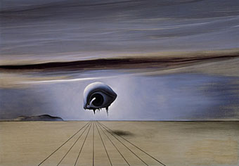
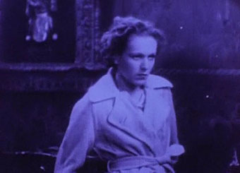
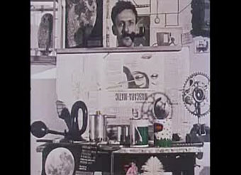
A nice collection of shorts by Walerian Borowczyk (1923–2006) at Ubuweb including this animated piece from 1959 which was co-directed by Chris Marker. The style is immediately reminiscent of that employed by Raoul Servais in Harpya and other films; it’s also not far removed from Terry Gilliam’s animation but it predates both. Also of note is Une Collection Particulière from 1973, a brief but fascinating look at a collection of antique pornographic toys and other adult items from the collection of Pieyre De Mandiargues. And L’Amour Monstre de tous les Temps from 1977 is a portrait of contemporary erotic Surrealist painter Ljuba Popovic at work. Borowczyk spent the Seventies making soft porn features such as Immoral Tales and The Beast, so the subject matter of the later films isn’t so surprising.
Previously on { feuilleton }
• Taxandria, or Raoul Servais meets Paul Delvaux
• Monsieur Chat
• The Brothers Quay on DVD
• Sans Soleil
• Barta’s Golem
• The art of Ljuba Popovic